Data Visualization and Information Design: Create a Visual Model
A course by Federica FragapaneInformation Designer
A course by Federica Fragapane, Information Designer

Bring clarity to complexity by creating an engaging data visualization piece that communicates information with ease
When elegant design meets data visualization, reading and understanding complex information becomes a pleasant experience. Information designer Federica Fragapane is renowned for her ability to transform tables and numbers into an opportunity to tell a captivating story.
In this course, uncover the possibilities of data visualization and discover how to efficiently relay information with style. Learn how to find reliable sources, select the right information, and create a data visualization piece that is both informative and visually striking.
What will you learn in this online course?
17 lessons & 37 downloads

Collaboration
8 minutes, 31 seconds

From Google Sheets to the Paper
3 minutes, 35 seconds
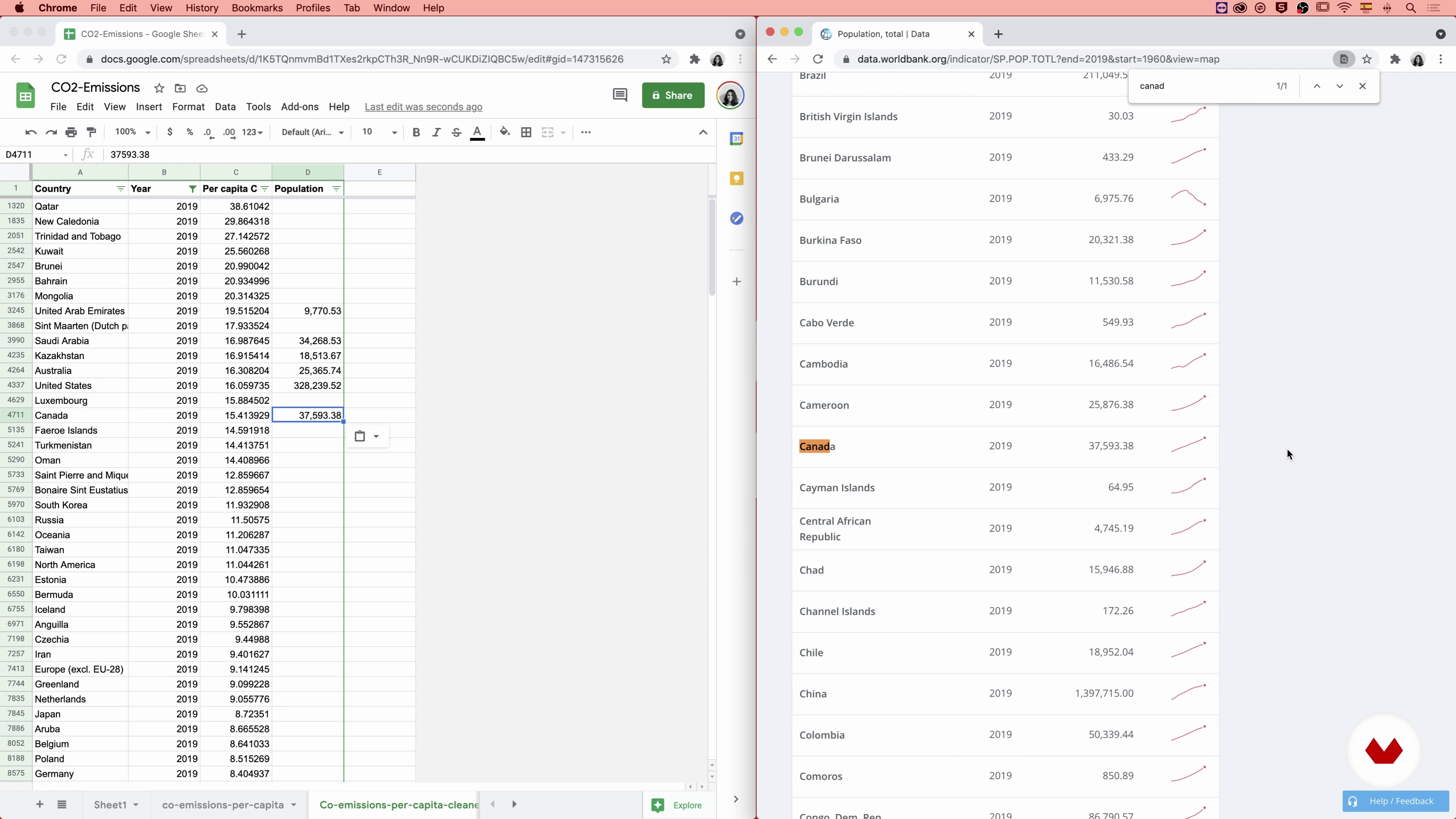
The Data
18 minutes, 34 seconds
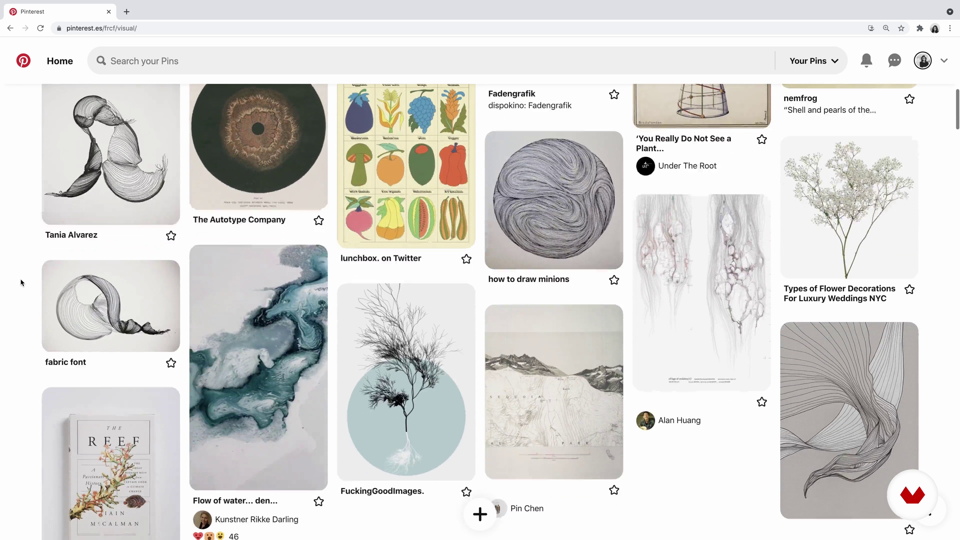
Visual Inspiration
6 minutes, 31 seconds
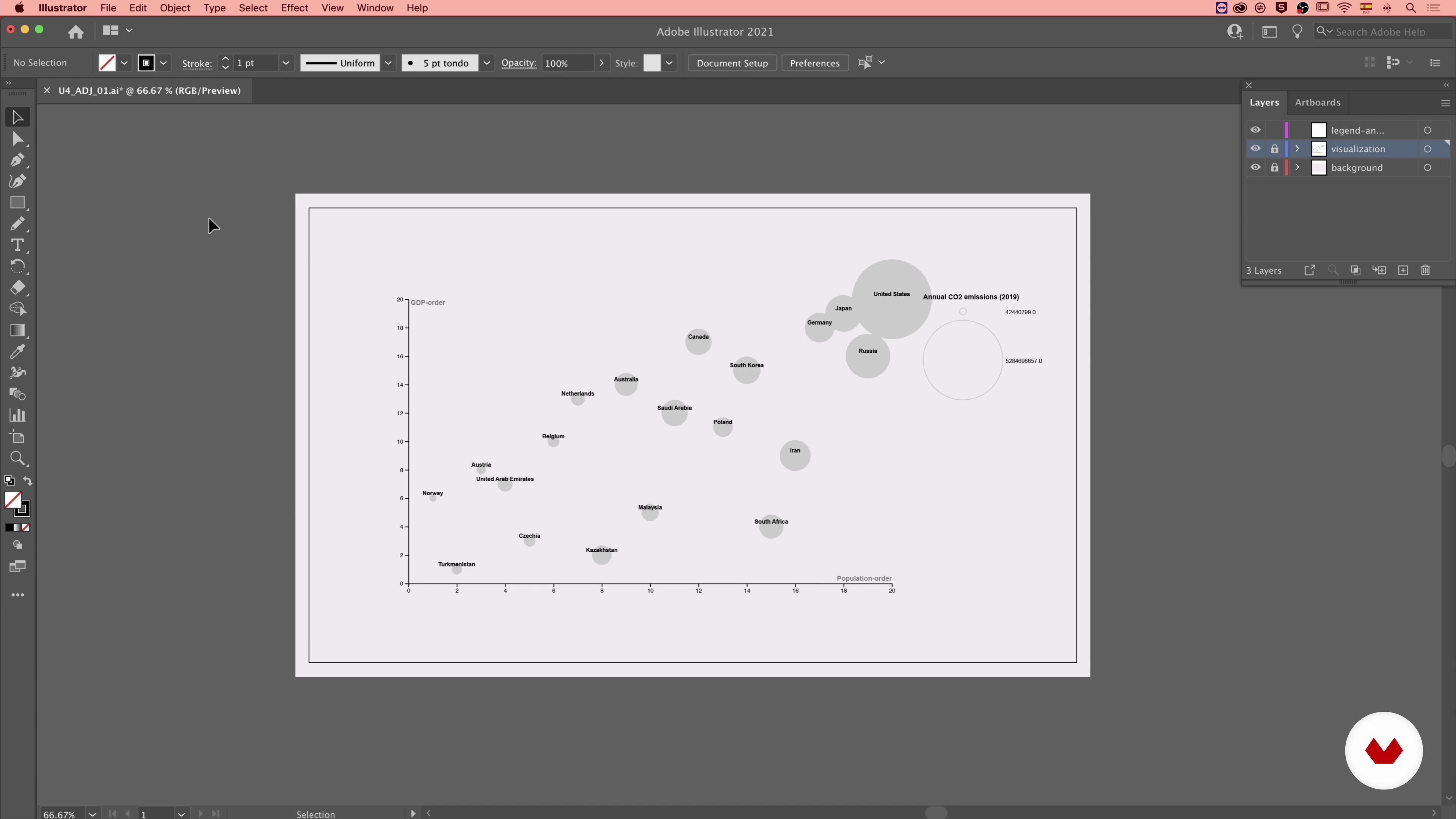
Editing with Adobe Illustrator 1
9 minutes, 35 seconds
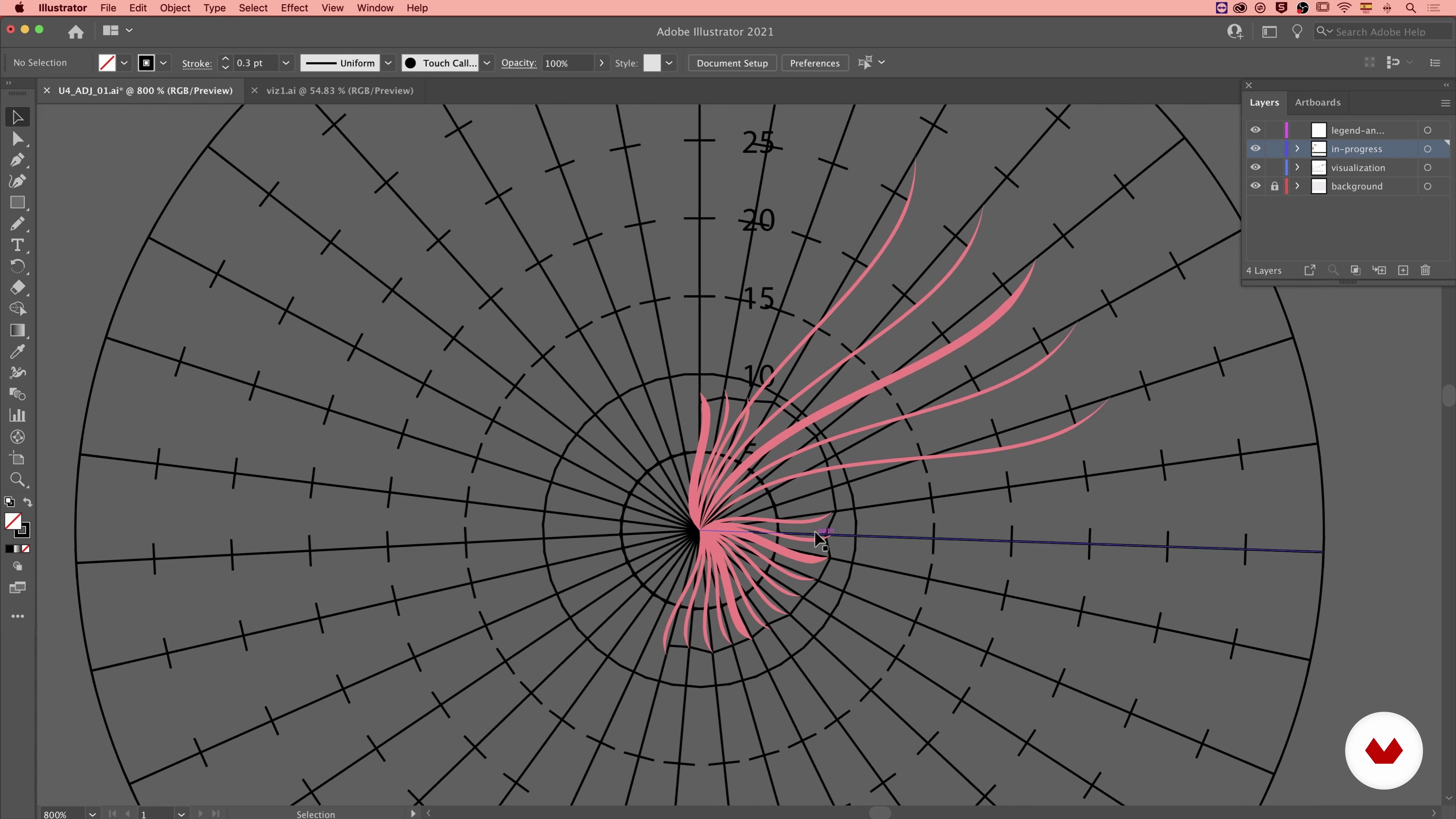
Adobe Illustrator 2
15 minutes, 44 seconds
What's included in this course?
Meet Federica Fragapane, information designer and your teacher for this course. She shares her professional background and how she came to work with companies and organizations like Google, the United Nations, BBC, and Scientific American. Hear about her influences and her sources of inspiration.
Dive into the broad field of data visualization and learn about its role and potential. Using her projects as visual aids, Federica contextualizes the delicate relationship between information design and its audience. Learn about the importance of collaboration when encountering information about unfamiliar topics.
Begin the first step of the design process: selecting sources and data. Learn how to find official and reliable sources and how to choose data that tells the stories you want to convey. Create a dataset using Google Sheets and explore the essential shift from an information table to a visual representation.
Federica shares her process for finding visual inspiration to design an engaging piece that seamlessly communicates multiple layers of information. Get a walkthrough on design software like RAWGraphs and Adobe Illustrator and create key elements like legends and visual guides, which facilitate an effortless reading experience. Wrap up the course by hearing Federica’s tips on refining and finalizing your work down to the last detail.
Recommended software & tools for this course
What is this course's project?
Create an information design piece that coveys multiple layers of information.

Projects by course students

Who is this online course for?
Anyone who wants to create intriguing but easy-to-read data visualization pieces.
Requirements and materials
Basic knowledge of Adobe Illustrator is required.
To take this course, you need access to a computer with internet connection and design software like Adobe Illustrator.

Reviews
- 2 months ago
Very apt explanation and course material. I love Federica Fragapane's work and love how uniquely she visualizes and protrays data! Truly an inspiration. So blessed to be learning a course taught directly by her! Thank you Domestika!
- 2 months ago
It was great
- 2 months ago
I love it! Thank you
- 3 months ago
awsome
- 4 months ago
Excellent info given and course

She has collaborated with organizations like the United Nations, BBC Science Focus, Wired, and Scientific American. Federica coauthored Planet Earth for NatGeoKIDS and Geopolitical Atlas of Water. In 2018, Federica was also invited to speak at OpenVis Conf in Paris and TEDxVerona, as well as EU DataViz at the Publications Office of the EU in 2019, and a virtual lecture at Design Lab, Harvard University in 2021. She also works with La Lettura, the cultural segment of the Italian newspaper Corriere della Sera.
Content
- U1
Introduction
- About Me
- Influences
- U2
About Data Visualization
- Designing Visual Alphabets
- The Broad Field of Data Visualization: Readers and Usage Context
- The Relationship with the Readers
- Collaboration
- U3
Setting the Project in Motion
- Finding the Data: The Sources
- The Data
- From Google Sheets to the Paper
- U4
Visualizing the Data
- Visual Inspiration
- Designing the Skeleton with RAWGraphs
- Editing with Adobe Illustrator 1
- Adobe Illustrator 2
- Adobe Illustrator 3
- Always Keeping in Mind the Readers: Legends and Feedback 1
- Always Keeping in Mind the Readers: Legends and Feedback 2
- Finishing the Job
- FP
Final project
- Data Visualization and Information Design: Create a Visual Model
What to expect from a Domestika course
Learn at your own pace
Enjoy learning from home without a set schedule and with an easy-to-follow method. You set your own pace.
Learn from the best professionals
Learn valuable methods and techniques explained by top experts in the creative sector.
Meet expert teachers
Each expert teaches what they do best, with clear guidelines, true passion, and professional insight in every lesson.
Certificates
PLUSIf you're a Plus member, get a custom certificate signed by your teacher for every course. Share it on your portfolio, social media, or wherever you like.
Get front-row seats
Videos of the highest quality, so you don't miss a single detail. With unlimited access, you can watch them as many times as you need to perfect your technique.
Share knowledge and ideas
Ask questions, request feedback, or offer solutions. Share your learning experience with other students in the community who are as passionate about creativity as you are.
Connect with a global creative community
The community is home to millions of people from around the world who are curious and passionate about exploring and expressing their creativity.
Watch professionally produced courses
Domestika curates its teacher roster and produces every course in-house to ensure a high-quality online learning experience.
FAQs
This course teaches the principles and process of designing effective static data visualizations and visual storytelling, with a focus on audience engagement and communicating complex information visually.
This course is designed for intermediate learners who have some prior experience with design or data analysis and want to deepen their skills in creating impactful data visualizations.
Familiarity with basic design, data analysis concepts, and spreadsheet software like Google Sheets is recommended. Experience with Adobe Illustrator and RAWGraphs is helpful but not required.
You'll learn how to analyze data, design visual narratives, use visual variables, create legends, combine information layers, and apply storytelling strategies to make engaging and accessible data visualizations.
Yes, the course covers designing infographics, building visual narratives, and differentiating between data visualization, infographics, and data art for various audiences and purposes.
The course teaches defining objectives, selecting and preparing data, conceptualizing visuals, designing and layering information, building legends, refining through feedback, and finalizing for publication.
Yes, you’ll learn to find, download, clean, and organize datasets using tools like Google Sheets, and prepare them for visualization projects.