Thanks so much for taking the course and submitting a project. This is off to a great start, love the subtle texture you have included in the label design. Hope you don't mind me providing a bit of feedback to help you push it further or consider things you may not have thought of yet!
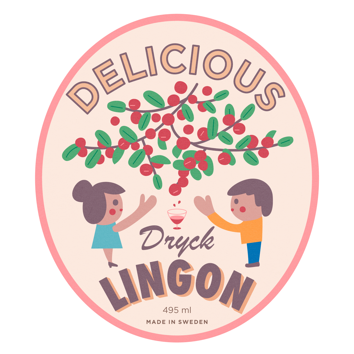
- First thing I'd do is make the word "Delicious" larger and a bit more uniform with the oval shape you have in the background. If this is the brand name for example, you would want that large and in charge so to speak.
- Next up, the illustration may be able to reduce in size just a tad to make room for larger type. Not by much!
- Also something to consider, maybe the label has a custom diecut so it feels more unique and fits your content that much better. Obviously more expensive in the real world if you actually printed this but hey, worth exploring unique shapes here too!
- Lastly, I'd personally love to see a bit of balance in the arcing of "Lingon". Maybe consider having it follow your oval shape again to balance the top portion of the label.
Lots and lots to consider but feel free to take these ideas and push them further or leave it be as is. At the end of the day, it's your project and you should do what makes sense for you, the client, the end goal, etc.



1 yorum
Hey @w_fukuyama!
Thanks so much for taking the course and submitting a project. This is off to a great start, love the subtle texture you have included in the label design. Hope you don't mind me providing a bit of feedback to help you push it further or consider things you may not have thought of yet!
Here's a link to the really quick sketch I mocked up for reference.
- First thing I'd do is make the word "Delicious" larger and a bit more uniform with the oval shape you have in the background. If this is the brand name for example, you would want that large and in charge so to speak.
- Next up, the illustration may be able to reduce in size just a tad to make room for larger type. Not by much!
- Also something to consider, maybe the label has a custom diecut so it feels more unique and fits your content that much better. Obviously more expensive in the real world if you actually printed this but hey, worth exploring unique shapes here too!
- Lastly, I'd personally love to see a bit of balance in the arcing of "Lingon". Maybe consider having it follow your oval shape again to balance the top portion of the label.
Lots and lots to consider but feel free to take these ideas and push them further or leave it be as is. At the end of the day, it's your project and you should do what makes sense for you, the client, the end goal, etc.
Hope this helps!
@youbringfire Thank you!
Yorum yapmak için Ücretsiz olarak giriş yapın veya katılın