From the Lettering to the Font
Type-Ø-Tones tarafından verilen bir kurs , Yazı tipi tasarımcıları


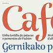
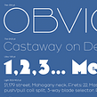

Create your own alphabet based on a found lettering
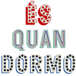
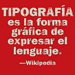

Many of the signs that we find on the street or in the advertising of yesteryear and that fascinate us are those that are well drawn, originally by hand. And it is because they underlie a coherent application of basic rules essential for design of letters and that determine their structure, appearance and the relationship between them.
In this course, with the typographers Josema Urós and Laura Meseguer (Type-Ø-Tones), you will learn to analyze "found" labels, deconstruct them and create new characters to generate your own labels, marks or even a complete alphabet.
Bu çevrimiçi kursta ne öğreneceksiniz?
1 ders & 1 indirme
- 99% olumlu yorumlar ( 108 )
- 1 öğrenci
- 1 ders ( 2h 47m )
- 1 ek kaynak (1 dosya)
- Çevrimiçi ve kendi hızınızda
- Uygulamada mevcut
- Ses: İspanyol
- İspanyol · İngilizce · Portekizce
- Seviye: Orta seviye
- Sonsuza kadar sınırsız erişim
Bu kurs için önerilen yazılım ve araçlar
 Adobe Illustrator
Bu kursun projesi nedir?
You will develop a keyword from which you can design the rest of the characters of your alphabet. Traditionally Hamburg has been used and some derivatives, Hamburgefonts, Hamburgevons and Hamburgefontsiv, but the challenge is to find yours.
Kurs öğrencilerinin projeleri


Bu çevrimiçi kurs kimlere yöneliktir?
To anyone who is curious to know how typographies and graphic design students are designed to have an interest in understanding how the architecture of the letter is.
Gereksinimler ve materyaller
For the analog part you will need mechanical pencils, soft pencil, eraser and onion paper. For the digital part, a computer with a vector drawing software installed.
It is essential to know how to draw by hand and have knowledge of vector drawing.

Yorumlar

Type-Ø-Tones
Type-Ø-Tones tarafından verilen bir kurs
José Manuel Urós, kendi kendini yetiştirmiş bir programcı, tipograf, tasarımcı ve gitaristtir.
1956 yılında, çok sevdiği ve her iki yılda bir, iki haftadan fazla ayrılmamaya çalıştığı Barselona'da doğdu.
Kariyerine 1980'li yıll...
İçerik
-
U 1
Introduction
-
Who we are and course objectives
-
Our influences: examples of alphabets extracted from "lettering"
-
-
U 2
Basic principles of the design of alphabets
-
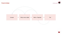
Production flow
-
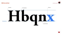
Vertical metric
-
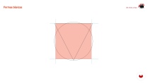
Basic forms and interior space
-
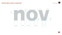
Optical systems, parts and components
-
-
U 3
Analogue sketching and preparation to digitize
-
Sketching by contour 1
-
Sketching by contour 2
-
-
U 4
Vector drawing
-
Prepare the document in Illustrator
-
Drawing by parts
-
Drawing the first series
-
Drawing of the derived characters 1
-
Drawing of the derived characters 2
-
-
U 5
Complete the project and ... beyond!
-
Drawing of 'unique' or 'special' characters
-
Capital letters
-
Fine adjustments. Space, print and correct
-
The spacing
-
Complete the alphabet?
-
-
FP
Bitirme projesi
-
From the Label to the Typography
-
Bir Domestika kursundan neler beklenebilir?
-
Kendi hızınızda öğrenin
Belirli bir program olmadan ve takip edilmesi kolay bir yöntemle evden öğrenmenin tadını çıkarın. Kendi hızınızı kendiniz belirlersiniz.
-
En iyi profesyonellerden öğrenin
Yaratıcı sektörün en iyi uzmanlarının açıkladığı değerli yöntem ve teknikleri öğrenin.
-
Uzman öğretmenlerle tanışın
Her uzman, her derste açık yönergelerle, gerçek tutkuyla ve profesyonel anlayışla en iyi yaptıkları şeyi öğretir.
-
Sertifikalar
ArtıPlus üyesiyseniz her kurs için öğretmeninizden imzalı bir özel sertifika alın. Portföyünüzde, sosyal medyada veya istediğiniz yerde paylaşın.
-
Ön sıra koltukları alın
En yüksek kalitede videolar sayesinde tek bir ayrıntıyı kaçırmazsınız. Sınırsız erişim sayesinde tekniğinizi mükemmelleştirmek için bunları istediğiniz kadar izleyebilirsiniz.
-
Bilgi ve fikirleri paylaşın
Sorular sorun, geri bildirim isteyin veya çözümler sunun. Öğrenme deneyiminizi topluluktaki, yaratıcılığa sizin kadar tutkulu olan diğer öğrencilerle paylaşın.
-
Küresel bir yaratıcı toplulukla bağlantı kurun
Topluluk, dünyanın her yerinden meraklı ve yaratıcılıklarını keşfetme ve ifade etme konusunda tutkulu milyonlarca insana ev sahipliği yapıyor.
-
Profesyonelce hazırlanmış kursları izleyin
Domestika, yüksek kaliteli bir çevrimiçi öğrenme deneyimi sağlamak için öğretmen kadrosunu seçer ve her dersi kendi bünyesinde üretir.
SSS
You’ll learn to create custom alphabets, analyze urban references, develop characters with decorative elements, and apply optical adjustments and metrics to ensure consistency and readability in typographic projects—from hand sketching to professional digitalization.
The course is aimed at people with basic design knowledge who want to deepen their skills in intermediate-level typographic and lettering creation processes, including manual techniques, optical adjustments, and digitizing.
You’ll need paper, pencil, tracing paper or onion skin, a scanner or camera to digitize sketches, and access to Adobe Illustrator or similar vector software for digitizing and refining characters.
The course teaches hand sketching, using tracing paper, scanning originals, vectorizing in Illustrator, organizing layers, and adjusting geometric shapes and typographic proportions.
You’ll learn how to analyze and extract distinctive features from urban signs and plaques in Barcelona to inspire and support the design of custom alphabets and typographic systems.
The course explains how to spot and fix visual imperfections through optical adjustments in proportions, overshoots, stroke weights, and spacing, enhancing harmony and legibility of the alphabet.
Yes, you’ll study structural differences, contrast, and adjustment needs between serif and sans serif typefaces, applying specific design criteria depending on the chosen style.
 Adobe Illustrator
it would have been superb if the course had an English audio translation
If there were English audio, it would be very helpful for me to learn this course.
Muy bueno
Very informative and easy to follow!
El curso está muy bien explicado. Sin embargo, me gustaría que lo actualizasen y quizás que contemplen más situaciones ej.: Que pasa si el rótulo elegido no tiene descendentes, o ascendentes, o como determinar que tipo de modificaciones le haremos a la letra de la que partimos.
De cualquier manera el curso esta muy bien y es un gran punto de partida para diseñar tipografias.