
From the Lettering to the Font
Un curs de Type-Ø-TonesDesigneri de fonturi
Un curs de Type-Ø-Tones, Designeri de fonturi

Create your own alphabet based on a found lettering
Many of the signs that we find on the street or in the advertising of yesteryear and that fascinate us are those that are well drawn, originally by hand. And it is because they underlie a coherent application of basic rules essential for design of letters and that determine their structure, appearance and the relationship between them.
In this course, with the typographers Josema Urós and Laura Meseguer (Type-Ø-Tones), you will learn to analyze "found" labels, deconstruct them and create new characters to generate your own labels, marks or even a complete alphabet.
Ce vei învăța în acest curs online?
1 lecție & 1 descărcare
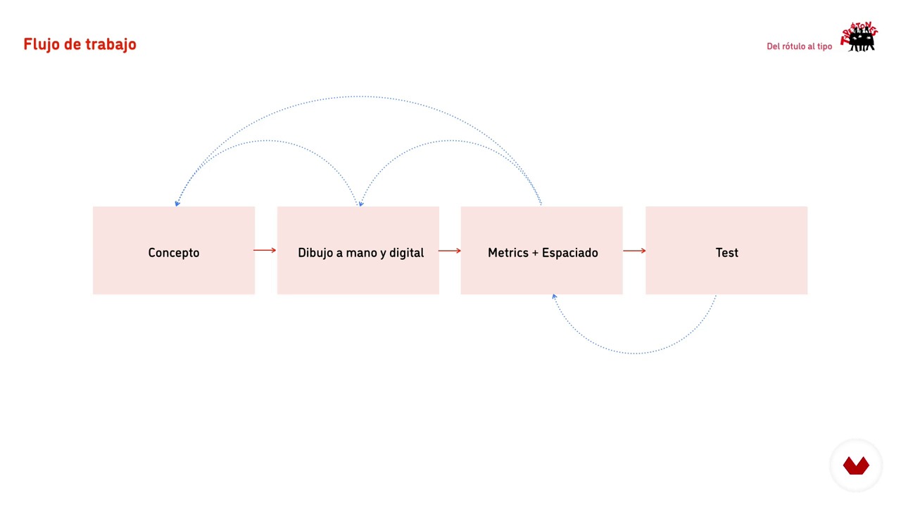
Production flow
1 minut, 1 secundă
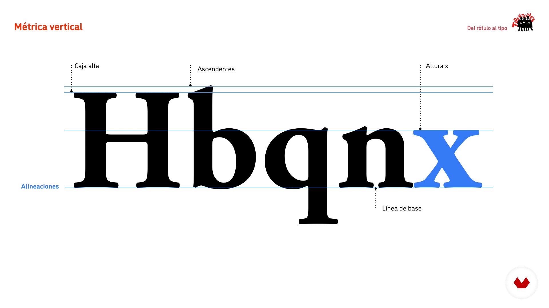
Vertical metric
1 minut, 1 secundă
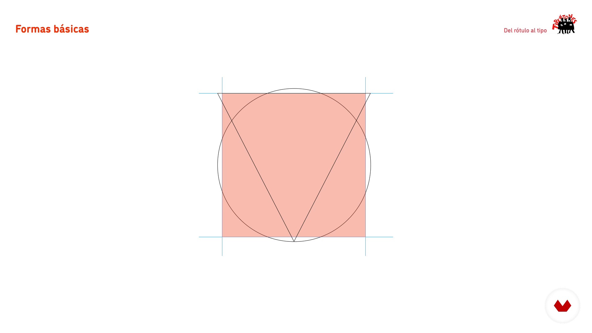
Basic forms and interior space
1 minut, 1 secundă
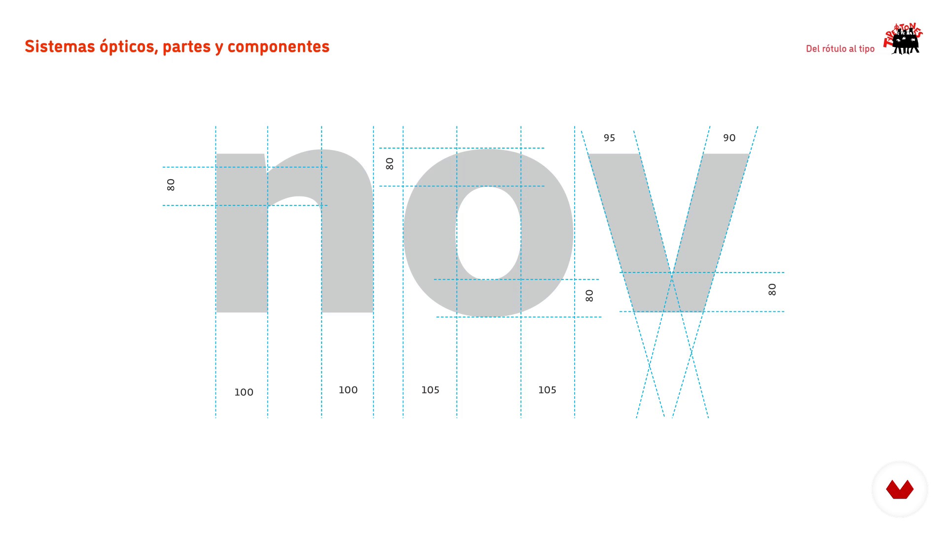
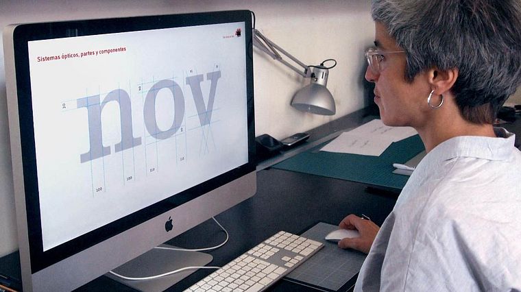
Optical systems, parts and components
1 minut, 1 secundă
Sketching by contour 1
1 minut, 1 secundă
Sketching by contour 2
1 minut, 1 secundă
Ce include acest curs?
You will start discovering the work of Laura and Josema, their work environment, the tools necessary to carry out the course and how to use them.
Next, you will learn the basic principles of alphabets design using the label as one of the possible sources of inspiration for type design. In this review by the methodology of the letters you will know the flow of production, the vertical metric, the basic forms, the interior space and the optical adjustments.
Later you will make the analog sketching of your own alphabet by contour. Once you have it digitized, you will take it to Illustrator to turn it into vectorial drawing.
To finish you will learn how to draw unique or special characters, create uppercase and give the final adjustments to your final project.

Software și instrumente recomandate pentru acest curs
Care este proiectul acestui curs?
You will develop a keyword from which you can design the rest of the characters of your alphabet. Traditionally Hamburg has been used and some derivatives, Hamburgefonts, Hamburgevons and Hamburgefontsiv, but the challenge is to find yours.
Proiecte ale studenților cursului


Pentru cine este acest curs online?
To anyone who is curious to know how typographies and graphic design students are designed to have an interest in understanding how the architecture of the letter is.
Cerințe și materiale
For the analog part you will need mechanical pencils, soft pencil, eraser and onion paper. For the digital part, a computer with a vector drawing software installed.
It is essential to know how to draw by hand and have knowledge of vector drawing.
Recenzii
- 1 an în urmă
it would have been superb if the course had an English audio translation
- 1 an în urmă
If there were English audio, it would be very helpful for me to learn this course.
- 2 ani în urmă
Muy bueno
- 2 ani în urmă
Very informative and easy to follow!
- 2 ani în urmă
El curso está muy bien explicado. Sin embargo, me gustaría que lo actualizasen y quizás que contemplen más situaciones ej.: Que pasa si el rótulo elegido no tiene descendentes, o ascendentes, o como determinar que tipo de modificaciones le haremos a la letra de la que partimos. De cualquier manera el curso esta muy bien y es un gran punto de partida para diseñar tipografias.

Născut în Barcelona în 1956, un oraș pe care îl adoră și din care încearcă să nu plece mai mult de două săptămâni la fiecare doi ani.
Și-a începu...
Conţinut
- U 1
Introduction
- Who we are and course objectives
- Our influences: examples of alphabets extracted from "lettering"
- U 2
Basic principles of the design of alphabets
- Production flow
- Vertical metric
- Basic forms and interior space
- Optical systems, parts and components
- U 3
Analogue sketching and preparation to digitize
- Sketching by contour 1
- Sketching by contour 2
- U 4
Vector drawing
- Prepare the document in Illustrator
- Drawing by parts
- Drawing the first series
- Drawing of the derived characters 1
- Drawing of the derived characters 2
- U 5
Complete the project and ... beyond!
- Drawing of 'unique' or 'special' characters
- Capital letters
- Fine adjustments. Space, print and correct
- The spacing
- Complete the alphabet?
- FP
Proiect final
- From the Label to the Typography
La ce să te aștepți de la un curs Domestika
Învață în ritmul tău propriu
Bucură-te de învățarea de acasă, fără un program fix și cu o metodă ușor de urmat. Tu îți stabilești propriul ritm.
Învață de la cei mai buni profesioniști
Învață metode și tehnici valoroase explicate de experți de top din sectorul creativ.
Întâlnește profesori experți
Fiecare expert predă ceea ce face cel mai bine, cu îndrumări clare, pasiune adevărată și perspicacitate profesională în fiecare lecție.
Certificate
PLUSDacă ești membru Plus, primești un certificat personalizat semnat de profesorul tău pentru fiecare curs. Distribuie-l în portofoliul tău, pe rețelele sociale sau oriunde dorești.
Obțineți locuri în primul rând
Videoclipuri de cea mai înaltă calitate, pentru a nu rata niciun detaliu. Cu acces nelimitat, le poți viziona de câte ori este nevoie pentru a-ți perfecționa tehnica.
Împărtășește cunoștințe și idei
Pune întrebări, solicită feedback sau oferă soluții. Împărtășește-ți experiența de învățare cu alți studenți din comunitate care sunt la fel de pasionați de creativitate ca și tine.
Conectează-te cu o comunitate creativă globală
Comunitatea găzduiește milioane de oameni din întreaga lume, curioși și pasionați de explorarea și exprimarea creativității lor.
Urmărește cursuri produse profesional
Domestika își gestionează lista de profesori și produce fiecare curs intern pentru a asigura o experiență de învățare online de înaltă calitate.
Întrebări frecvente
You’ll learn to create custom alphabets, analyze urban references, develop characters with decorative elements, and apply optical adjustments and metrics to ensure consistency and readability in typographic projects—from hand sketching to professional digitalization.
The course is aimed at people with basic design knowledge who want to deepen their skills in intermediate-level typographic and lettering creation processes, including manual techniques, optical adjustments, and digitizing.
You’ll need paper, pencil, tracing paper or onion skin, a scanner or camera to digitize sketches, and access to Adobe Illustrator or similar vector software for digitizing and refining characters.
The course teaches hand sketching, using tracing paper, scanning originals, vectorizing in Illustrator, organizing layers, and adjusting geometric shapes and typographic proportions.
You’ll learn how to analyze and extract distinctive features from urban signs and plaques in Barcelona to inspire and support the design of custom alphabets and typographic systems.
The course explains how to spot and fix visual imperfections through optical adjustments in proportions, overshoots, stroke weights, and spacing, enhancing harmony and legibility of the alphabet.
Yes, you’ll study structural differences, contrast, and adjustment needs between serif and sans serif typefaces, applying specific design criteria depending on the chosen style.