
Fonts: Build your Word
Un curs de Glíglifo Designeri grafici specializați în tipografie
Un curs de Glíglifo, Designeri grafici specializați în tipografie

Design a font with the double pencil technique
Do you love the letter? Well wait to master the word. In this online course, you will learn the theoretical and practical knowledge to get closer to the world of typography. You will design your own word step by step within a typographic system, from the manual creation to double pencil until the last adjustments in the computer.
Ce vei învăța în acest curs online?
1 lecție & 1 descărcare
Bibliography
1 minut, 1 secundă
Basic forms
1 minut, 1 secundă
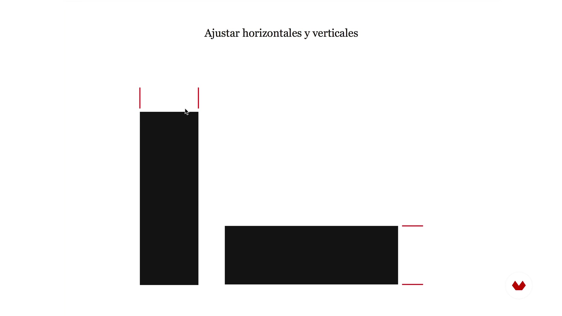
Optical laws
1 minut, 1 secundă
Spacing and rhythm
1 minut, 1 secundă
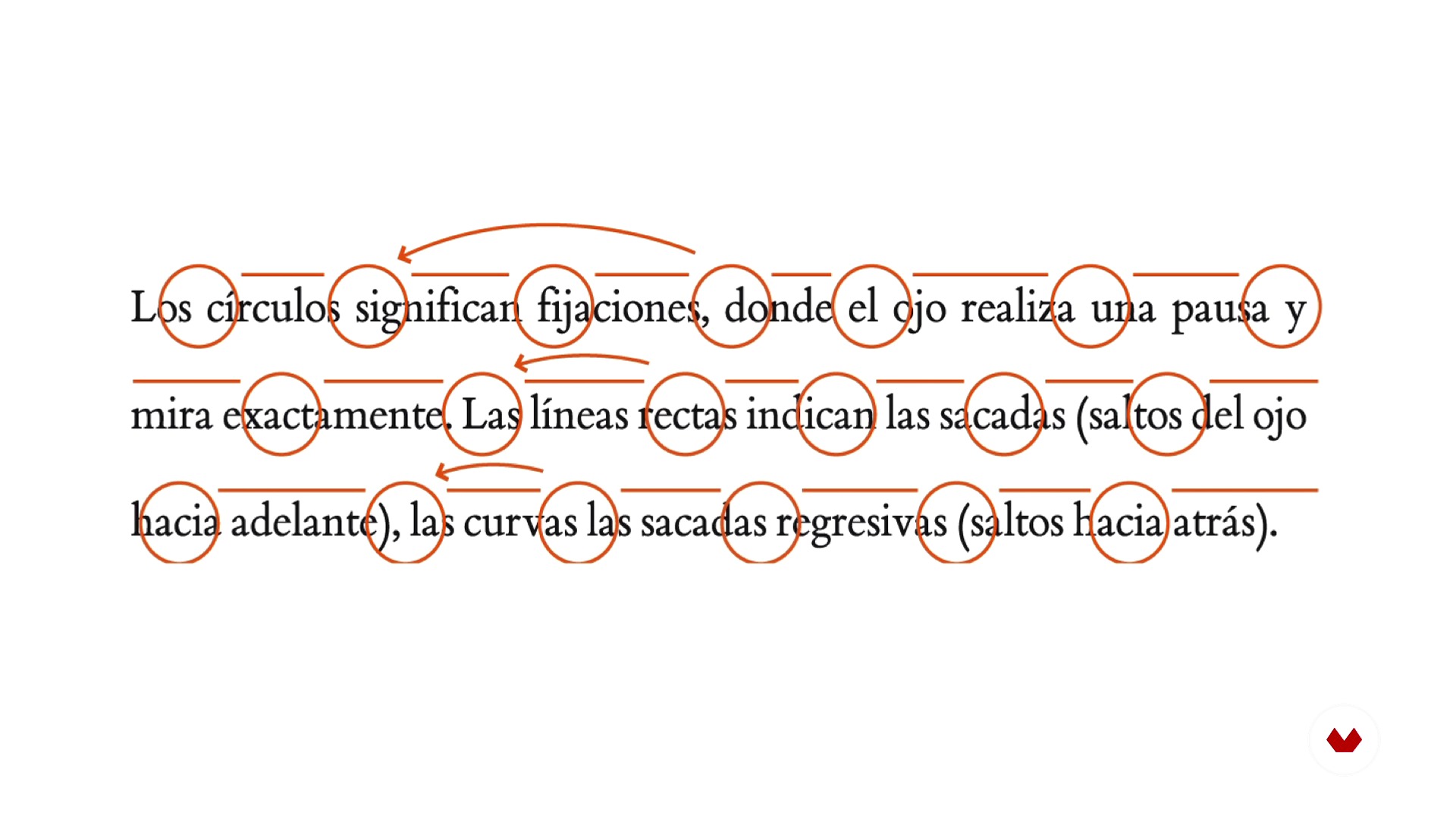
Reading and readability
1 minut, 1 secundă
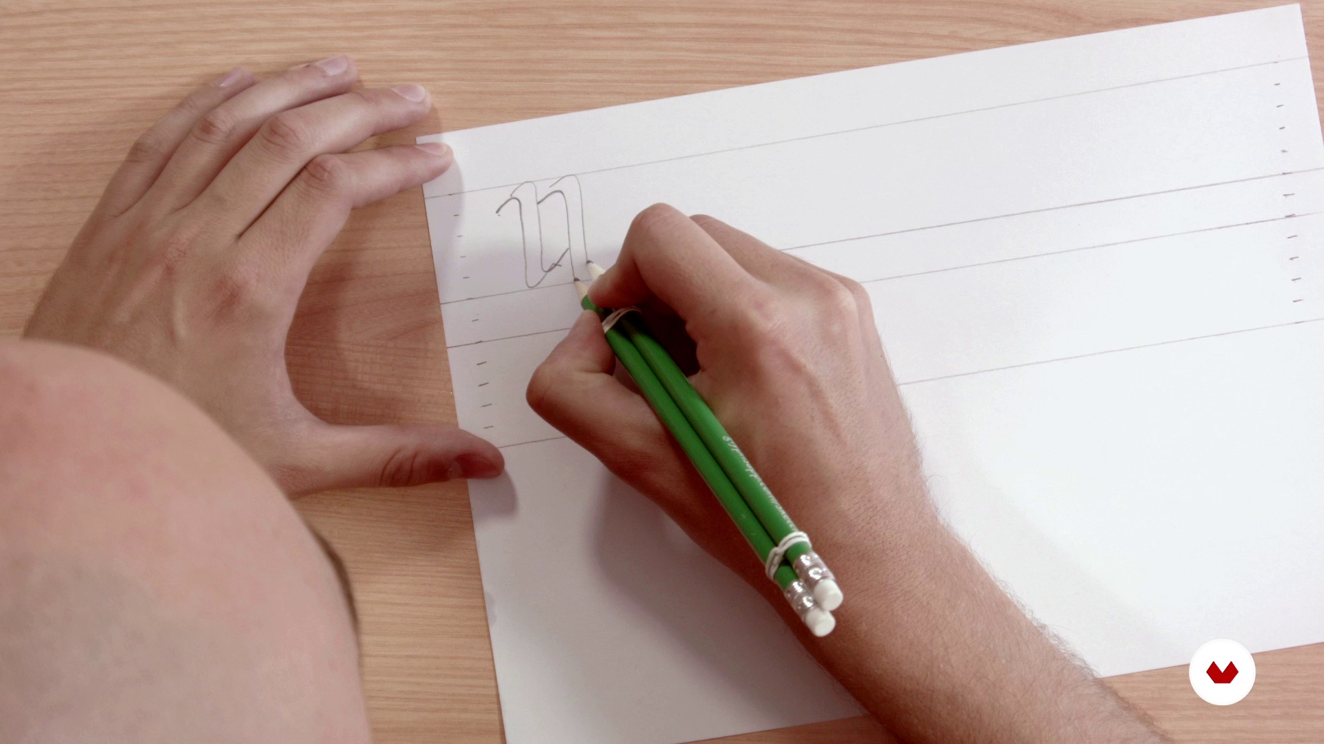
Structure and rhythm with double pencil
1 minut, 1 secundă
Ce include acest curs?
In this course of typography you will begin by laying the theoretical bases of construction and anatomy of the letter starting from basic forms, playing with the optical laws, taking into account the spacing, the rhythm and the readability.
Next, you will define the typographic form with the double pencil technique, a simple tool that will allow you to learn to manage the rhythm and structure of the letters.
Then, you will go to the digitization phase using Illustrator and Glyphs (software for Mac), for the final obtaining of a typographic font. Finally, you will learn to apply certain tweaks and adjustments to then export the new type and be able to use it on your computer.
Software și instrumente recomandate pentru acest curs
Care este proiectul acestui curs?
The professors of Gliglifo will propose you a series of words taken from literature to find "their aroma" and begin to design a typeface that you can install on your computer. From there, you will already have the base to develop your own typographic system.

Proiecte ale studenților cursului


Pentru cine este acest curs online?
To all letter lovers.
Cerințe și materiale
You do not need any prior knowledge in typography to create your final project. As for materials, you will need a normal paper, vegetable paper, two pens, two rubber bands to join the pencils and a computer with the Glyphs and Illustrator software (although the course offers alternative programs to be able to work on the typography design).

Recenzii
- 2 luni în urmă
Muy buen curso, grandes herramientas
- 2 ani în urmă
Molto interessante.
- 3 ani în urmă
Esperaba más de este curso, pero en cualquier caso merece la pena hacerlo porque siempre se aprende algo.
- 3 ani în urmă
This course is an absolute necessity for anyone who plans to begin their journey to become a professional typeface designer.
- 3 ani în urmă
Este curso es una pequeña maravilla. Muchos tips, muy buenos

Conţinut
- U 1
Introduction
- Presentation
- Understand the letter, aroma and exercise
- Bibliography
- U 2
Anatomy of the letter
- Basic forms
- Optical laws
- Spacing and rhythm
- Reading and readability
- U 3
Architecture of the letter
- Structure and rhythm with double pencil
- Base drawing
- Adjustment and refinement
- U 4
Digitization
- Introduction to vectorization
- Digitization with Illustrator
- Digitization with Glyphs 1
- Digitization with Glyphs 2
- Export and testing
- U 5
Microtype, diacritics and spacing
- Microtypegraphic adjustments
- Diacritics
- Spacing between letters and end
- FP
Proiect final
- Typography: Build your word
La ce să te aștepți de la un curs Domestika
Învață în ritmul tău propriu
Bucură-te de învățarea de acasă, fără un program fix și cu o metodă ușor de urmat. Tu îți stabilești propriul ritm.
Învață de la cei mai buni profesioniști
Învață metode și tehnici valoroase explicate de experți de top din sectorul creativ.
Întâlnește profesori experți
Fiecare expert predă ceea ce face cel mai bine, cu îndrumări clare, pasiune adevărată și perspicacitate profesională în fiecare lecție.
Certificate
PLUSDacă ești membru Plus, primești un certificat personalizat semnat de profesorul tău pentru fiecare curs. Distribuie-l în portofoliul tău, pe rețelele sociale sau oriunde dorești.
Obțineți locuri în primul rând
Videoclipuri de cea mai înaltă calitate, pentru a nu rata niciun detaliu. Cu acces nelimitat, le poți viziona de câte ori este nevoie pentru a-ți perfecționa tehnica.
Împărtășește cunoștințe și idei
Pune întrebări, solicită feedback sau oferă soluții. Împărtășește-ți experiența de învățare cu alți studenți din comunitate care sunt la fel de pasionați de creativitate ca și tine.
Conectează-te cu o comunitate creativă globală
Comunitatea găzduiește milioane de oameni din întreaga lume, curioși și pasionați de explorarea și exprimarea creativității lor.
Urmărește cursuri produse profesional
Domestika își gestionează lista de profesori și produce fiecare curs intern pentru a asigura o experiență de învățare online de înaltă calitate.
Întrebări frecvente
A glyph is the specific visual representation of a character, which can be a letter, number, or symbol. A character is the abstract unit, while the glyph is its concrete visual form within a typeface.
The course is aimed at people with basic knowledge of graphic design or typography, so it’s intermediate level. Familiarity with visual concepts and digital tools is recommended.
You’ll need a computer with vector design software like Adobe Illustrator and preferably a specialized typography program such as Glyphs or FontLab. Tracing paper, pencils, and a scanner are also recommended.
You’ll learn how to create custom glyphs, design letters from scratch, adjust proportions, spacing, and typographic rhythm, digitize your work, and apply optical principles to enhance legibility and consistency in your fonts.
The course guides you from manual sketching and anatomical understanding to digitization and optical adjustment of each letter, using techniques like the double-pencil method, calligraphic proportions, and visual tweaks in professional software.
Typographic consistency ensures all glyphs in a font share a unified visual and expressive logic, improving communication, readability, and strengthening the visual identity of any graphic design project.
The optical center is the visually balanced point of a letter, usually slightly above the mathematical center. Adjusting based on the optical center improves the look and legibility of characters.