


My project for course: Effective Data Visualization: Transform Information into Art
de Athraa Al-Asadi @allullean
- 9
- 1
- 2
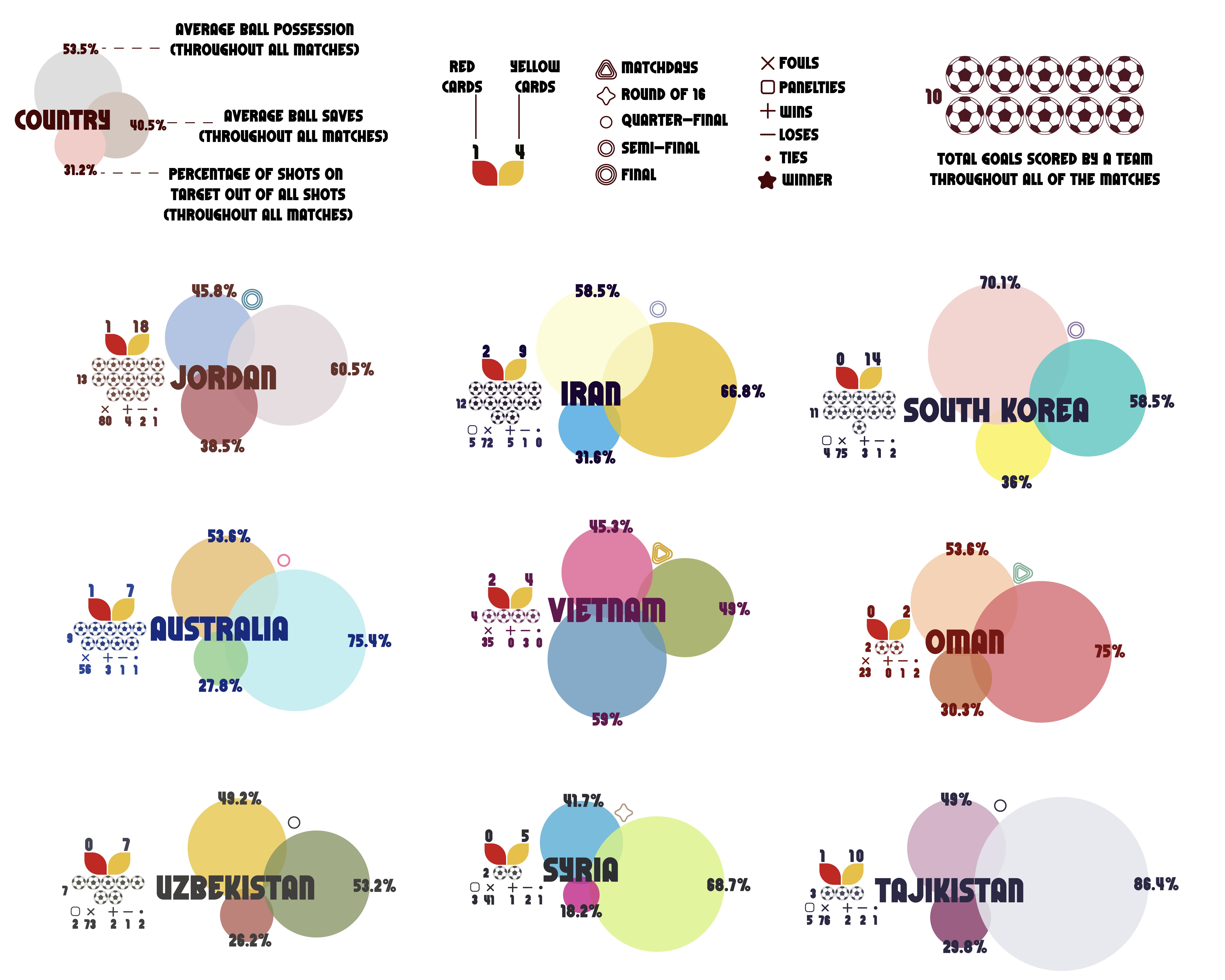
A Data Visualization of the Asian Cup 2023 Stats
This data design showcases the different data recorded after the matches for each team, collected and presented here in this visualization.
the data include different data which are: the team's total goals, ball possession, average saves, percentage of shots on target, total yellow and red cards, last round reached by the teams (3/3 match days, round of 16, quarter-final, semi-final, final), total wins, loses, and ties, total penalties, and total fouls.
Color Choices
I pulled out color palettes for each country from their nature, culture, tradition, clothing, and buildings. I created color palettes from nature like of the diamond beach in Bali, Indonesia. the Australian Reef, the cherry blossoms of japan… pulling out color palettes from traditional clothings of Tajikistan, Uzbekistan, and Kyrgyzstan. to culture like the pottery of Bahrain and Oman, Babylon’s Gates of Iraq, and so many more.
hope you like it :)
you can find it on my insta at @allullean
and behance at https://www.behance.net/Athraaty

2 comentários
studio_terp
Professor PlusObrigado por compartilhar :-)
Adoro a ousadia da visualização, é completamente diferente do que estamos acostumados nos esportes. Também toca aqui pelo visual colorido, tão bom de ler que você não os escolheu aleatoriamente.
Visualizar original
Ocultar original
studio_terp
Professor PlusVocê está bem se eu compartilhar isso em minhas redes sociais?
Visualizar original
Ocultar original
Faça login ou cadastre-se Gratuitamente para comentar