


The Chalet School in Exile - Effective Data Visualization: Transform Information into Art
de fjtweedie @fjtweedie
- 396
- 9
- 1
I loved the idea of analysing a book text, and had been really impressed at the new things to think abut when creating a data visualisation. I chose to look at a school story published in 1940, "The Chalet School in Exile" by Elinor M. Brent-Dyer. It's the fourteenth book in the series, and is a pivotal moment in what becomes 58-book series, finishing in 1970. As a wartime book for children, it was remarkable in drawing a clear separation between Germans and Austrians, and the Nazis.
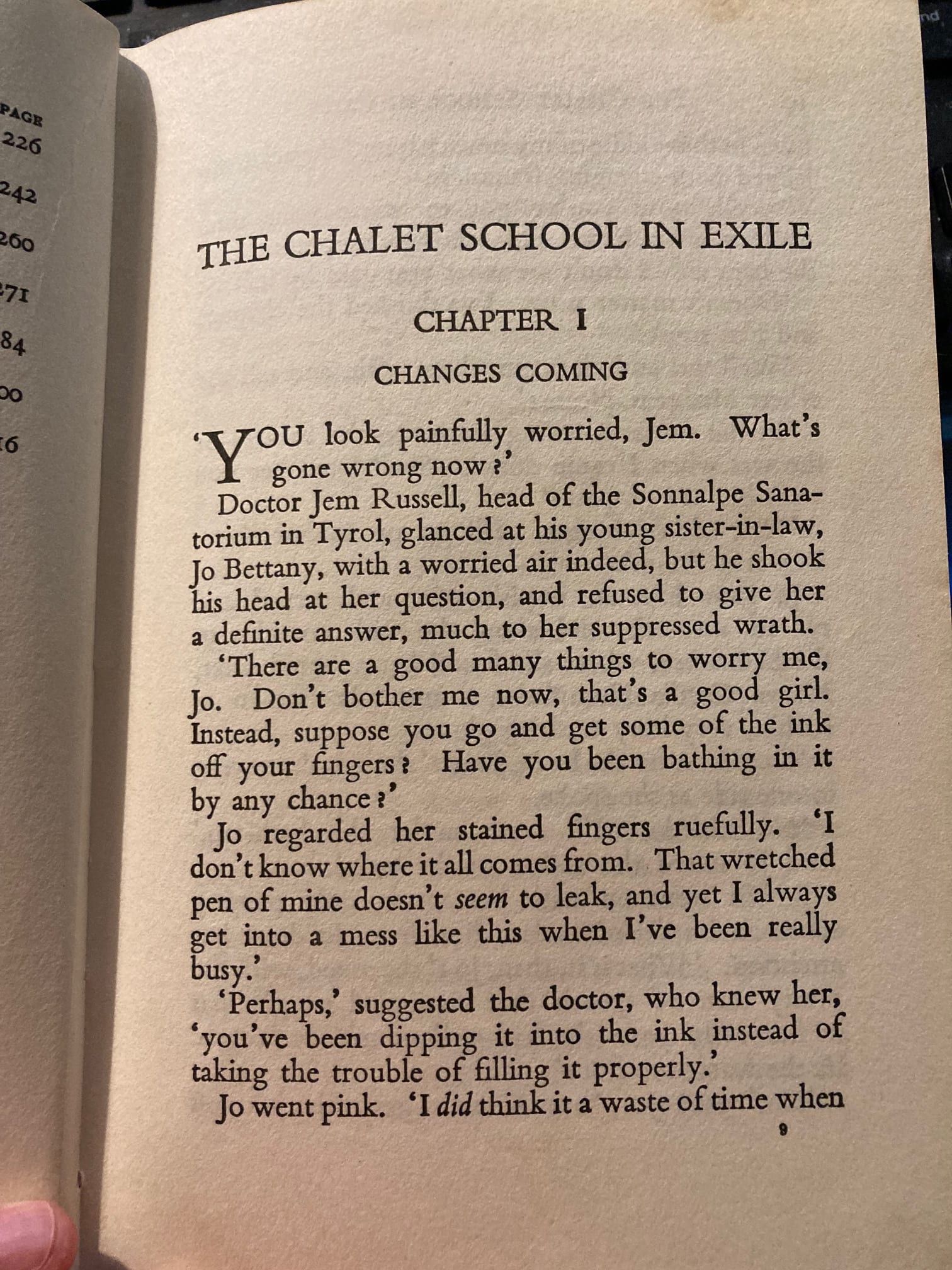
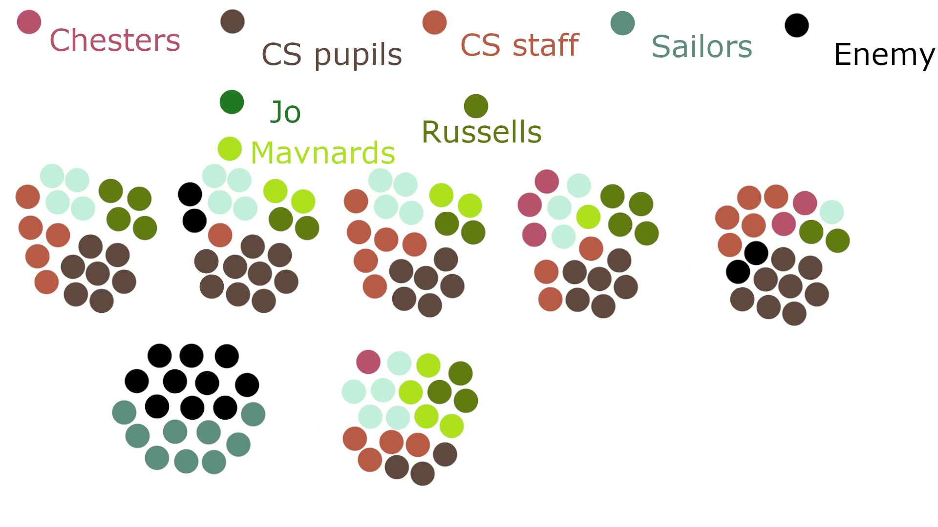
I knew the book very well, and it was fun to go through it identifying all the characters, chapters and locations to produce a big spreadsheet.
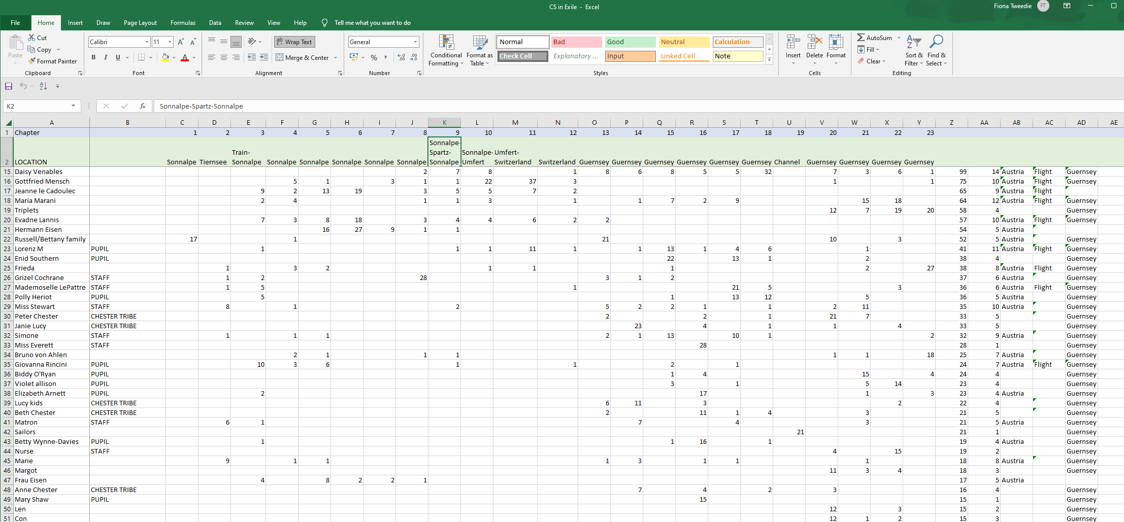
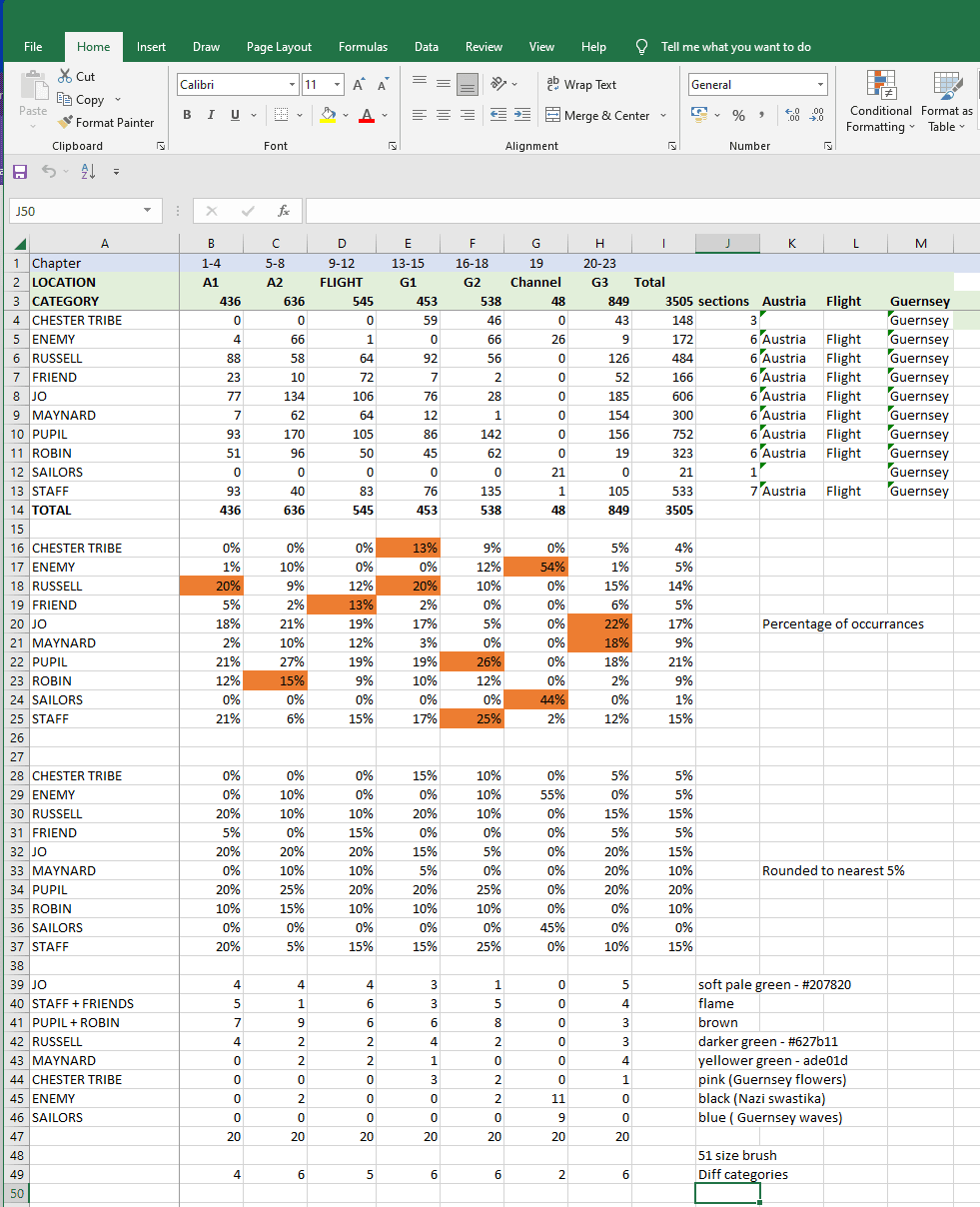
There was FAR too much data, so grouped the chapters into sections, and the characters into a few groups. I then converted each section into 5% chunks so that I'd have 20 points for each text section.

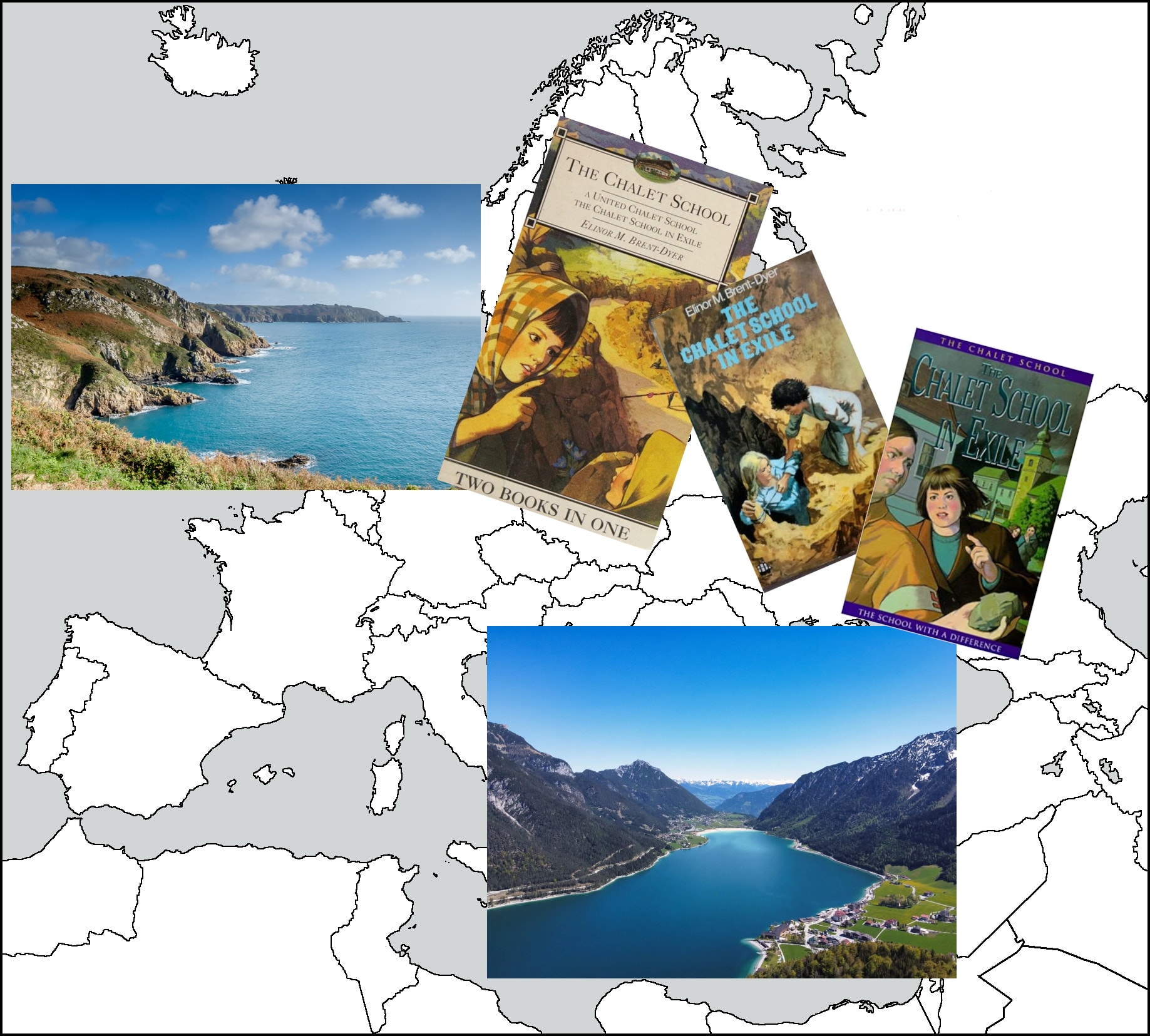
I found photos of the locations, and of cover images from the various editions. I wondered about incorporating a map, but I couldn't make it work.
I chose the colours to match those of the school - brown and flame for staff and pupils - and black seemed like a good "enemy" colour. Joey is often described in later books as wearing a "soft pale green" dress, so I used that as her colour, with her older sister and brother-in-law in darker green, and her husband and daughters in a brighter green. The "Chesters" who appear in the Guernsey section had their colour from the pink flowers on one of the book cover images that was in Guernsey. I was happy that this picked up colours from the books, and indicated the structure of the relationships between the characters. I created groups for each of the text sections.
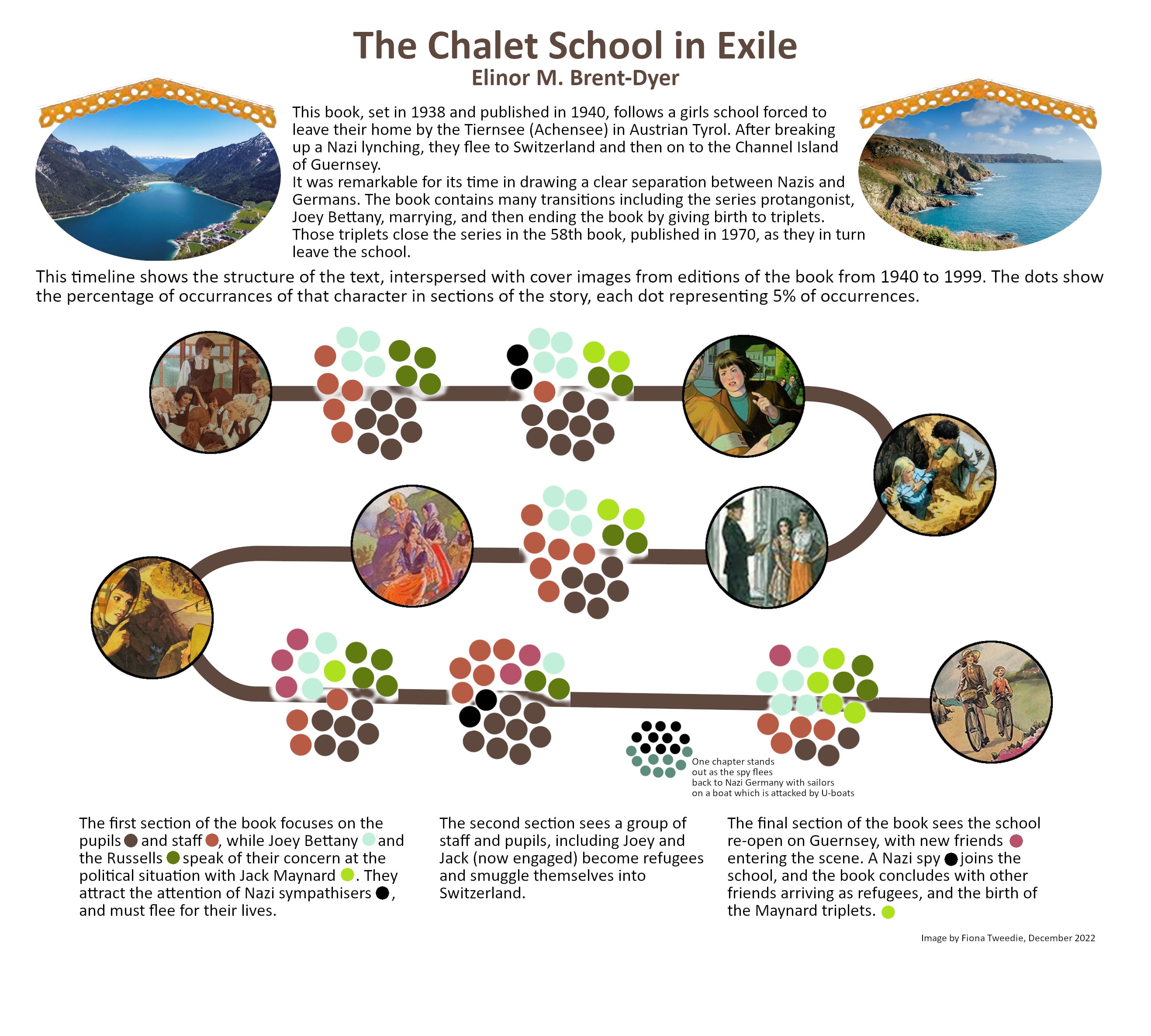
I put the final image together with the timeline, standardised circles from the cover images and text introducing the book and its sections. The chapter which is an outlier, I chose to separate from the main timeline to indicate its distinctiveness. The images of the Achensee (real life location) and Guernsey - the beginning and end of this story are at the top, framed with a "chalet roof" graphic also from the CS book series covers.
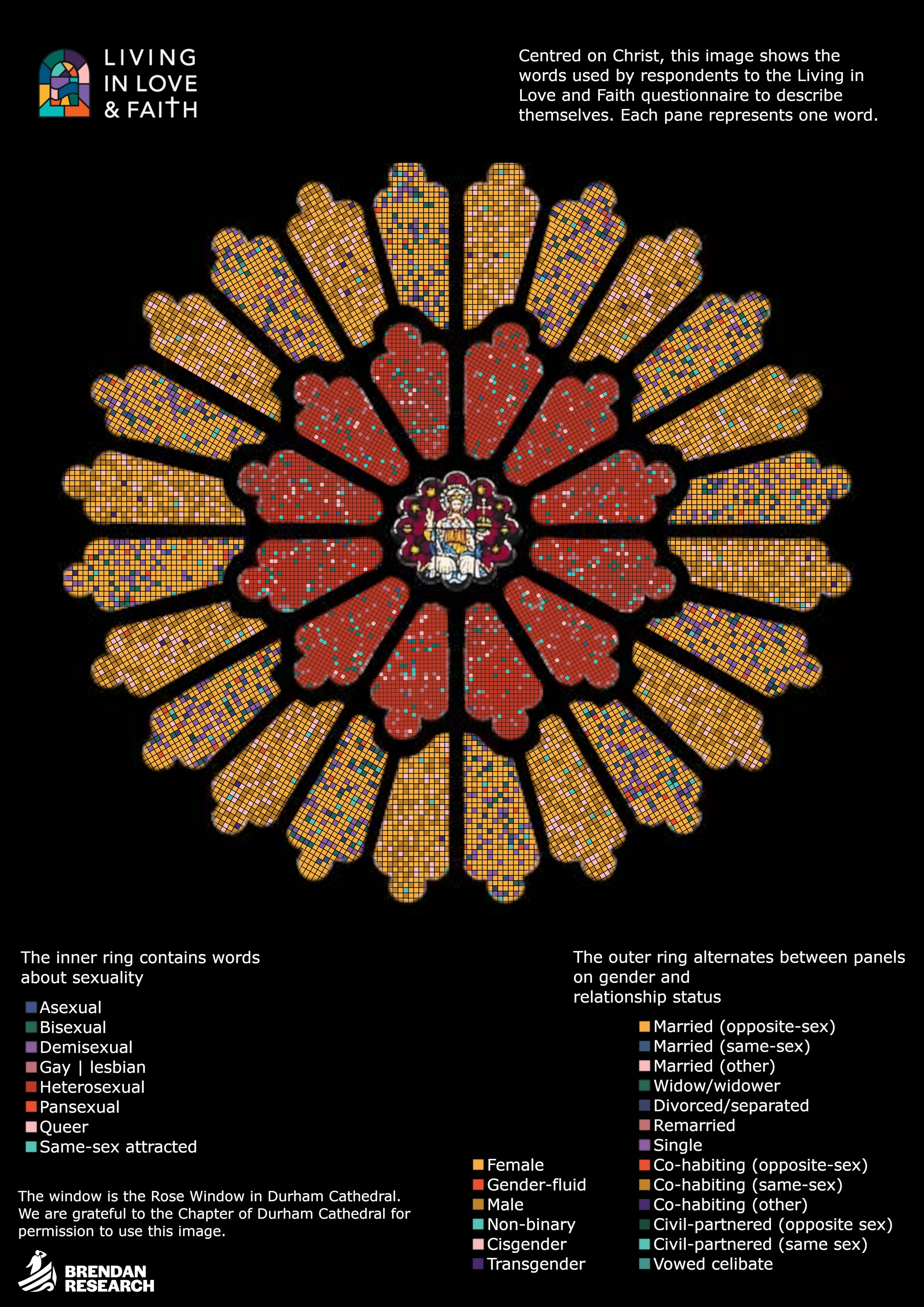
I learned a great deal from the course, but more about the whole idea of data visualisation as art. I'm happy enough with what I produced for this, but it's really developed my work in other ways - this was another recent data visualisation for a church project.


1 comentário
lou.lacerda
Este é um trabalho incrível e uma forma realmente inovadora de ver os dados. Se você publicou um artigo com isso, poderia me enviar a referência?
Visualizar original
Ocultar original
Faça login ou cadastre-se Gratuitamente para comentar