Workshop presentation in Canva
przez Andreea Laura Amzu @andreea_laura
- 73
- 5
- 1
Introduction
Competition Entry: Canva Professional Designs
About the Project
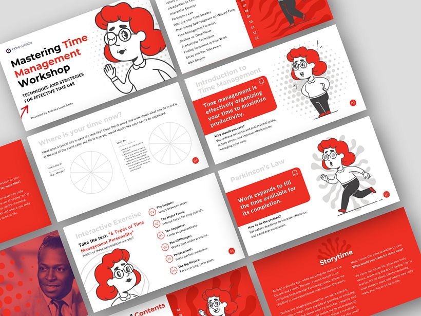
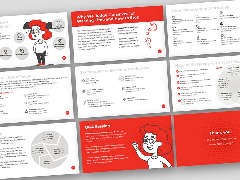
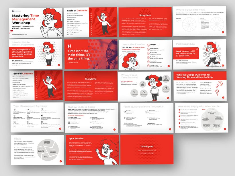
I embraced the competition as a challenge to create a comprehensive course in just one day with the aim to benefit others. Thus, I crafted a "Mastering Time Management Workshop" presentation. The workshop spans 17 slides, including elements such as a cover, table of contents, exercises, tips, techniques, quotes, and much more. It draws from my personal experiences, books I've explored, and workshops I've attended.
Learning Outcomes (You can learn for free from my presentation)
Time Assessment Exercise: Discover where your time is currently spent and explore your time aspirations.
Personal Story: A moral-driven narrative about time management.
Introduction to Time Management: Understand the definition and its importance.
Interactive Exercise: Explore the "6 Types of Time Management Personality" test.
Parkinson's Law: Learn its definition and prevention techniques.
Identify Time Stealers: List and discuss time thieves with the audience.
Overcoming Self-Judgment: Insights into Human Psychology Regarding Time.
Time Management Formulas: Nine strategies to enhance productivity.
Shallow vs. Deep Focus: Definitions and Six Techniques for Deep Focus.
Productivity Techniques: Explore six effective methods.
Finding Happiness in Work: Implementing PERMA for Fulfillment.
Recap and Key Takeaways: Summarize learning highlights.
Q&A Session: Engage with the audience for further clarification.
Design Process
With my presentation experience and research, the foundation was clear: minimal text on slides, clean fonts, a color palette with no more than three colors, and the use of two fonts max. The style chosen was vintage/minimalist, utilizing round shapes for a clean look. After drafting the content, it was summarized and organized across slides.
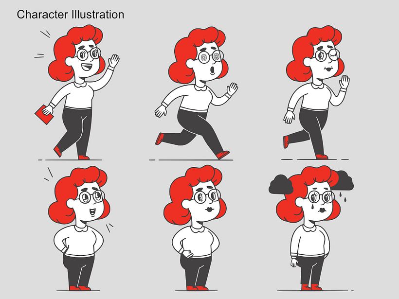
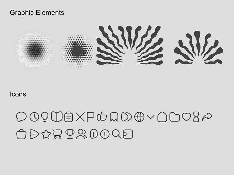
Illustrations were crafted around a central character I designed in Affinity Designer, while Canva's Draw tool facilitated shape creation. Icons from Canva and svgrepo.com were directly integrated into the presentation. After organizing graphics and content, I reviewed the presentation with fresh eyes to ensure clarity and coherence before adding final touches like page numbers and a filled table of contents.
Share and Support
If you appreciate my work, please vote for me.
Supplies
Content: The information is from my own experience, the books I've read, and the workshops I've personally attended.
Reformulate content and resume with Magic Write
Illustrations: self made with Affinity Designer
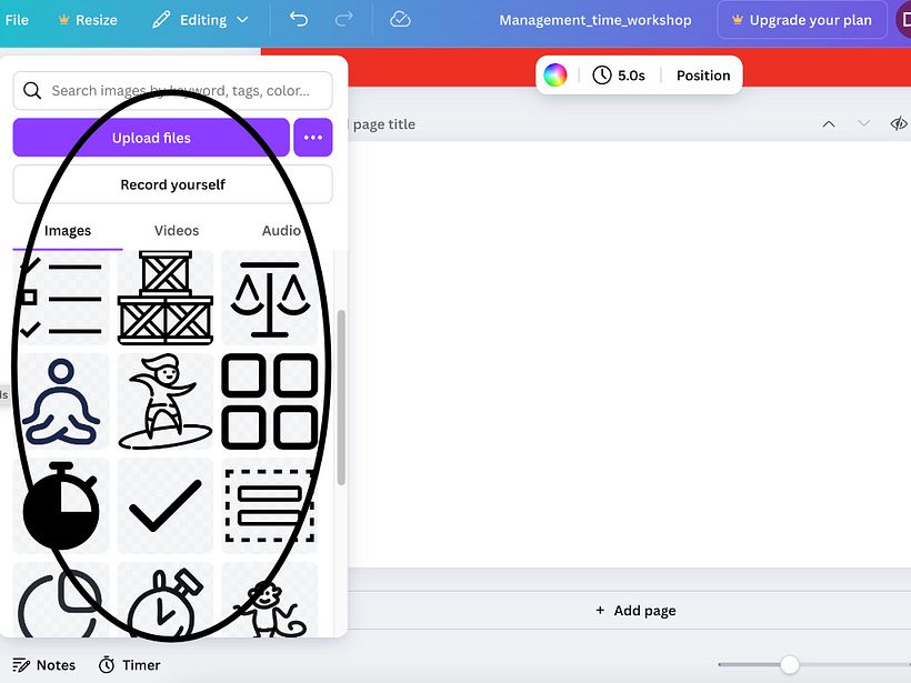
Icons: from Canva Elements and svgrepo.com
Step 1. Set the Foundation:
Drawing from my past experiences and research, I established essential design principles: using minimal text, selecting clear fonts, maintaining a color palette of up to three colors, and utilizing no more than two fonts. I chose a vintage, minimalist style with clean, round shapes.
Step 2. Content Preparation:
I drafted the text I wanted to include in the presentation, then summarized and organized it across the slides.
Step 3. Gather Materials:
I created the necessary illustrations and I collected graphic elements based on the types of slides I planned to make, designing a consistent set of six illustrations with the same character. I dragged icons directly onto the slides from Canva or imported them from external sites like svgrepo.com.
Step 4. Design Layout:
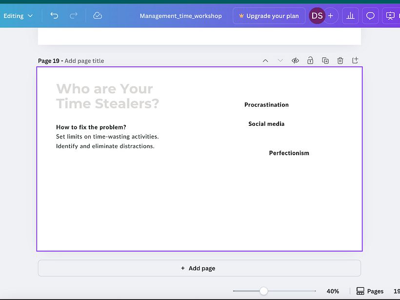
I arranged the elements and content on the slides, ensuring visual balance and clarity.
Step 5. Review and Adjust:
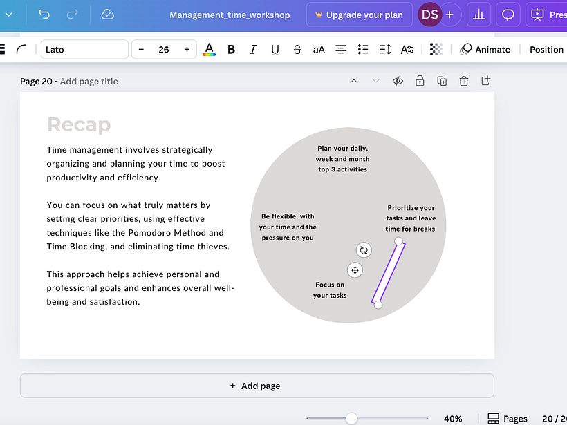
I took a break to review the presentation with fresh eyes, identifying areas for correction or improvement.
Step 6. Finalize Details:
I added finishing touches, such as page numbers, and completed the table of contents with corresponding pages. I prepared the presentation for sharing.

1 komentarz
roberta
efektowna i łatwa do odczytania grafika, podoba mi się! Piękne ilustracje, gratulacje.
Zobacz oryginał
Ukryj oryginał
Zaloguj się lub dołącz bezpłatnie, aby móc komentować