Wprowadzenie do wizualizacji danych
Kurs prowadzi Victor Pascual , Specjalista ds. wizualizacji danych

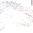
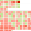
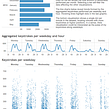

Twórz wizualizacje z przekazem i naucz się wizualizować Twoje ulubione seriale

In this course by Víctor Pascual, discover what data visualization is, seeing how to distinguish between static and dynamic or interactive graphics.
Learn the basic rules to take into account when developing a visualization to help your critical analysis. As well as analyzing and communicating data, end up answering questions you hadn't even considered before!
Czego nauczysz się na tym kursie online?
liczba lekcji: 12 & liczba dodatkowych zasobów: 9

- 95% pozytywnych ocen (592)
- Liczba uczestników: 15.623
- 12 lekcji (2 h 46 min)
- Dodatkowe zasoby: 9 (liczba plików: 2)
- Online i we własnym tempie
- Dostępne w aplikacji
- Audio: Hiszpański, Angielski, Francuski, Włoski, Portugalski, Türkçe
- Hiszpański · Angielski · Portugalski · Niemiecki · Francuski · Włoski · Polski · Holenderski · Türkçe
- Poziom: Podstawowy
- Dostęp nielimitowany na zawsze
Zalecane oprogramowanie i narzędzia dla tego kursu
 Google Sheets
 Tableau Public
Jaki jest projekt kursu?
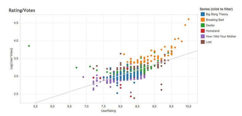
Visualize your favorite series interactively by learning to "scrape" or collect data on www.imdb.com and process it all in a spreadsheet. As a final result, discover the stories hidden behind the data by uncovering details that reflect how viewers have experienced these series.
Projekty uczestników kursu


Do kogo jest skierowany ten kurs online?
This course is completely transversal and can be taken by people with all kinds of backgrounds. It is of special interest to designers, journalists, analysts, and online marketing professionals who want to learn how to extract value from and represent data.
Wymagania i materiały
No previous knowledge is required for this course.
In terms of materials, you need a computer with an internet connection and access to Google Sheets and the Tableau Public software.

Oceny

Victor Pascual
Kurs prowadzi Victor Pascual
Víctor Pascual jest zadeklarowanym entuzjastą naukowej wizualizacji danych. Posiada doktorat z informatyki i komunikacji cyfrowej. Swoją pracę doktorską poświęcił badaniom nad nowymi metodami reprezentacji danych internetowych. Od 2009 roku jest data s...
Zawartość
-
Cz.1
Data Visualization
-
Víctor Pascual
-
Introduction to Data Visualization
-
Influences
-
-
Cz.2
How to develop effective visualizations
-
The process of data visualization
-
Objectives and examples
-
Basic rules
-
-
Cz.3
Data collection and analysis
-
Explanation of the project
-
Introduction to data scraping
-
Cleaning and data processing
-
Preparing the data
-
-
Cz.4
Display data with Tableau
-
Introduction to Tableau Public
-
View data from our series
-
-
PK
Projekt końcowy
-
Introduction to data visualization
-
Kurs Domestika - czego możesz się spodziewać?
-
Nauka we własnym tempie
Radość z nauki w domu, bez wyznaczonych terminów. Szybko przyswajasz wiedzę, a swój plan zajęć układasz wedle uznania.
-
Nauka z najlepszymi ekspertami
Przydatne metody oraz ciekawe techniki przedstawione i wyjaśnione przez najlepszych specjalistów z branży kreatywnej.
-
Doświadczeni prowadzący
Wszyscy prowadzący są specjalistami w swojej dziedzinie. Przekazują wiedzę z pasją, tłumaczą zagadnienia w jasny sposób, a podczas zajęć kładą nacisk na praktyczne zastosowanie zdobytej wiedzy.
-
Certyfikaty
PlusJeśli posiadasz subskrypcję Plus, otrzymasz spersonalizowany certyfikat ukończenia kursu podpisany przez instruktora. Możesz go dołączyć do swojego portfolio lub udostępnić w sieciach społecznościowyc
-
Miejsca w pierwszym rzędzie
Wysoka jakość wideo sprawia, że nie umknie Ci żaden szczegół. Dzięki nieograniczonemu dostępowi możesz obejrzeć nagrania tyle razy, ile potrzebujesz, aby przyswoić nowe umiejętności.
-
Dzielenie się wiedzą i pomysłami
Zadawaj pytania, nie wahaj się poprosić o opinię czy poszukać rozwiązania. Podziel się swoimi wrażeniami z nauki z pozostałymi członkami społeczności, którzy tak jak Ty uwielbiają tworzyć.
-
Łączność z kreatywną społecznością z całego świata
Społeczność kilku milionów użytkowników z całego świata, pełnych ciekawości oraz chęci odkrywania i wyrażania swojej kreatywności.
-
Profesjonalna realizacja kursów
Domestika starannie dobiera prowadzących i produkuje wszystkie kursy we własnym zakresie, aby zapewnić wysoką jakość nauki online.
Często zadawane pytania
Data visualization is the process of representing information through charts and images to make it easier to interpret large datasets and quickly spot patterns, trends, or anomalies.
The course is designed for people with intermediate skills in data handling and digital tools, covering everything from theoretical basics to advanced visualization techniques.
You’ll need access to Google Sheets or Excel, Tableau Public, and some basic knowledge of R and D3 if you want to explore advanced options. Prior experience with all these tools isn’t required.
You’ll learn how to analyze, clean, and prepare data, apply perceptual and theoretical principles in visualizations, create both interactive and static visuals, and choose the right chart type for your context and audience.
Scrollytelling is a storytelling technique that combines web scrolling with sequential visualizations, guiding users interactively through the story the data tells.
The course teaches you how to import, clean, and analyze data in Google Sheets and Tableau Public, and how to use their features to build interactive charts, maps, and custom dashboards.
Yes, the course covers basic web scraping techniques to gather data online, as well as methods to clean and organize that data in spreadsheets before visualizing it.
 Google Sheets
 Tableau Public
me encanto , buena explicación en cada unidad
The content was clear however the presentation needs to be available in English. The instructor spoke English but used visuals from another language. The resources need to be updated as some of the urls do not work. The fact that Domestika is using a bot to respond to questions indicates to me a disconnect between themselves and instructors. The instructor for this course has not updated course resources. Domestika uses content from original courses to create guided material. Pay twice same.
¡Me encantó!, Víctor hace que parezca muy sencillo trabajar con datos.
Estaría buenísimo explorar más sobre las posibilidades gráficas de Tableau, he encontrado visualizaciones muy interesantes con formas que parecen personalizadas y quiero aprender a hacer eso, ¿me pueden recomendar un curso para profundizar en la herramienta?
Un curso claro que te lleva a traves del proceso, desde la toma de datos hasta la visualización. Muchos tips buenos
Las explicaciones super claras y el curso es muy util.