


MOJITO: Art Deco Style for Digital Illustration course
par Pearse O'Halloran @pearseohalloran
- 829
- 94
- 8
INTRO
Mads' art deco style is something I've admired for ages since following his work on Behance. My usual style is very flat colours with bold thicks lines so I was intrigued to take this course and learn a different approach.
The research phase was fascinating and I love how Mad's draws from past masters like Vermeer. The likes of Lyonel Feininger was completely new to me and really inspirational for thinking about composition.
APPROACH
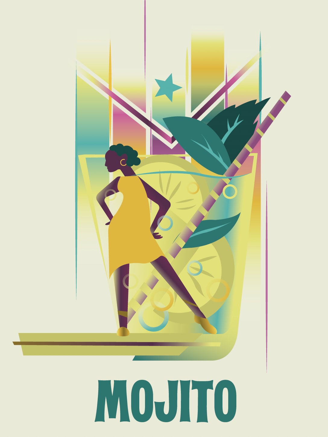
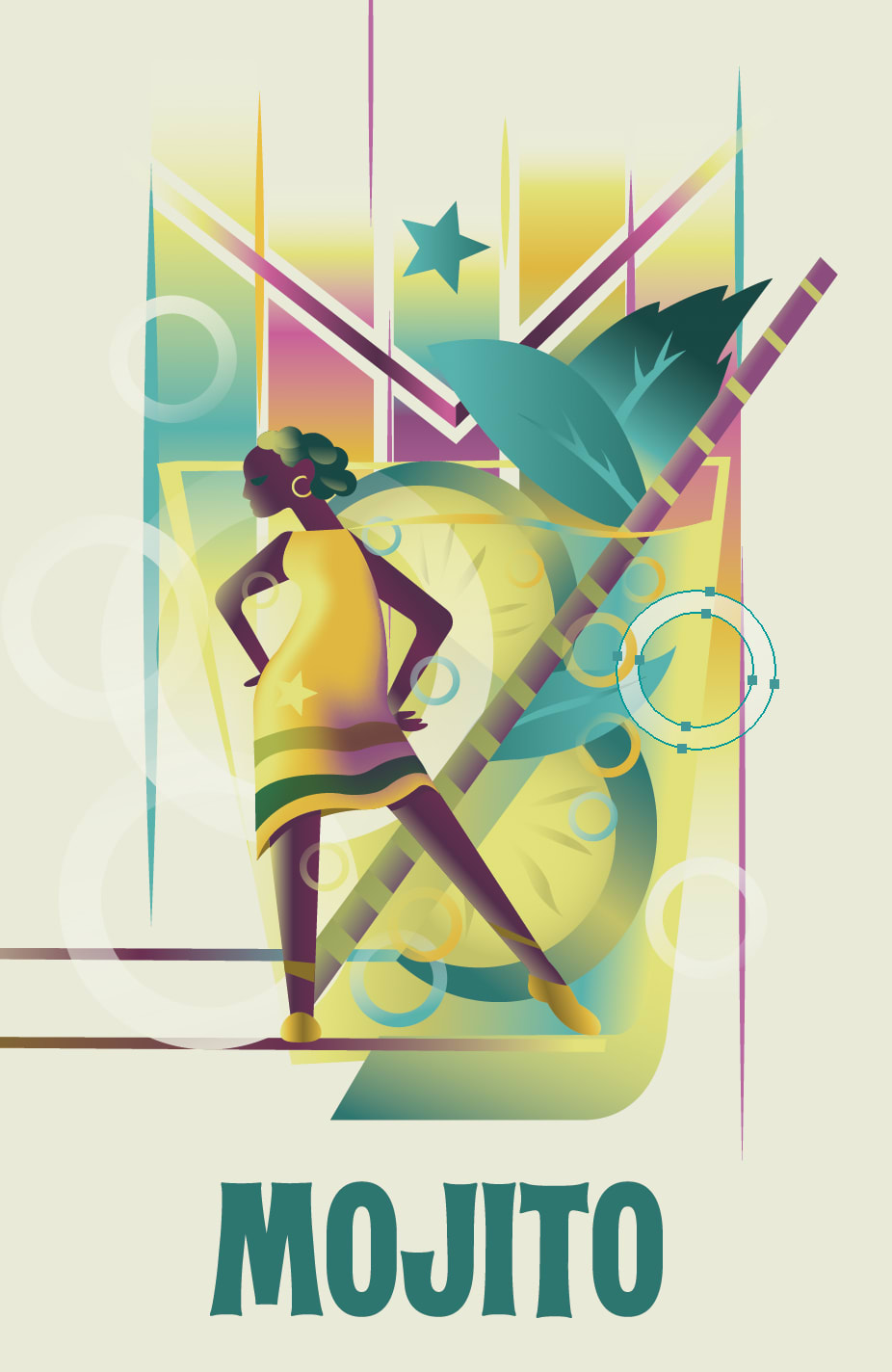
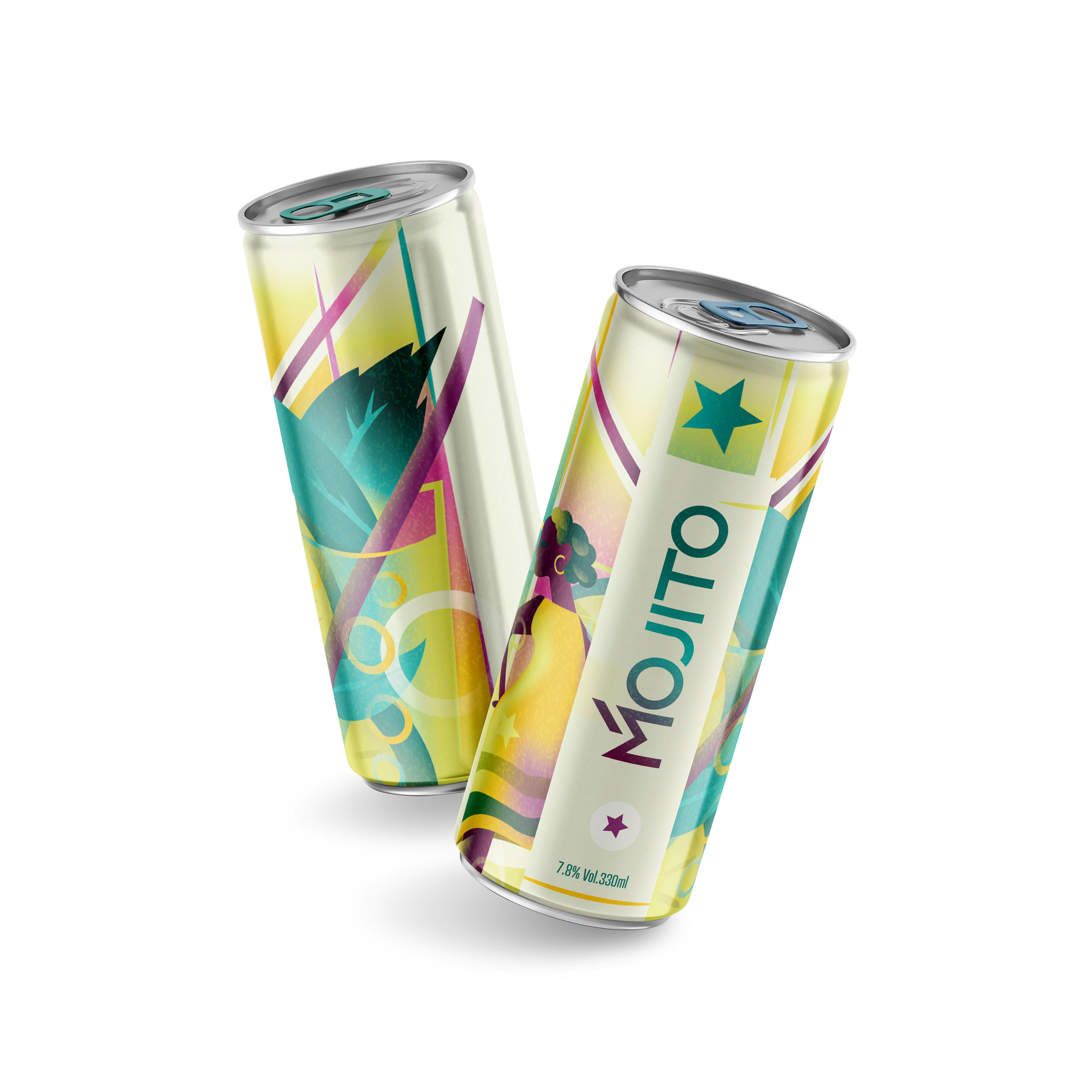
I think because it's my favourite cocktail, I immediately thought of a 'Mojito' when approaching the project brief. I instantly liked the idea of bringing in Cuban/Latin elements into the work which is maybe not so readily associated with Art Deco Style.
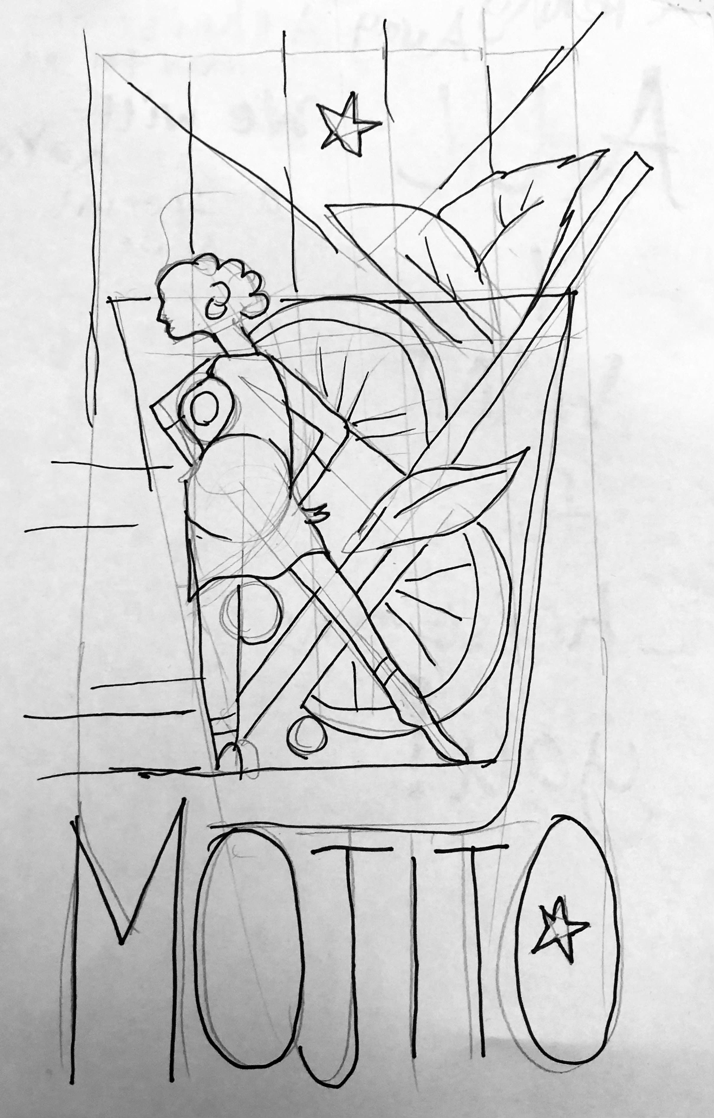
I sketched out all the possible elements Lime, Mint, Glass, Stirrers Straws, Dancers, Sugar, Soda Bubbles, the star of the Cuban Flag.
The composition I chose featured all of these with a slightly abstract placement of a Dancer merging into the Cocktail glass. This is framed by the 5 stripes and star of the Cuban Flag.
BASIC SHAPES
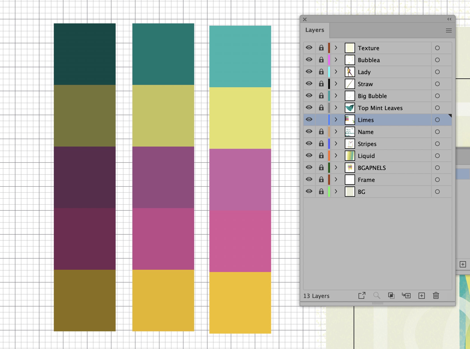
Before importing the composition sketch I built up a colour palette. The Mojito colours need a lime green and mint. An analogous yellow and complimentary magenta and purple completed a neat set of 5 colours.
Mads' tip of using the colour guide to get a lighter and darker set of the same core colours was really helpful.
With the sketch inserted I began building the shapes underneath.
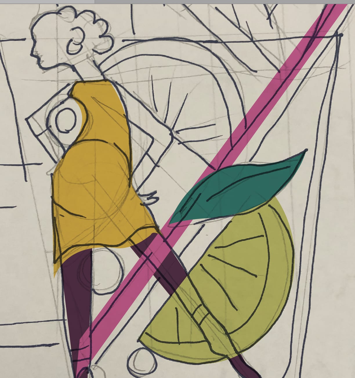


GRADIENTS
Applying the gradients was a really fun part. As said, I don't normally put gradients in my work, so it was a refreshing change to let loose and build-up colours with multiple blends. There were some happy accidents along the way.
CUSTOM TYPE
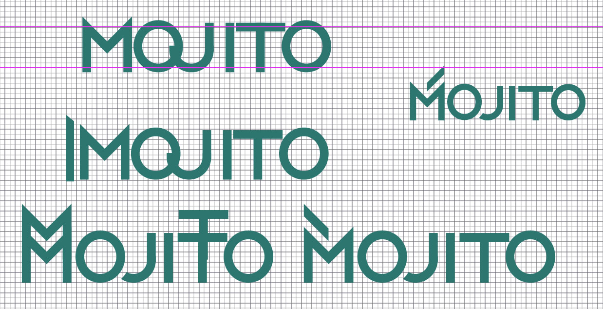
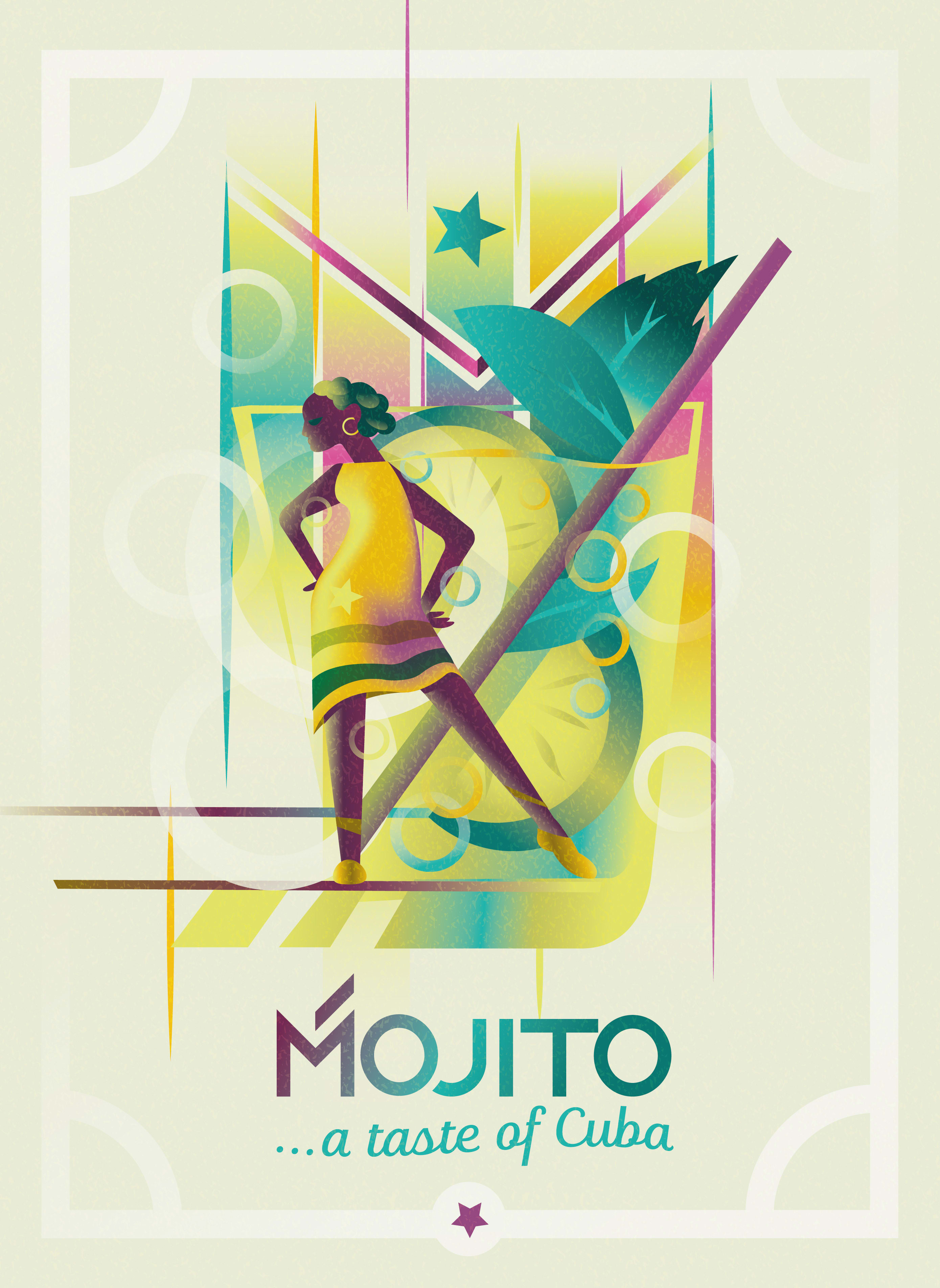
I initially had a lovely sans serif Art Deco typeface from my catalogue as the text. But I was inspired by Mads to make the effort and create a custom wordmark for the piece.
I build simple shapes from lines and then played around with the letters to add something stylised to emphasise this is a custom piece. I thought a little backslash over the 'M' did the trick as it was reminiscent of Spanish/Latin type.
FINSHING UP
The addition of a texture overlay really helped to add a vintage feel without losing the sharp contemporary feel.
I didn't add too much by way of framing. I tried some elaborate ornate pieces but because the illustration itself was quite busy it seemed to detract from it.
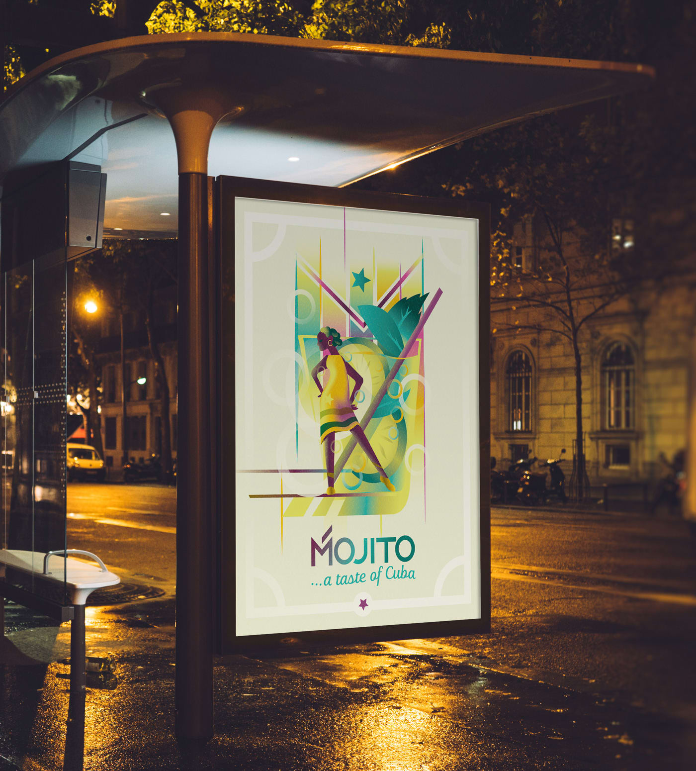
I placed the image in some mockups to get a feel for how the illustration would work in a commercial environment.
THANKS!
Thanks so much for sharing your process with us Mads. Very inspiring.
I'd love any feedback on my work.
You can connect and follow my studio's work on:
Twitter | Instagram | Behance
Thanks for stopping by! 😃
Pearse O'Halloran
Oh and here's a process video if you want to see more of how my illustration came together... 👇


8 commentaires
cindernella28
PlusLes couleurs et le style sont superbes. J'aime l'Art Déco.
Afficher le texte original
Masquer le texte original
pearseohalloran
Merci! J'apprécie les commentaires.
Afficher le texte original
Masquer le texte original
maryayugay
Bon travail! Merci de partager le processus très détaillé de création de ce travail ^^
Afficher le texte original
Masquer le texte original
pearseohalloran
@maryayugay . J'espère que ça aide!
Afficher le texte original
Masquer le texte original
jackienoelle
Cela s'est avéré vraiment magnifique. Je le trouve très inspirant. Vous êtes très talentueux. Bon travail!
Afficher le texte original
Masquer le texte original
pearseohalloran
@jackienoelle AW merci beaucoup Jackie. C'est très gentil à vous de le dire.
Afficher le texte original
Masquer le texte original
hdg67
Vraiment merveilleux et inspirant. Merci de partager vos processus.
Afficher le texte original
Masquer le texte original
pearseohalloran
@hdg67 VOUS ÊTES BIENVENUE 🙏
Afficher le texte original
Masquer le texte original
Connectez-vous ou inscrivez-vous gratuitement pour commenter