


Mi Proyecto del curso: Caricatura en acuarela
by Luján Apollaro @lujizen
- 345
- 13
- 3
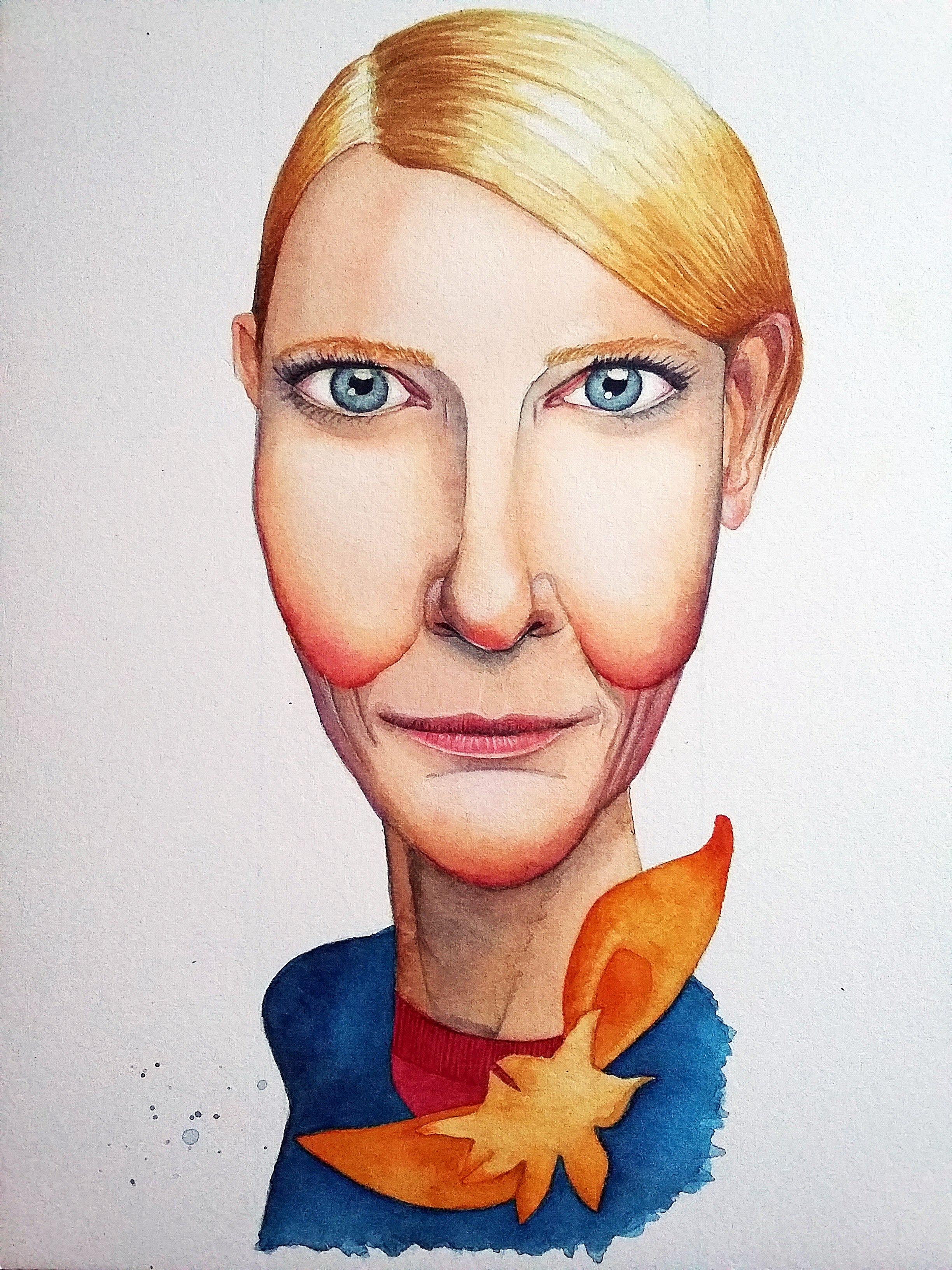
Creo que no conseguí imitar del todo el efecto de sangrado que proponía Carlos en el ejercicio, la piel me quedó más bien aterciopelada.
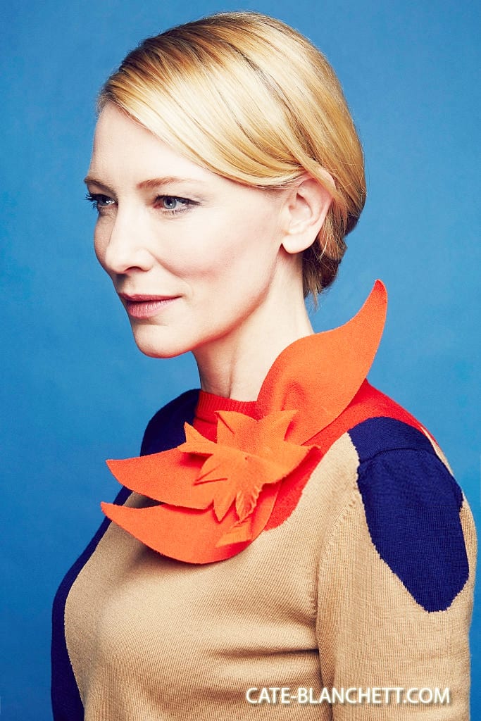
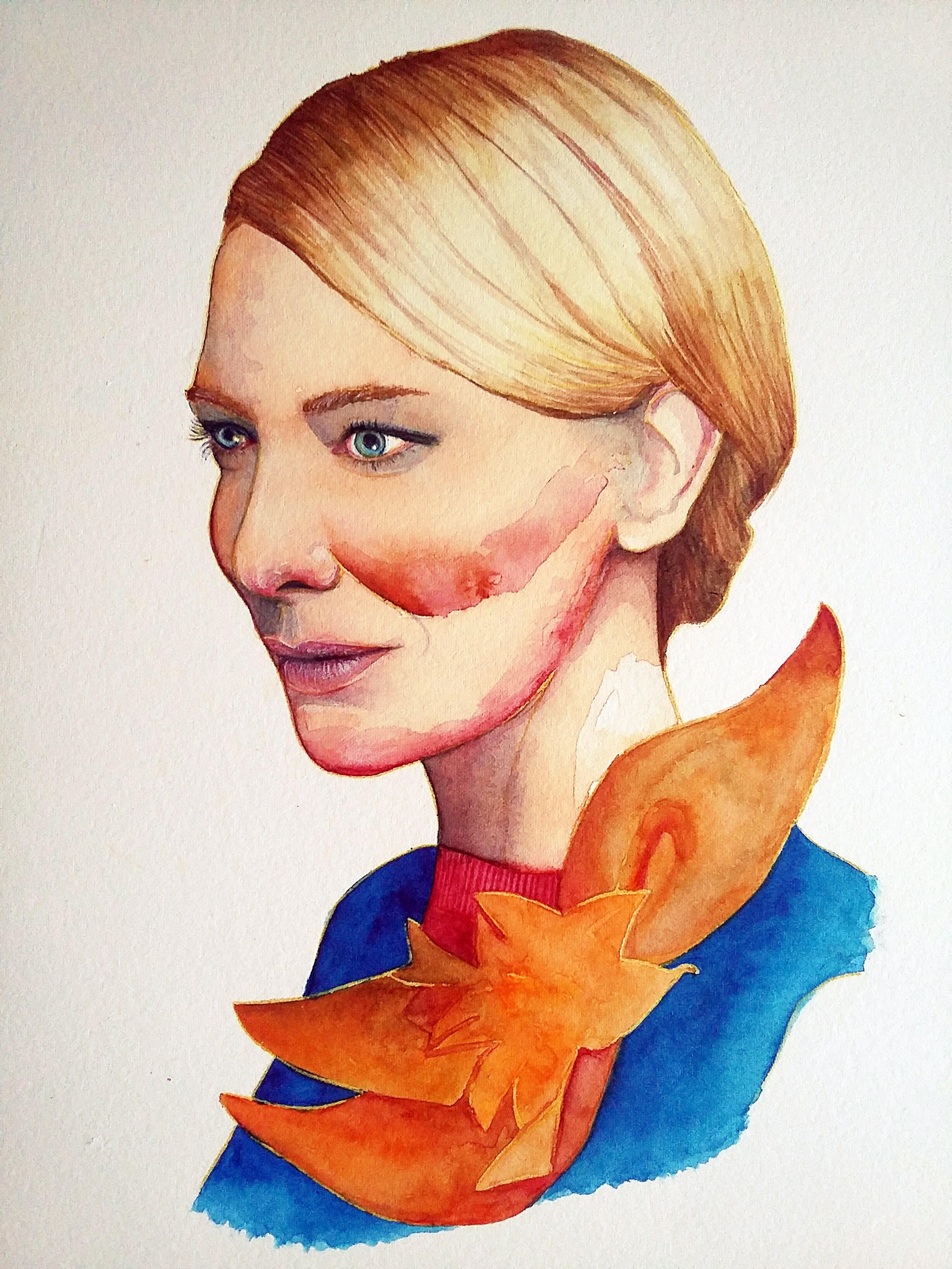
Pero lo volveré a intentar en el próximo ejercicio (el de la portada).
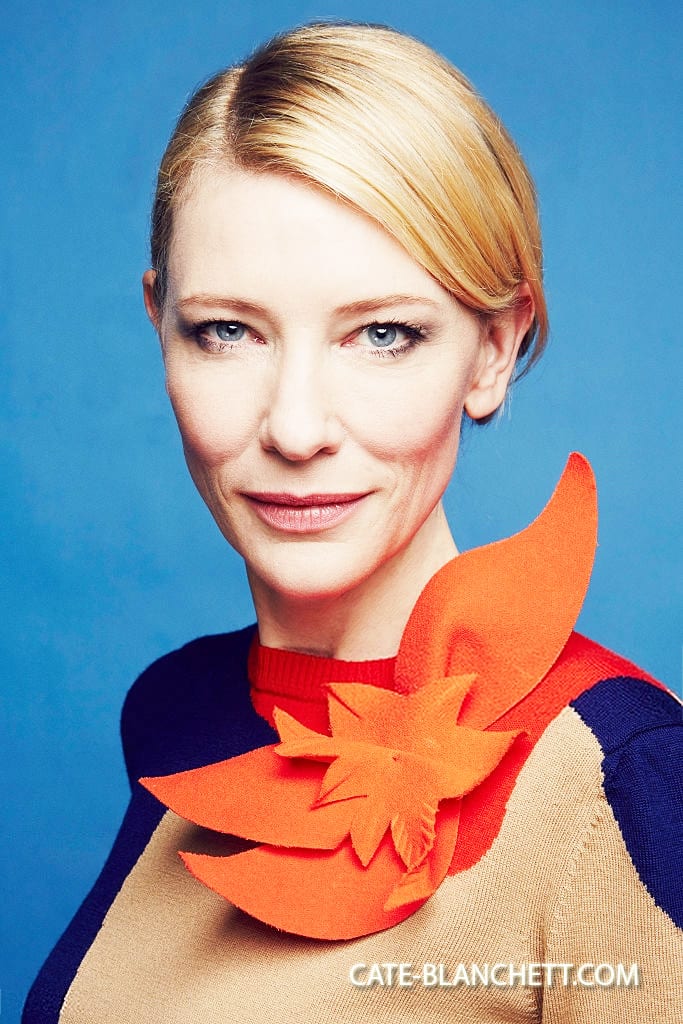
En este 2do. ejercicio, he intentado según consejo de Carlos, soltar un poco más la pincelada y el control. La verdad no se si lo he conseguido del todo, incluso creo que en algunos casos -como la pincelada en el pómulo-, más bien un poco todo se me descontroló y luego me fue difícil armonizarlo, pero al final, creo que el resultado es un poco más espontáneo que el anterior (la oreja la dejé desdibujada adrede) y eso me gustó.
Todavía me queda por delante la parte del curso sobre retoque digital, aún no pude verla y avanzar con eso, pero más luego veré si a ambas imágenes les puedo realizar algún retoque.
🙂

3 comments
carlosrodriguezcasado
Teacher PlusWhat an interesting cartoon Luján! You have used a very symmetrical pattern for her face that, although it distances itself from the reference pose, makes the expression very striking. There are three parts of your drawing that have me crazy:
1 - The hair treatment is fantastic!
2 - The lips and the cleft that goes from the nose to the upper lip. It's very subtle, but I love how you've worked all the reliefs.
3 - The reflection of the orange flower on the skin. It gives a touch of color to the face that is very flattering. And in general the colors you have achieved are great :)
I understand what you say about the bleed effect, you may not have gotten those internal textures on the skin because you have a very delicate watercolor treatment, contained. You can tell that you control the amount of water you carry with the brush very well, and the truth is, I think you have a very personal style. If you are interested in these effects, try to loosen up a bit more, but I really like the skin you have achieved, I would not touch it at all;)
I'm going to leave you some tips for digital retouching with which you could improve this work:
1 - Since you have worked the face very symmetrically, make it completely symmetrical, for example: look at the cheekbones. The left one is larger and more pointed than the right, when it is this one that should look bigger because of the pose. Since your face is very frontal, you can retouch the right one with Photoshop so that they are even.
2 - The eyes you have got are very captivating, but knowing that it is Cate Blanchett I would try to reduce them a bit. A very characteristic feature of her is that she has very slanted eyes and I would say that even small ones, try to see how they look like this in your drawing! You will notice that the face is more elongated, even exaggerated, but you may gain similar;)
My goodness what a long message ... But that's a good sign haha, you've done a great job that gives a lot to comment on. I can't wait to see what you do for the cover exercise!
See original
Hide original
lujizen
Plus@carlosrodriguezcasado Thank you very much for your return! I really appreciate your all your comments and I will take them into account for the next exercise, to see what comes out! :) Thank you!
See original
Hide original
carlosrodriguezcasado
Teacher Plus@lujizen Luján, your second exercise is wonderful, excellent work !! I love that you have taken two photos of the same session, because that has made your two exercises very homogeneous in terms of colors and aesthetics. It was a great idea;)
I can see the intention of letting go of the hand more, for example, in the amplitude that you have given to the shadow spots (in your first exercise they were more contained) and the effects that you have allowed to do to the water when it dries. The shadow of the cheekbone draws a lot of attention, as you say, but I like it as a counterpoint to your delicate lines.
As I told you in the previous comment, you have a very high level of drawing and a finesse when handling the brush that, putting these two exercises in common, I think are your hallmark. The hair treatment, once again, is precious, and details like the eyelashes or the shine added with white pencil on the nose and in the crevices of the lips (it is pencil, right?) Speak of the care of your process, and as a result your portrait is super elegant.
Thank you for taking my advice into account and putting it into practice! When you watch the digital retouching lesson, you can try to make corrections such as smoothing shadows (you can see if the cheekbone looks better in a lighter tone with the Dodge tool) and retouching features that you want to refine (equalizing the eyes, for example, although It is true that in the photo Cate has one more squinted than another hehe).
Simply, congratulations!
See original
Hide original
Log in or join for Free to comment