


Mi Proyecto del curso: Diseño de carteles para eventos musicales
by Paula de Aguirre García @pauladeaguirre
- 288
- 5
- 2
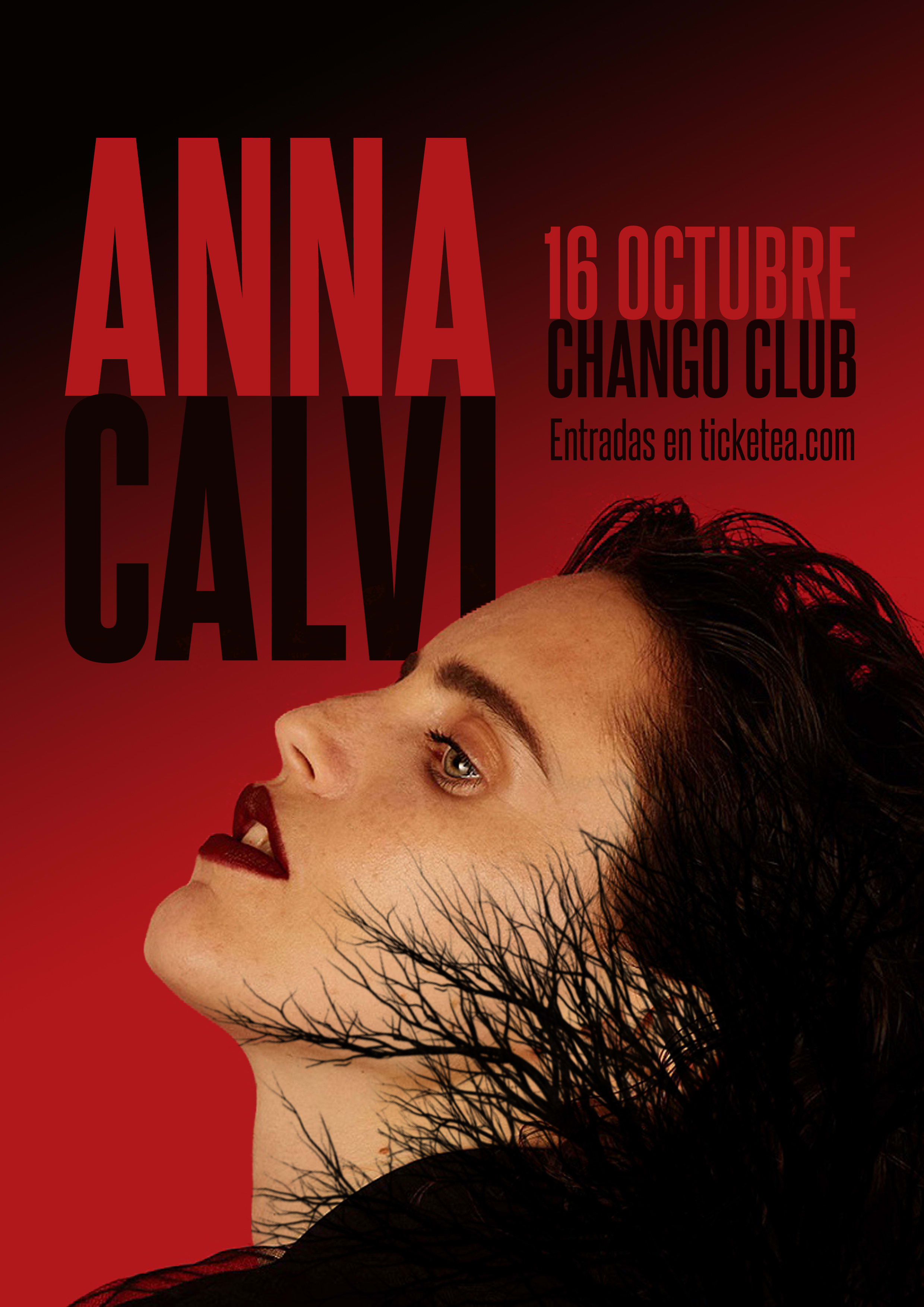
He elegido hacer un póster para la guitarrista y cantante Anna Calvi.
Para ello, he elegido los colores rojo y negro. El primero porque es muy utilizado por la artista en su vestuario y se corresponde con una manera de tocar en directo muy pasional. El segundo porque sus letras tienen cierto aire de oscuridad. En cuánto al detalle de las ramas sobre su rostro, tenía claro que quería añadir un elemento natural por lo salvaje de sus riffs. Por último, he aplicado una tipografía condensada porque quería que tuviera impacto. Por el mismo motivo he omitido detalles como precio, horario...que me parecían más mundanos en el contexto de este cartel. Al fin y al cabo, considero que si la gente está verdaderamente interesada en la actuación de esta artista irá a buscar la información en internet.
En fin, gracias por la ayuda prestada en este curso. Siento que los consejos de Quim me han ayudado a tener cierto sentido de la composición. No obstante, como diseñadora amateaur siento que aún tengo muchas lagunas sobre cómo conseguir determinados efectos o hacer determinadas virguerías.
Gracias a todos los compañeros también. Ha sido muy enriquecedor ver vuestros trabajos :)
¡Hasta la próxima!


2 comments
quimmarinstudio
Teacher PlusHello!
Shocking poster, sure I would look at it. I am not familiar with the work of Anna Calvi, so I am perfect to analyze your poster from a receiver point of view.
1) if you like Anna, you will love this poster.
He has the right and necessary info (perfect!) Evokes his aesthetic, and his fans would love to have this poster with his face.
2) if you don't know who it is, this poster will interest you.
It gives me a sense of a play, or movie. (Which is nothing negative, just that it is a very theatrical scene)
Using the symmetry of ANNA and CALVI, which have the same number of letters and generates that mirror ... it is outstanding, that's design. Bravo.
And limiting the info on the poster seems perfect to me, as you argue. I try to give you more content to design, because that is what the course is about, give intention to the content and know how to deal with it.
Thanks for sharing your project
Cheers
See original
Hide original
pauladeaguirre
Plus@quimmarinstudio Totally agree with the theater.
My boy says it looks like an American Horror Story poster, haha.
Thanks for your tips!
See original
Hide original
Log in or join for Free to comment