


Course project
Caatinga no estilo xilogravura. Projeto do curso: Ilustração vetorial com estilo doodles
by Vanessa Erler Sontag @van_sontag
- 1267
- 5
- 2
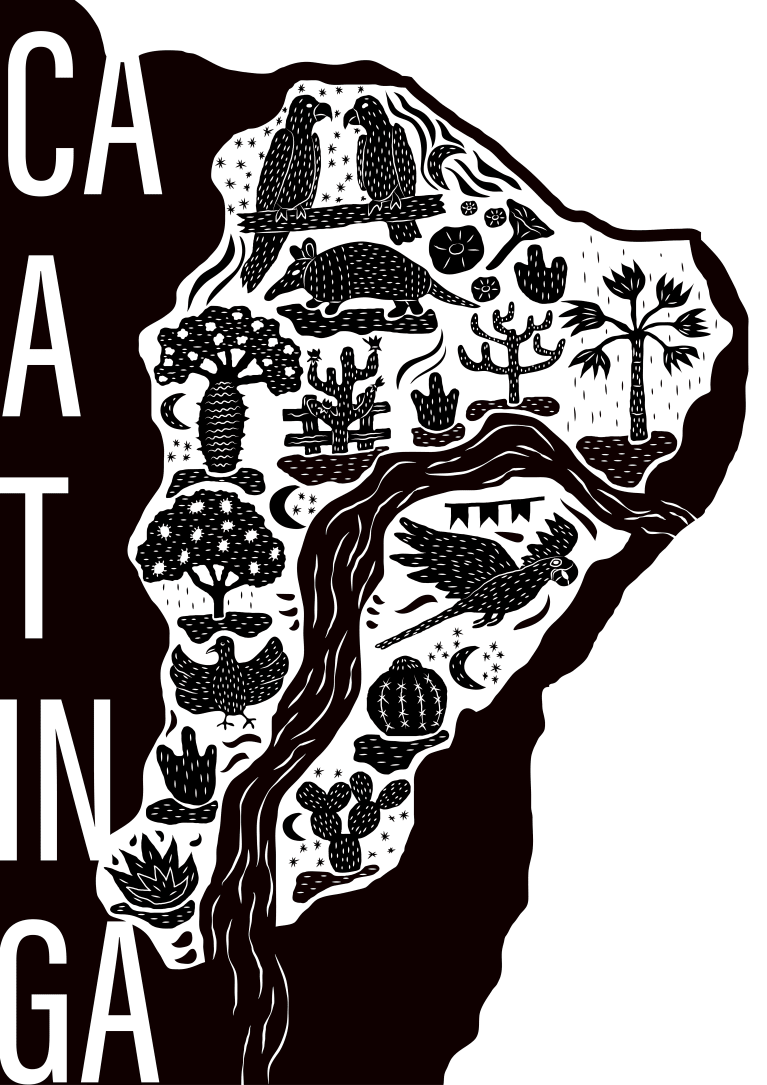
Resolvi distribuir os elementos na pontinha do mapa do Brasil. O fundo branco mostra a abrangência da Caatinga e o rio São Francisco cruza o bioma. Os desenhos mostram elementos da região como o "mandacaru quando fulora na seca"ou na cerca! Para quem canta errado. O tatu-bola, asa branca, ararinha azul e o periquito do certão. A barriguda, os cactos, a faveleira, jitirana e muitos outros elementos no estilo xilogravura.
2 comments
mauromartins
Teacher PlusWow! It was very beautiful.
I love the woodcut style. I even venture out sometimes too. The high contrast of black and white is very beautiful. The elements are very well done, with a lot of personality in the line.
I have a few detail comments that I think are worth a try:
- One of the things that enrich this style of woodcutting is precisely the irregularity of the line, the organic forms. So, following this logic, I would try to give the same treatment to the text "Caatinga". Draw the letters, instead of typing. This will make everything more harmonious.
- Do you know these tiny details around the tree up there on the right, in the Northeast? I think this is a detail that enriches a lot. I would try to use something similar in the black part of the composition, but with the white details, of course. I think it can bring a little bit of that wood grain texture and make the work even richer.
- In the tree below and to the left of the armadillo, I noticed that you used some kind of gradient on the internal details of the trunk. I think it would be better to keep everything in high contrast, without gradients.
That's it!
Congratulations on the beautiful work!
See original
Hide original
van.sontag
Hi Mauro!
Thank you so much for the tips! I kept changing the font several times and I didn't reach a conclusion, now it's explained! I also loved the idea of including graphics on the black part, maybe even put it in the font, let's see how it will look.
I didn’t use a gradient but I used that Illustrator stroke that is wider in the middle and tapers off at the ends. It is symmetrical and rounded. I used it in all the strokes but I think that in the longer strokes the tips were very thin giving this aspect of gradient. I didn't even notice it! Good eyes! I'll see how to fix it because it was really weird.
Hugs!
Vanessa
See original
Hide original
Log in or join for Free to comment