


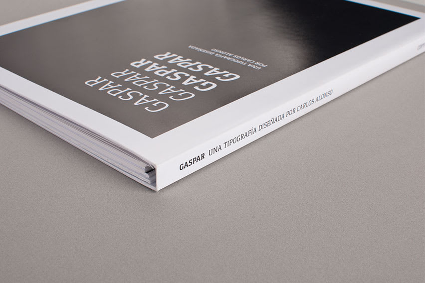
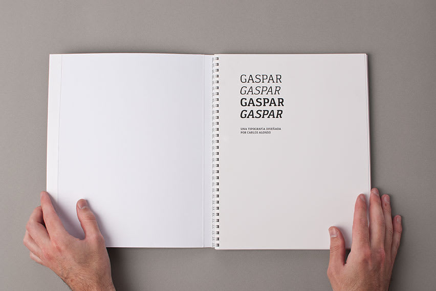
Tipografía Gaspar
by Carlos Alonso @carlos_alonso_costa
- 2146
- 25
- 5
Hola a todos!!
La familia Gaspar la pueden encontrar en fontsquirrel.
http://www.fontsquirrel.com/fonts/gaspar
Espero que les sea útil...
Hola a todos!!
La familia Gaspar la pueden encontrar en fontsquirrel.
http://www.fontsquirrel.com/fonts/gaspar
Espero que les sea útil...
5 comments
Carlos Alonso Costa
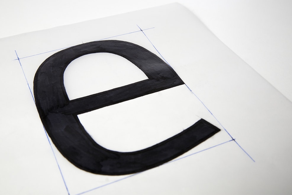
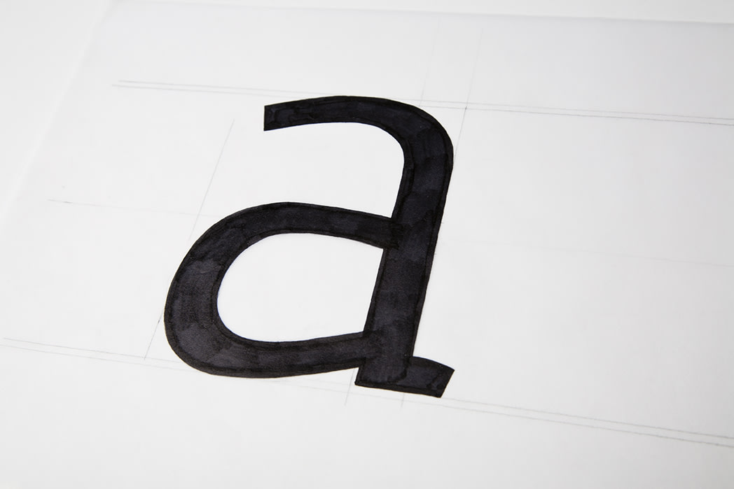
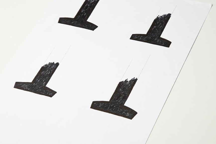
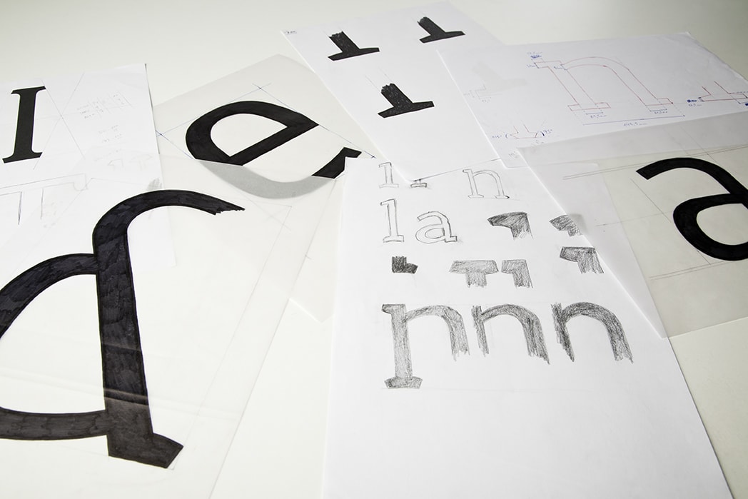
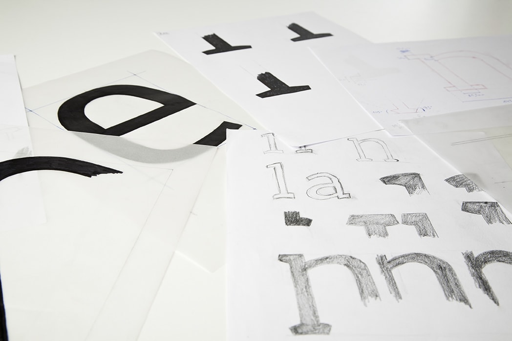
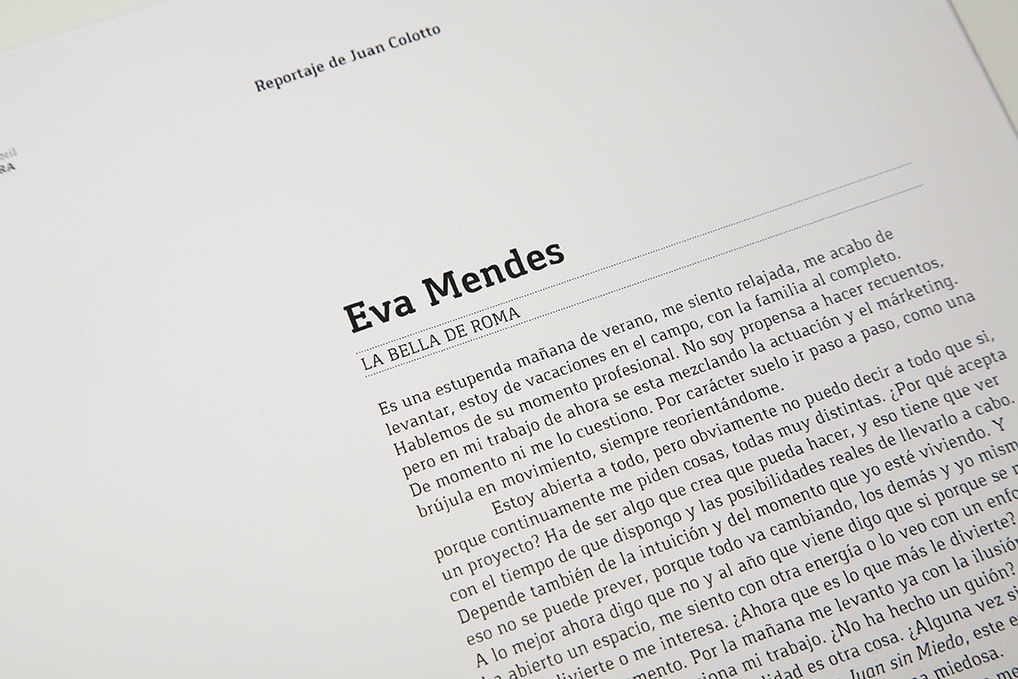
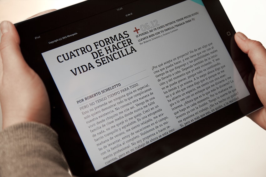
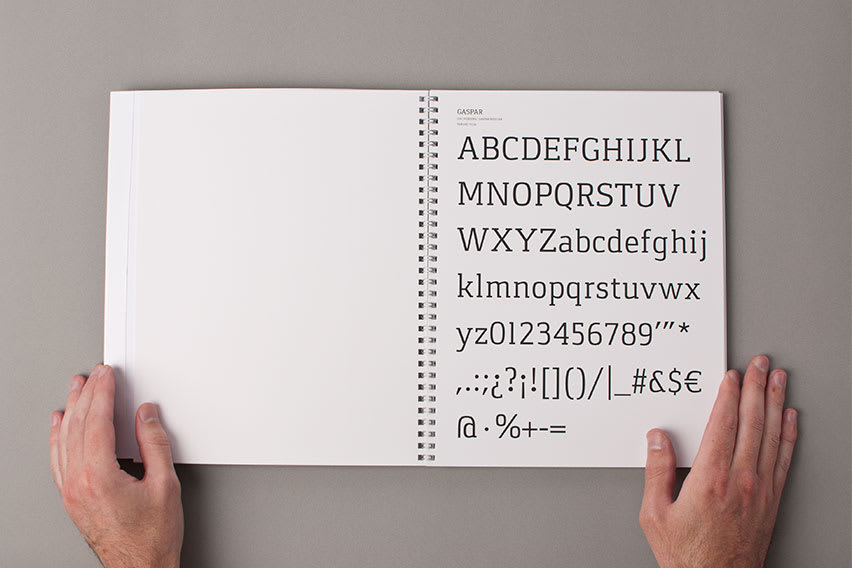
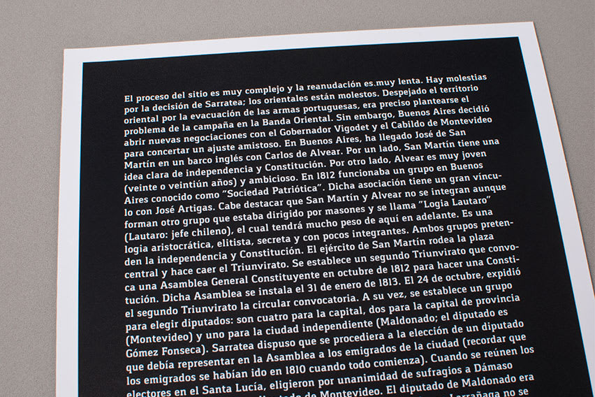
Gaspar pretends to be an Egyptian Serif family conceived for intensive editorial use.
The main goal became to be an editorial typeface that allows readability and prevents the text from becoming dense. This type of Egyptian families build character from the humanistic conception, hence the effect of modulation is so important. It adapts perfectly to print jobs such as magazines or newspapers, thanks to a very low contrast and excellent texture in continuous text. Its most characteristic features are the angles of its finials and its curve. This adds visual interest, removes rigidity and gives a certain attitude to the character. In Bold fonts, the main objective was to balance the weight of contrast and denote its main virtue of typography for continuous text.
See original
Hide original
lacajadetipos
We like. We have already downloaded it to do the odd test. Congratulations on the job!
See original
Hide original
Vicente Gomez Grafico
Very good work. :)
See original
Hide original
entelab
See original
Hide original
Manuel Persa
good job Carlos, I have published it in mytypografiafavorita
See original
Hide original
Log in or join for Free to comment