


Course project
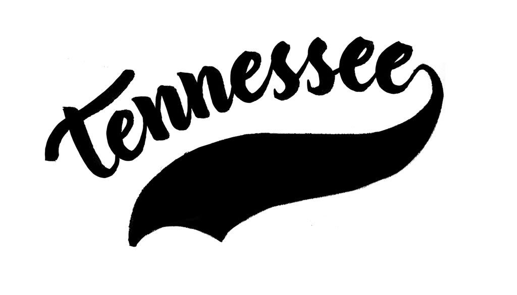
Tennessee
by Javier Piñol @javier_pinol
- 245
- 4
- 2
Bien, después de 240 repeticiones con algún pequeño cambio de planteamiento por el camino publico por fin el proyecto del logo de Tennessee. Pensaba hacer alguna más pero algún día tenía que parar y ha sido hoy. He seguido los consejos de Iván lo mejor que he podido y hasta el final he pensado si vectorizar todo o no. Al final he optado por hacerlo a lo "frankestein" y he corregido alguna cosa copia-pegando. Hubiera ganado vectorizado, podría haber hecho más correcciones y tal, pero no tengo mucho tiempo y se podría haber eternizado.


2 comments
superl0pez
Hi.
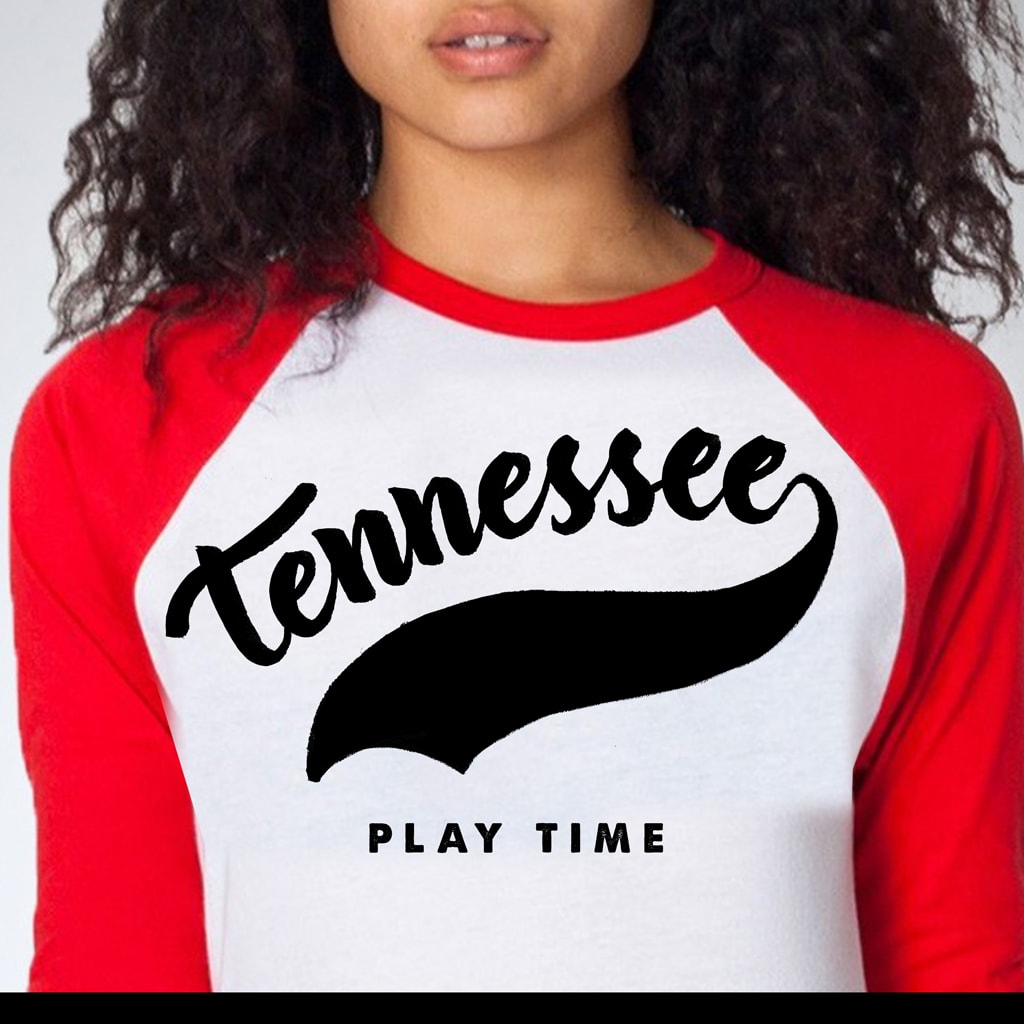
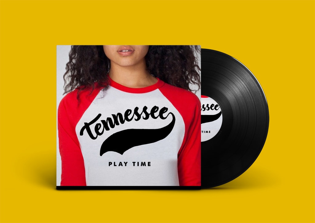
I like the result of the letters and the set of the cover with the photo of the girl, the only thing that the descendant that comes out of the final "e" seems very exaggerated. If you dare one day, you can try to vectorize the logo and try to make that output a little finer. Remember that this does not end here, that it is good to continue to reinforce the creative process and add things to what you have learned.
A greeting!
See original
Hide original
javier_pinol
Thanks for the comments @superlopez , the underlining is a bit exaggerated, I have tried to do something similar to the logos of baseball teams. I do not know if you have seen the collection of logos that I made previously, take a look at it in the forum in the section of previous sketches. The problem with this logo was the repetition of the same letters, without ascending or descending, neither chicha nor limoná. There are better solutions, but this is the best I've been able to do it, but you're right, the underline is too thick. Regarding the vectoring, I'll polish it a bit later, but Iván doesn't ask for any vectoring, I think he wants us to cure it with the brush as best as possible. I had thought to vectotize it more than anything to add a fillet to the letters and give it a little more vibe. I appreciate your comments again. A greeting!
See original
Hide original
Log in or join for Free to comment