
Fonts: Build your Word
Eğitmen: Glíglifo Tipografi konusunda uzmanlaşmış grafik tasarımcılar
Eğitmen: Glíglifo, Tipografi konusunda uzmanlaşmış grafik tasarımcılar

Design a font with the double pencil technique
Do you love the letter? Well wait to master the word. In this online course, you will learn the theoretical and practical knowledge to get closer to the world of typography. You will design your own word step by step within a typographic system, from the manual creation to double pencil until the last adjustments in the computer.
Bu çevrimiçi kursta ne öğreneceksiniz?
1 ders & 1 indirme
Bibliography
9 dakika, 58 saniye
Basic forms
2 dakika, 55 saniye
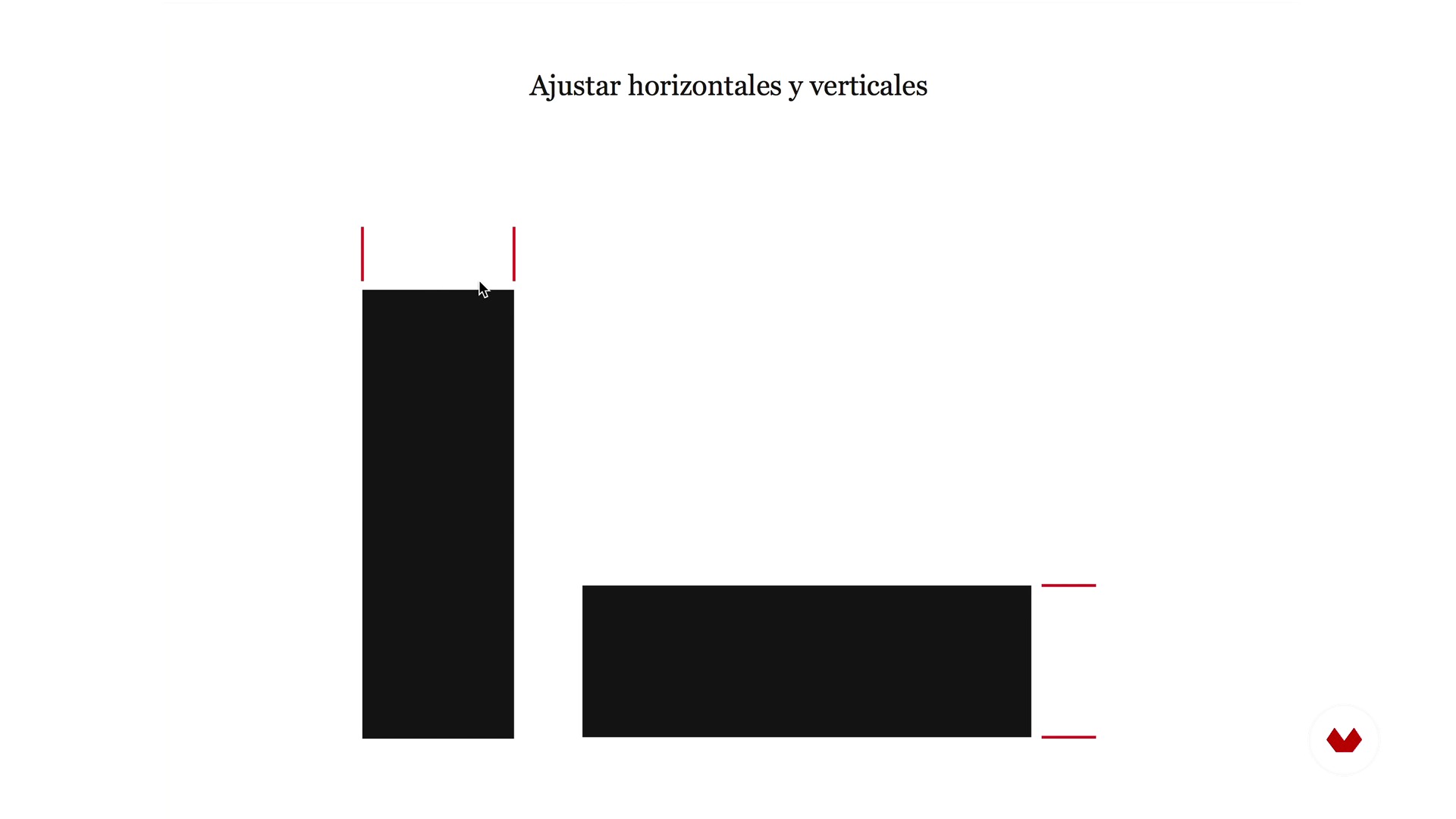
Optical laws
3 dakika, 59 saniye
Spacing and rhythm
5 dakika, 46 saniye
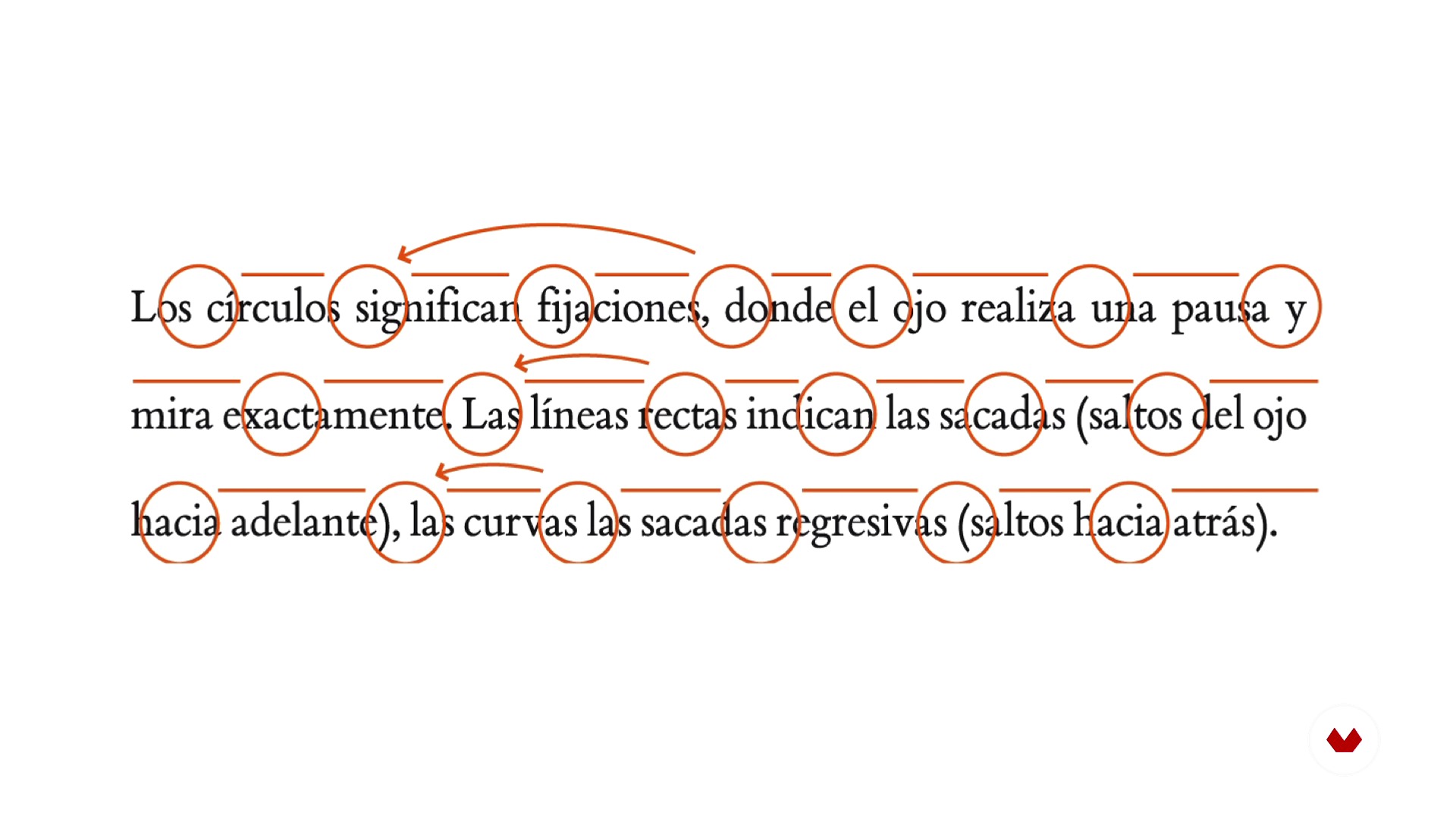
Reading and readability
4 dakika, 40 saniye
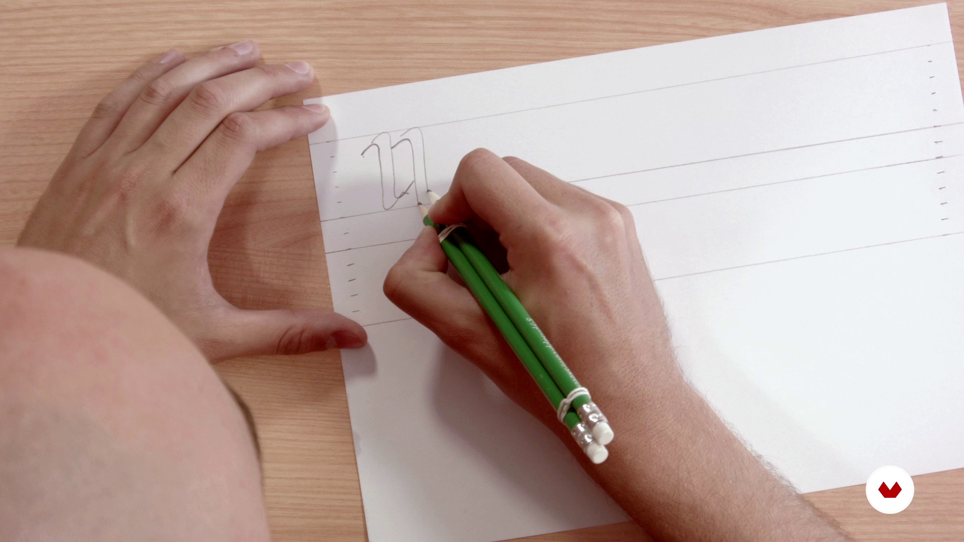
Structure and rhythm with double pencil
4 dakika, 50 saniye
Bu kursa neler dahil?
In this course of typography you will begin by laying the theoretical bases of construction and anatomy of the letter starting from basic forms, playing with the optical laws, taking into account the spacing, the rhythm and the readability.
Next, you will define the typographic form with the double pencil technique, a simple tool that will allow you to learn to manage the rhythm and structure of the letters.
Then, you will go to the digitization phase using Illustrator and Glyphs (software for Mac), for the final obtaining of a typographic font. Finally, you will learn to apply certain tweaks and adjustments to then export the new type and be able to use it on your computer.
Bu kurs için önerilen yazılım ve araçlar
Bu kursun projesi nedir?
The professors of Gliglifo will propose you a series of words taken from literature to find "their aroma" and begin to design a typeface that you can install on your computer. From there, you will already have the base to develop your own typographic system.

Kurs öğrencilerinin projeleri


Bu çevrimiçi kurs kimlere yöneliktir?
To all letter lovers.
Gereksinimler ve materyaller
You do not need any prior knowledge in typography to create your final project. As for materials, you will need a normal paper, vegetable paper, two pens, two rubber bands to join the pencils and a computer with the Glyphs and Illustrator software (although the course offers alternative programs to be able to work on the typography design).

Yorumlar
- 2 ay önce
Muy buen curso, grandes herramientas
- 2 yıl önce
Molto interessante.
- 3 yıl önce
Esperaba más de este curso, pero en cualquier caso merece la pena hacerlo porque siempre se aprende algo.
- 3 yıl önce
This course is an absolute necessity for anyone who plans to begin their journey to become a professional typeface designer.
- 3 yıl önce
Este curso es una pequeña maravilla. Muchos tips, muy buenos

İçerik
- U 1
Introduction
- Presentation
- Understand the letter, aroma and exercise
- Bibliography
- U 2
Anatomy of the letter
- Basic forms
- Optical laws
- Spacing and rhythm
- Reading and readability
- U 3
Architecture of the letter
- Structure and rhythm with double pencil
- Base drawing
- Adjustment and refinement
- U 4
Digitization
- Introduction to vectorization
- Digitization with Illustrator
- Digitization with Glyphs 1
- Digitization with Glyphs 2
- Export and testing
- U 5
Microtype, diacritics and spacing
- Microtypegraphic adjustments
- Diacritics
- Spacing between letters and end
- FP
Bitirme projesi
- Typography: Build your word
Bir Domestika kursundan neler beklenebilir?
Kendi hızınızda öğrenin
Belirli bir program olmadan ve takip edilmesi kolay bir yöntemle evden öğrenmenin tadını çıkarın. Kendi hızınızı kendiniz belirlersiniz.
En iyi profesyonellerden öğrenin
Yaratıcı sektörün en iyi uzmanlarının açıkladığı değerli yöntem ve teknikleri öğrenin.
Uzman öğretmenlerle tanışın
Her uzman, her derste açık yönergelerle, gerçek tutkuyla ve profesyonel anlayışla en iyi yaptıkları şeyi öğretir.
Sertifikalar
PLUSPlus üyesiyseniz her kurs için öğretmeninizden imzalı bir özel sertifika alın. Portföyünüzde, sosyal medyada veya istediğiniz yerde paylaşın.
Ön sıra koltukları alın
En yüksek kalitede videolar sayesinde tek bir ayrıntıyı kaçırmazsınız. Sınırsız erişim sayesinde tekniğinizi mükemmelleştirmek için bunları istediğiniz kadar izleyebilirsiniz.
Bilgi ve fikirleri paylaşın
Sorular sorun, geri bildirim isteyin veya çözümler sunun. Öğrenme deneyiminizi topluluktaki, yaratıcılığa sizin kadar tutkulu olan diğer öğrencilerle paylaşın.
Küresel bir yaratıcı toplulukla bağlantı kurun
Topluluk, dünyanın her yerinden meraklı ve yaratıcılıklarını keşfetme ve ifade etme konusunda tutkulu milyonlarca insana ev sahipliği yapıyor.
Profesyonelce hazırlanmış kursları izleyin
Domestika, yüksek kaliteli bir çevrimiçi öğrenme deneyimi sağlamak için öğretmen kadrosunu seçer ve her dersi kendi bünyesinde üretir.
SSS
A glyph is the specific visual representation of a character, which can be a letter, number, or symbol. A character is the abstract unit, while the glyph is its concrete visual form within a typeface.
The course is aimed at people with basic knowledge of graphic design or typography, so it’s intermediate level. Familiarity with visual concepts and digital tools is recommended.
You’ll need a computer with vector design software like Adobe Illustrator and preferably a specialized typography program such as Glyphs or FontLab. Tracing paper, pencils, and a scanner are also recommended.
You’ll learn how to create custom glyphs, design letters from scratch, adjust proportions, spacing, and typographic rhythm, digitize your work, and apply optical principles to enhance legibility and consistency in your fonts.
The course guides you from manual sketching and anatomical understanding to digitization and optical adjustment of each letter, using techniques like the double-pencil method, calligraphic proportions, and visual tweaks in professional software.
Typographic consistency ensures all glyphs in a font share a unified visual and expressive logic, improving communication, readability, and strengthening the visual identity of any graphic design project.
The optical center is the visually balanced point of a letter, usually slightly above the mathematical center. Adjusting based on the optical center improves the look and legibility of characters.