First foray into hyperrealism
de Adrienne Dy @aidz
- 175
- 7
- 1
Introduction
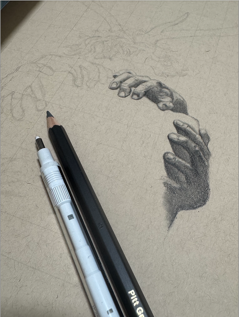
This is my first try at hyperrealism, so I decided to follow along with Mr. Dry, deviating only when my materials (and paper size) didn't allow the same techniques. It took four days (toiling on this after work). All in all, am quite happy with the result and already thinking of an original concept to draw next!

Supplies
Strathmore toned tan sketch paper (9"x12"), Pitt Graphite Matt pencils (2B to 12B), General's white charcoal pencil, a variety of erasers
Day 1: First strokes
Used the grid method to transfer the image and attempted mapping and blending on the first two hands. With the size of the paper it was hard to achieve crisp, fine lines, but I kept at it, focusing on getting the shadows and highlights right.

Day 2: Hair and fine detail
First time to try drawing hair this way, and again it helped to focus on the shadows and highlights, letting the toned paper take care of the midtones for now. I also added more hands, and started with the initial shadows on the back.

Day 3: Mapping the back
Spent a lot of time trying to map the back area accurately, using landmarks like moles as guides. It was easy to get lost over such a large area (comparatively) and I had to refine this a lot.

Day 4: Horns and highlights
Finished the horns, trying valiantly to avoid repetitive lines (a bit difficult given the available real estate vis a vis my pencil diameter - even my electric eraser proved too large for the tiny space!). Moved on to the highlights. Was very nervous about adding white charcoal but decided to trust Mr. Dry's advice on the Q&A page. I applied it slowly, wary of overdoing it. The blending stump proved useful in smoothing the back - I really tried to go for that "skin glow"! - while I kept the highlights on the horns a bit rougher to imply the texture. Edges could be crisper, maybe something to aim for in a bigger project. As I said, all in all I am happy with this and surprised with how much detail and realism can be achieved with a little bit of patience and attention to detail. Would love to try the techniques on another concept soon. Grateful for the lessons and guidance!


1 comentário
jonodry
Professor PlusIsso é fantástico! Acho que a diferença de materiais realmente criou uma oportunidade para a criatividade neste projeto. O resultado final é algo muito mais estilizado, mas ainda mantendo alguns elementos de realismo. Adorei a sutileza que você alcançou nos destaques no verso; a iluminação é maravilhosamente enfatizada e cria belos momentos de volume. Lembre-se de tomar cuidado com a grade; tente pressionar com ainda mais suavidade ao desenhá-la, caso contrário, pode causar alguns problemas mais tarde no desenho. Também pode ser útil experimentar diferentes tipos de algodão e pincéis para descobrir quais criam misturas mais suaves. Mas, no geral, adorei o resultado do seu projeto!
Visualizar original
Ocultar original
Faça login ou cadastre-se Gratuitamente para comentar