My project for course: Color Theory: How to Apply It to Your Images
przez Gabriele La Monaca @gmanneken
- 137
- 1
- 0

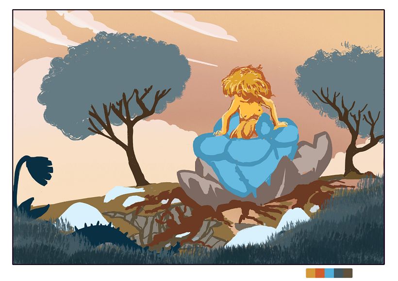
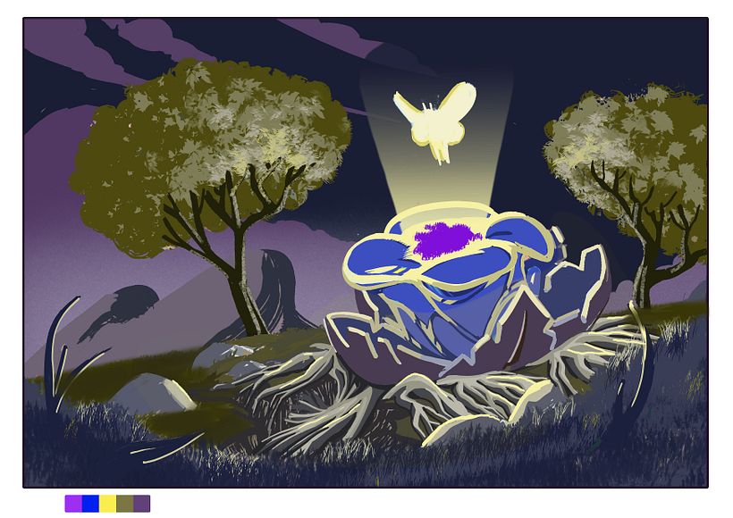
Above I started with the "happy" version, took a while to identify the palette using the color wheel. Choosing colors is the most difficult step in general. After few experiments I opted for using orange/cyan contrast and red to bridge the two. Once I established the palette I layed down the colors in a very rough version in order to check the contrasts.
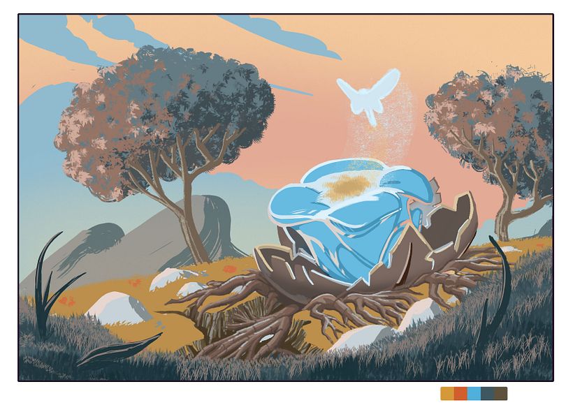
While I was refining the "happy " version i decided to simplify the entity who was coming out from the flower and added instead elements of the background to improve detail and rithm. I could've added some of the red reflections I applied on the trees on the grass as well but it seemed to me a little bit too much, thought I might be running the risk of giving too muche detail to background elements thus making the focus of the image less readable.


0 komentarzy
Zaloguj się lub dołącz bezpłatnie, aby móc komentować