Visual identity for Klidné Místo (translates as Calm Space)
Visual identity for Klidné Místo (translates as Calm Space)
przez jitka @jitka
- 63
- 0
- 0
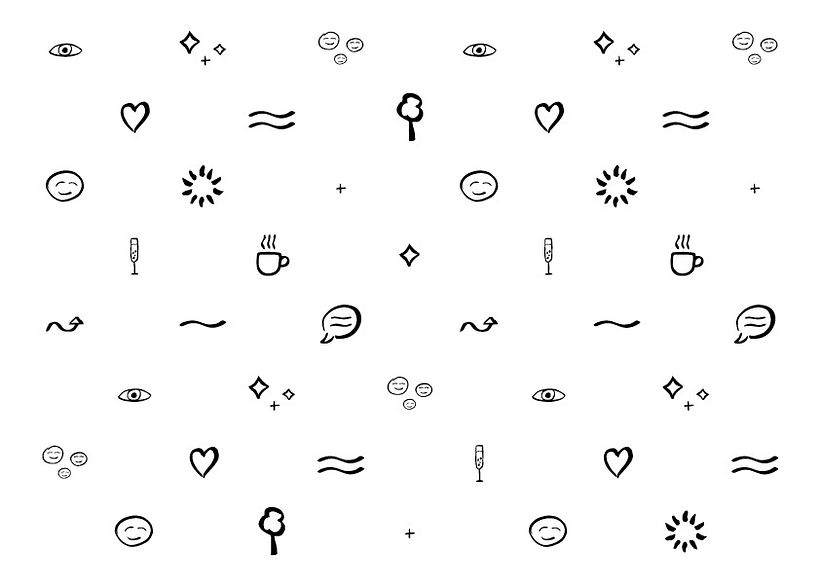
The visual identity reflects the diversity of themes and activities that Klidné Místo does (personal coaching, workshops, lifestyle and health consultancy, personal training). Each symbol/icon represent the different aspects of services that Klidné Místo does. The beautiful thing about the symbols is that each symbol by meaning overlaps different areas of client's services. Client is very happy with the fact, that she can use the symbols as she likes according to whatever workshop she is currently doing.
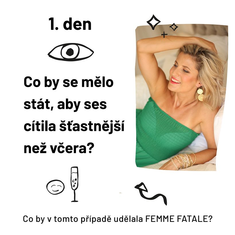
This post says:
-
1st day
What should happen so you feel happier than yesterday?
In this case, what would FEMME FATALE do?
-
The post is part of a 2 week online workshop called FEMME FATALE. Each day = one post with a message.
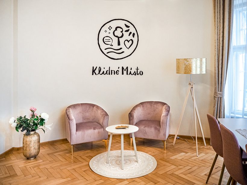
I hand-painted (with the help of a data projector) the logo in the office, as well as symbols on different spots around the office.
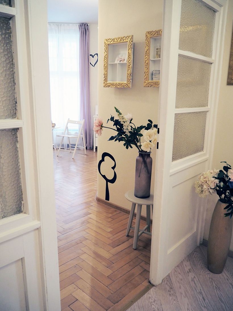
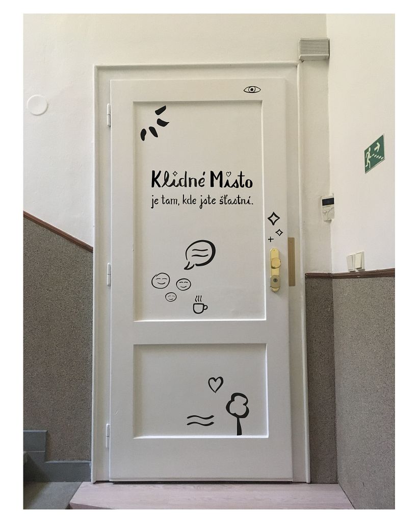
I was also working on naming of the project, Klidné Místo translates as Calm Space/Place. I persuaded the client to use something that represents how she wants her clients to feel after working together. I also created the tagline, that can been see on the entering door - Klidné Místo je tam, kde jste šťastni. it translates as Calm Space/Place is where you are happy..
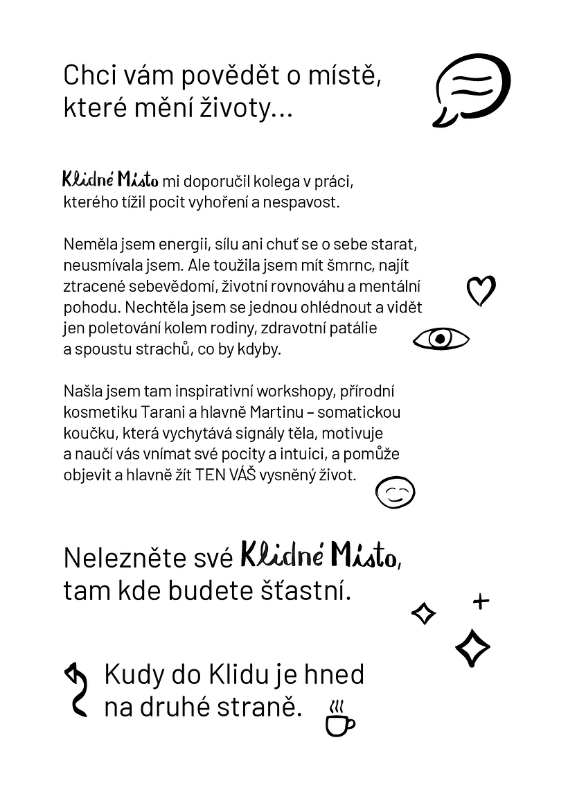
The leaflet says a story of a client (Klidné Místo's ideal client) - how she felt before knowing Klidné Místo and how it changed her life after working with Klidné Místo. Top headline says "I want to tell you about a place that changes lifes...", second headline says "Find your Calm Space/Place, where you will be happy." Unfortunately, the client wasn't quite ready to be this creative. :D


0 komentarzy
Zaloguj się lub dołącz bezpłatnie, aby móc komentować