Mikrotypografia: podstawy struktury czcionek
A course by David KimuraProjektant wydawniczy i typograf
A course by David Kimura, Projektant wydawniczy i typograf

Poznaj podstawy projektowania edytorskiego
In this online course, graphic and editorial designer David Kimura teaches you the art of composing texts correctly, paying special attention to formatting.
Learn the fundamentals of typographic composition, from the space between characters to text justification. David also explains how to format line spacing and paragraph styles, along with some tricks of the trade to solve common problems when designing texts.
Czego nauczysz się na tym kursie online?
llekcji: 18 & liczba dodatkowych zasobów: 10
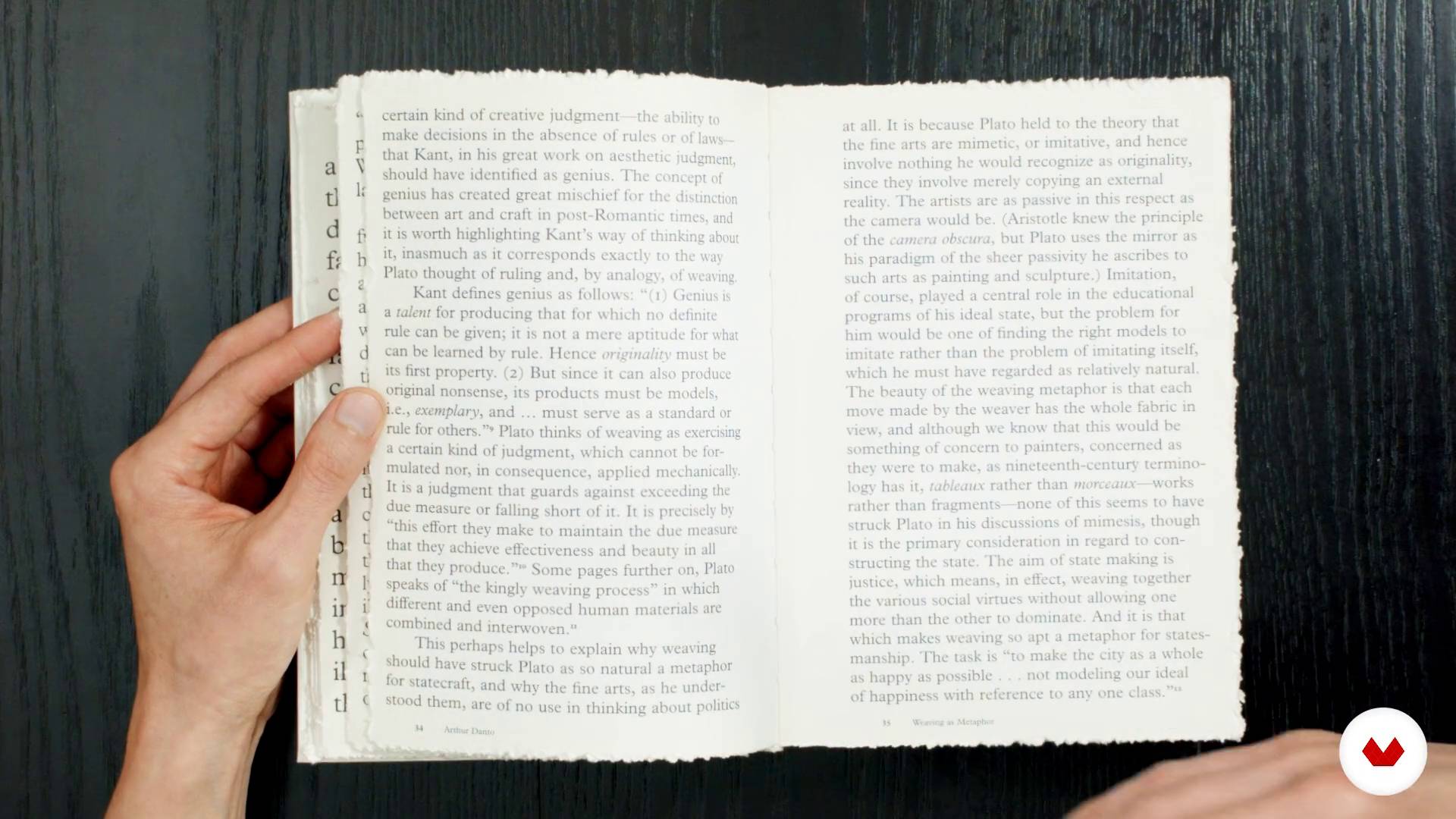
Influences: Good and bad
13 min, 1 sekunda

Structure of the course
1 minuta, 50 sek.
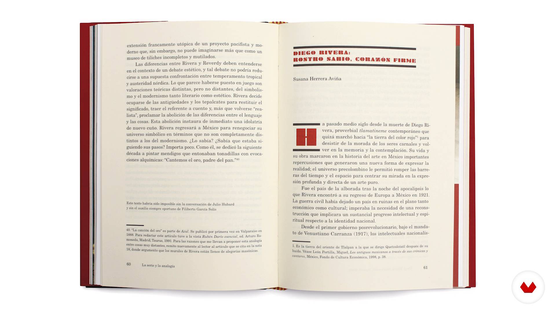
Definition of objectives and content analysis
5 min, 21 sek.
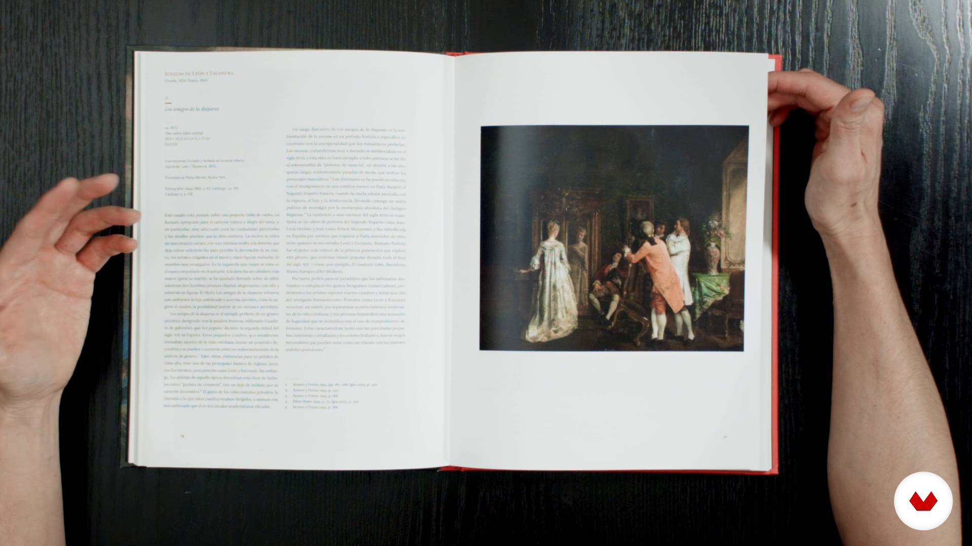
Typography as part of a whole
6 min, 56 sek.
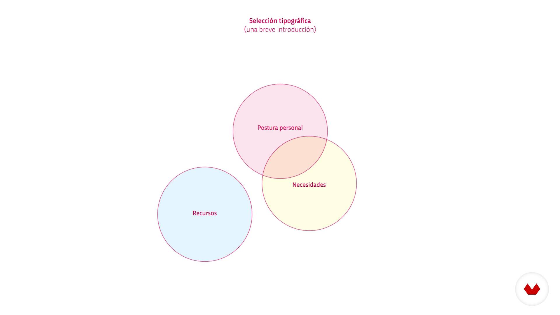
Typographic selection
5 min, 34 sek.
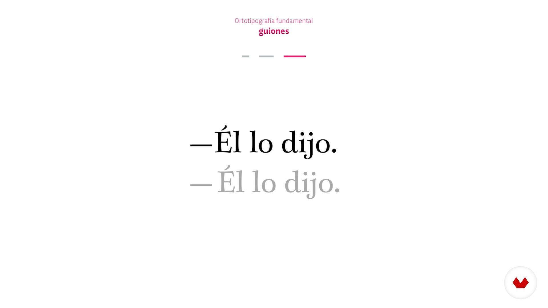
Fundamental orthotypography
6 min, 6 sek.
Co obejmuje ten kurs?
David Kimura begins the course by introducing himself and his work, along with an overview of what the course entails.
Discover why typography is so important and how small decisions can have a big impact on text.
Learn the basic concepts that every designer should know before starting an editorial project. David explains essential ideas such as typographic selection and fundamental orthotypography.
Next, dive into microtypography. See how to correctly space characters and look at the importance of the body text, line spacing, and text box width, as well as the relationship between them and the typographic selection.
Find out how to justify texts to the left and on both sides before looking at paragraph and character styles.
Finally, David covers the most common errors made in the text design process and how to solve them without affecting the paragraph format.
Wrap up by formatting the text in a galley proof applying everything you've learned.
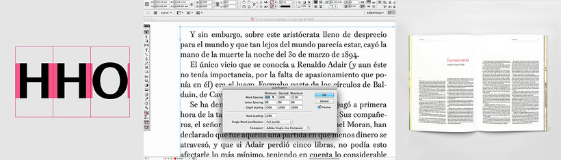
Recommended software & tools for this course
What is this course's project?
Design and format the text of a literary magazine.
Projekty uczestników kursu


Who is this online course for?
Designers and anyone interested in typography and editorial design.
Requirements and materials
Basic notions of editorial design and a working knowledge of InDesign are recommended.
As for materials, you need a computer with access to InDesign.

Oceny
- matheusvalente_qPLUS10 dni temu
Um ótimo curso com ensinamentos valiosos!
- 7 miesięcy temu
Un buen curso sobre la disciplina de la microtipografía.
- 10 miesięcy temu
Muy intersante el curso, estoy ingresando al mundo de la tipografía y hasta ahora me parece interesante la microtipografía porque es algo nuevo para mí y útil.
- rok temu
EXCELENTE CURSO! La selección de los contenidos es muy completa y adecuada al nivel. Muy buena calidad expositiva, con lenguaje claro y conciso hace comprensibles los contenidos. Solo sugeriría mejores precisiones en el Software (InDesign)
- enrqalejandroPLUSrok temu
Un curso fantástico, muy bien explicado y muy completo para cualquiera que quiera iniciarse en esta profesión.

Był współzałożycielem studiów Kimera i Bésame Mucho. Od 2005 roku wsp...
Zawartość
- Cz.1
Who I am?
- Who I am?
- Why is typography important?
- Influences: Good and bad
- Structure of the course
- Cz.2
Preliminary and first decisions
- Definition of objectives and content analysis
- Typography as part of a whole
- Typographic selection
- Fundamental orthotypography
- First decisions for our project
- Cz.3
The text box
- Space between characters
- Other basic typographical parameters
- Design a justified text on the left
- The justified texts on both sides and justified values I
- The justified texts on both sides and justified values II
- Preparing the style palette
- Cz.4
Text formation
- Typical problems during training
- Resources to eliminate problems
- Formation of the text of the exercise
- PK
Projekt końcowy
- Microtypegraphy: fundamentals of typesetting
Kurs Domestika - czego możesz się spodziewać?
Nauka we własnym tempie
Radość z nauki w domu, bez wyznaczonych terminów. Szybko przyswajasz wiedzę, a swój plan zajęć układasz wedle uznania.
Nauka z najlepszymi ekspertami
Przydatne metody oraz ciekawe techniki przedstawione i wyjaśnione przez najlepszych specjalistów z branży kreatywnej.
Doświadczeni prowadzący
Wszyscy prowadzący są specjalistami w swojej dziedzinie. Przekazują wiedzę z pasją, tłumaczą zagadnienia w jasny sposób, a podczas zajęć kładą nacisk na praktyczne zastosowanie zdobytej wiedzy.
Certificates
PLUSIf you're a Plus member, get a spersonalizowany certyfikat signed by your teacher for every course. Share it on your portfolio, social media, or wherever you like.
Miejsca w pierwszym rzędzie
Wysoka jakość wideo sprawia, że nie umknie Ci żaden szczegół. Dzięki nieograniczonemu dostępowi możesz obejrzeć nagrania tyle razy, ile potrzebujesz, aby przyswoić nowe umiejętności.
Dzielenie się wiedzą i pomysłami
Zadawaj pytania, nie wahaj się poprosić o opinię czy poszukać rozwiązania. Podziel się swoimi wrażeniami z nauki z pozostałymi członkami społeczności, którzy tak jak Ty uwielbiają tworzyć.
Łączność z kreatywną społecznością z całego świata
Społeczność kilku milionów użytkowników z całego świata, pełnych ciekawości oraz chęci odkrywania i wyrażania swojej kreatywności.
Profesjonalna realizacja kursów
Domestika starannie dobiera prowadzących i produkuje wszystkie kursy we własnym zakresie, aby zapewnić wysoką jakość nauki online.
Często zadawane pytania
Microtypography deals with the fine details of spacing, alignment, and character proportions. When applied correctly, it boosts readability and visual appeal, raising the professional quality of any publication.
This course is designed for those with basic design or editing knowledge, perfect for anyone wanting to dive deeper into microtypography and typographic quality in editorial work.
It’s recommended to have some basic graphic design skills and familiarity with tools like InDesign, but advanced typography experience isn’t required.
You’ll learn how to analyze and apply microtypographic principles, adjust spacing, choose suitable fonts, structure information hierarchies, and solve typographic problems to enhance books, magazines, and other printed materials.
The course teaches you how to apply orthotypographic rules, fine-tune justification, margins, styles, and spacing to create visually balanced, easy-to-read publications across both digital and print formats.
You’ll need a computer with layout software like Adobe InDesign, and optionally some editorial text samples or your own projects to practice on.
Microtypography focuses on details like kerning, tracking, proper use of dashes, quotation marks, and numerals — all crucial for readability and the professional look of any editorial text.