
Infografika na ziewanie
A course by relajaelcocoArtyści infografik i projektanci graficzni
A course by relajaelcoco, Artyści infografik i projektanci graficzni

Stwórz imponującą infografikę o najbardziej kuriozalnych przyczynach śmierci
Win the battle against boring data. In this online course, Francesco and Pablo teach you the methodology to effortlessly turn a handful of information into an infographic poster. Design your own infographic about the stupidest deaths on the planet, from the choice of data to the final touches, working on the techniques with a relaxed and fun approach that you can apply in your future as a 21st century infographics artist.
Czego nauczysz się na tym kursie online?
llekcji: 16 & liczba dodatkowych zasobów: 16
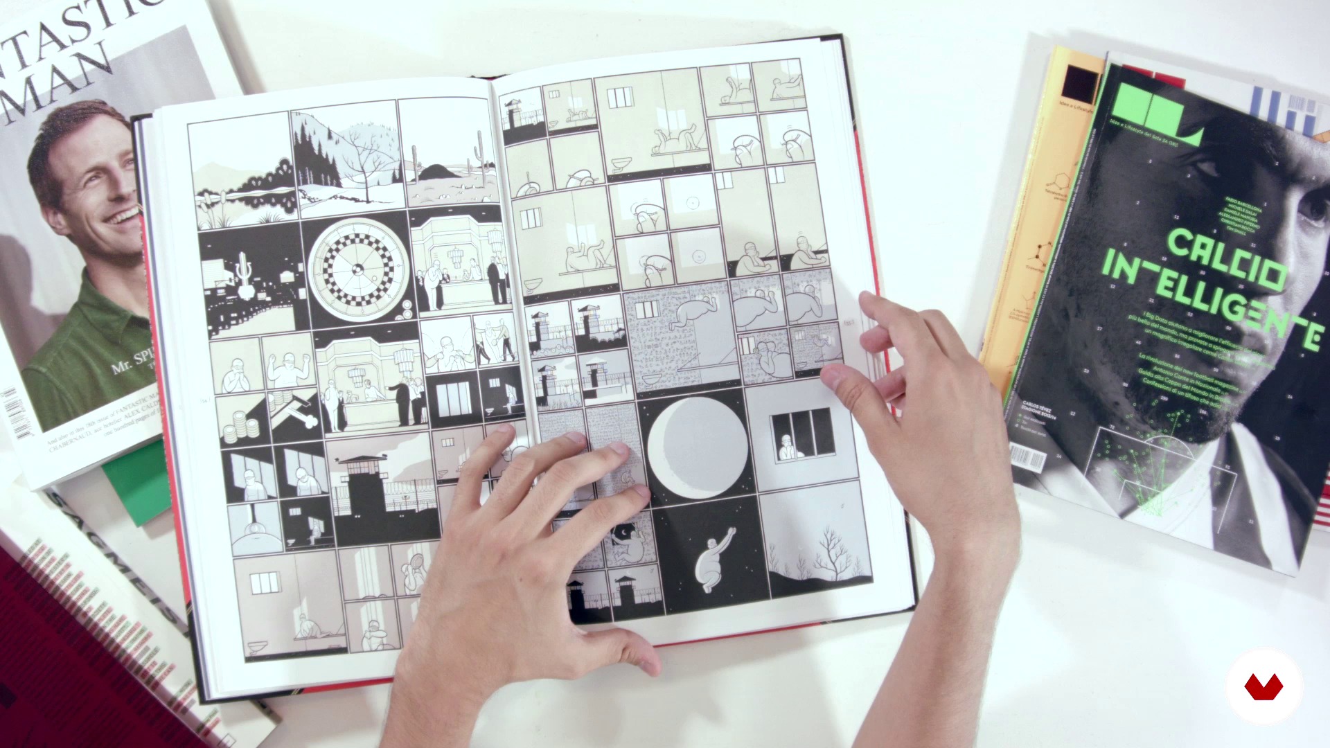
Graphic references
10 min, 46 sek.

The project: An infographic poster about the most stupid deaths
1 minuta, 19 sek.
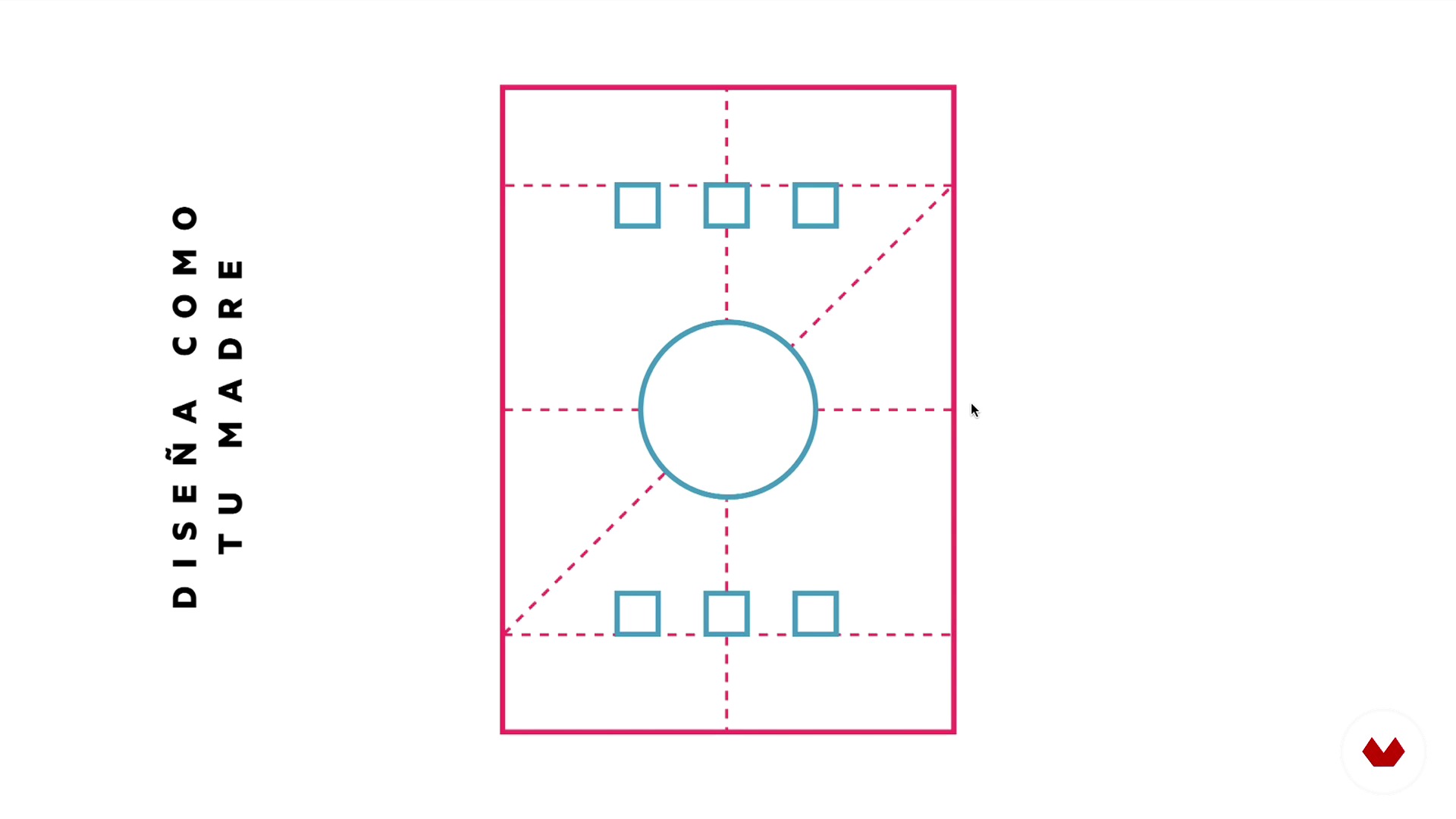
The infographic structures
5 min, 16 sek.
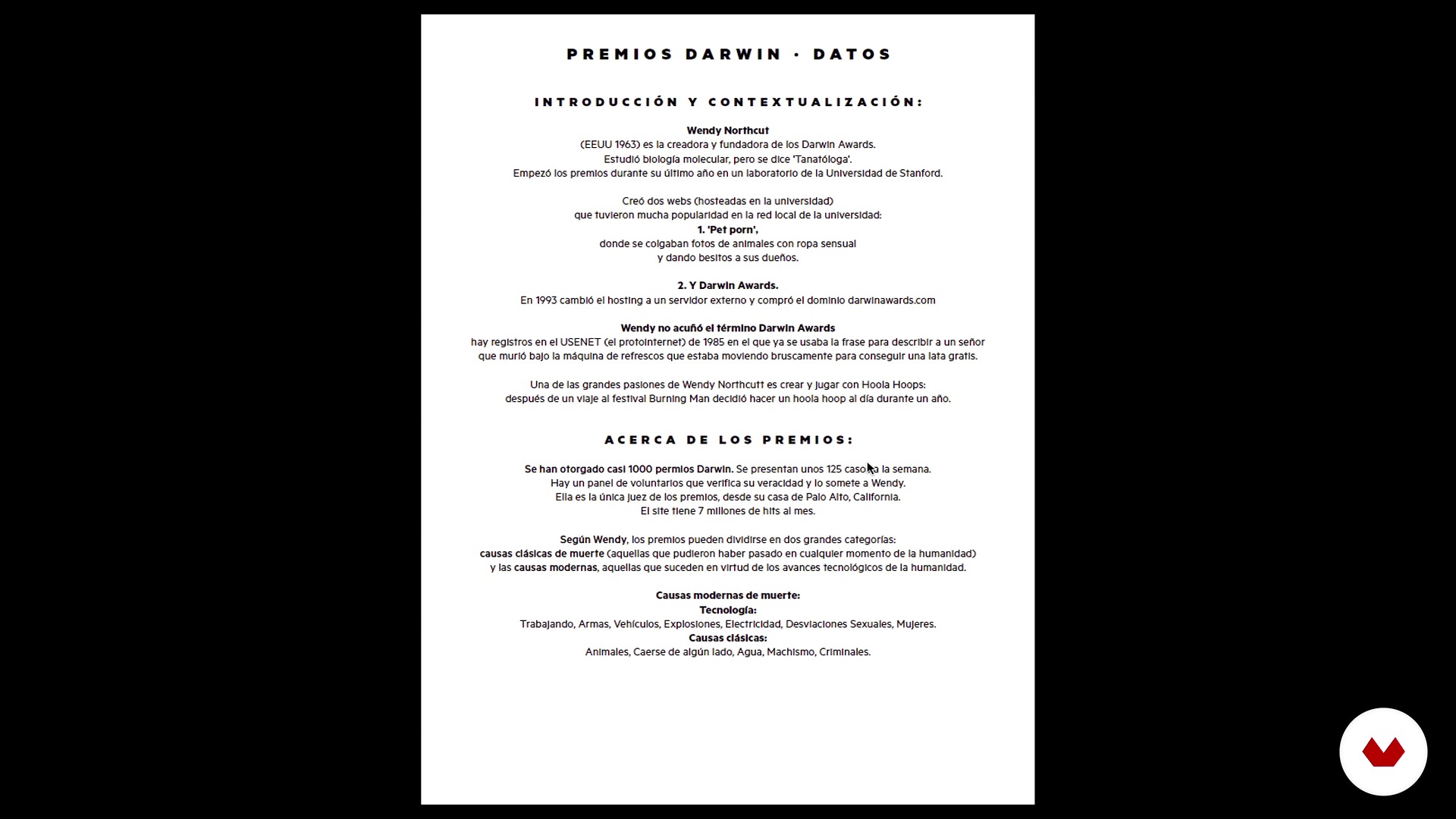
How to choose the data
4 min, 44 sek.

Conceptualization
2 min, 17 sek.
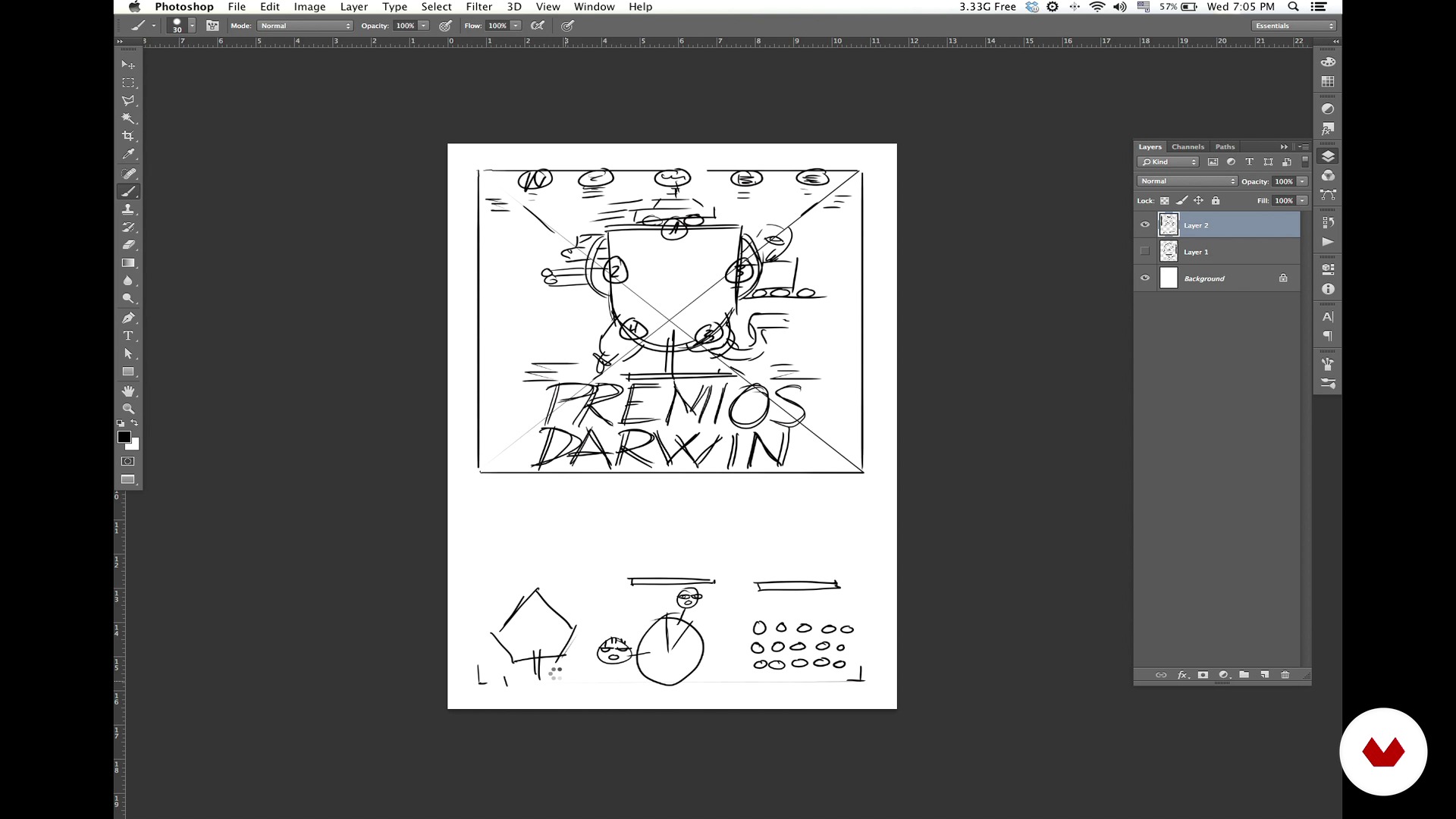
Sketches, reticles and storytelling
12 min, 20 sek.
Co obejmuje ten kurs?
Learn to develop a cool infographic and not die trying. The experts at Relajaelcoco provide you with a basic kit of tricks and tools to brighten up your projects, finding out how anti-yawning data is sought and how you can organize and transform it into an impressive infographic.
Explore the entire infographic workflow:
- The referents.
- Choice of information and data analysis.
- Sketch and structure of the grid. The secret to the perfect reticle!
- Typography, geometric vector, and color range.
- Preparation of the material and final touches.
Also discover tricks to organize yourself and divide your work into smaller, more manageable tasks. As if that were not enough, do it all while laughing in the face of death, in a graphic sense.
Recommended software & tools for this course
What is this course's project?
Make a high-impact infographic poster step by step, to allow you to graphically explain the essence of the evolution of the species—the Darwin Awards, with the Top 5 most stupid deaths on the planet.

Projekty uczestników kursu


Who is this online course for?
Don't worry if infographics are not really your thing. In a few years, you may regret not having taken advantage of this course. So get ready, you'll thank yourself later. The course is open to anyone with the motto "Divide et impera," because it's the only way to live in the world of infographics.

Requirements and materials
You need basic knowledge of Adobe tools, you'll be fine with a bit of Photoshop, InDesign, and Illustrator. If you've worked with typography and visual hierarchy before, even better. If not, there's a first time for everything!
For materials, all you need is a computer and your brain in gear.
Oceny
- rok temu
Es un curso genial. La creatividad de Relajaelcoco no tiene límites y el sentido del humor es básico para una enseñanza relajada como ellos, jeje..
- dansolfrei_91PLUS2 lata temu
Excelente, me está ayudando mucho para una infografía de la universidad!
- 2 lata temu
Excelente curso
- 2 lata temu
Excelente curso.
- 2 lata temu
Exclente, muy buena dinamica para mostrar sus ejemplos, recomendado

Relajaelcoco to studio graficzne, którego ideą jest szczęście i dobre wibracje. Nasz proces pracy nie istniałby bez muzyki, którą pochłaniamy każdego dnia. To racjonalny proces, oparty na ko...
Zawartość
- Cz.1
Introduction
- Introduction
- Definition of "relaxed infographics"
- Graphic references
- Cz.2
Let's do it
- The project: An infographic poster about the most stupid deaths
- The infographic structures
- How to choose the data
- Cz.3
How to count it with data
- Conceptualization
- Sketches, reticles and storytelling
- Cz.4
The graphic style
- The geometric vector
- The chromatic palette
- The typographical choice
- Cz.5
This is how an infographic is done
- The preparation of the file
- The relationship between data and reticles
- Organization of the material
- Cz.6
This is an infographic II
- We start with the headline
- Realization of the illustrated graphics
- PK
Projekt końcowy
- Anti-smash infographics
Kurs Domestika - czego możesz się spodziewać?
Nauka we własnym tempie
Radość z nauki w domu, bez wyznaczonych terminów. Szybko przyswajasz wiedzę, a swój plan zajęć układasz wedle uznania.
Nauka z najlepszymi ekspertami
Przydatne metody oraz ciekawe techniki przedstawione i wyjaśnione przez najlepszych specjalistów z branży kreatywnej.
Doświadczeni prowadzący
Wszyscy prowadzący są specjalistami w swojej dziedzinie. Przekazują wiedzę z pasją, tłumaczą zagadnienia w jasny sposób, a podczas zajęć kładą nacisk na praktyczne zastosowanie zdobytej wiedzy.
Certificates
PLUSIf you're a Plus member, get a spersonalizowany certyfikat signed by your teacher for every course. Share it on your portfolio, social media, or wherever you like.
Miejsca w pierwszym rzędzie
Wysoka jakość wideo sprawia, że nie umknie Ci żaden szczegół. Dzięki nieograniczonemu dostępowi możesz obejrzeć nagrania tyle razy, ile potrzebujesz, aby przyswoić nowe umiejętności.
Dzielenie się wiedzą i pomysłami
Zadawaj pytania, nie wahaj się poprosić o opinię czy poszukać rozwiązania. Podziel się swoimi wrażeniami z nauki z pozostałymi członkami społeczności, którzy tak jak Ty uwielbiają tworzyć.
Łączność z kreatywną społecznością z całego świata
Społeczność kilku milionów użytkowników z całego świata, pełnych ciekawości oraz chęci odkrywania i wyrażania swojej kreatywności.
Profesjonalna realizacja kursów
Domestika starannie dobiera prowadzących i produkuje wszystkie kursy we własnym zakresie, aby zapewnić wysoką jakość nauki online.
Często zadawane pytania
You’ll learn how to create effective infographics, apply visual systems, develop concepts, select color palettes, organize data, and work with illustration, typography, and urban maps to communicate information visually in a professional way.
This is an intermediate-level course, perfect for those with basic graphic design or illustration skills who want to deepen their knowledge in creating infographics and visual resources.
You’ll need a computer with access to graphic design software (like Adobe Illustrator or similar) and basic digital tool skills to get the most out of this course.
The course covers concept development, sketching, icon systems, color palettes, vector illustration, geometric composition, urban maps, digital lettering, visual storytelling, and infographic project management.
You’ll learn to manage projects from research through final artwork, apply effective workflows, define visual concepts, and organize data for clients or editorial publications.
Yes, the course includes practical exercises like designing infographic posters, urban maps, micro-infographics, and icon systems, blending theory and practice to strengthen your skills.
You’ll learn how to define and apply cohesive color palettes using color theory, the color wheel, and CMYK parameters to create strong visual identity and storytelling in your projects.