
Van het etiket tot de typografie
A course by Type-Ø-TonesLettertypeontwerpers
A course by Type-Ø-Tones, Lettertypeontwerpers

Maak je eigen alfabet van een gevonden label
Many of the signs that we find on the street or in the advertising of yesteryear and that fascinate us are those that are well drawn, originally by hand. And it is because they underlie a coherent application of basic rules essential for design of letters and that determine their structure, appearance and the relationship between them.
In this course, with the typographers Josema Urós and Laura Meseguer (Type-Ø-Tones), you will learn to analyze "found" labels, deconstruct them and create new characters to generate your own labels, marks or even a complete alphabet.
Wat leer je tijdens deze online cursus?
18 lessen & 6 aanvullende bronnen
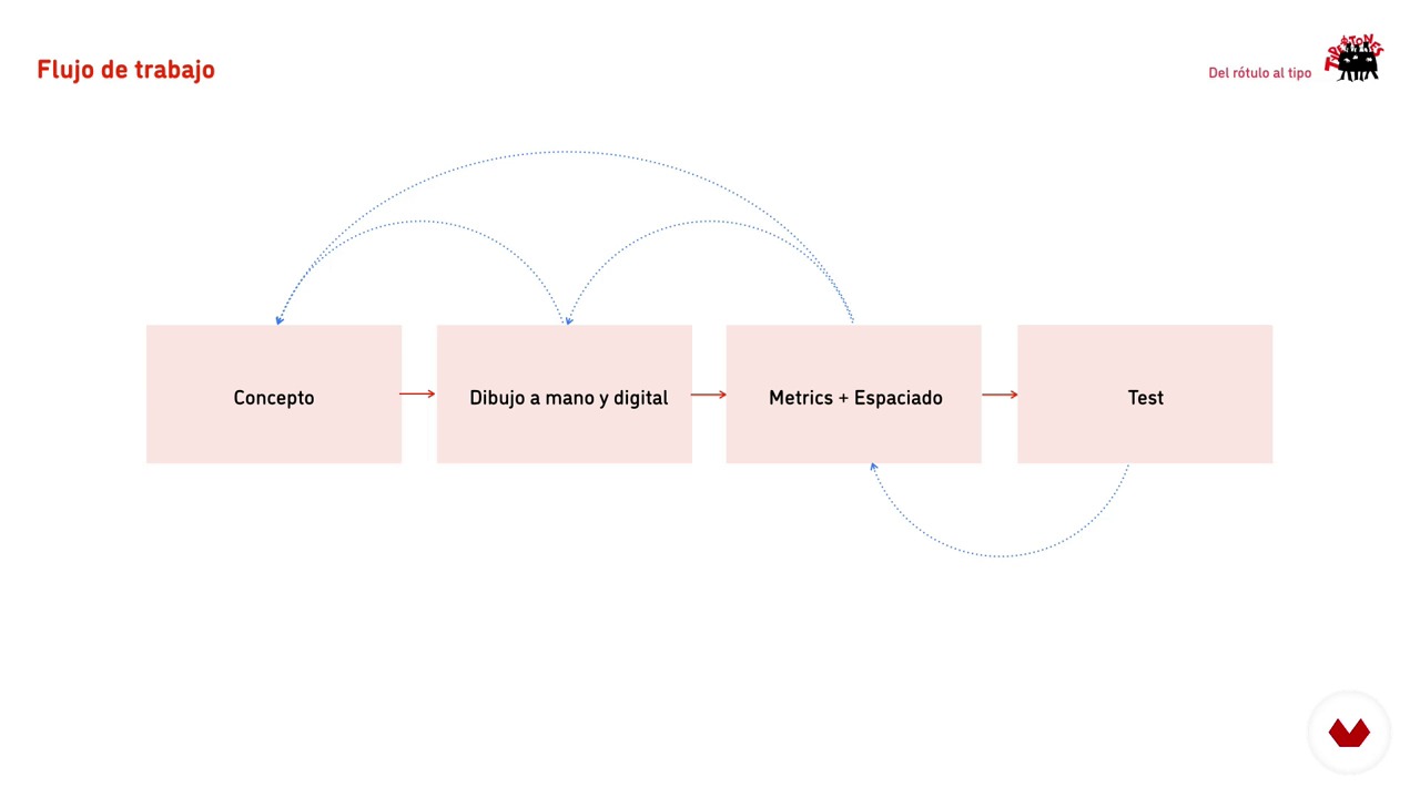
Production flow
3 minuten, 27 seconden
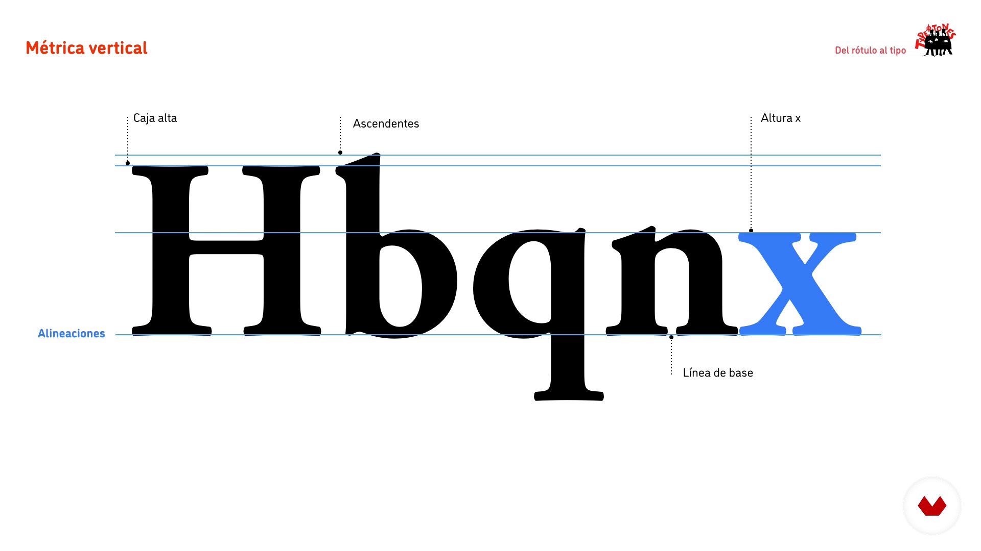
Vertical metric
1 minuut, 46 seconden
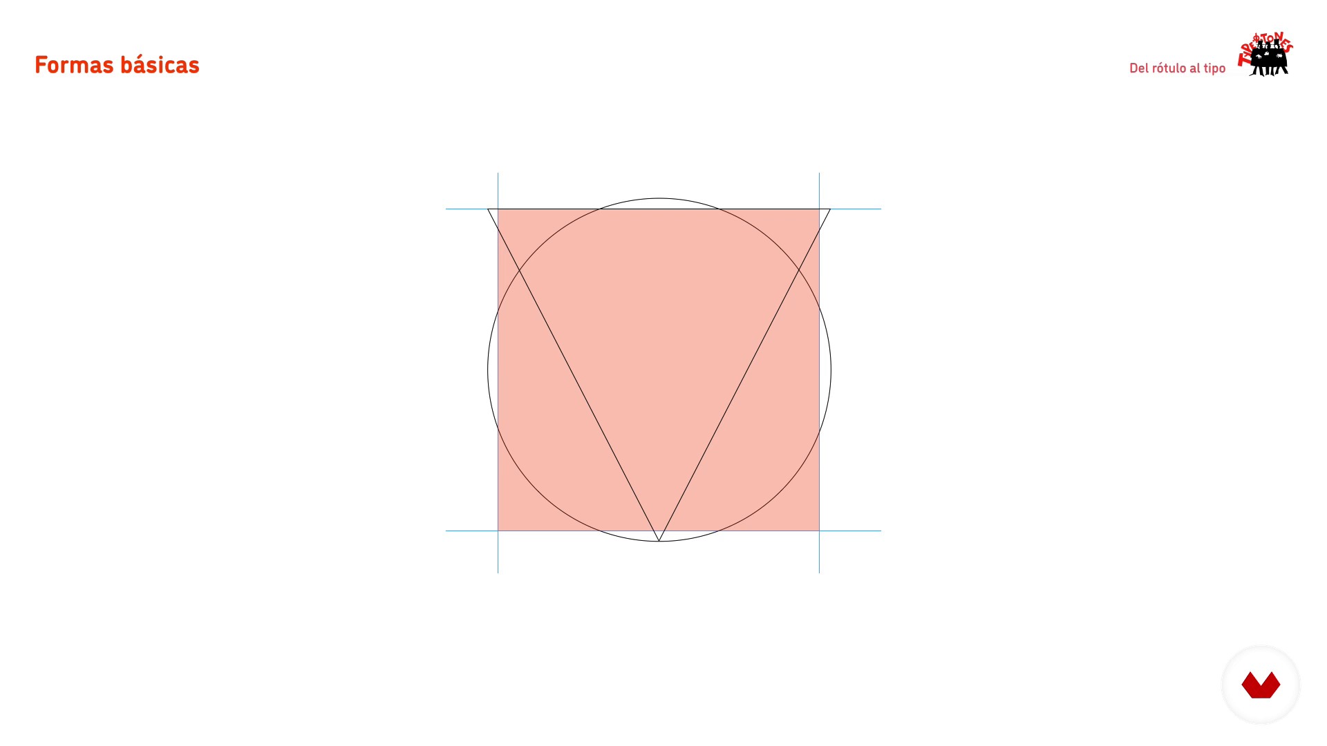
Basic forms and interior space
2 minuten, 31 seconden
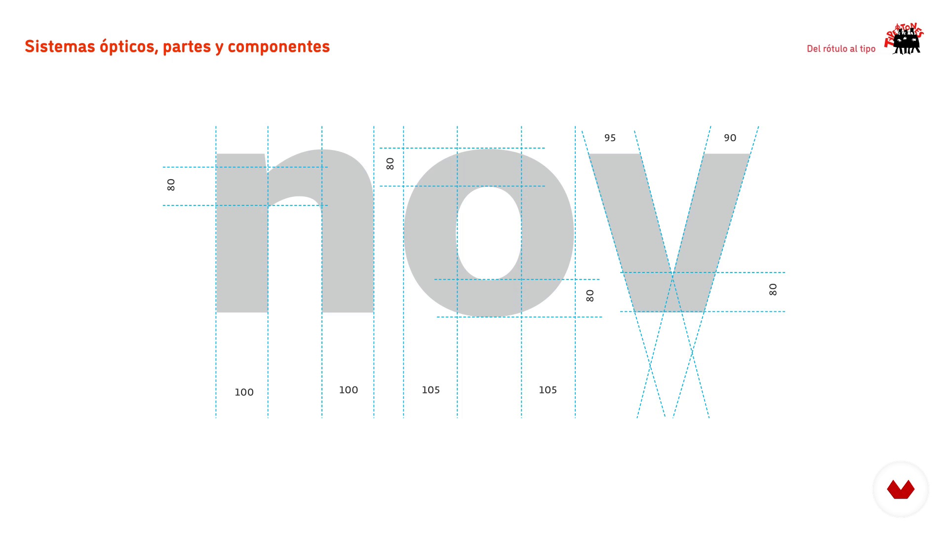
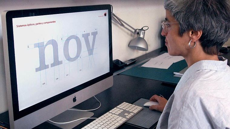
Optical systems, parts and components
4 minuten, 59 seconden
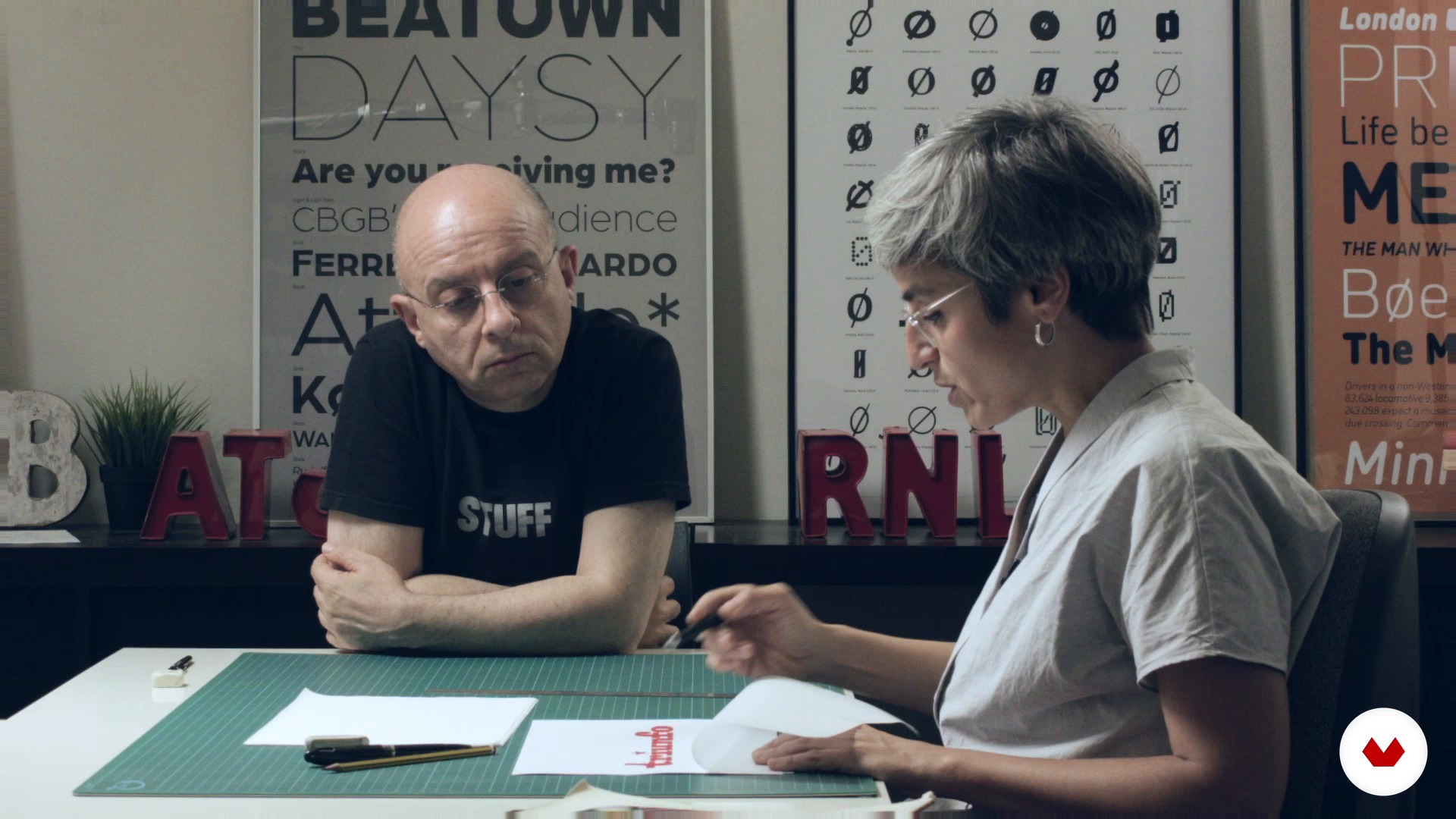
Sketching by contour 1
18 minuten, 37 seconden
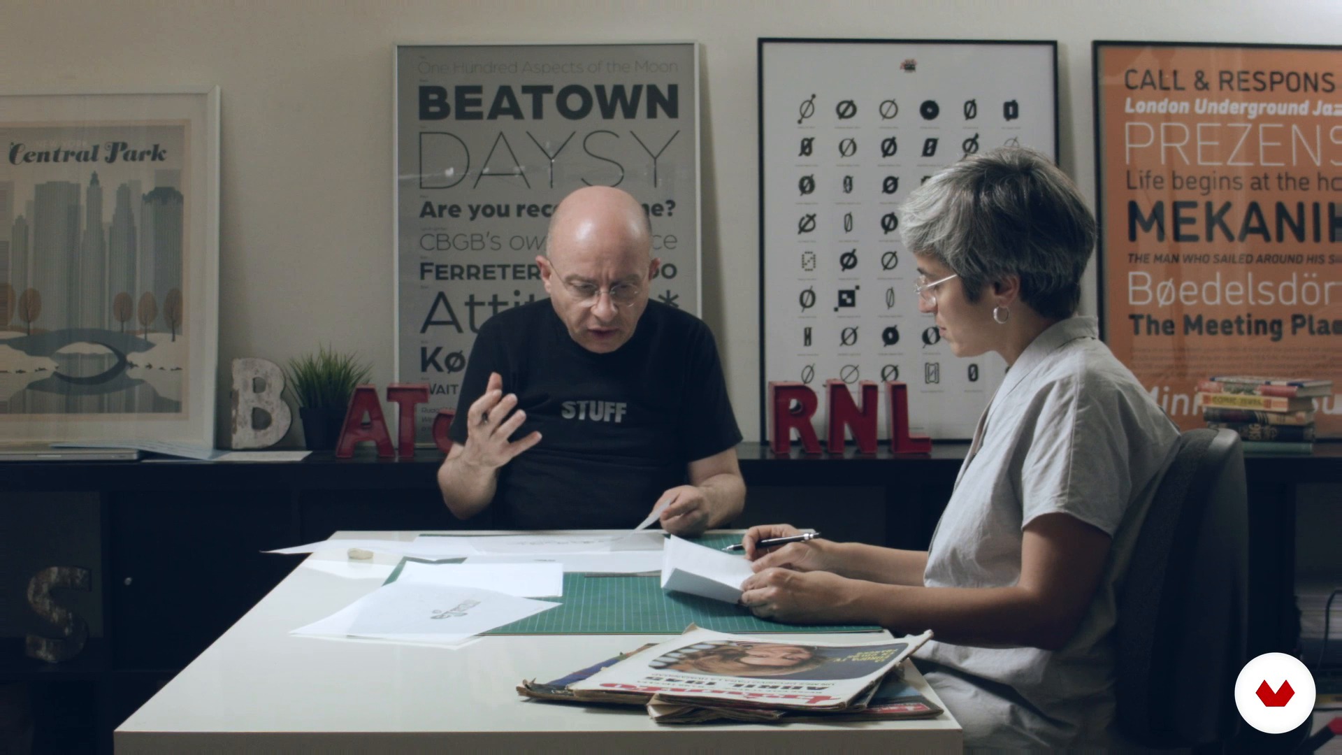
Sketching by contour 2
14 minuten, 58 seconden
Wat is inbegrepen in deze cursus?
You will start discovering the work of Laura and Josema, their work environment, the tools necessary to carry out the course and how to use them.
Next, you will learn the basic principles of alphabets design using the label as one of the possible sources of inspiration for type design. In this review by the methodology of the letters you will know the flow of production, the vertical metric, the basic forms, the interior space and the optical adjustments.
Later you will make the analog sketching of your own alphabet by contour. Once you have it digitized, you will take it to Illustrator to turn it into vectorial drawing.
To finish you will learn how to draw unique or special characters, create uppercase and give the final adjustments to your final project.

Recommended software & tools for this course
What is this course's project?
You will develop a keyword from which you can design the rest of the characters of your alphabet. Traditionally Hamburg has been used and some derivatives, Hamburgefonts, Hamburgevons and Hamburgefontsiv, but the challenge is to find yours.
Projecten van studenten van de cursus


Who is this online course for?
To anyone who is curious to know how typographies and graphic design students are designed to have an interest in understanding how the architecture of the letter is.
Requirements and materials
For the analog part you will need mechanical pencils, soft pencil, eraser and onion paper. For the digital part, a computer with a vector drawing software installed.
It is essential to know how to draw by hand and have knowledge of vector drawing.
Beoordelingen
- 1 jaar geleden
it would have been superb if the course had an English audio translation
- 1 jaar geleden
If there were English audio, it would be very helpful for me to learn this course.
- 2 jaar geleden
Muy bueno
- 2 jaar geleden
Very informative and easy to follow!
- 2 jaar geleden
El curso está muy bien explicado. Sin embargo, me gustaría que lo actualizasen y quizás que contemplen más situaciones ej.: Que pasa si el rótulo elegido no tiene descendentes, o ascendentes, o como determinar que tipo de modificaciones le haremos a la letra de la que partimos. De cualquier manera el curso esta muy bien y es un gran punto de partida para diseñar tipografias.

Hij werd in 1956 geboren in Barcelona, een stad die hij aanbidt en die hij om de twee jaar niet langer dan twee weken probeert te verlaten.
...
Inhoud
- U1
Introduction
- Who we are and course objectives
- Our influences: examples of alphabets extracted from "lettering"
- U2
Basic principles of the design of alphabets
- Production flow
- Vertical metric
- Basic forms and interior space
- Optical systems, parts and components
- U3
Analogue sketching and preparation to digitize
- Sketching by contour 1
- Sketching by contour 2
- U4
Vector drawing
- Prepare the document in Illustrator
- Drawing by parts
- Drawing the first series
- Drawing of the derived characters 1
- Drawing of the derived characters 2
- U5
Complete the project and ... beyond!
- Drawing of 'unique' or 'special' characters
- Capital letters
- Fine adjustments. Space, print and correct
- The spacing
- Complete the alphabet?
- EP
Eindproject
- From the Label to the Typography
Wat kan je verwachten van een cursus van Domestika
Leer in je eigen tempo
Geniet van thuis leren, zonder lesroosters en in je eigen tempo. Jij beslist wanneer je verder gaat met het volgende onderdeel.
Leer met de beste professionals
Leer de meest bruikbare methoden en technieken van de beste professionals in de creatieve industrie.
Ontmoet deskundige docenten
Iedere docent brengt kennis met passie over, biedt duidelijke uitleg en een professioneel perspectief bij elke les.
Certificates
PLUSIf you're a Plus member, get a persoonlijk certificaat signed by your teacher for every course. Share it on your portfolio, social media, or wherever you like.
Zorg dat je op de voorste rij zit
Dankzij de hoge kwaliteit van de video's mis je geen enkel detail. Dankzij de onbeperkte toegang kun je de lessen zo vaak bekijken als nodig is om je vaardigheden te perfectioneren.
Deel kennis en ideeën
Stel vragen, krijg feedback en bied oplossingen aan. Deel je leerervaringen met andere studenten in de community die net als jij een passie hebben voor creativiteit.
Maak contact met een wereldwijde creatieve community
Deze community heeft miljoenen gebruikers van over de hele wereld, nieuwsgierig en enthousiast om hun creativiteit te verkennen en te uiten.
Geef cursussen op een professionele manier
Domestika selecteert zorgvuldig haar docenten en produceert iedere cursus in eigen huis om een uitstekende online leerervaring te garanderen.
Veelgestelde vragen
You’ll learn to create custom alphabets, analyze urban references, develop characters with decorative elements, and apply optical adjustments and metrics to ensure consistency and readability in typographic projects—from hand sketching to professional digitalization.
The course is aimed at people with basic design knowledge who want to deepen their skills in intermediate-level typographic and lettering creation processes, including manual techniques, optical adjustments, and digitizing.
You’ll need paper, pencil, tracing paper or onion skin, a scanner or camera to digitize sketches, and access to Adobe Illustrator or similar vector software for digitizing and refining characters.
The course teaches hand sketching, using tracing paper, scanning originals, vectorizing in Illustrator, organizing layers, and adjusting geometric shapes and typographic proportions.
You’ll learn how to analyze and extract distinctive features from urban signs and plaques in Barcelona to inspire and support the design of custom alphabets and typographic systems.
The course explains how to spot and fix visual imperfections through optical adjustments in proportions, overshoots, stroke weights, and spacing, enhancing harmony and legibility of the alphabet.
Yes, you’ll study structural differences, contrast, and adjustment needs between serif and sans serif typefaces, applying specific design criteria depending on the chosen style.