


Illustration Tutorial: How to Use Light

Learn how to use light, and how to depict it according to the your colors in your llustration, with Pablo Velasco
Orange surrounded by dark shades is not the same as orange on a white background. It’s vital to understand how our eyes will interpret colors and light in order to achieve more sophisticated details, like shadows, depth and texture.
In this tutorial, graphic designer and illustrator Pablo Velasco Bertolotto (@bertolotto), an expert in achieving a vast range of nuances using nothing but marker pens, teaches you how to understand the impact of your choice of colors.
Learn more in the video:
3 tips on how to use light in illustration
1. Experiment with different contrasts

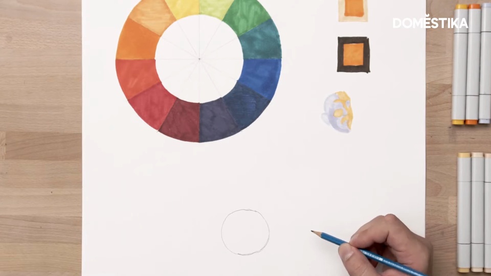
As we explained in the introduction, how we see color depends on all the tones surrounding your chosen shade, as well as the color itself. The image below shows what happens when you use exactly the same orange pen to color squares surrounded by another square shaded in different colors.
The first example is surrounded by a light color, so the orange looks darker. But in the lower example, with the darker frame, it looks a lot brighter.
It’s vital to remember this when choosing your colors.
2. Use cold colors for shadow and warm colors for light

Use blue shades as the basis for your shadows. “You can’t always see these cold colors in the shadows, but they work really well in illustration,” Pablo explains.
To give a clear idea of the point of impact, highlights should always be drawn in colors like yellow and orange.
3. Experiment by shading objects


It’s important to know where your light source is located, even in your mind. This will determine the brightest and darkest areas and the direction of the shadow.
For example, light gradually turns to shade on a sphere. Use your warmer, more vigorous colors first on the area you have decided is closest to the source of light, then transition gradually into cooler shades.
The same thing happens inside the shadow: the darkest point will be nearest to the object, while the shadow fades as you move further away.
Like these tips? Learn how to draw an original illustrated portrait exploring color techniques in Pablo Velasco Bertolotto’s online course: Creative Portraits with Markers.
You may be interested in:
- Realistic Portraits with Pen, a course by Joaquín Rodríguez.
- Realistic Portrait with Colored Pencils, a course by Néstor Canavarro.
- Artistic Charcoal Portraiture: Creating Atmosphere, a course by Sarah Stokes.
- Chiaroscuro Creative Portrait With Pencils, a course by Marco Mazzoni.


0 opmerkingen