

Microtypography: Basics of Typographical Composition
Kursus oleh David KimuraDesainer editorial dan tipografer
Kursus oleh David Kimura, Desainer editorial dan tipografer

Learn the basic principles of editorial design
In this online course, graphic and editorial designer David Kimura teaches you the art of composing texts correctly, paying special attention to formatting.
Learn the fundamentals of typographic composition, from the space between characters to text justification. David also explains how to format line spacing and paragraph styles, along with some tricks of the trade to solve common problems when designing texts.
Apa yang akan Anda pelajari dalam kursus daring ini?
1 pelajaran & 1 unduhan
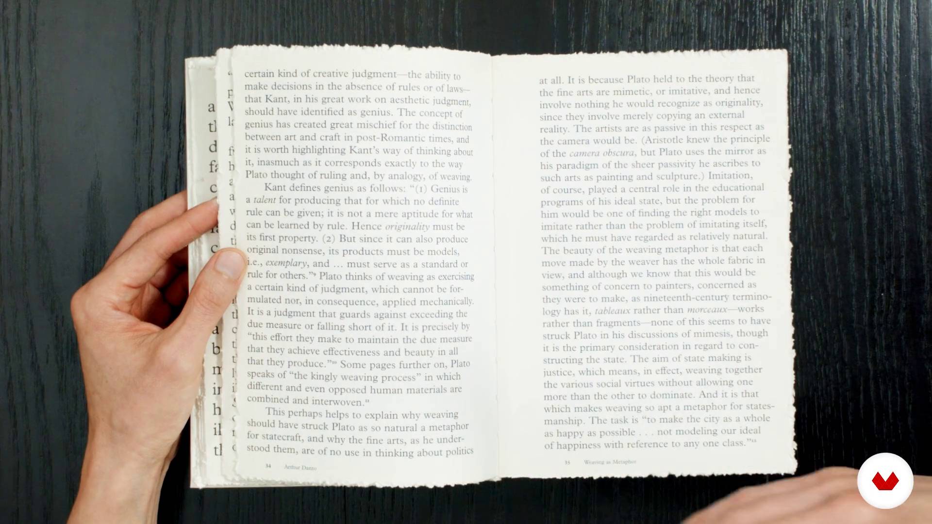
Influences: Good and bad
1 menit, 1 detik
Structure of the course
1 menit, 1 detik
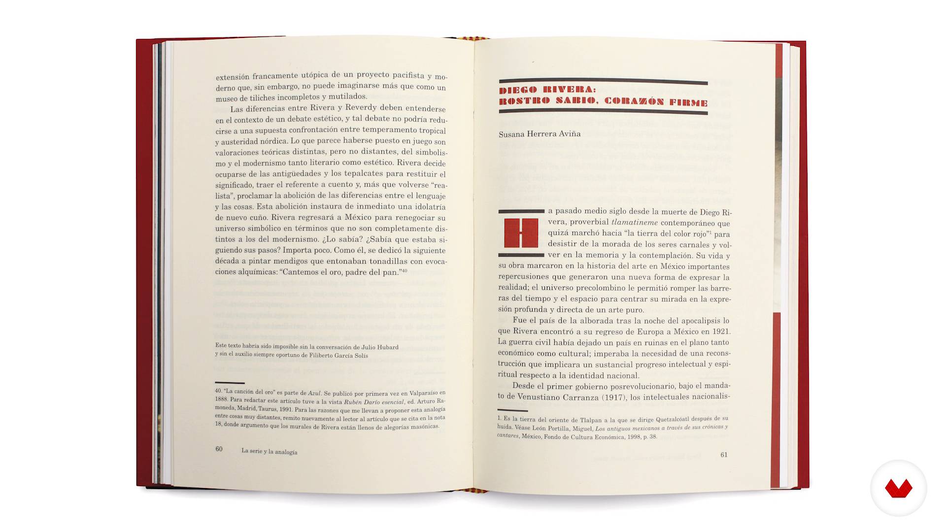
Definition of objectives and content analysis
1 menit, 1 detik
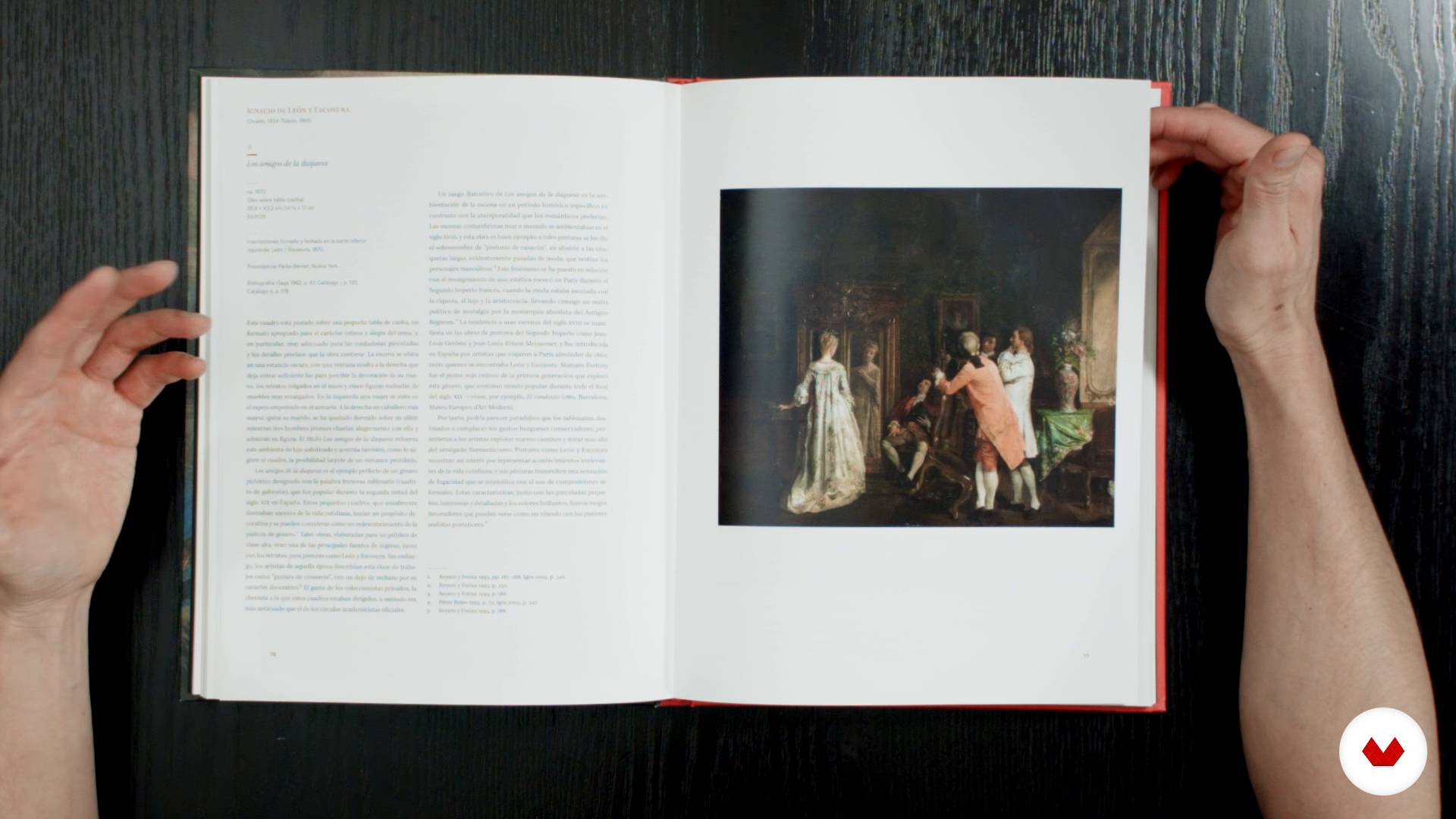
Typography as part of a whole
1 menit, 1 detik
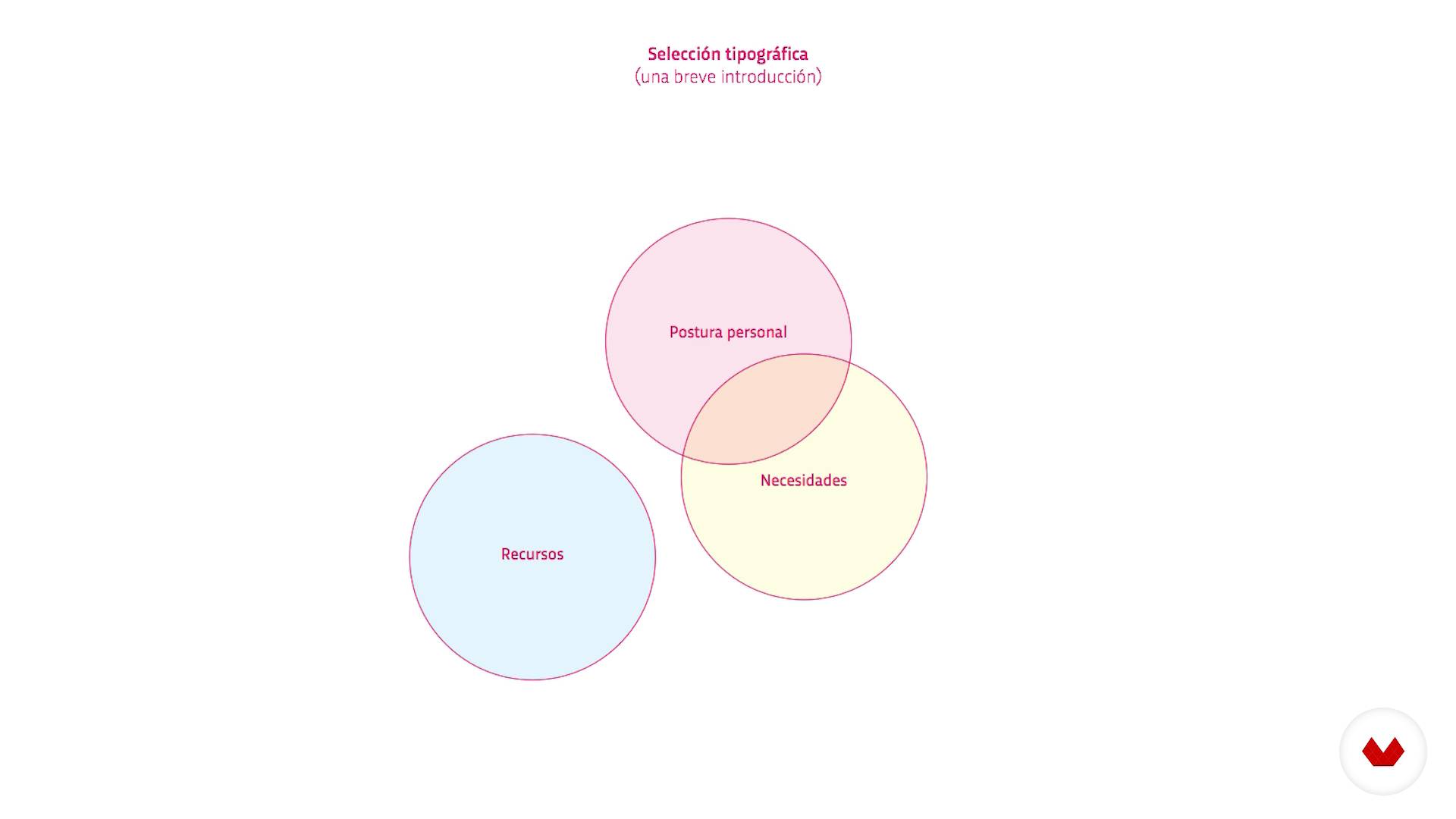
Typographic selection
1 menit, 1 detik
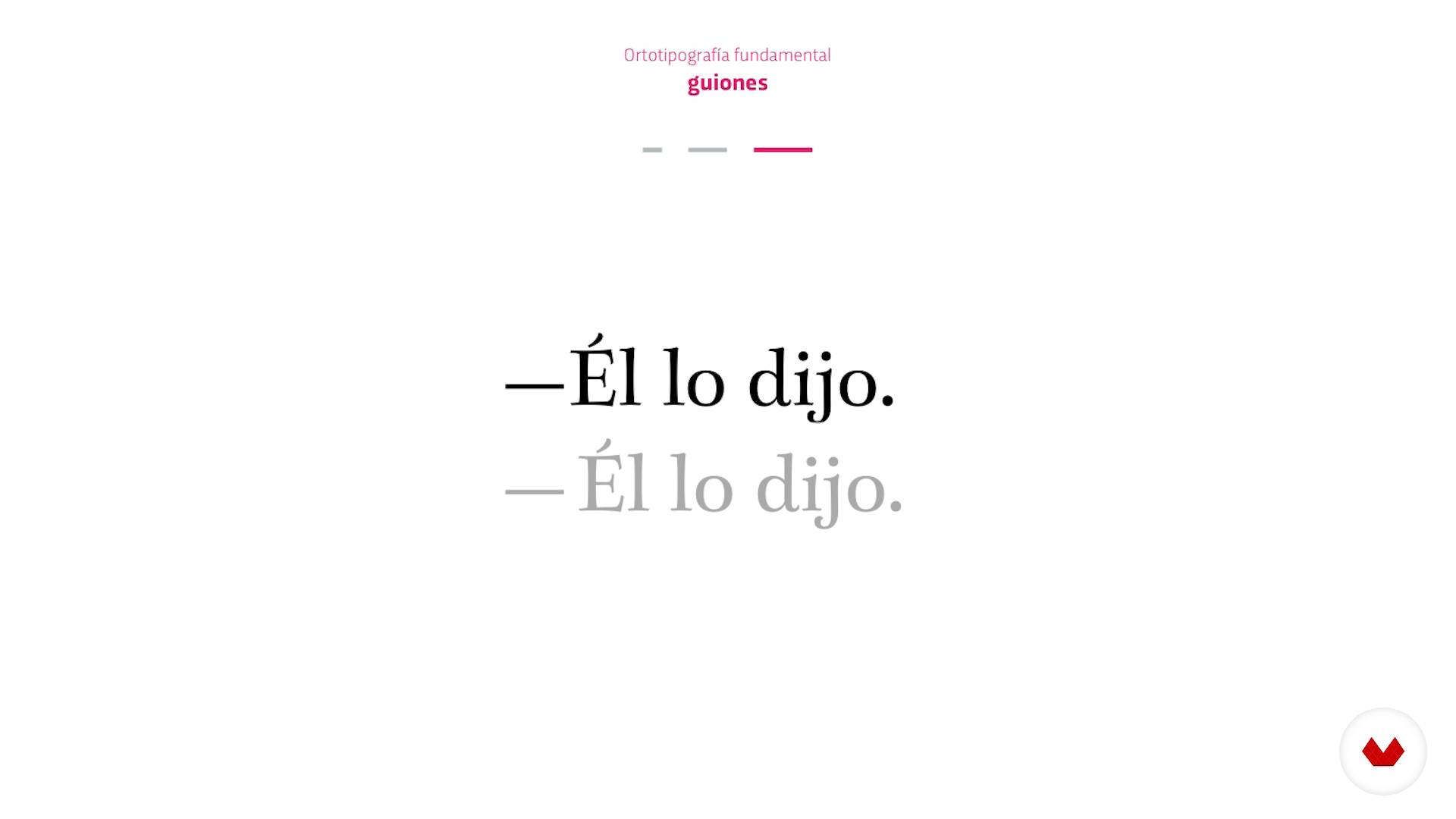
Fundamental orthotypography
1 menit, 1 detik
Apa yang termasuk dalam kursus ini?
David Kimura begins the course by introducing himself and his work, along with an overview of what the course entails.
Discover why typography is so important and how small decisions can have a big impact on text.
Learn the basic concepts that every designer should know before starting an editorial project. David explains essential ideas such as typographic selection and fundamental orthotypography.
Next, dive into microtypography. See how to correctly space characters and look at the importance of the body text, line spacing, and text box width, as well as the relationship between them and the typographic selection.
Find out how to justify texts to the left and on both sides before looking at paragraph and character styles.
Finally, David covers the most common errors made in the text design process and how to solve them without affecting the paragraph format.
Wrap up by formatting the text in a galley proof applying everything you've learned.
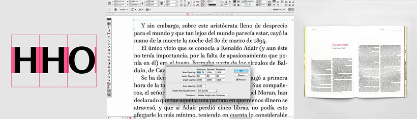
Perangkat lunak & alat yang direkomendasikan untuk kursus ini
Apa proyek kursus ini?
Design and format the text of a literary magazine.
Proyek oleh mahasiswa kursus


Untuk siapa kursus daring ini?
Designers and anyone interested in typography and editorial design.
Persyaratan dan bahan
Basic notions of editorial design and a working knowledge of InDesign are recommended.
As for materials, you need a computer with access to InDesign.

Ulasan
- 1 bulan yang lalu
Um ótimo curso com ensinamentos valiosos!
- 8 bulan yang lalu
Un buen curso sobre la disciplina de la microtipografía.
- 11 bulan yang lalu
Muy intersante el curso, estoy ingresando al mundo de la tipografía y hasta ahora me parece interesante la microtipografía porque es algo nuevo para mí y útil.
- 1 tahun yang lalu
EXCELENTE CURSO! La selección de los contenidos es muy completa y adecuada al nivel. Muy buena calidad expositiva, con lenguaje claro y conciso hace comprensibles los contenidos. Solo sugeriría mejores precisiones en el Software (InDesign)
- enrqalejandroPLUS1 tahun yang lalu
Un curso fantástico, muy bien explicado y muy completo para cualquiera que quiera iniciarse en esta profesión.

Ia adalah mitra pendiri studio Kimera dan Bésame Mucho. Sejak 2005, ia tela...
Isi
- U 1
Who I am?
- Who I am?
- Why is typography important?
- Influences: Good and bad
- Structure of the course
- U 2
Preliminary and first decisions
- Definition of objectives and content analysis
- Typography as part of a whole
- Typographic selection
- Fundamental orthotypography
- First decisions for our project
- U 3
The text box
- Space between characters
- Other basic typographical parameters
- Design a justified text on the left
- The justified texts on both sides and justified values I
- The justified texts on both sides and justified values II
- Preparing the style palette
- U 4
Text formation
- Typical problems during training
- Resources to eliminate problems
- Formation of the text of the exercise
- FP
Proyek akhir
- Microtypegraphy: fundamentals of typesetting
Apa yang diharapkan dari kursus Domestika
Belajar dengan kecepatan Anda sendiri
Nikmati belajar dari rumah tanpa jadwal tetap dan dengan metode yang mudah diikuti. Anda bisa mengatur kecepatan belajar Anda sendiri.
Belajar dari para profesional terbaik
Pelajari metode dan teknik berharga yang dijelaskan oleh para ahli terkemuka di sektor kreatif.
Bertemu dengan guru ahli
Setiap pakar mengajarkan apa yang paling mereka kuasai, dengan pedoman yang jelas, semangat yang membara, dan wawasan profesional dalam setiap pelajaran.
Sertifikat
PLUSJika Anda anggota Plus, dapatkan sertifikat khusus yang ditandatangani oleh pengajar Anda untuk setiap kursus. Bagikan di portofolio, media sosial, atau di mana pun Anda suka.
Dapatkan kursi baris depan
Video berkualitas tinggi, jadi Anda tidak akan melewatkan satu detail pun. Dengan akses tak terbatas, Anda dapat menontonnya sesering yang Anda butuhkan untuk menyempurnakan teknik Anda.
Berbagi pengetahuan dan ide
Ajukan pertanyaan, minta masukan, atau tawarkan solusi. Bagikan pengalaman belajar Anda dengan siswa lain di komunitas yang sama bersemangatnya dengan Anda dalam hal kreativitas.
Terhubung dengan komunitas kreatif global
Komunitas ini merupakan rumah bagi jutaan orang dari seluruh dunia yang ingin tahu dan bersemangat untuk mengeksplorasi dan mengekspresikan kreativitas mereka.
Tonton kursus yang diproduksi secara profesional
Domestika menyusun daftar guru dan memproduksi setiap kursus secara internal untuk memastikan pengalaman belajar daring berkualitas tinggi.
Tanya Jawab Umum
Microtypography deals with the fine details of spacing, alignment, and character proportions. When applied correctly, it boosts readability and visual appeal, raising the professional quality of any publication.
This course is designed for those with basic design or editing knowledge, perfect for anyone wanting to dive deeper into microtypography and typographic quality in editorial work.
It’s recommended to have some basic graphic design skills and familiarity with tools like InDesign, but advanced typography experience isn’t required.
You’ll learn how to analyze and apply microtypographic principles, adjust spacing, choose suitable fonts, structure information hierarchies, and solve typographic problems to enhance books, magazines, and other printed materials.
The course teaches you how to apply orthotypographic rules, fine-tune justification, margins, styles, and spacing to create visually balanced, easy-to-read publications across both digital and print formats.
You’ll need a computer with layout software like Adobe InDesign, and optionally some editorial text samples or your own projects to practice on.
Microtypography focuses on details like kerning, tracking, proper use of dashes, quotation marks, and numerals — all crucial for readability and the professional look of any editorial text.