Orthotypography for Designers
Kursus oleh Raquel Marín Álvarez , Desainer grafis, ilustrator, dan penulis

Bergabung sejak Februari 2015


Learn in great detail the typographical standards for the characters you design with
Bergabung sejak Februari 2015

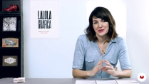
Raquel Marín (Lalolagráfica) is a graphic designer and expert in typography. It is specialized in orthotypography, that is, the set of rules that govern the correct use of typography.
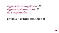
In this Domestika course you will learn the correct application of the signs and symbols found on the keyboard and in the menus of the programs with which you design (quotes, dashes, stripes, brackets, voladitas, acronyms, italics, small caps ...)
Do not forget that a graphic designer, as a visual communicator, must constantly issue typography messages and it is vital to do it correctly.
Apa yang akan Anda pelajari dalam kursus daring ini?
1 pelajaran & 1 unduhan

- 98% ulasan positif ( 252 )
- 1 siswa
- 1 pelajaran ( 1 jam 1m )
- 1 sumber daya tambahan (1 berkas)
- Online dan sesuai kecepatan Anda sendiri
- Tersedia di aplikasi
- Audio: Spanyol
- Spanyol · Bahasa inggris · Portugis · Jerman · Perancis · Italia · Polandia · Belanda · Turki · Rumania · Indonesia
- Tingkat: Pemula
- Akses tak terbatas selamanya
Perangkat lunak & alat yang direkomendasikan untuk kursus ini
 Adobe InDesign
Apa proyek kursus ini?
You will design a typographic and informative poster with real texts and full-meaning sentences using InDesign. You must apply the rules seen during the course and get, not only do something beautiful, but a piece that transmits relevant information.

Proyek oleh mahasiswa kursus


Untuk siapa kursus daring ini?
Designers, publicists, journalists, copys and anyone who wants to learn how to apply typography well and get all the expressive potential of the sources he uses.
If you have ever wondered why we have all these types of quotes, how the acronyms are written, why they are abbreviations, how to write a foreignerism or if the figure is written or not to the percentages, this is your course.
Persyaratan dan bahan
No previous knowledge is needed, just want to learn to write correctly and know how to use in depth all the resources offered by the sources with which we work daily: quantities, signs, acronyms, magnitudes, foreign words, dates, symbols, percentages, quotes ...
Regarding the materials, you will need to have a computer with InDesign and fonts installed in it (even if they are from the system).

Ulasan

Raquel Marín Álvarez
Kursus oleh Raquel Marín Álvarez
Raquel Marín Álvarez meraih gelar di bidang Humaniora dan merupakan seorang desainer grafis. Setelah menyelesaikan gelar magister tipografi tingkat lanjut di Universitas Otonom Barcelona, ia mulai bekerja sebagai desainer untuk berbagai studio dan pene...
Isi
-
U 1
Introduction
-
Presentation
-
Influences
-
-
U 2
Typography and orthotypography: convergences and divergences
-
Nobody's land
-
What is orthotype?
-
Graphic design and lack of orthotypography
-
Level test where do you come from?
-
-
U 3
Signs as an image: first aid
-
Signs and symbols: expressive economy
-
Quotation marks: classes and uses
-
Apostrophes, bonuses and superscripts: conflicts
-
Horizontal signs: differences
-
Vertical signs: correct and incorrect uses
-
Spaces and whites in typography
-
-
U 4
Voices in typography: distinctive types
-
Distinctive types: how and for what
-
Italic: when yes and when not
-
Quotation marks: typical errors
-
Capital letter: use and abuse
-
Versalita: that great unknown
-
-
U 5
Ten tips on orthotypography for your project
-
Ten tips on orthotypography for your project
-
-
FP
Proyek akhir
-
Orthotypography for designers
-
Apa yang diharapkan dari kursus Domestika
-
Belajar dengan kecepatan Anda sendiri
Nikmati belajar dari rumah tanpa jadwal tetap dan dengan metode yang mudah diikuti. Anda bisa mengatur kecepatan belajar Anda sendiri.
-
Belajar dari para profesional terbaik
Pelajari metode dan teknik berharga yang dijelaskan oleh para ahli terkemuka di sektor kreatif.
-
Bertemu dengan guru ahli
Setiap pakar mengajarkan apa yang paling mereka kuasai, dengan pedoman yang jelas, semangat yang membara, dan wawasan profesional dalam setiap pelajaran.
-
Sertifikat
PlusJika Anda anggota Plus, dapatkan sertifikat khusus yang ditandatangani oleh pengajar Anda untuk setiap mata kuliah. Bagikan di portofolio, media sosial, atau di mana pun Anda suka.
-
Dapatkan kursi baris depan
Video berkualitas tinggi, jadi Anda tidak akan melewatkan satu detail pun. Dengan akses tak terbatas, Anda dapat menontonnya sesering yang Anda butuhkan untuk menyempurnakan teknik Anda.
-
Berbagi pengetahuan dan ide
Ajukan pertanyaan, minta masukan, atau tawarkan solusi. Bagikan pengalaman belajar Anda dengan siswa lain di komunitas yang sama bersemangatnya dengan Anda dalam hal kreativitas.
-
Terhubung dengan komunitas kreatif global
Komunitas ini merupakan rumah bagi jutaan orang dari seluruh dunia yang ingin tahu dan bersemangat untuk mengeksplorasi dan mengekspresikan kreativitas mereka.
-
Tonton kursus yang diproduksi secara profesional
Domestika menyusun daftar guru dan memproduksi setiap kursus secara internal untuk memastikan pengalaman belajar daring berkualitas tinggi.
Tanya Jawab Umum
Kursus Domestika adalah kelas daring yang memungkinkan Anda mempelajari keterampilan baru dan menciptakan proyek-proyek luar biasa. Semua kursus kami menawarkan kesempatan untuk berbagi hasil karya Anda dengan siswa dan/atau guru lain, menciptakan komunitas belajar yang aktif. Kami menawarkan berbagai format:
Kursus Asli : Kelas lengkap yang menggabungkan video, teks, dan materi pendidikan untuk menyelesaikan proyek tertentu dari awal hingga akhir.
Kursus Dasar : Pelatihan khusus di mana Anda menguasai perangkat lunak tertentu langkah demi langkah.
Kursus Spesialisasi : Jalur pembelajaran dengan berbagai guru ahli tentang topik yang sama, cocok untuk menjadi spesialis dengan belajar dari berbagai pendekatan.
Kursus Terbimbing : Pengalaman praktis yang ideal untuk memperoleh keterampilan tertentu secara langsung.
Kursus Intensif (Pendalaman) : Proses kreatif baru berdasarkan alat kecerdasan buatan dalam format yang mudah diakses untuk pemahaman yang mendalam dan dinamis.
Semua kursus 100% daring, jadi setelah dipublikasikan, kursus dimulai dan berakhir kapan pun Anda mau. Anda yang menentukan kecepatan kelas. Anda dapat kembali untuk meninjau apa yang paling Anda minati dan melewatkan apa yang sudah Anda ketahui, mengajukan pertanyaan, menjawab pertanyaan, membagikan proyek Anda, dan banyak lagi.
Kursus-kursus ini dibagi menjadi beberapa unit. Setiap unit mencakup pelajaran, teks informasi, tugas, dan latihan untuk membantu Anda menyelesaikan proyek langkah demi langkah, dengan sumber daya dan unduhan tambahan yang tersedia. Anda juga akan memiliki akses ke forum eksklusif tempat Anda dapat berinteraksi dengan pengajar dan siswa lain, serta berbagi pekerjaan dan proyek kursus Anda, sehingga menciptakan komunitas di sekitar kursus.
Anda dapat menebus kursus yang Anda terima dengan mengakses halaman penebusan dan memasukkan kode hadiah Anda.
 Adobe InDesign
Súper útil y súper completo. Mucha información nueva y muy bien explicado.
Raquel explica de maravilla. Es un curso muy completo que sin duda pondré en práctica.
Me ha encantado, muy interesante y detallista, trataré de aplicar todos los consejos y mejorar mi ortotipografía.
Un curso demasiado completo que nos ayuda a los diseñadores en la práctica real para interactuar con correctores.
Un curso fantástico.