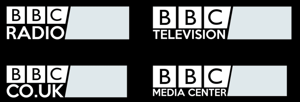
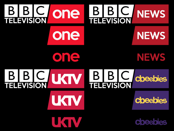
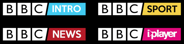
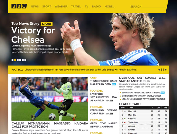
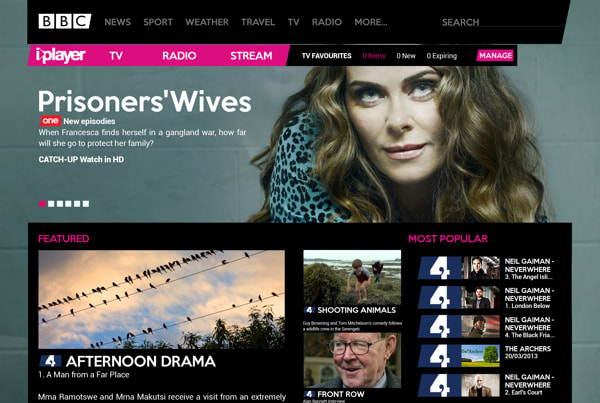
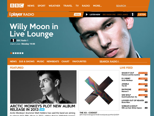
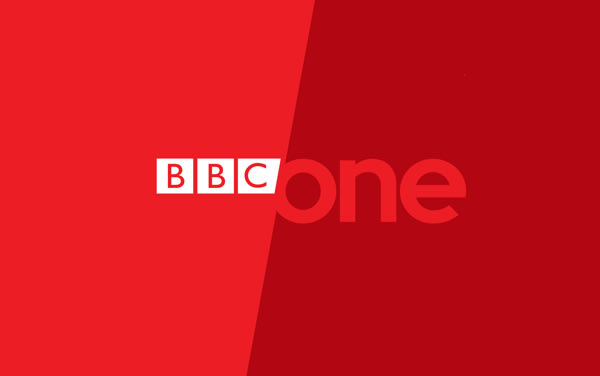
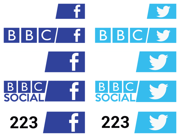
We expand our review :) We also like the logo but we are very shocked (and we think it is something that could be corrected) the change in size of the BBC according to what it has below: Radio, Television, Co.Uk, Media Center ... Don't you think it takes away cohesion?
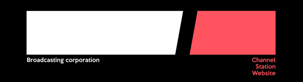
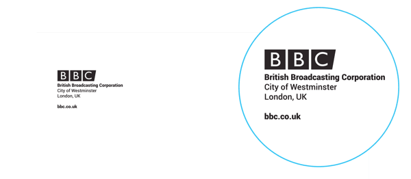
The BBC logo is the base, the matrix and accessories are adapted to it. The diagonal space between them marks a balance. Also in the sample you can notice the change in size of the BBC according to what is underneath: Radio, Television, Co.Uk, Media Center but exposed as a whole, on the other hand, exposing only one elements that mention the visual force is not lost nor are the values of design counteracted.


4 comments
lacajadetipos
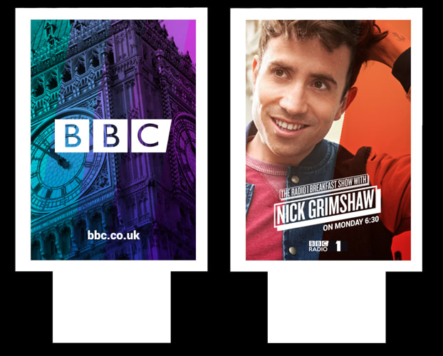
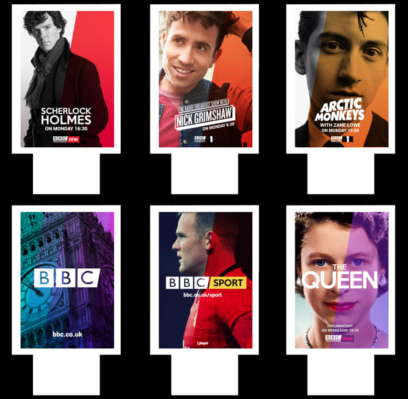
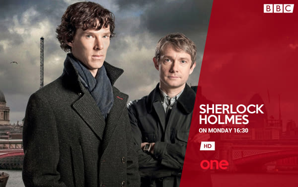
What we like most of all are the posters :)
See original
Hide original
_A
BRUTAL
lacajadetipos
We expand our review :) We also like the logo but we are very shocked (and we think it is something that could be corrected) the change in size of the BBC according to what it has below: Radio, Television, Co.Uk, Media Center ... Don't you think it takes away cohesion?
See original
Hide original
alejomalia
The BBC logo is the base, the matrix and accessories are adapted to it. The diagonal space between them marks a balance. Also in the sample you can notice the change in size of the BBC according to what is underneath: Radio, Television, Co.Uk, Media Center but exposed as a whole, on the other hand, exposing only one elements that mention the visual force is not lost nor are the values of design counteracted.
See original
Hide original
Log in or join for Free to comment