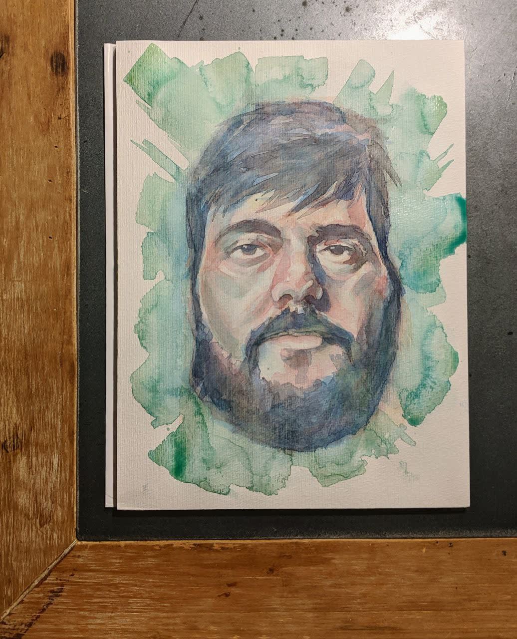
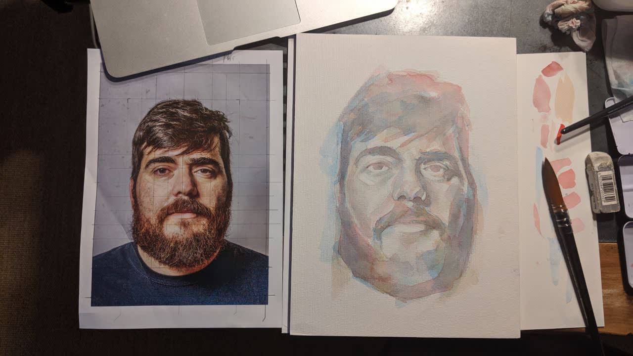
Well, in this portrait of Ale I have cast the day today. I think that I did not choose the complementary color well or that I was very shy with the first layers, because at the beginning I was very gray skin. Then I already added reds, greens and blues to cholón and the paleness disappeared, but without the subtleties that the teacher achieves. We will have to keep practicing.
Very happy with the course, it is very good and Ale has a lot of knowledge. The only thing I missed maybe would be some guidelines on where to put warm, and where cold, or perhaps it is that with this method you have to add both everywhere.
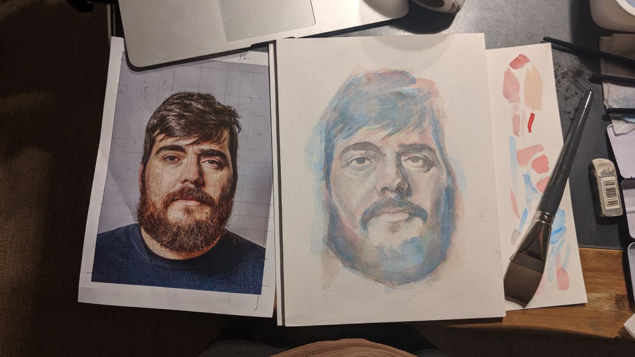
Hello! I really like the work, it is extremely successful. Obviously it shows a lot that you know how to draw. If we have to put some "but" it would be in the continuity of the brushstrokes. Try to load the brush with water and that the brush strokes "flow" on the paper, do not punish it, better a brush stroke than 5.
On where to place the cold or the warm ones, that depends on your choice, there are images that you will have to reinforce the warm ones in one part and the cold ones more in another. Always depending on the image and your intentions.
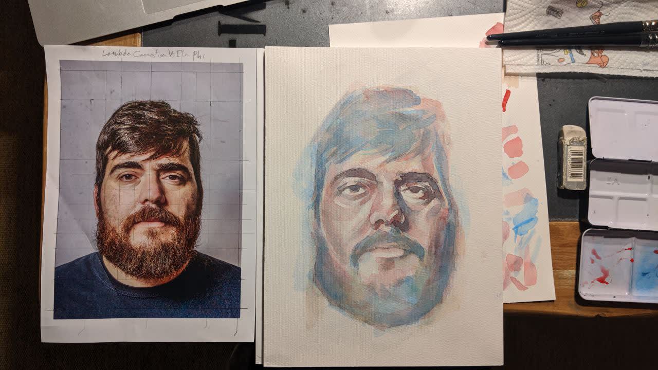
Good job, I love the background !!


2 comments
jimenezpena
Well, in this portrait of Ale I have cast the day today. I think that I did not choose the complementary color well or that I was very shy with the first layers, because at the beginning I was very gray skin. Then I already added reds, greens and blues to cholón and the paleness disappeared, but without the subtleties that the teacher achieves. We will have to keep practicing.
Very happy with the course, it is very good and Ale has a lot of knowledge. The only thing I missed maybe would be some guidelines on where to put warm, and where cold, or perhaps it is that with this method you have to add both everywhere.
See original
Hide original
casanova_ale
Teacher PlusHello! I really like the work, it is extremely successful. Obviously it shows a lot that you know how to draw. If we have to put some "but" it would be in the continuity of the brushstrokes. Try to load the brush with water and that the brush strokes "flow" on the paper, do not punish it, better a brush stroke than 5.
On where to place the cold or the warm ones, that depends on your choice, there are images that you will have to reinforce the warm ones in one part and the cold ones more in another. Always depending on the image and your intentions.
Good job, I love the background !!
See original
Hide original
Log in or join for Free to comment