


ANNICE
by Estudio Marina Goñi @submarina
- 234
- 7
- 0
ANNICE
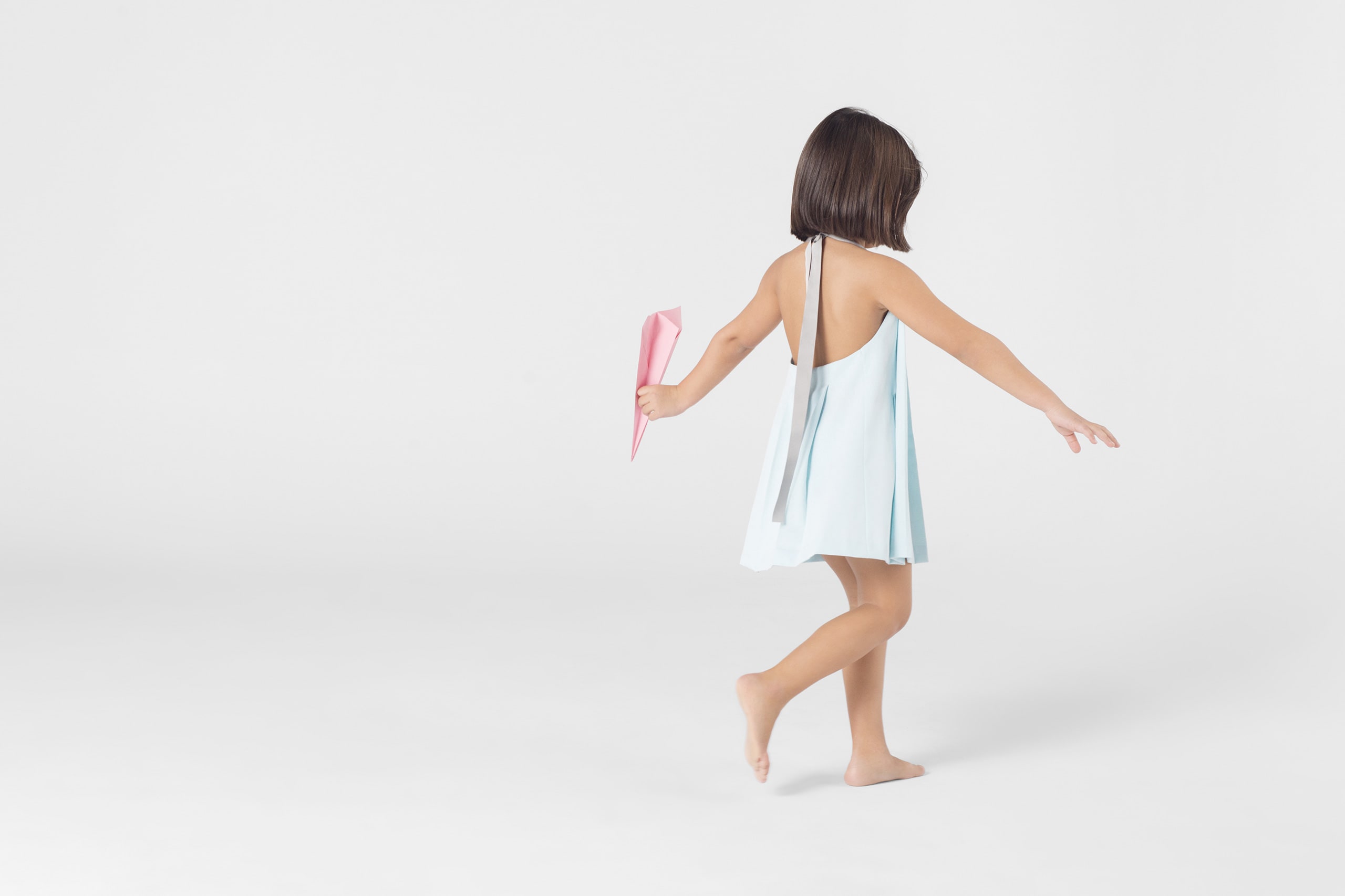
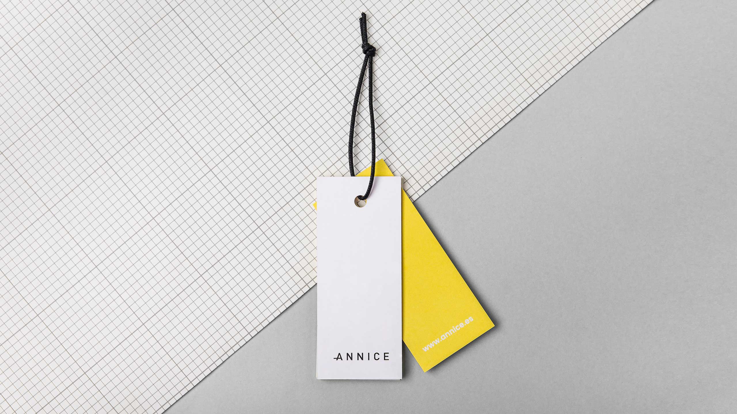
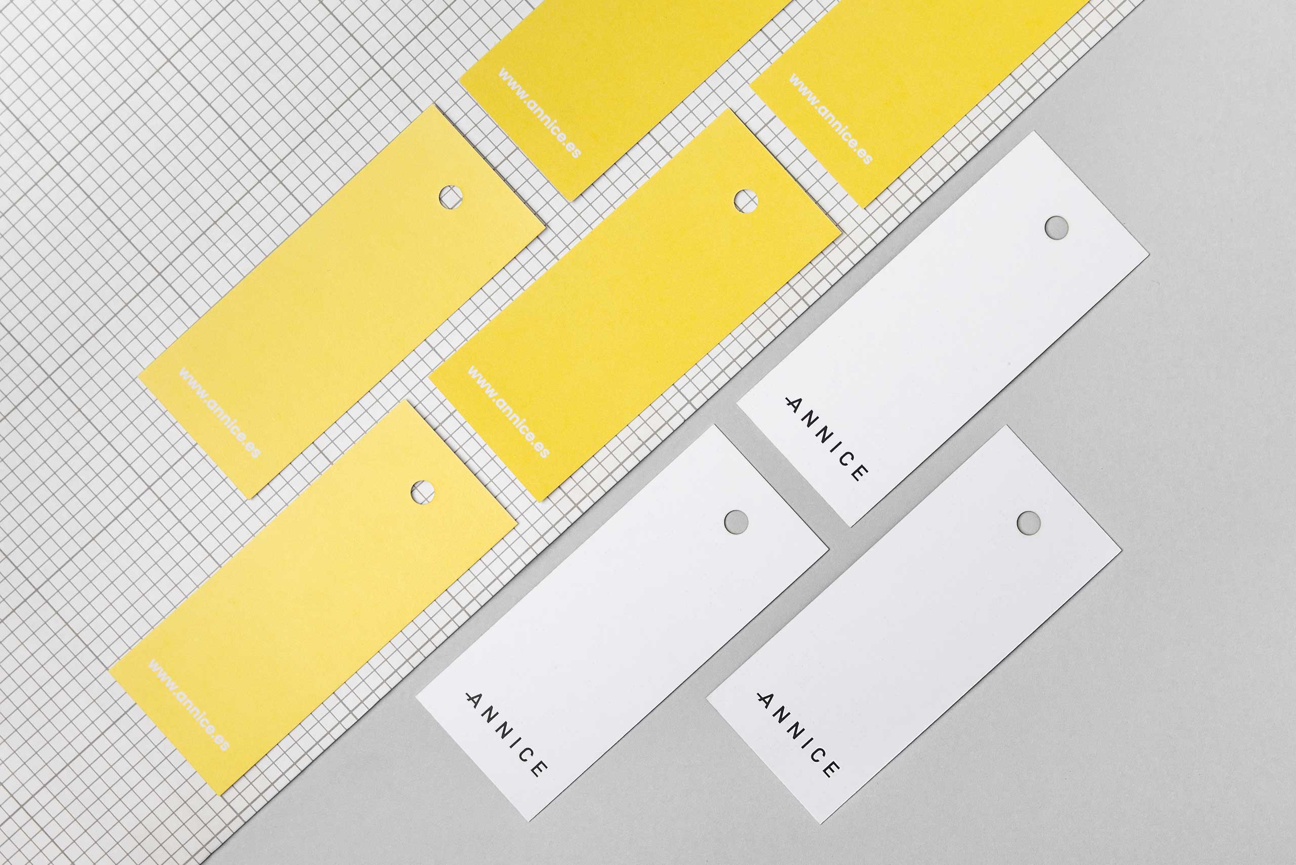
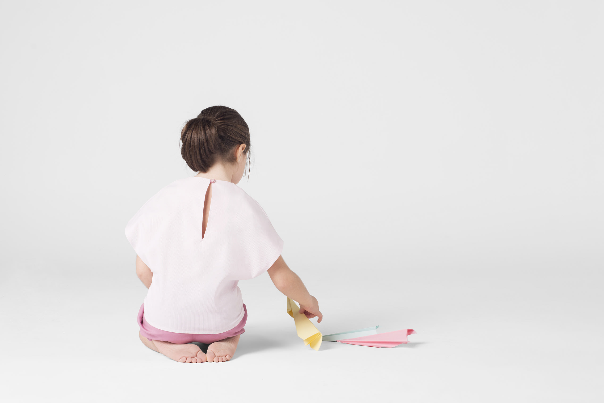
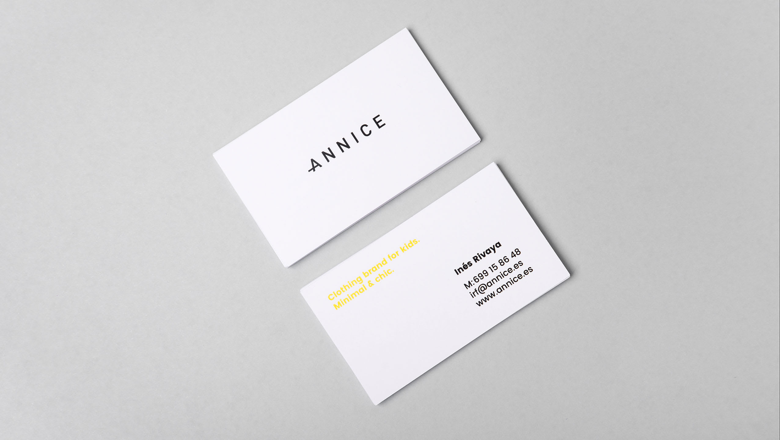
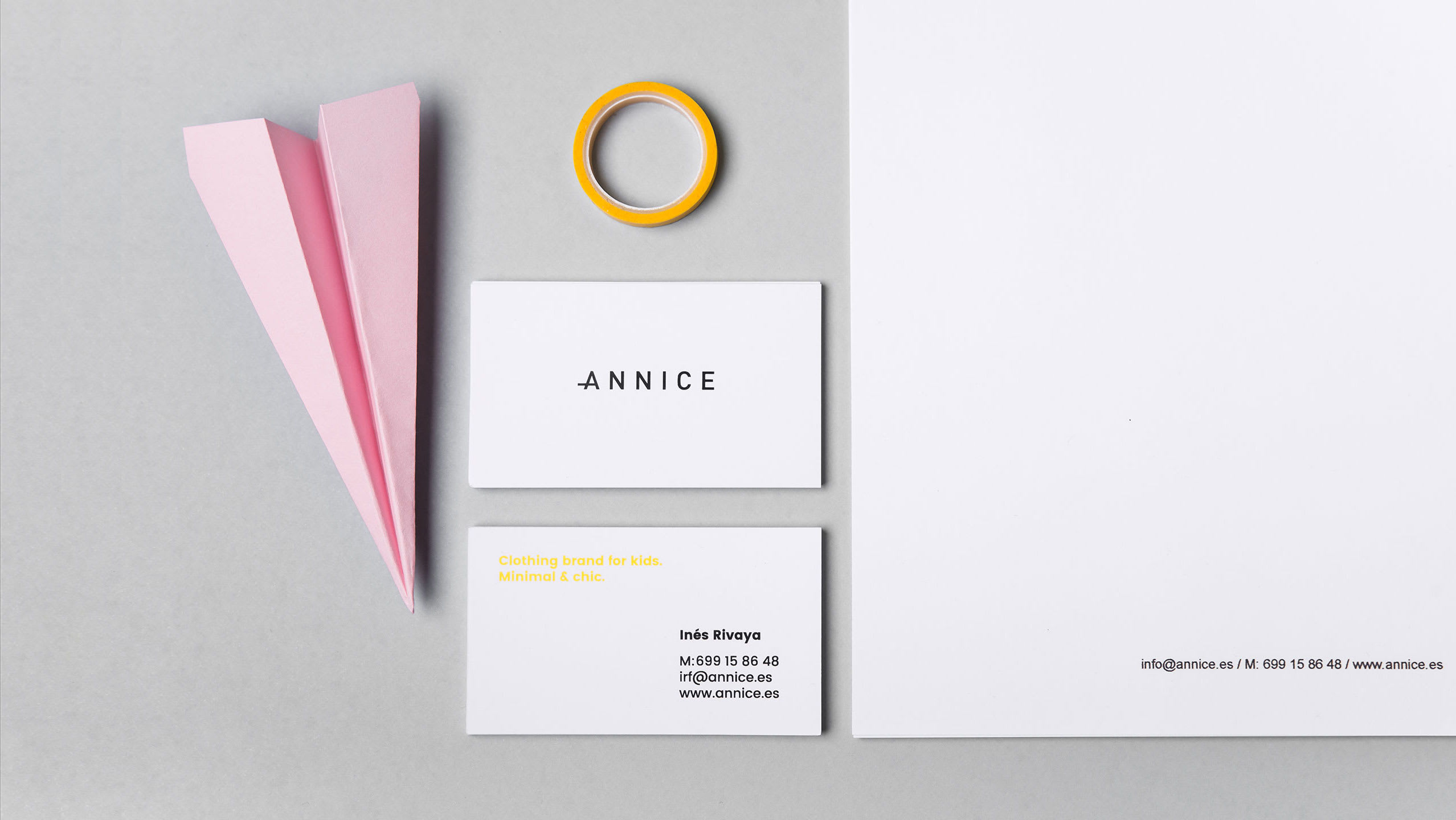
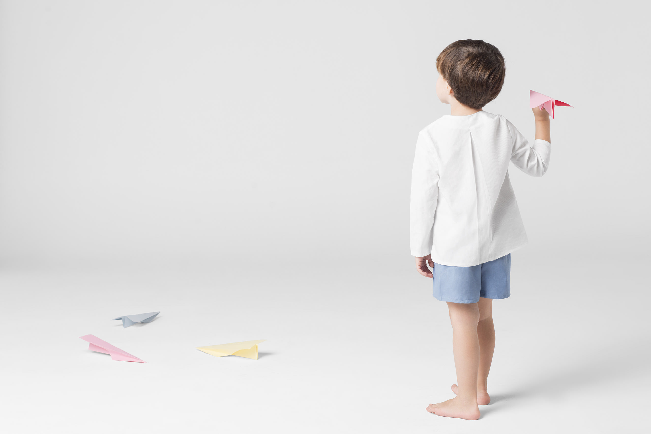
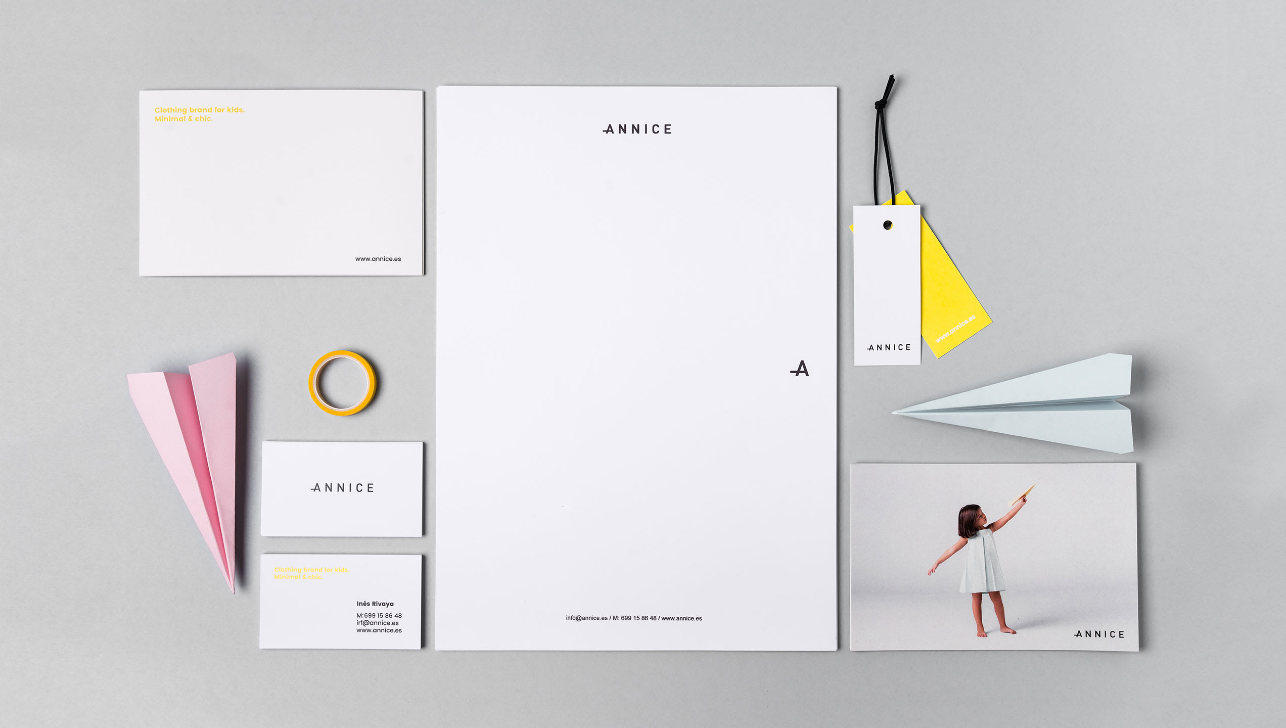
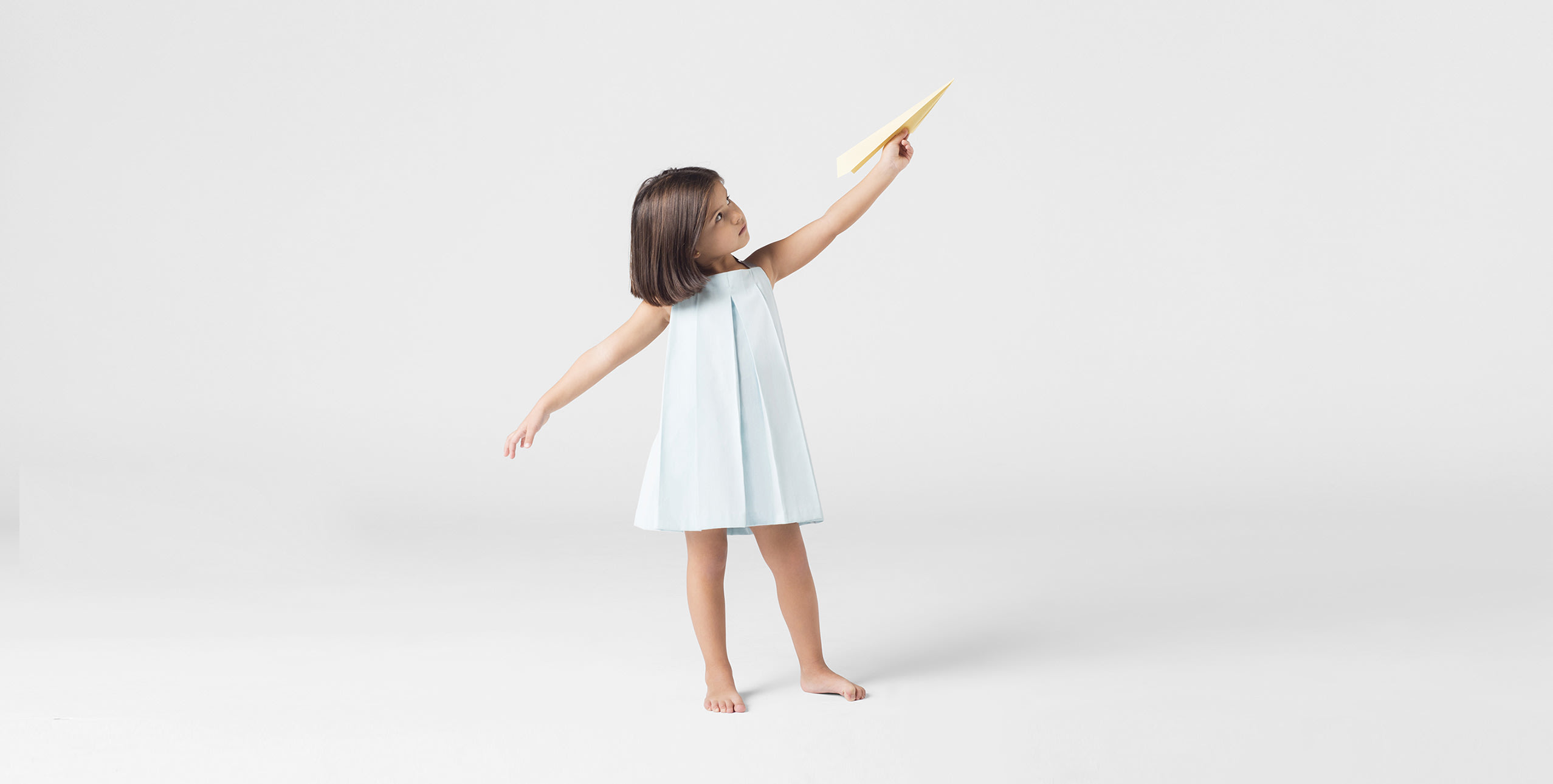
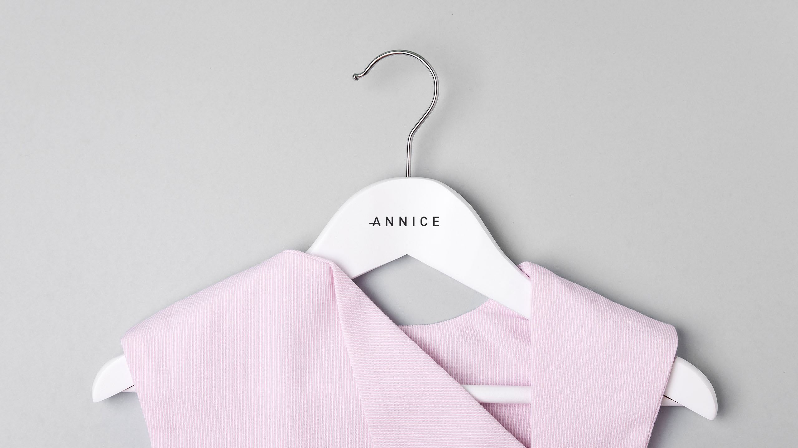
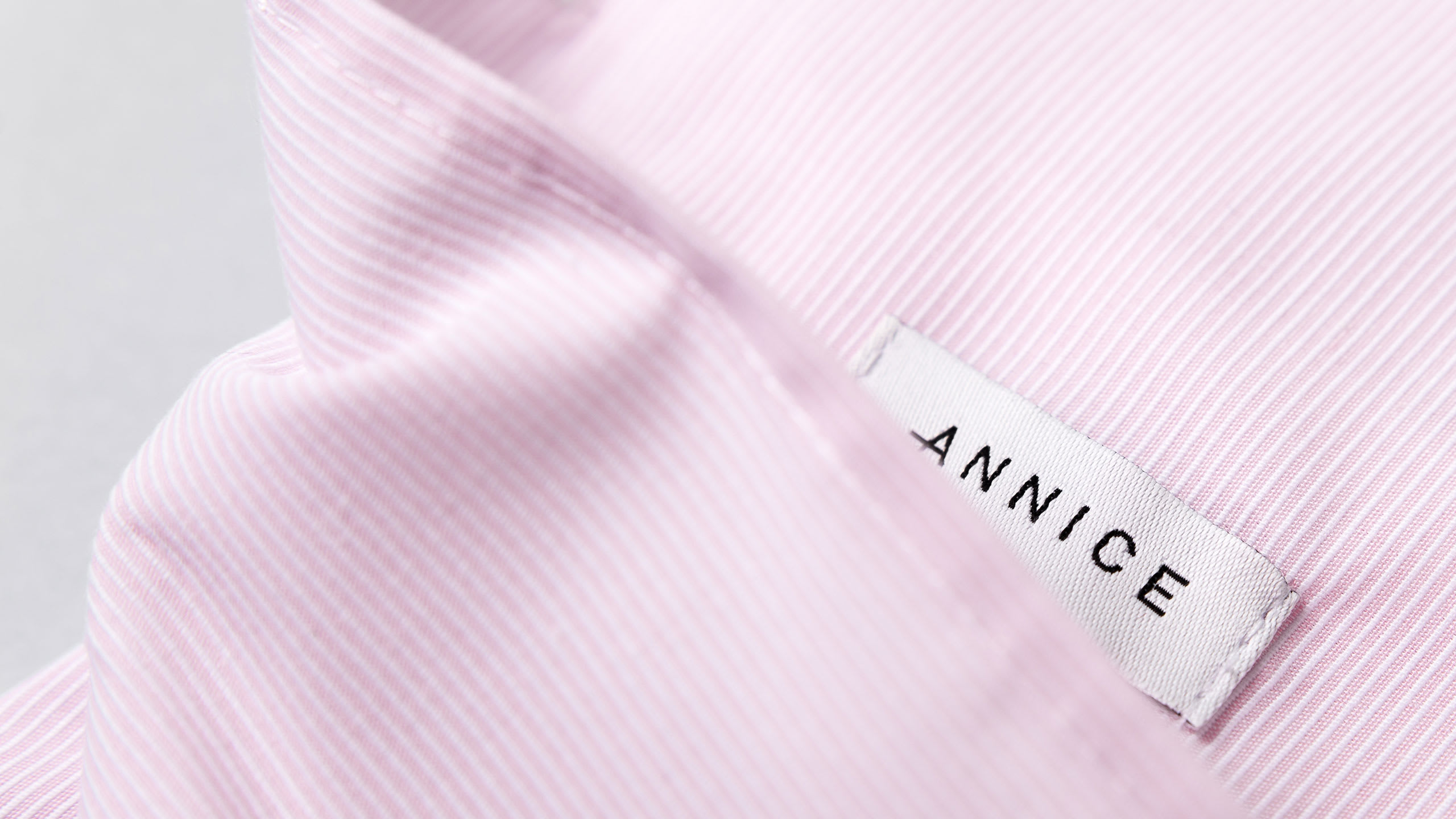
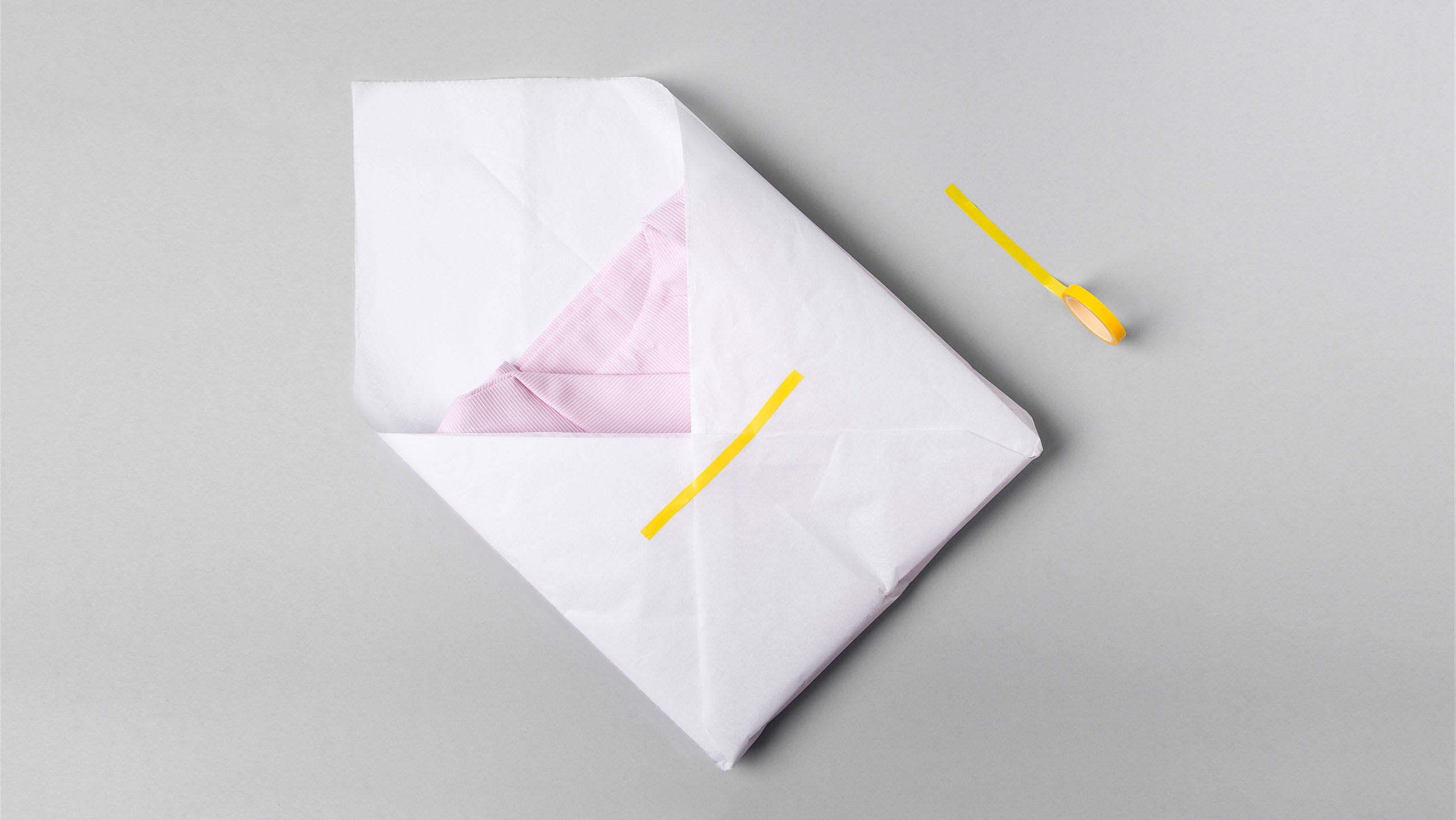
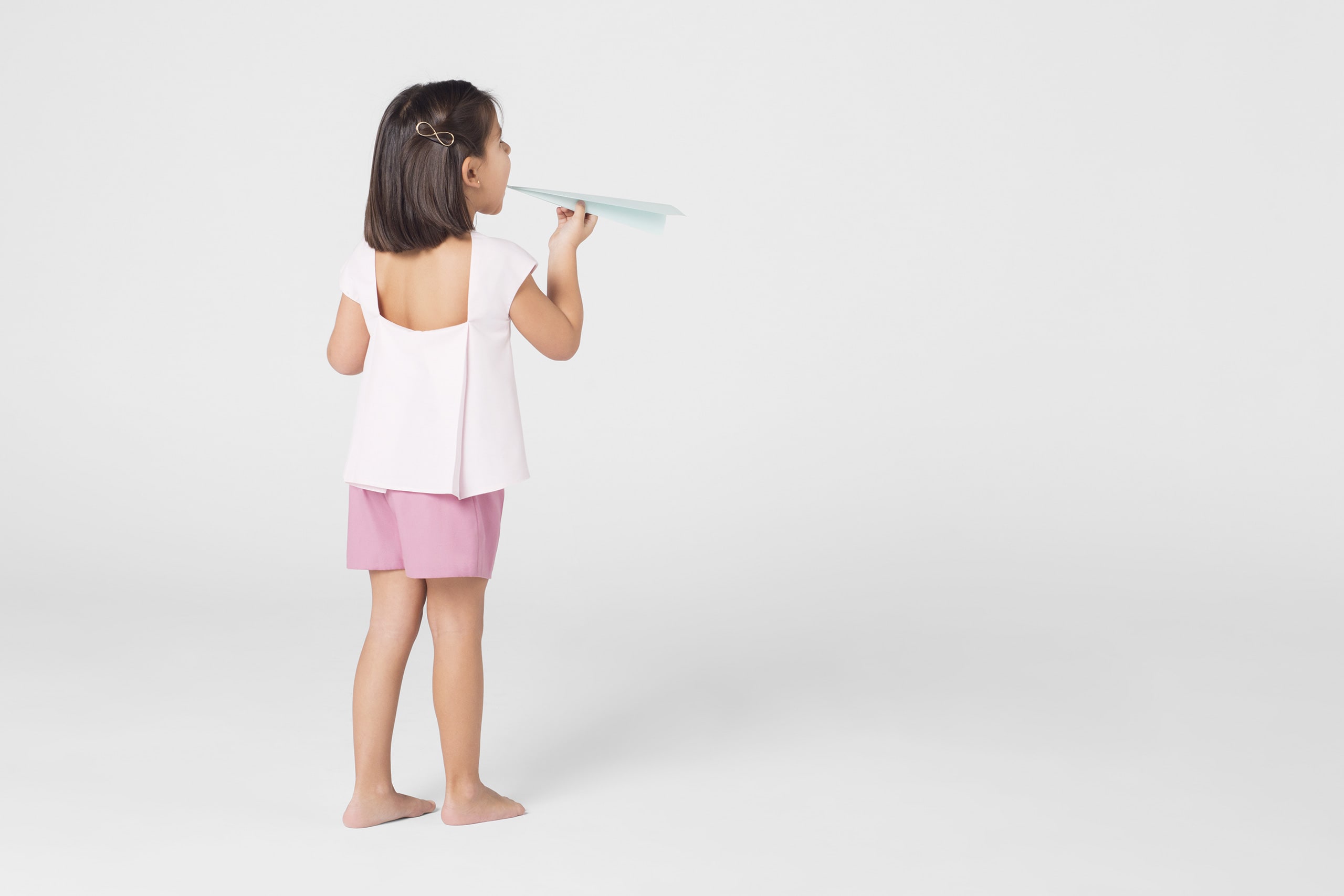
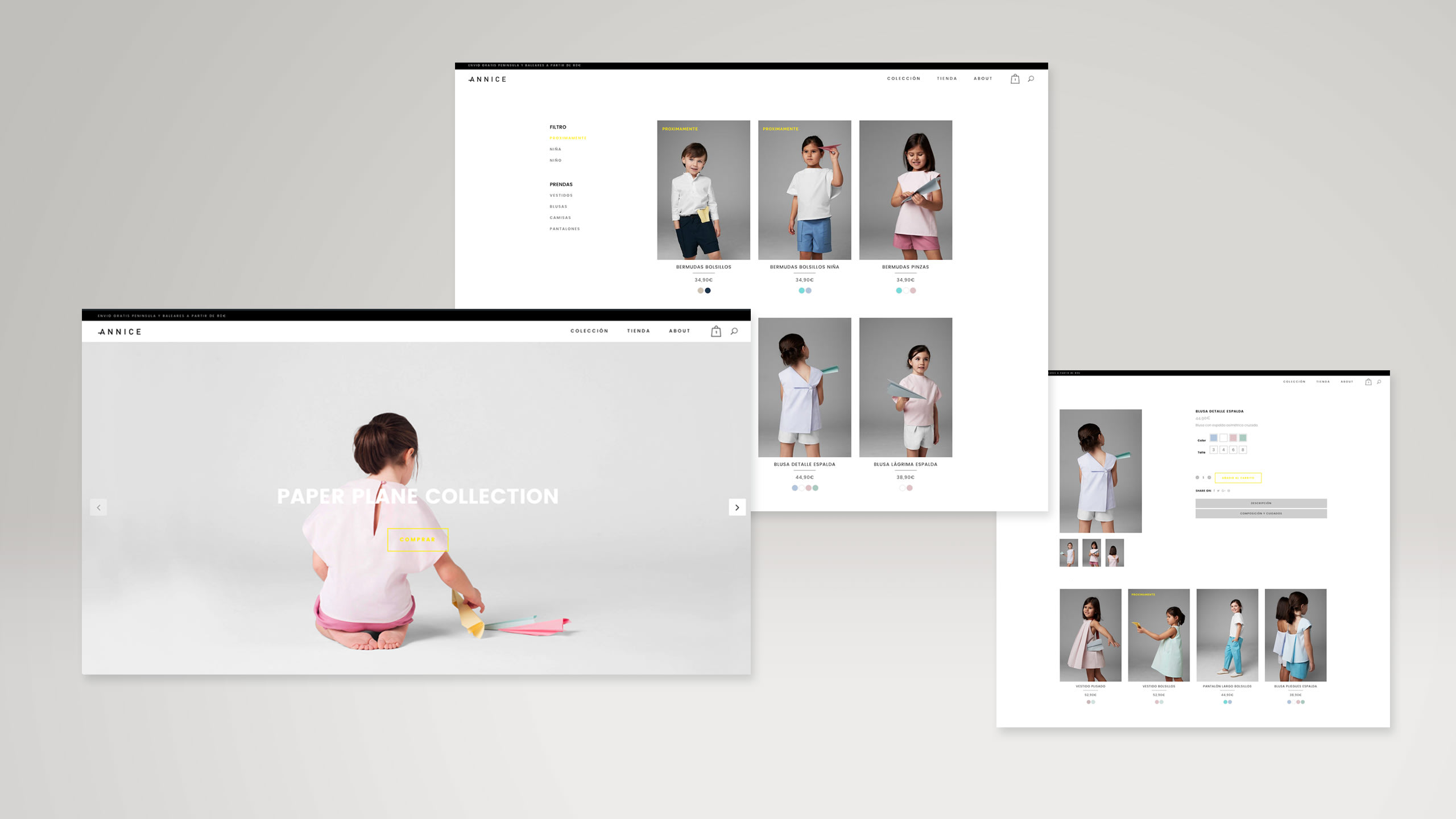
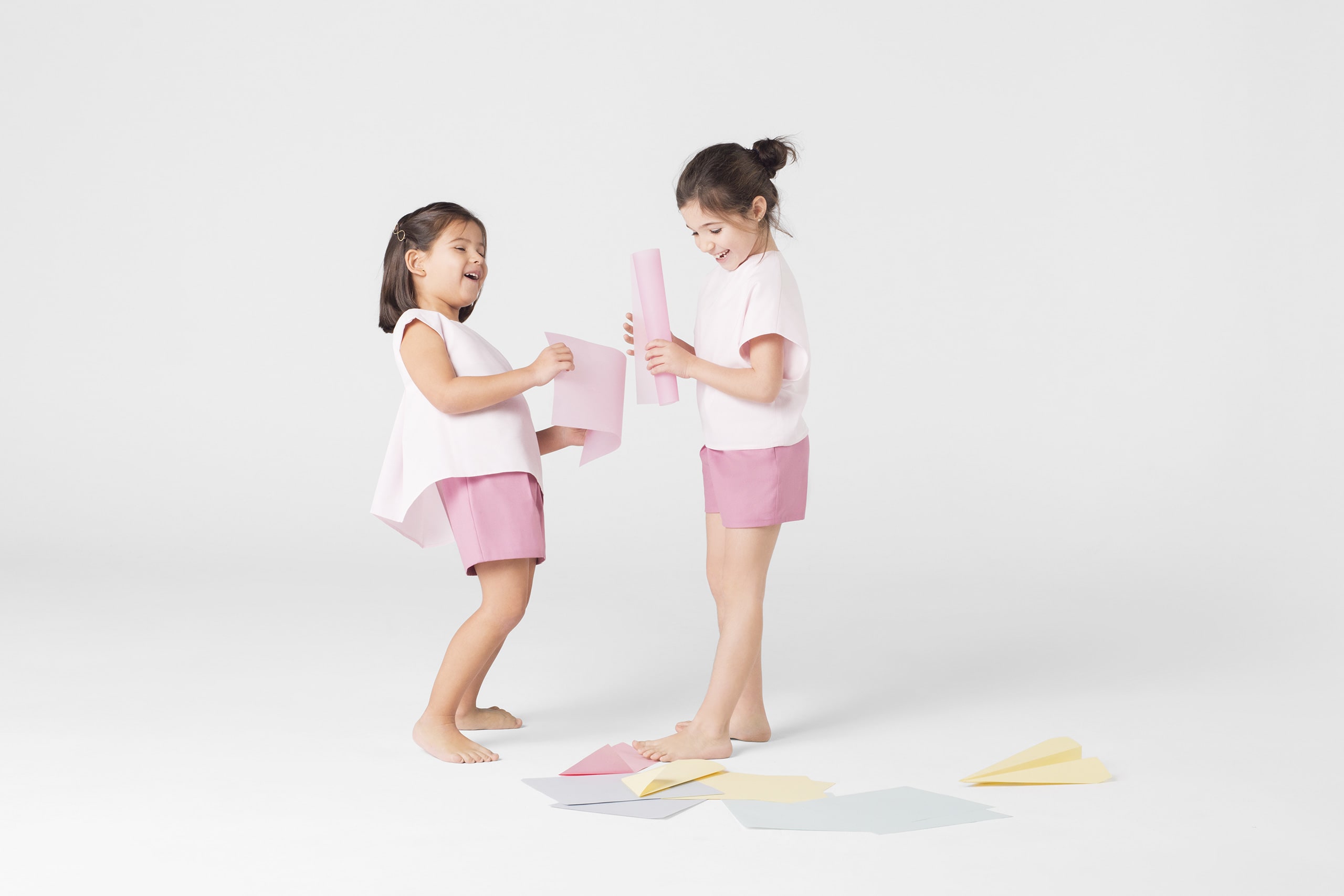
Identidad para una marca de moda infantil que traslada los valores de minimalismo y calidad. El equipo detrás de Annice viene del mundo de la arquitectura, de ahí que sus diseños estén basados en volúmenes, cortes y líneas. Diseños sencillos pero muy cuidados y llenos de detalles sutiles; un lazo, un botón, un pliegue… y fueron precisamente estos pequeños elementos los que representamos en el logotipo. Una "A" que se pliega, tiene un lazo, y es un ojal. Colores suaves y los aviones de papel como hilo conductor para crear una marca actual, atemporal y chic.
------
Identity for a kid’s fashion brand that brings the values of minimalism and quality. The team behind Annice comes from the world of architecture, that’s why its designs are based in volumes, edges and lines. Simple designs but very cared and full of subtle details; one bow, one button, one fold… and its just these small elements that we represent the logotype. An “A” that folds, with a bow, being a buttonhole at the same time. Soft colors and paper planes as common thread to create a contemporary brand, timeless and chic.


0 comments
Log in or join for Free to comment