


Boing Channel Rebrand Pitch
by TAVO STUDIO @tavo
- 2324
- 82
- 8
BOING CHANNEL REBRAND
We Pitched in the new rebrand of Boing Channel for Turner Spain. We Had to go through the different trajectory and problems of this brand in different countries, pros and cons. For the unification and renewal of Boing channels we believed that a complete rebrand of the Logo, characters and ident in general was necessary, to unify the whole brand.
_____
Concept & Art Direction
TAVO
Producer Executive
BEETA
Music & Sound Design
Aural Sound
Client
TURNER
_____
_____
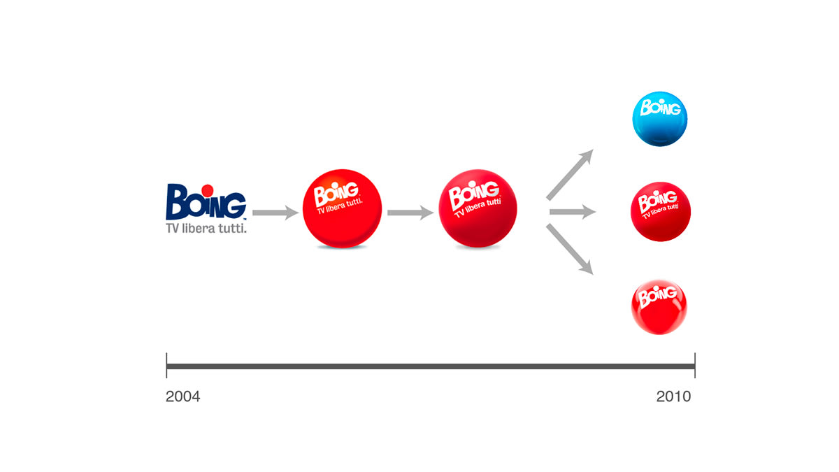
LOGO EVOLUTION SINCE 2004
Since this channel was born, there have been very few changes in the logotype. Using the sphere as the main form, the logo has gone from just the letter “I” to include many other elements. This has led to some problems in adapting the logo in other countries. In Spain for example, the problem was the similarity of this logo with the one of Cuatro Channel, which belongs to the same Group Company, Mediaset and couldn´t live together with the same color, both were a red sphere.
_____
_____
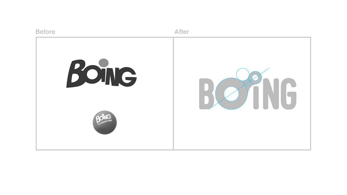
BUILDING A NEW LOGO
Keeping the circular shape of the logo that has been used in the recent years and playing with the point of the letter "I", used before, we can evolve the logo and typography while maintaining the original essence, giving a new personality with more possibilities to communicate.
_____
_____
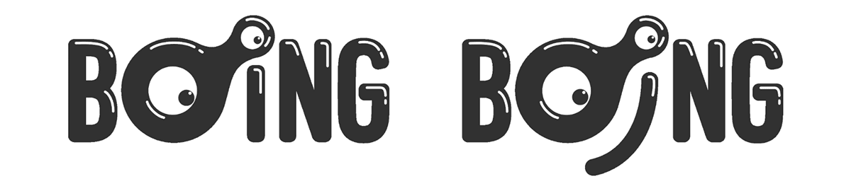
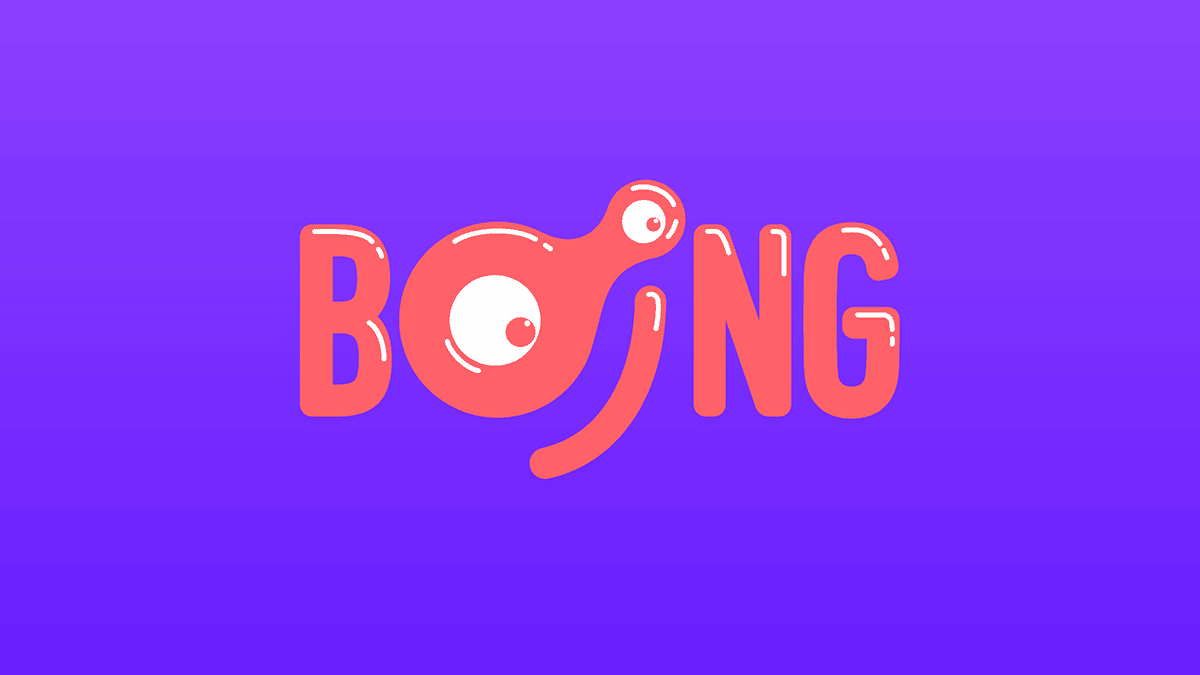
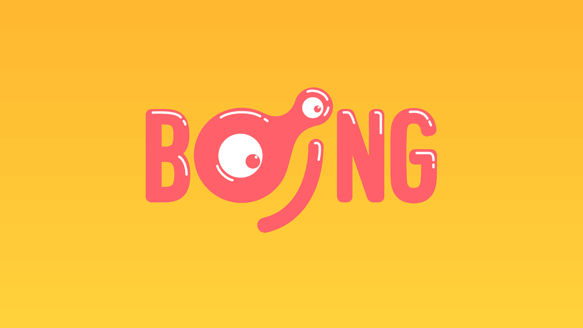
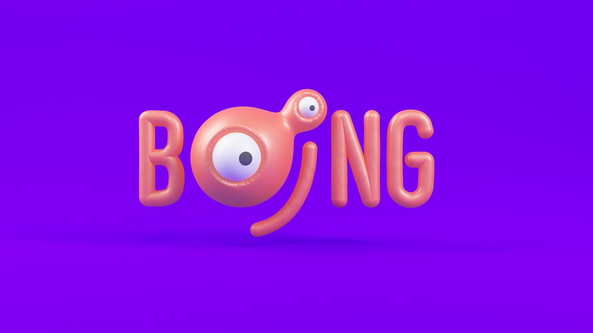
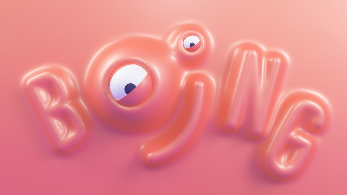
NEW LOGO 2D VERSION
We will add personality to the logo, with glosses to make it more friendly and creating a character with the own logo. A new logo that will have personality, dynamism and it will give new ways to communicate. A logo which differs from the rest, it can work without color too, it is unique because of the various forms it can adopt.
_____
_____
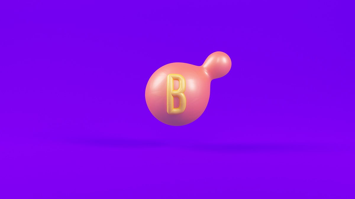
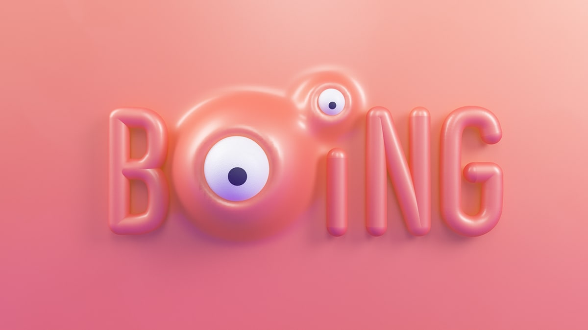
NEW LOGO 2D VERSION
To use as Imago, Bug or reduced spaces, we have created this small version. It simplifies the extended version, maintaining its personality and its readability.
_____

_____
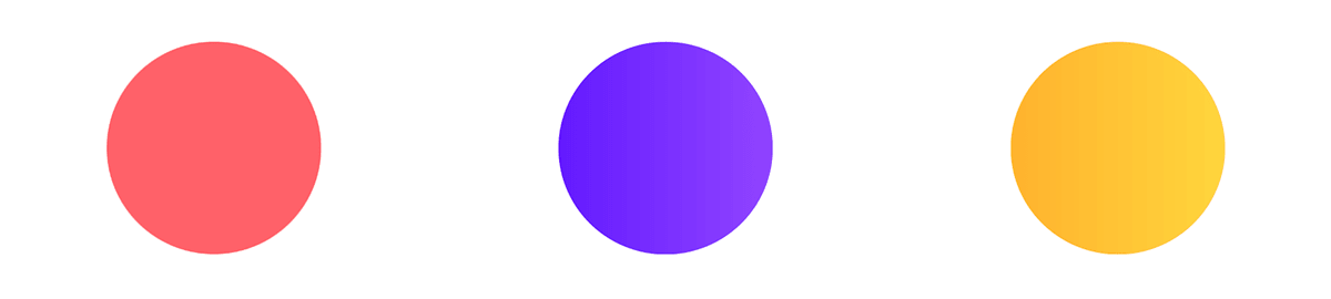
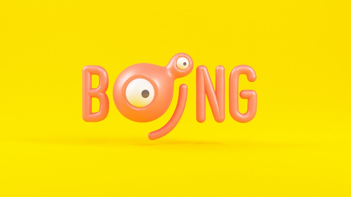
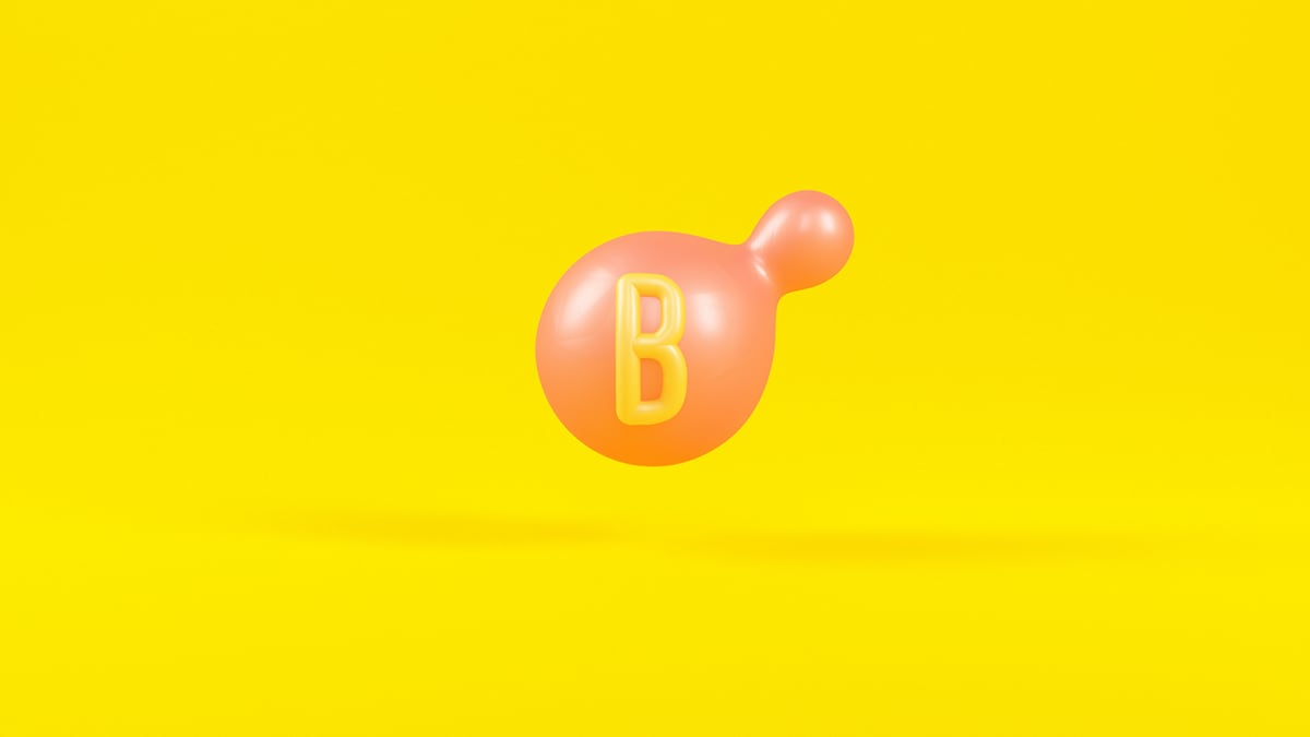
COLORS
We have created a new color palette. Showing colors that renew the image and that are not linked to other channels. This range of color will be a multi colored palette, keeping always the same color for the logo, we will be able to change the background colors depending on each communication needs.
_____
_____
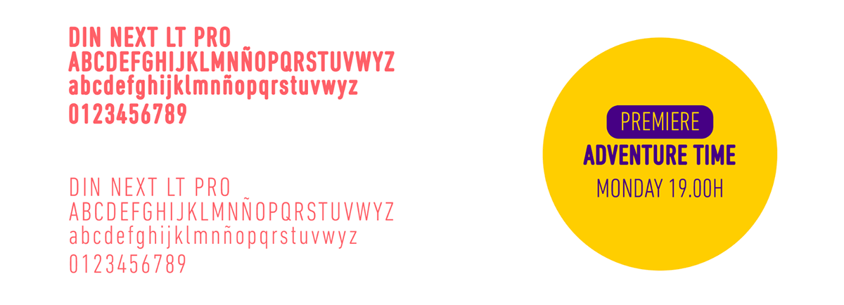
TYPOGRAPHY
For the logo and the headlines, we will use a personalized DIN typo with an out-line to make it more rounded and more friendly. For the rest of the texts, we will use it without the outline.
_____
LOGO FLAT VERSION
LOGO 3D VERSION
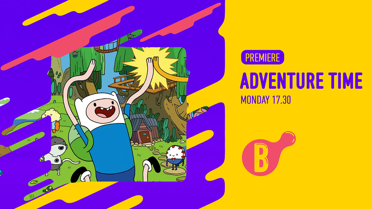
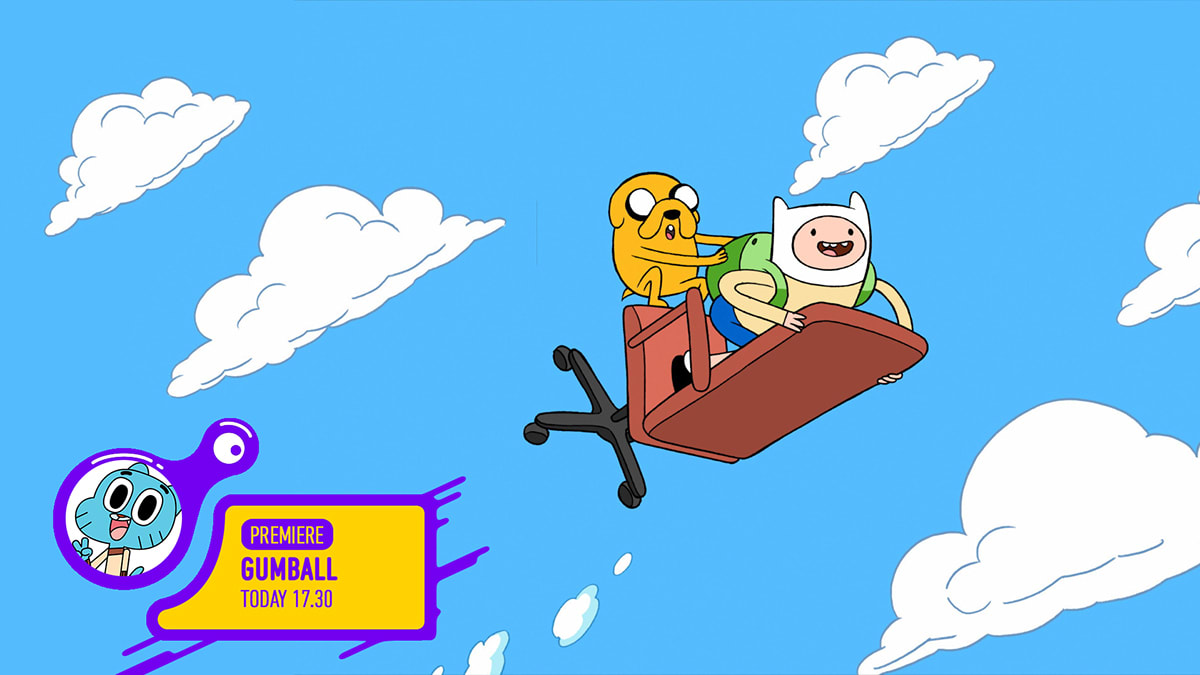
PROMO VERSION A
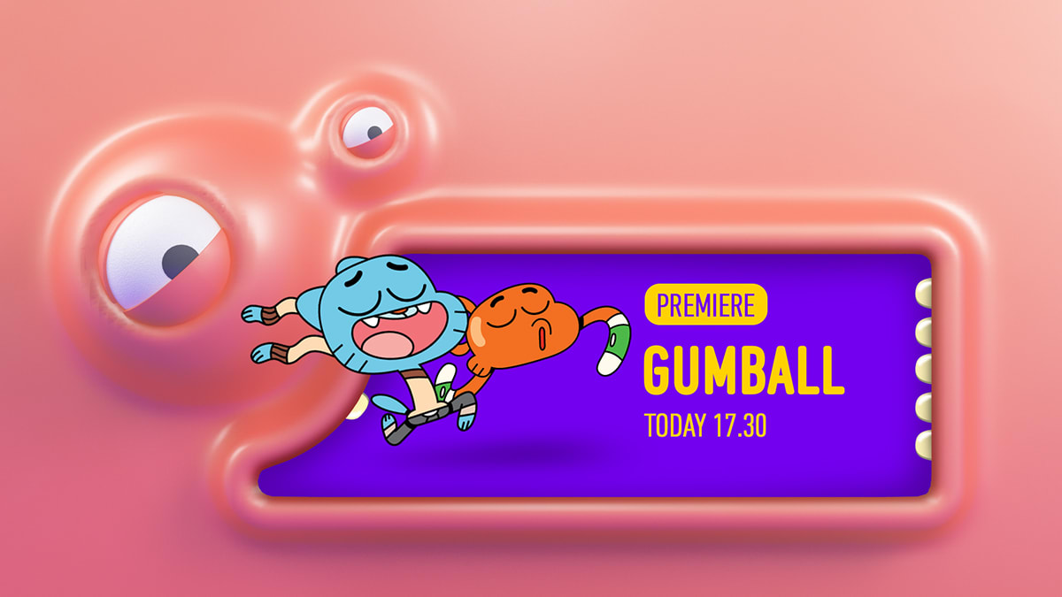
PROMO VERSION B
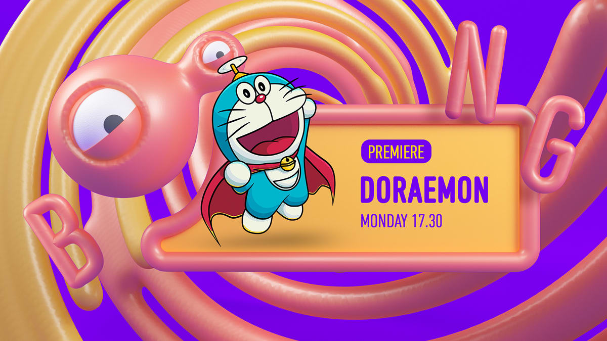
PROMO VERSION C
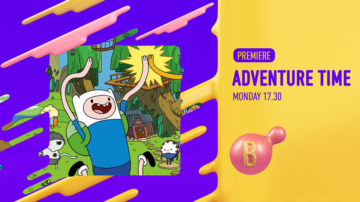
PROMO VERSION C FLAT
PATHFINDER
Channel ID Logo


8 comments
margarito_estudio
Fine thing, congratulations! :)
See original
Hide original
elizabeth_castillo_castillo
I loved it super.
See original
Hide original
ivaniaeaton4
your project is very good and interesting, I wish you the best of success in your project !!! Congratulations!!
See original
Hide original
microbians
StaffGreat job Tavete
See original
Hide original
cerrajerosencastellon1
Very good work
See original
Hide original
tefa_martinez_p
IN-CRE-Í-BLE!
See original
Hide original
gladyssiwon16
be amazed with the development of the concept! woooow!
See original
Hide original
cerrajeroscastellon
What a crack !!!!
See original
Hide original
Log in or join for Free to comment