She is very pretty! I just have one observation: don't you think it's too trendy to survive more than 5 years without looking bad? Because, we well know that in design timelessness is above trends. I just think.
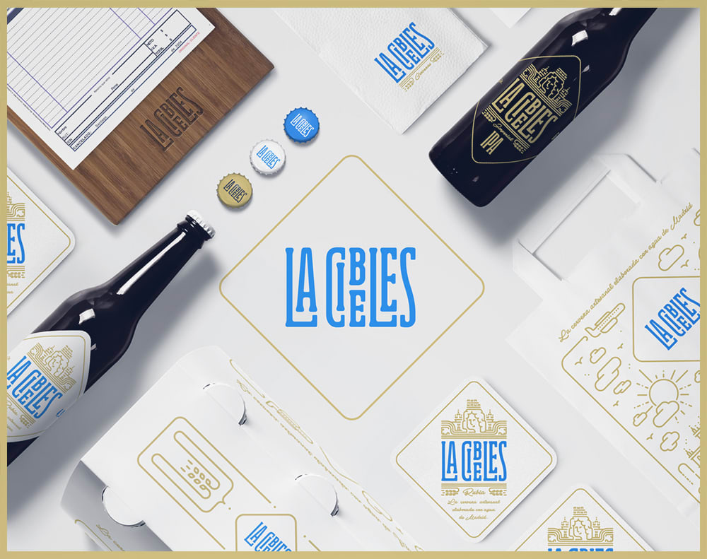
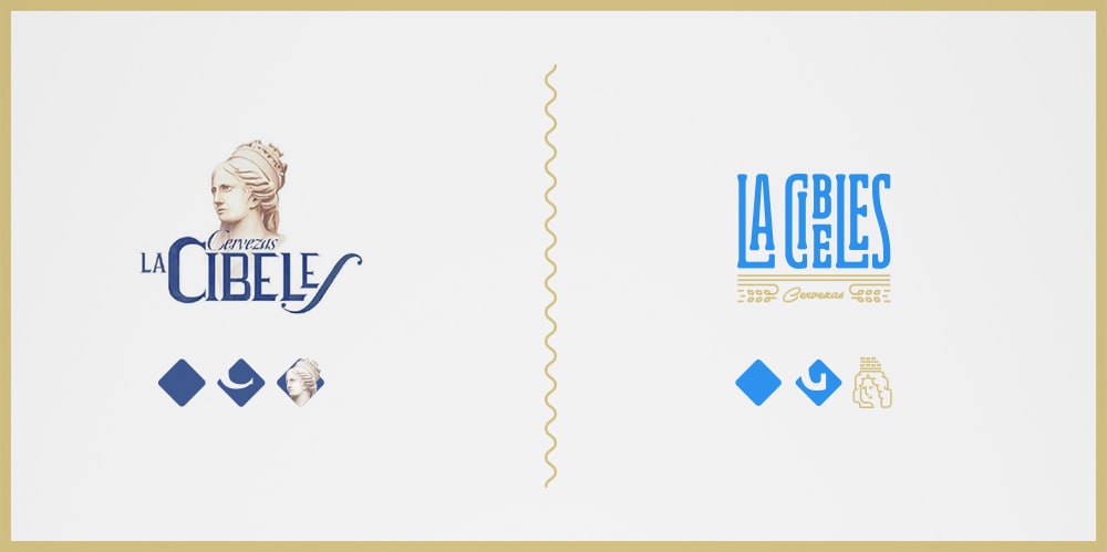
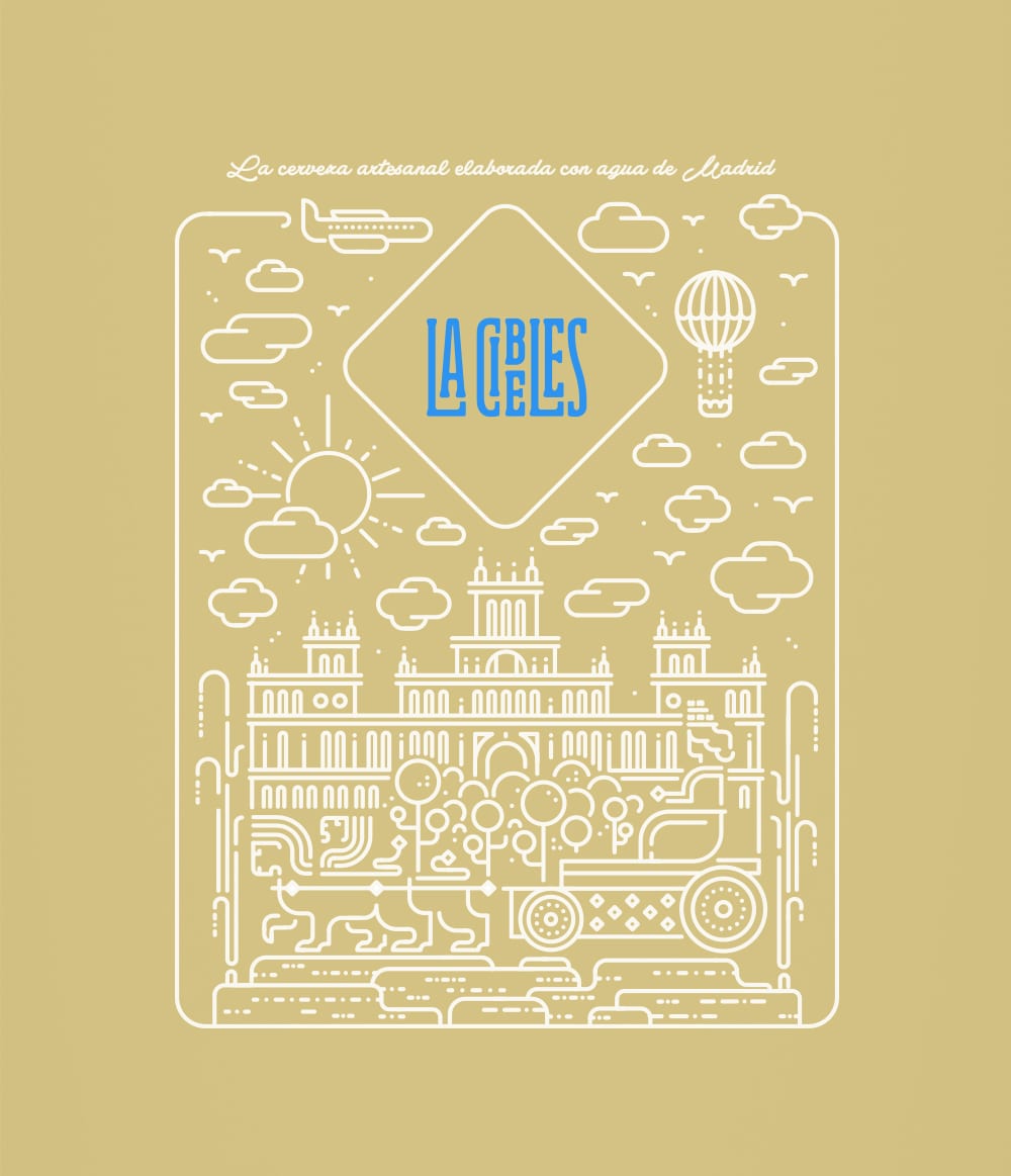
As a Madrilenian I can tell you that the logo is very traditional. The most difficult thing is the way in which you have managed to update the traditional aesthetic in contemporary while maintaining the original flavor.
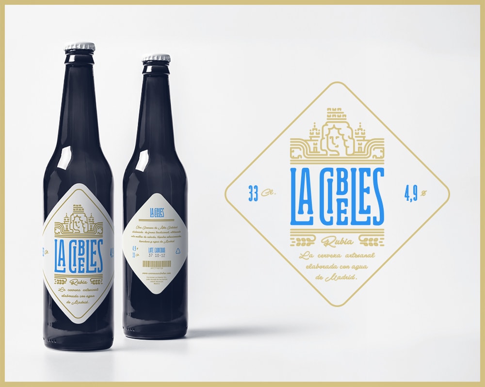
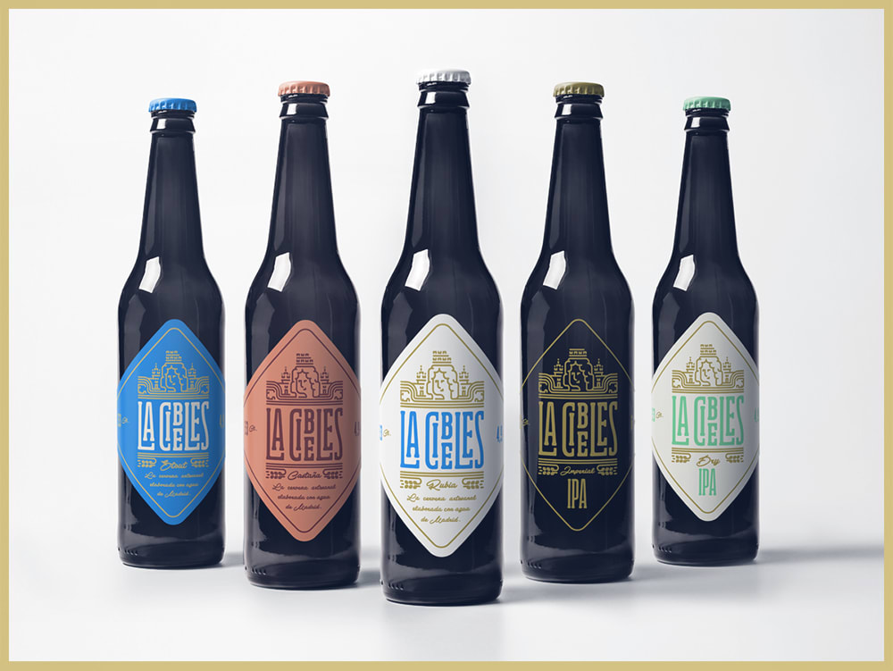
What squeaks a bit is the article "La" heading the logo, I think that with "Cibeles" it would have had more impact in general. The color and the impeccable typesetting.


7 comments
Miguel Ferrera
How cool !!!!
See original
Hide original
igloo
Very cool !!
See original
Hide original
Rafa Hernández
Congratulations, it's great!
See original
Hide original
llamarada
Teacher PlusShe is very pretty! I just have one observation: don't you think it's too trendy to survive more than 5 years without looking bad? Because, we well know that in design timelessness is above trends. I just think.
See original
Hide original
nueve_estudio
+++
pchico
I love. Congratulations!!
See original
Hide original
picreation
As a Madrilenian I can tell you that the logo is very traditional. The most difficult thing is the way in which you have managed to update the traditional aesthetic in contemporary while maintaining the original flavor.
What squeaks a bit is the article "La" heading the logo, I think that with "Cibeles" it would have had more impact in general. The color and the impeccable typesetting.
See original
Hide original
Log in or join for Free to comment