Hello @toni_matas , congratulations on finishing the course with the project!
I give you some feedback on your delivery:
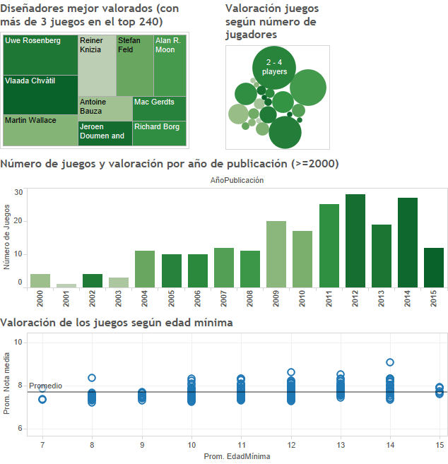
1. Keep in mind that, as I mentioned in the course, using sizes to compare values is not the best option. However, it is good to do when the representation gives us other things. In this case, I think it would be better to look for alternatives to the tremmap and the bubble chart that you have at the beginning
2. The visualization as a whole is missing labels that help to understand (at least, non-experts like me) what data is being visualized.
3. In the barchart it would be good if you rotate the number of the years to put them horizontally and thus improve their visibility. In the same way, maybe it will be good to add a small grid that helps to see the value of the bars
4. The final graphic doesn't quite communicate too much. Looking at the graph I don't know exactly what it is showing me
Thank you for your feedback, I will take your advice into account.
In principle, these are data on the first 240 board games rated on a specialized website (www.boardgamegeek.com), I found it interesting to associate the number of games with the size and intensity of the color with the rating (bigger, more games, more dark best games).
Regarding the final graph, my idea is that children's games (with lower minimum ages) are less valued than complex games (where the minimum age required is higher). I do not know if there is causality, if, as they are children's games, users value them worse, etc. But my idea was to show the games by minimum age and see the average valuation (after moving the mouse you can see what games we are talking about).


2 comments
victorpascual
Teacher PlusHello @toni_matas , congratulations on finishing the course with the project!
I give you some feedback on your delivery:
1. Keep in mind that, as I mentioned in the course, using sizes to compare values is not the best option. However, it is good to do when the representation gives us other things. In this case, I think it would be better to look for alternatives to the tremmap and the bubble chart that you have at the beginning
2. The visualization as a whole is missing labels that help to understand (at least, non-experts like me) what data is being visualized.
3. In the barchart it would be good if you rotate the number of the years to put them horizontally and thus improve their visibility. In the same way, maybe it will be good to add a small grid that helps to see the value of the bars
4. The final graphic doesn't quite communicate too much. Looking at the graph I don't know exactly what it is showing me
Cheers
See original
Hide original
toni_matas
Thank you for your feedback, I will take your advice into account.
In principle, these are data on the first 240 board games rated on a specialized website (www.boardgamegeek.com), I found it interesting to associate the number of games with the size and intensity of the color with the rating (bigger, more games, more dark best games).
I don't know if you have been able to access the link, which perhaps contains more information thanks to the tooltips; There are also graphics that, when placed in the dashboard, "ate" text: https://public.tableau.com/views/Domestika-Proyecto/Dashboard1?:embed=y&:display_count=yes&:showTabs=y
Regarding the final graph, my idea is that children's games (with lower minimum ages) are less valued than complex games (where the minimum age required is higher). I do not know if there is causality, if, as they are children's games, users value them worse, etc. But my idea was to show the games by minimum age and see the average valuation (after moving the mouse you can see what games we are talking about).
a greeting
See original
Hide original
Log in or join for Free to comment