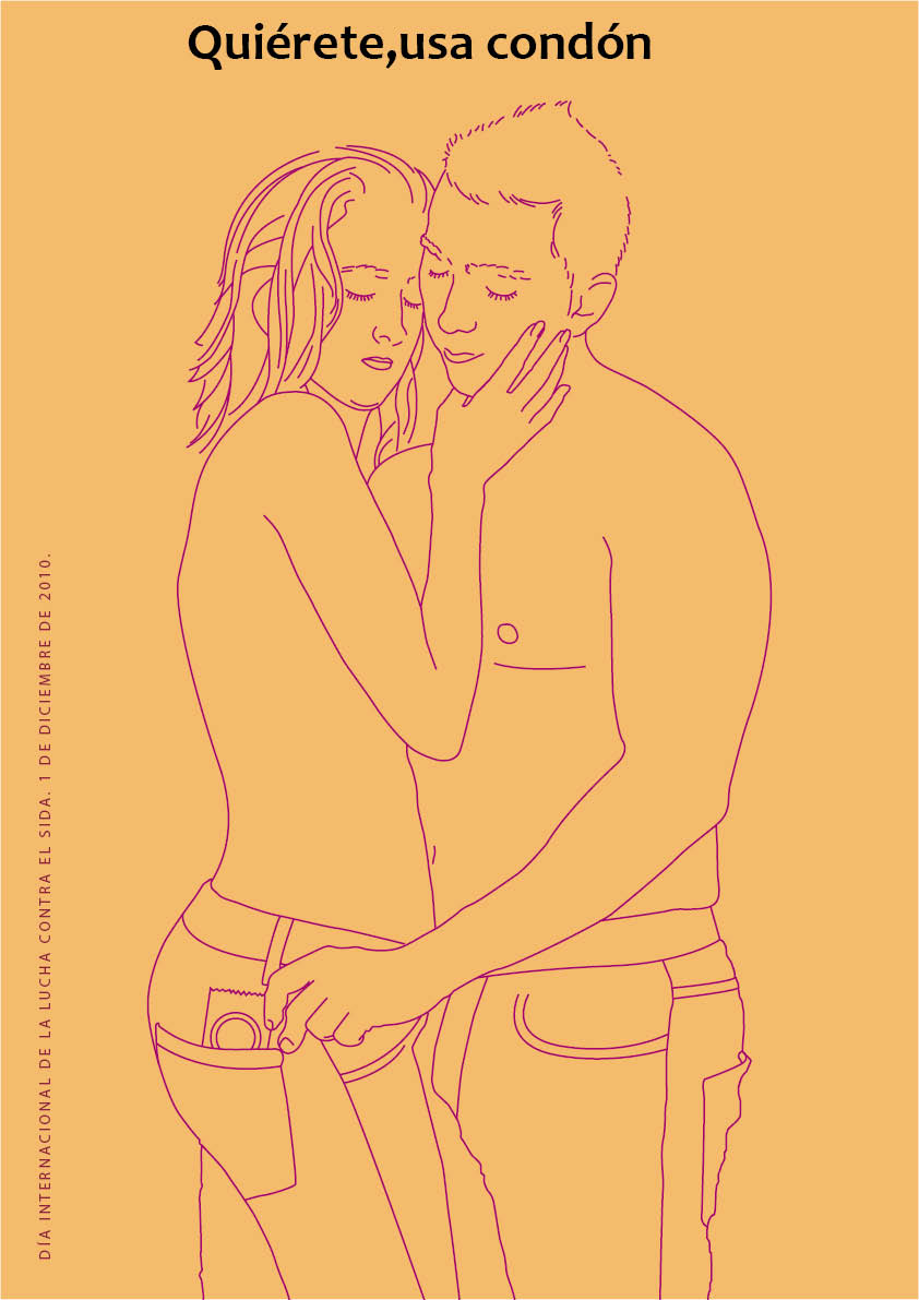
The title as Angie says, yes, you should center it a little bit and give it more space to breathe.
The illustration is perfect although it would also make it smaller, so it would have more space for the title.
Now, looking at the phrase on the left, I think it is also important, I would play with it next to the title and I would not leave it to one side of the poster, do not make it the same size but if it plays with it.
On the other hand, I see the poster itself very uniform in terms of color, I like that you have not used red as they always put in this type of posters, apart from being a serious issue, the message you intend to give is "this is the remedy "And that is why a poster has to attract attention, either with the title or with the illustration, so that it is remembered without having the poster in front of it.
Good luck and courage, you are on the right track!


1 comment
BBDIMAGE
The title as Angie says, yes, you should center it a little bit and give it more space to breathe.
The illustration is perfect although it would also make it smaller, so it would have more space for the title.
Now, looking at the phrase on the left, I think it is also important, I would play with it next to the title and I would not leave it to one side of the poster, do not make it the same size but if it plays with it.
On the other hand, I see the poster itself very uniform in terms of color, I like that you have not used red as they always put in this type of posters, apart from being a serious issue, the message you intend to give is "this is the remedy "And that is why a poster has to attract attention, either with the title or with the illustration, so that it is remembered without having the poster in front of it.
Good luck and courage, you are on the right track!
See original
Hide original
Log in or join for Free to comment