@kikillor-1 Enrique, I had not seen it, or it passed between several emails or the notification had not reached me, sorry!
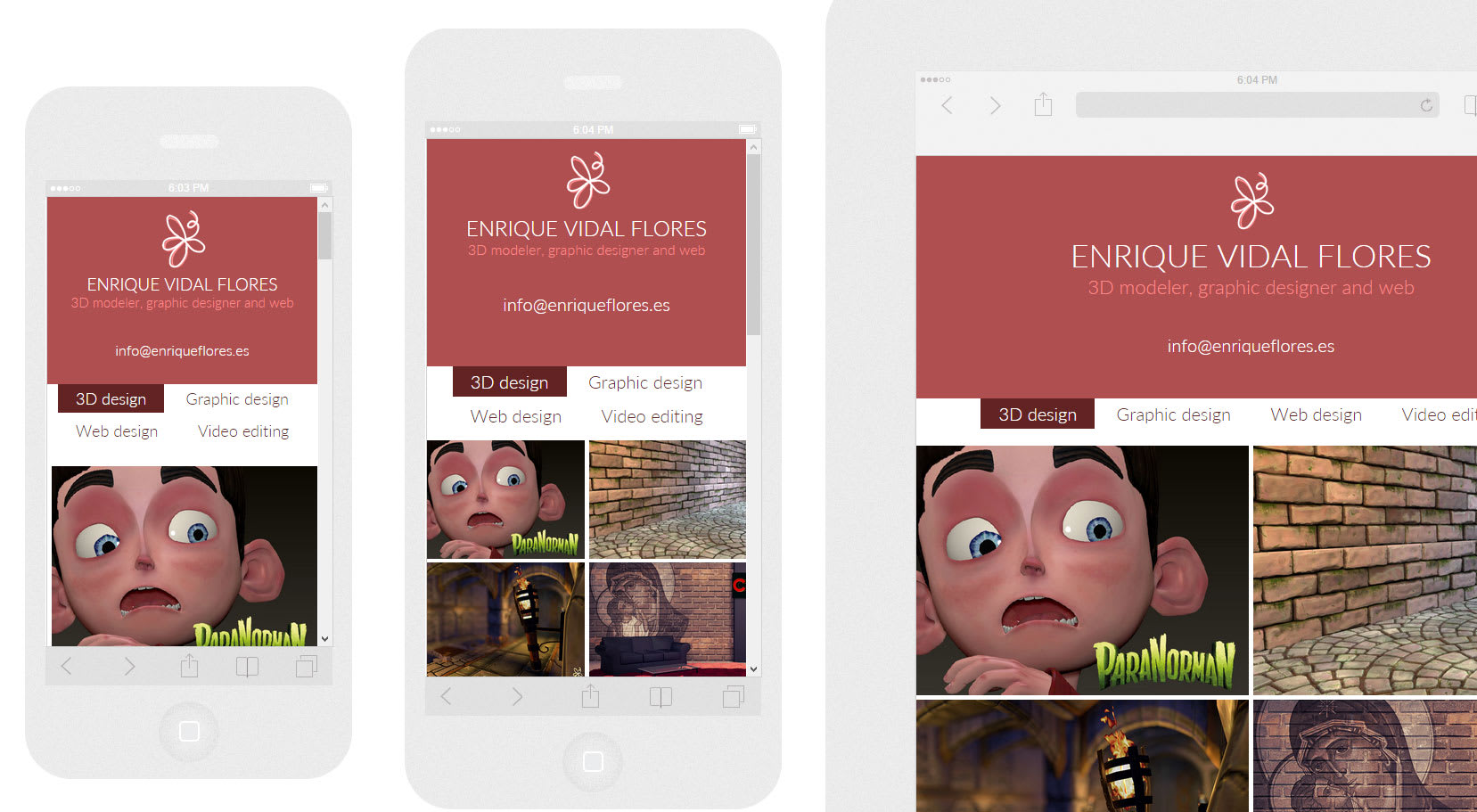
I see the responsive theme well resolved by changing the number of columns depending on the device. You have a headboard with a flat color that you could enhance with a background image or give it some depth, but it is only an aesthetic issue, so simple it also works.
Just take into account that the main menu on the mobile (with two columns) could be asymmetric if you add a fifth section. In that case, if you have each section in a single row (1 column), it does not matter how many entries you have, it will always be centered.


3 comments
enriqueflores
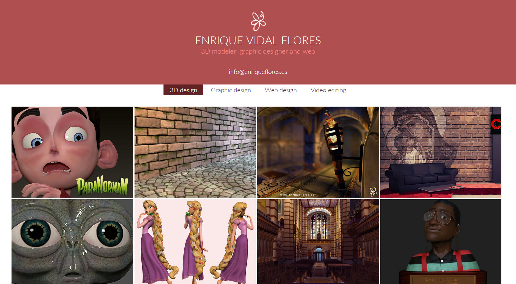
The web is this www.enriqueflores.es
See original
Hide original
fad
Teacher Plus@kikillor-1 Enrique, I had not seen it, or it passed between several emails or the notification had not reached me, sorry!
I see the responsive theme well resolved by changing the number of columns depending on the device. You have a headboard with a flat color that you could enhance with a background image or give it some depth, but it is only an aesthetic issue, so simple it also works.
Just take into account that the main menu on the mobile (with two columns) could be asymmetric if you add a fifth section. In that case, if you have each section in a single row (1 column), it does not matter how many entries you have, it will always be centered.
See original
Hide original
enriqueflores
Thanks for your helpful comment! See if I can take a look at it to see how I implement it. :) :) :)
See original
Hide original
Log in or join for Free to comment