


Beer colors
by Txaber Mentxaka @txaber
- 1305
- 35
- 7
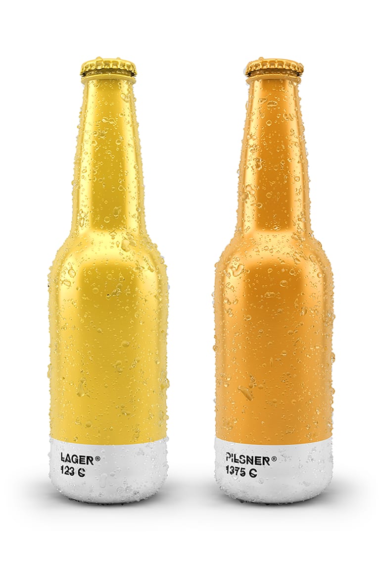
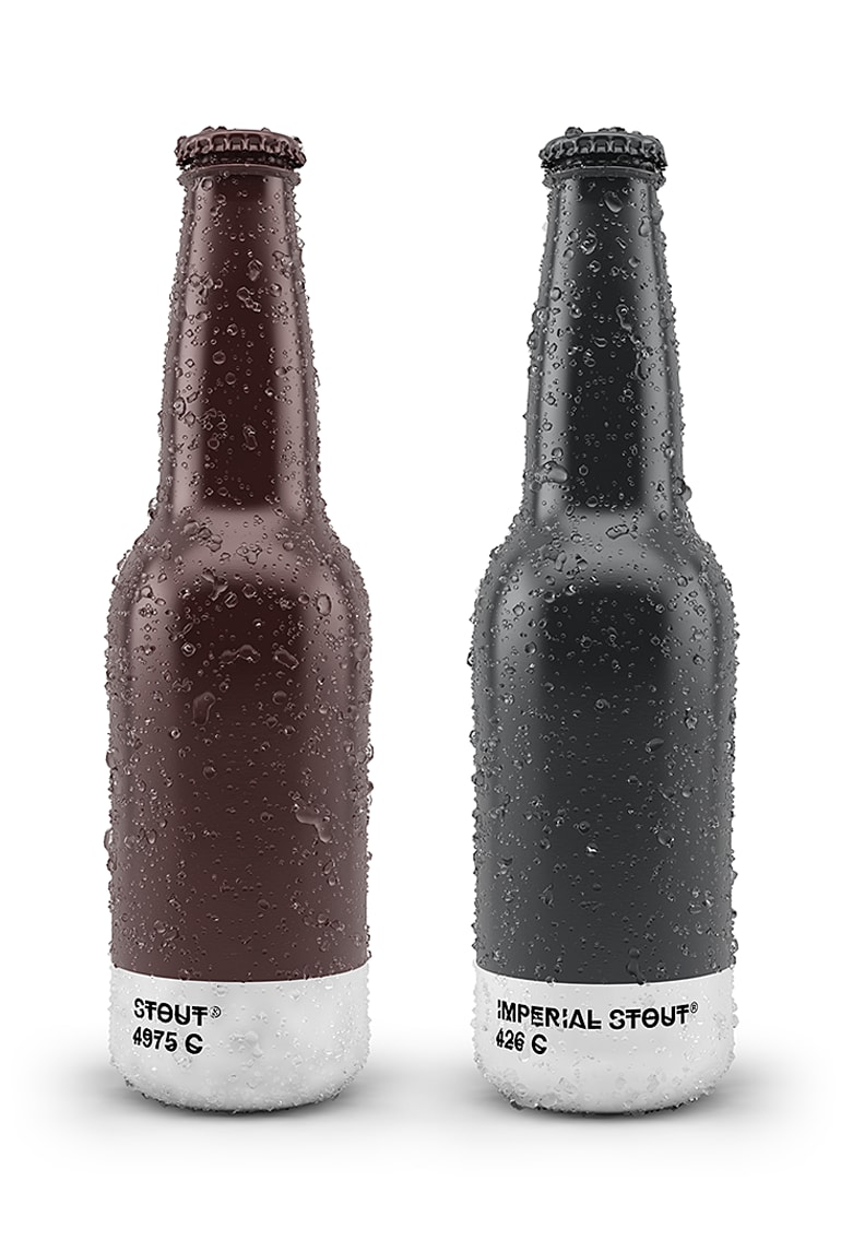
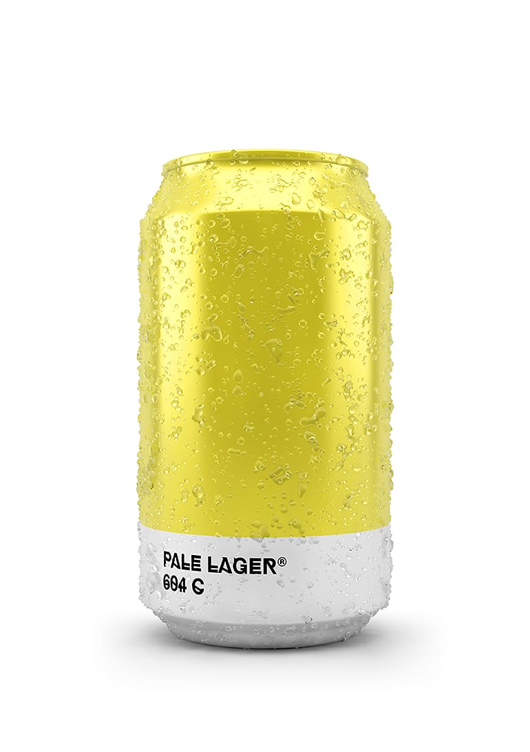
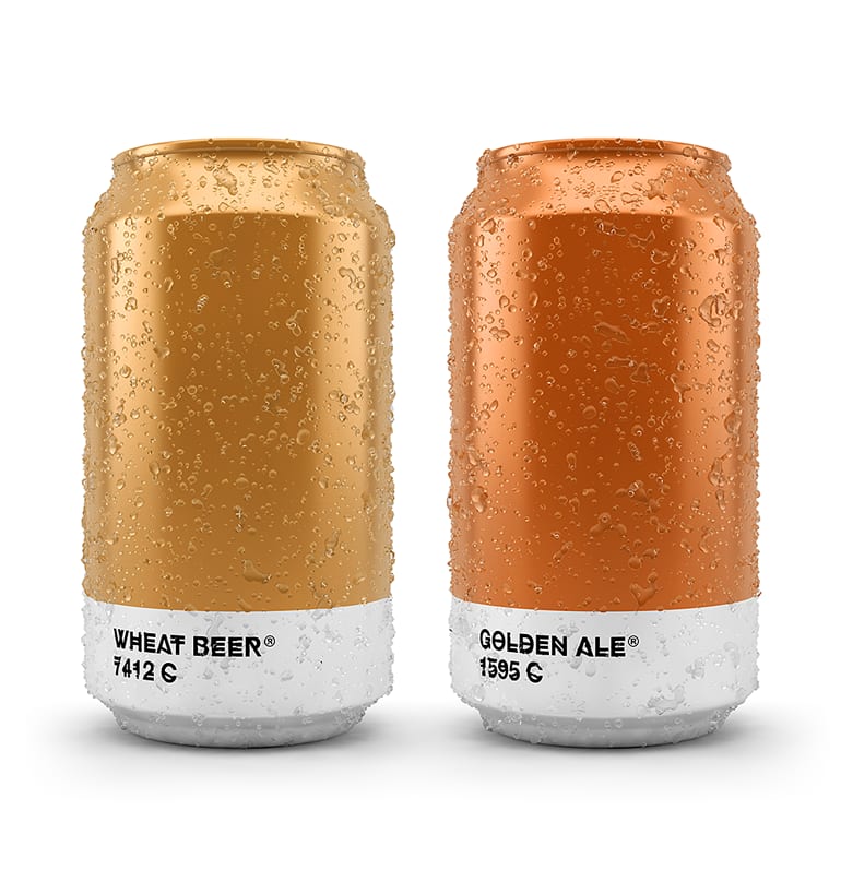
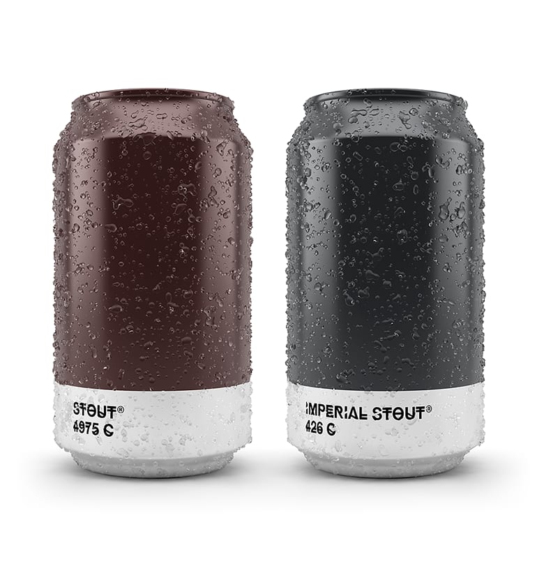
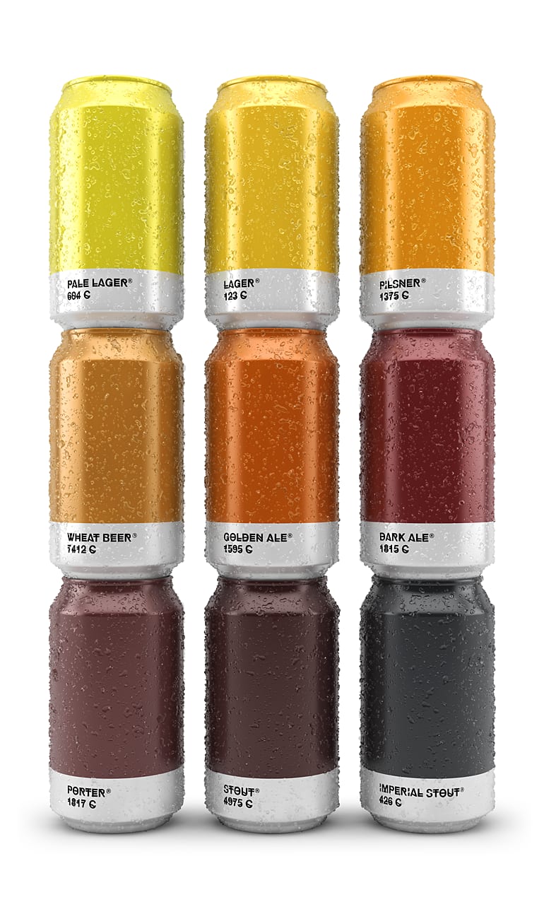
Diseño para línea de cervezas basado en el color. Cada tipo de cerveza está asociado con su correspondiente color Pantone. La tipografía elegida es HipstelveticaFontFamily en su versión bold diseñada por José Gomes, gracias por compartirla. Este proyecto ha sido ganador de un Pentaward de plata en la categoría de concepto.


7 comments
maduko
I really like the idea, the presentation is very good, but I kind of lack the connotation of beer. I think the line is closer to energy drinks (more "techno")
You have very good jobs. Congratulations.
See original
Hide original
modestoperezmorales
I think the idea of beer is made clear by the color from a lighter lager to a stronger, stronger stout. The maturation gives that tonality and those colors that I believe are quite successful. Perhaps there is very little difference between one and the other. I would stick to or trade 4 key shades.
But hey what I say, jj this beer is for experienced drinkers and why not have such a different range.
I was blown away and I want to drink a range of those
Congratulations !!!
See original
Hide original
maduko
You're right, that is very clear within the original concept, I put it wrong, what I lack is the brand. There is the concept of varieties of beers (different maturations), It is like a base graph of differentiation of lines through the concept of color, but the brand does not exist.
See original
Hide original
jmquiros
very good, so much so that we have posted it on the blog:
http://www.machodominante.es/un-color-una-cerveza/
;)
See original
Hide original
erreee
As bright as ever Txaber! ;)
See original
Hide original
albertoojeda
very good idea!!
See original
Hide original
holasergio
Very good!!
See original
Hide original
Log in or join for Free to comment