My project for course: Data Visualization and Information Design: Create a Visual Model
de Leza Deyzel @lezadeyzel
- 137
- 2
- 0
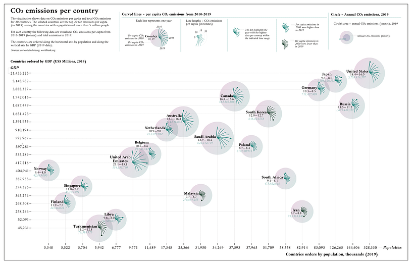
Since this was my first project, I decided to work with the CO2 emissions data as suggested in the course and followed the following steps:
1) Downloaded the CO2 emissions (total and per capita) for 2010-2019 from ourworldindata.org.
2) Added the population data for the top 20 countries in terms of CO2 emissions per capita.
3) I then selected the data for the top 20 countries for change over 2010-2019 (10 years).
4) I inspected and cleaned the data in Google Sheets by using filters and sorting.
5) My inspiration for the visualisation included a dandelion as well as green/grey colours.
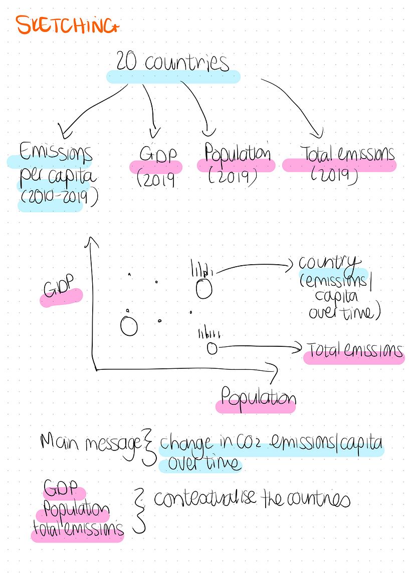
6) I sketched the planning for the visualisation to make sense of how the data could be displayed.
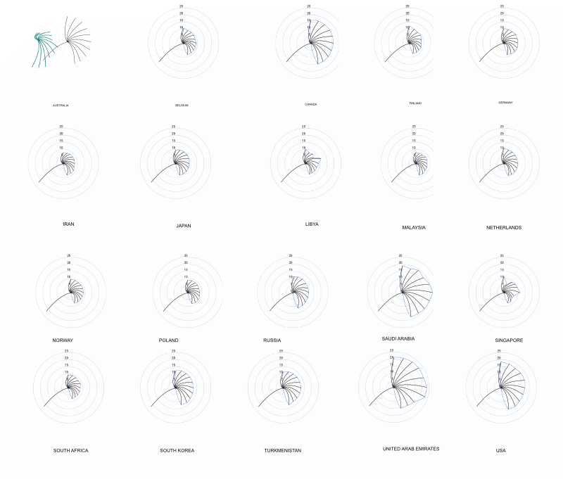
6) I plotted the emissions data in RAW Graphs and exported the images to Affinity Designer.
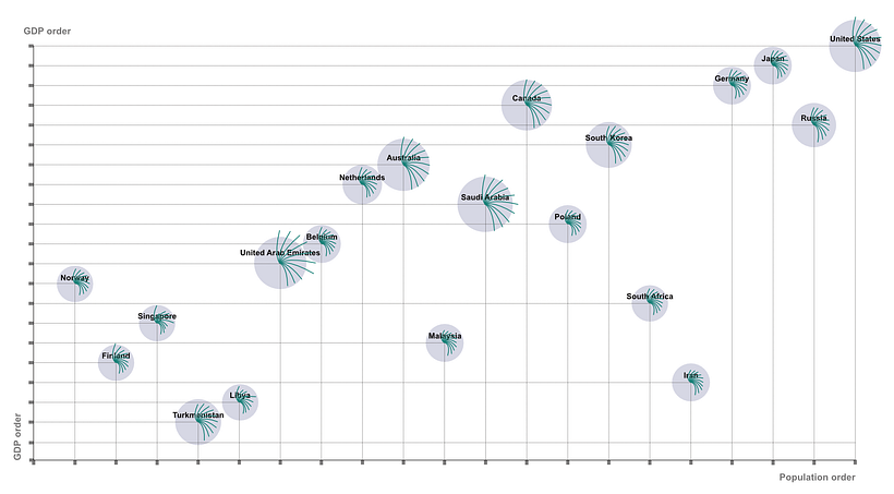
7) I worked in Affinity Designer and along the way I had to figure out other ways of completing the tasks since the same functionality as Adobe Illustrator was not necessarily available in Affinity Designer. For example, Affinity Designer does not have a built-in graphing tool. I then used RAW Graphs to export the radar charts for the emissions over time for each country in order to create the visuals in Affinity Designer.


I was very excited to complete the data visualisation and in addition to learning more about the process of creating the visualisation I also further developed my skills in Affinity Designer. One thing that really stood out for me in the course is how to constantly consider how your readers (users) will interact with the visualisation.

0 comentários
Faça login ou cadastre-se Gratuitamente para comentar