Self Identity
Self Identity
van Giorgia Smiraglia @giorgia_smiraglia
- 261
- 7
- 0
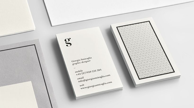
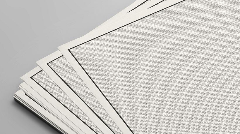
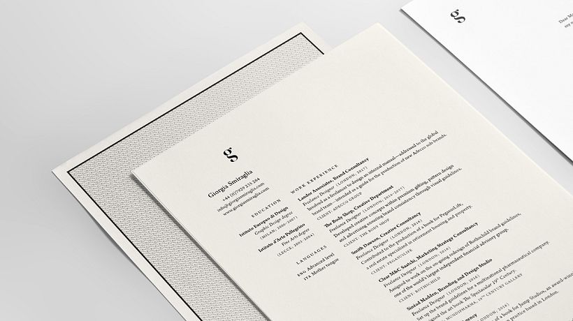
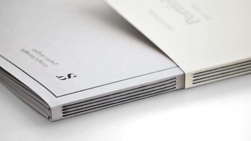
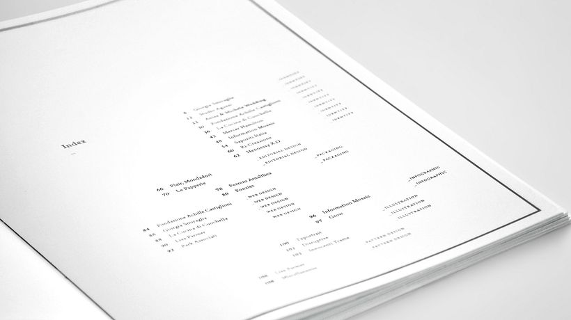
The monogram was created merging my initials vertically to create a unique sinuous mark. The font used is Didot that, with its contrasts and its neoclassical mark, evokes the values of clearness, balance and elegance while maintaining a strong character. These features characterize my work that, as for the Neoclassical style, is mainly based on rigour and harmony. The chosen typeface, Arno, is one of the most complete serif font families ever designed. Designed to be as readable as possible, the concrete nature of Arno font complies with the Neoclassical values. Based on the design of the logotype, an abstract pattern was created to embellish the back of the paper. It is characterised by a flowing rhythm that guides the eye along an oblique and dynamic trend.


0 opmerkingen
Log in of doe gratis mee om te reageren