
Karakters met karakter
Een cursus van Marta Cerdà AlimbauGrafisch ontwerper
Een cursus van Marta Cerdà Alimbau, Grafisch ontwerper

Digitale technieken en trucs om een decoratieve initiaal te tekenen
If you draw letters by hand you are not very good at it, do not worry, with the help of Marta Cerdà you will learn to draw perfect curves without getting a finger stained.
In this course you will design a wide variety of letter styles while exploring the boundaries between illustration and typography in a simple and methodological way. How? Through different techniques and digital tricks that will serve to give free rein to your most creative side.
In the end you will be able to create your own capitular or initial letter, basis of any word and starting point to make more complex letterings.
Wat leer je tijdens deze online cursus?
12 lessen & 6 aanvullende bronnen
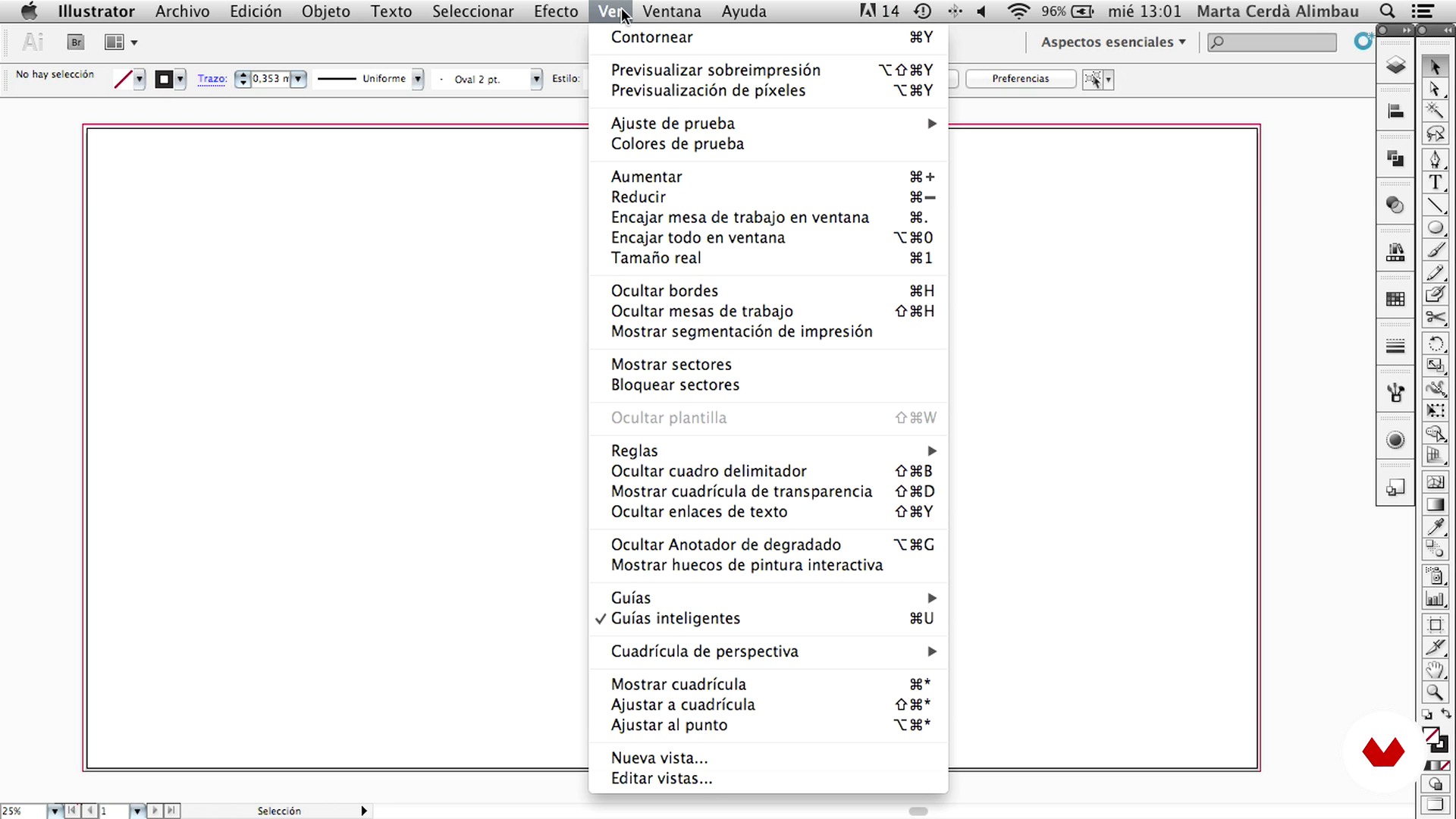
Prepare the document
3 minuten, 53 seconden
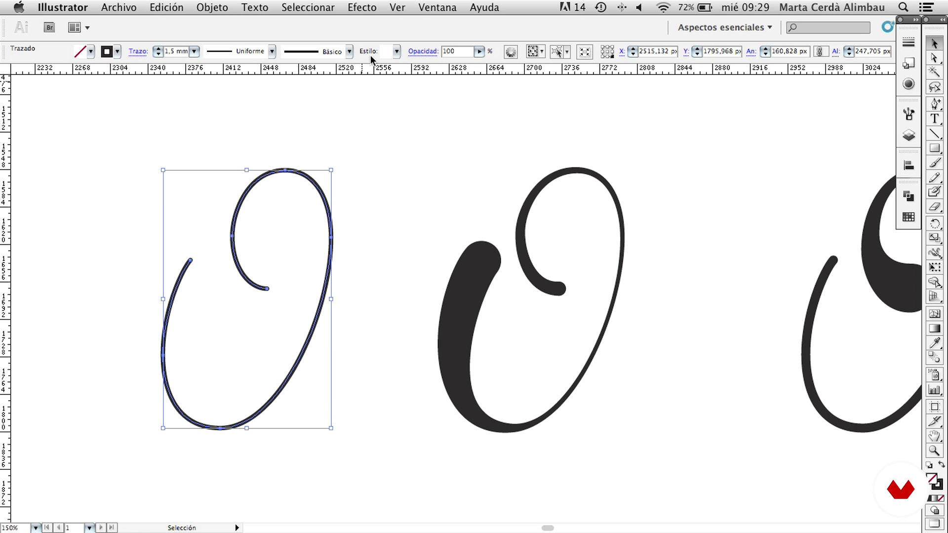
The pen and geometric shapes
12 minuten, 31 seconden
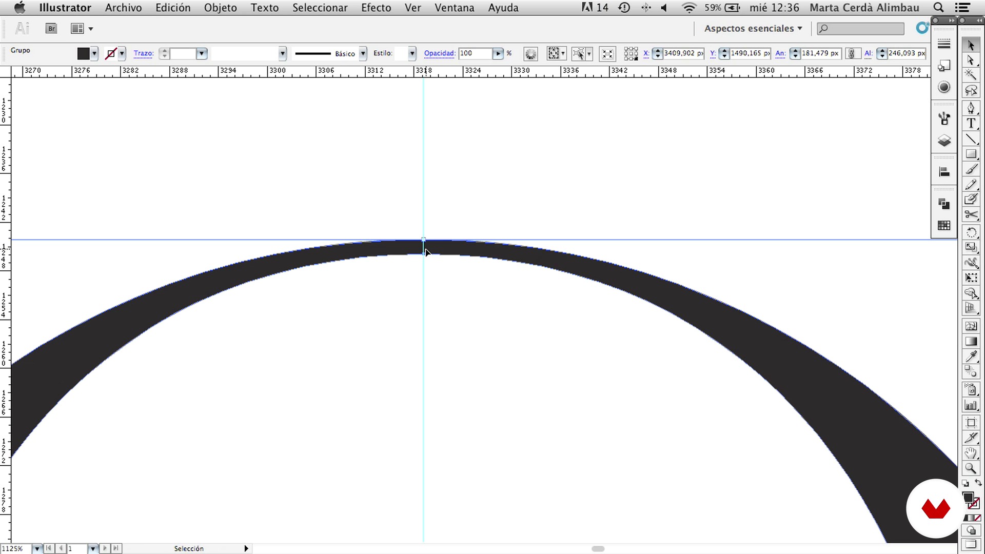
The modules
6 minuten, 8 seconden
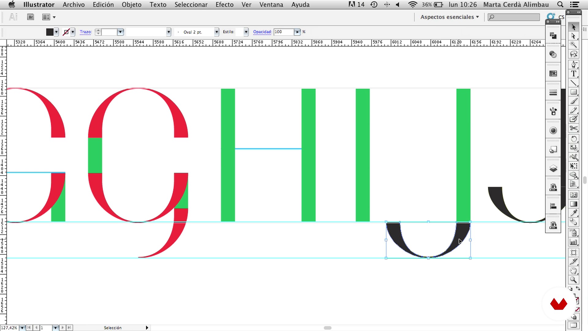
Capitulars: alphabet
7 minuten, 55 seconden
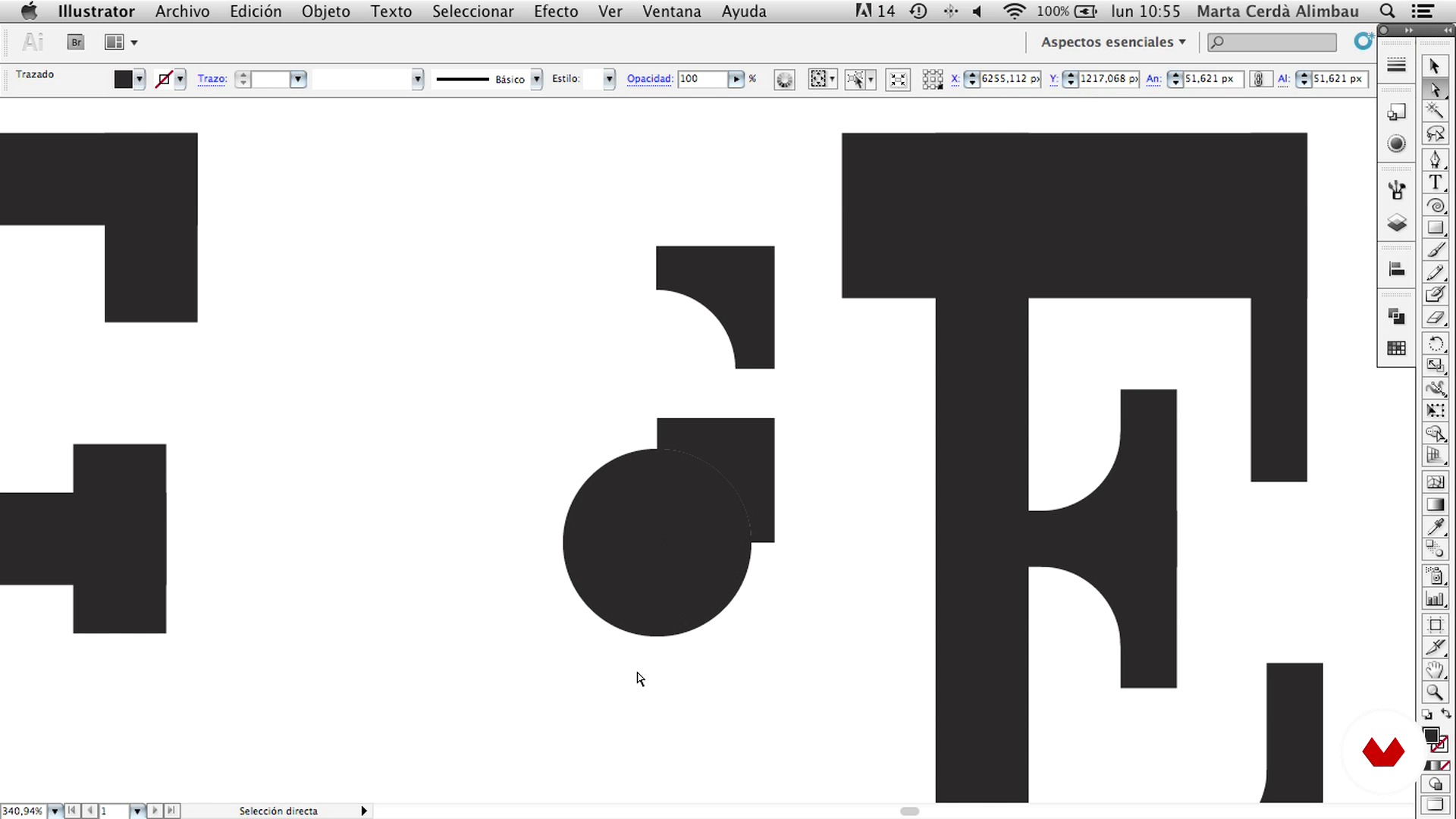
Capitulars: styles
10 minuten, 54 seconden
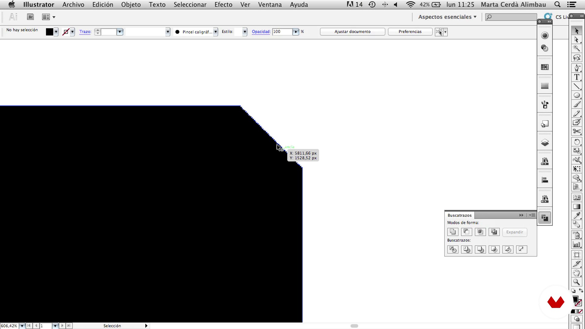
Vector volume effects I
11 minuten, 52 seconden
Wat is inbegrepen in deze cursus?
Much character! You will begin by knowing better the work of Marta Cerdà, who focuses her work between the borders of lettering, typography and illustration, and also some books that may be of help.
Without going through the pencil and paper, you will learn to prepare a document correctly so you can start drawing a letter directly from the vector. You will know in depth the pen tool and all its possibilities, and how to play with it, combining it with geometric shapes. Then, using the scissors, you will discover the modules that will simplify the process and create more letters.
Then, with the base learned, you will review the entire alphabet and different styles, from the most geometric to the script. And finally, once you have learned how to draw a good skeleton, you will focus on the skin: the effects.
Aanbevolen software en tools voor deze cursus
Wat is het cursusproject?
Once you have learned the tools, you will design your own caption for a wine label. Marta will provide a template for Photoshop with which you can easily enter your label on the image of the bottle and give the final touch.

Projecten van studenten van de cursus


Voor wie is deze online cursus bedoeld?
To all those graphic designers who have an interest in letters and illustration and who want to start in this world. Also for those students who are already familiar with digital lettering and who want to explore and expand their set of tricks and tools.
Vereisten en materialen
For this course you will need a computer with Adobe Illustrator and Photoshop.

Beoordelingen
- 2 jaar geleden
muy bueno....
- 2 jaar geleden
Genialll
- 3 jaar geleden
Fantástica profesora
- 3 jaar geleden
Un curso genial.
- 3 jaar geleden
Marta es impecable, gracias :)

Toen hij eind 2008 de...
Inhoud
- U1
Tipas and types
- Welcome to the class!
- Books that can help you
- U2
Good practice manual
- Prepare the document
- The pen and geometric shapes
- The modules
- U3
Capitulars
- Capitulars: alphabet
- Capitulars: styles
- U4
Effects
- Vector volume effects I
- Effects of vector volume II
- U5
Wine label
- Ideas and Moodboard
- Proposals
- The final image: the photomontage
- EP
Eindproject
- Characters with character
Wat kan je verwachten van een cursus van Domestika
Leer in je eigen tempo
Geniet van thuis leren, zonder lesroosters en in je eigen tempo. Jij beslist wanneer je verder gaat met het volgende onderdeel.
Leer met de beste professionals
Leer de meest bruikbare methoden en technieken van de beste professionals in de creatieve industrie.
Ontmoet deskundige docenten
Iedere docent brengt kennis met passie over, biedt duidelijke uitleg en een professioneel perspectief bij elke les.
Certificaten
PLUSAls Plus-lid krijg je voor elke cursus een persoonlijk certificaat, ondertekend door je docent. Deel het in je portfolio, op social media of waar je maar wilt.
Zorg dat je op de voorste rij zit
Dankzij de hoge kwaliteit van de video's mis je geen enkel detail. Dankzij de onbeperkte toegang kun je de lessen zo vaak bekijken als nodig is om je vaardigheden te perfectioneren.
Deel kennis en ideeën
Stel vragen, krijg feedback en bied oplossingen aan. Deel je leerervaringen met andere studenten in de community die net als jij een passie hebben voor creativiteit.
Maak contact met een wereldwijde creatieve community
Deze community heeft miljoenen gebruikers van over de hele wereld, nieuwsgierig en enthousiast om hun creativiteit te verkennen en te uiten.
Geef cursussen op een professionele manier
Domestika selecteert zorgvuldig haar docenten en produceert iedere cursus in eigen huis om een uitstekende online leerervaring te garanderen.
Veelgestelde vragen
Lettering is de kunst van het creatief en persoonlijk tekenen van letters, terwijl digitale kalligrafie het schrijven van letters met digitale tools is, gericht op de vloeiendheid en structuur van het letterbeeld. In deze cursus combineren we beide om decoratieve letters te maken.
De cursus is gemiddeld van niveau, dus het is handig als je basiskennis hebt van grafisch ontwerp of programma’s zoals Illustrator. Je hoeft geen expert te zijn, maar vertrouwd raken met digitale tools is wel aan te raden.
Je hebt een computer nodig met Adobe Illustrator en Photoshop. Een tekentablet is fijn, maar je kunt ook met een muis werken. Toegang tot inspiratiebronnen zoals typografieboeken en digitale moodboards is aanbevolen.
Je leert versierde beginletters maken, illustratie en typografie combineren, historische stijlen toepassen, wijnetiketten ontwerpen, geavanceerde vector technieken gebruiken en je projecten professioneel presenteren.
Een versierde beginletter is een grote, versierde hoofdletter aan het begin van een tekst of paragraaf, die opvalt en een artistiek accent geeft. Ze komen vaak voor in boeken, etiketten en uitgeefprojecten.
Ja, de cursus behandelt technieken om volumetrische effecten, schaduwen, texturen, neon-effecten en vectorornamenten te maken met Illustrator en Photoshop, zodat je letters er extra mooi uitzien.
Ja, je leert historische stijlen zoals Art Déco, middeleeuwse versierde beginletters en fantasie-alfabetten analyseren en opnieuw toepassen in digitale typografie.