
Typografie: ontwerp je eigen woorden
Een cursus van GlíglifoGrafisch ontwerpers gespecialiseerd in lettertypen
Een cursus van Glíglifo, Grafisch ontwerpers gespecialiseerd in lettertypen

Ontwerp een lettertype met de dubbele potloodtechniek
Do you love the letter? Well wait to master the word. In this online course, you will learn the theoretical and practical knowledge to get closer to the world of typography. You will design your own word step by step within a typographic system, from the manual creation to double pencil until the last adjustments in the computer.
Wat leer je tijdens deze online cursus?
18 lessen & 8 aanvullende bronnen
Bibliography
9 minuten, 58 seconden
Basic forms
2 minuten, 55 seconden
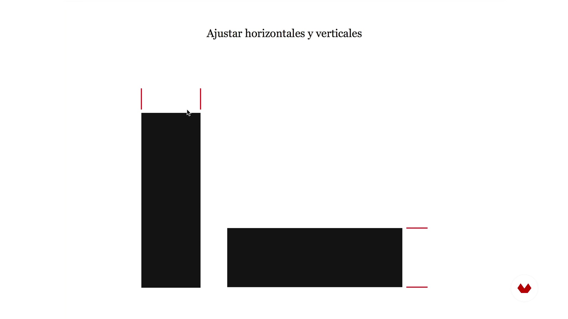
Optical laws
3 minuten, 59 seconden
Spacing and rhythm
5 minuten, 46 seconden
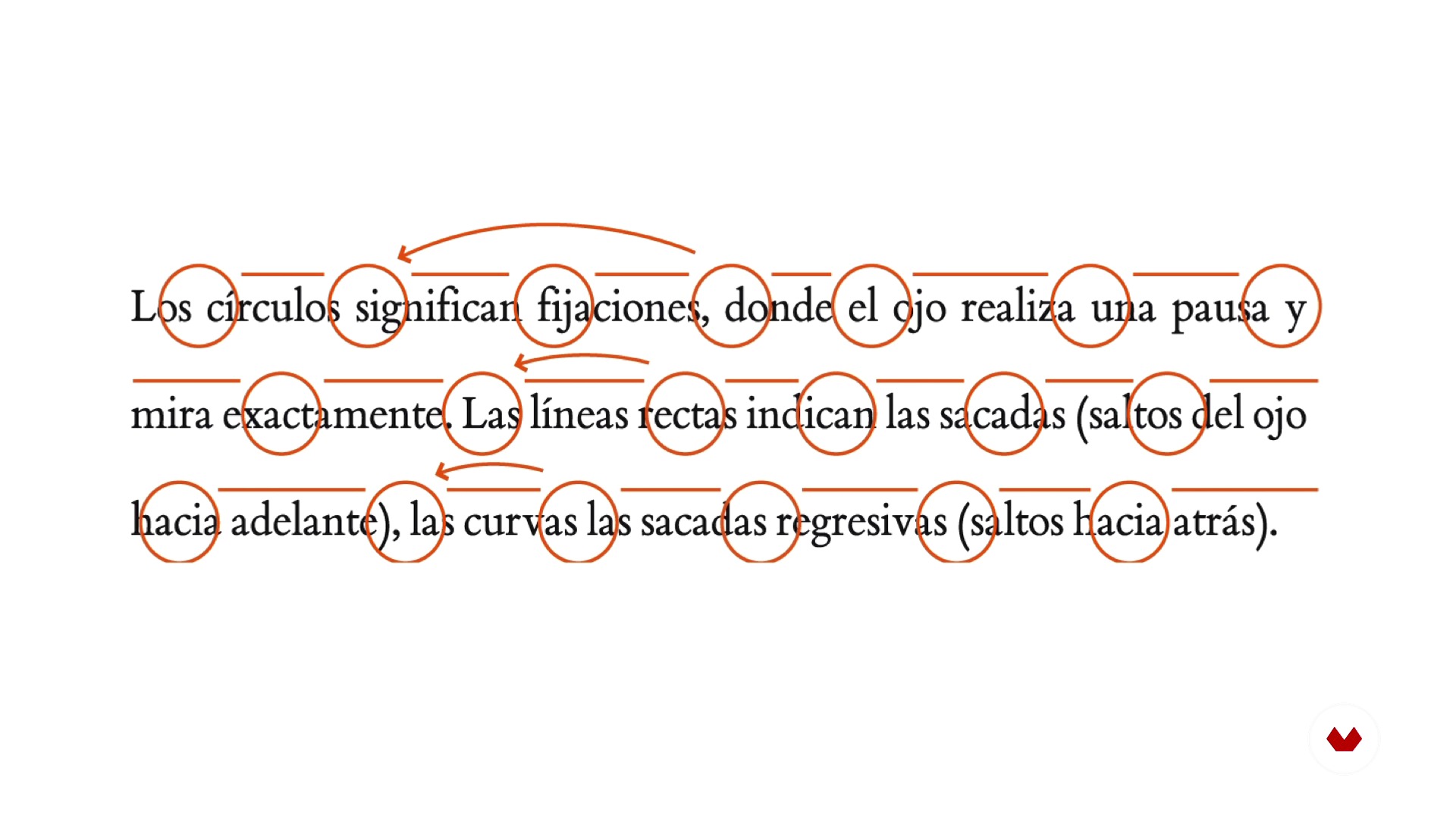
Reading and readability
4 minuten, 40 seconden
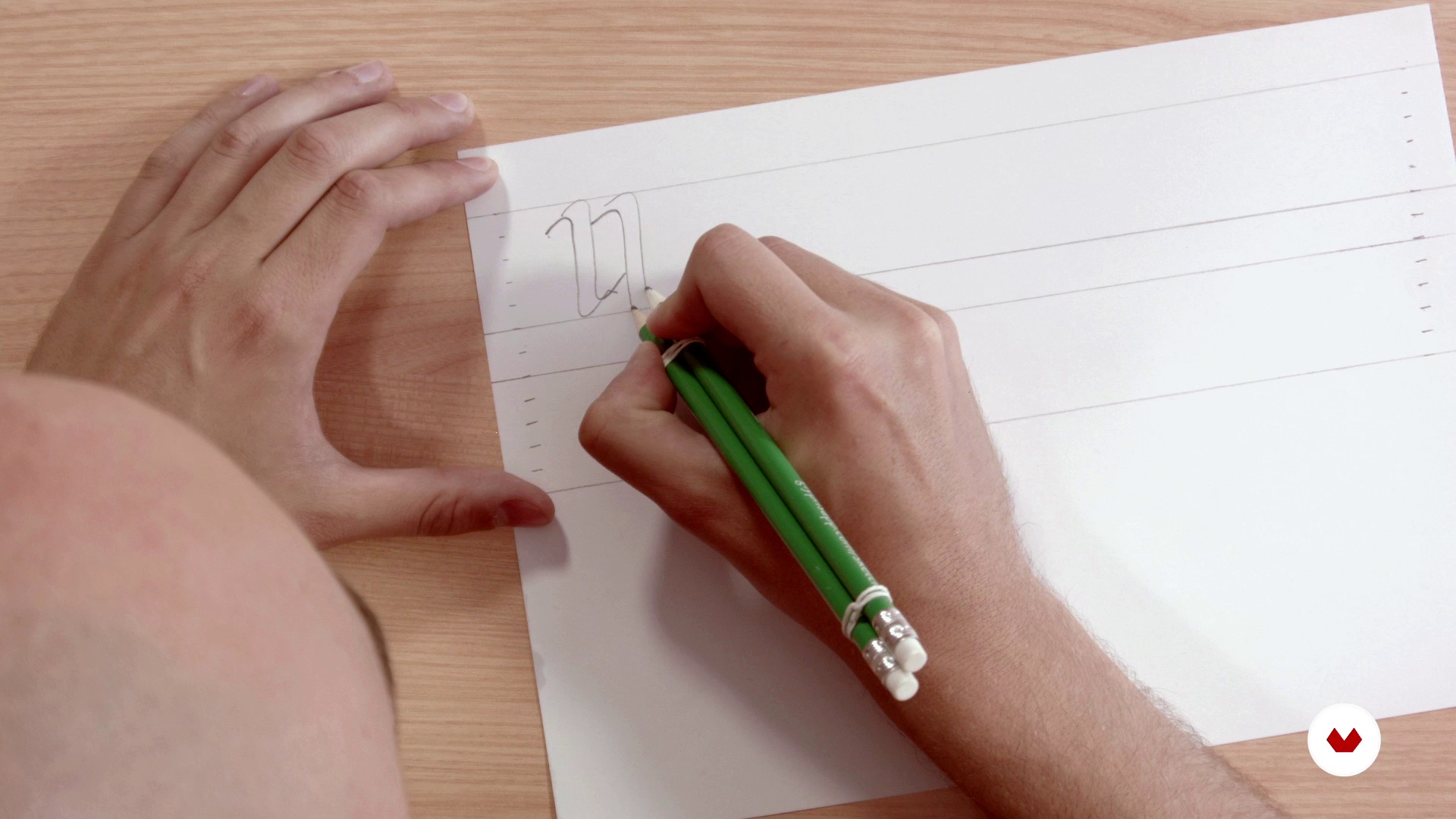
Structure and rhythm with double pencil
4 minuten, 50 seconden
Wat is inbegrepen in deze cursus?
In this course of typography you will begin by laying the theoretical bases of construction and anatomy of the letter starting from basic forms, playing with the optical laws, taking into account the spacing, the rhythm and the readability.
Next, you will define the typographic form with the double pencil technique, a simple tool that will allow you to learn to manage the rhythm and structure of the letters.
Then, you will go to the digitization phase using Illustrator and Glyphs (software for Mac), for the final obtaining of a typographic font. Finally, you will learn to apply certain tweaks and adjustments to then export the new type and be able to use it on your computer.
Aanbevolen software en tools voor deze cursus
Wat is het cursusproject?
The professors of Gliglifo will propose you a series of words taken from literature to find "their aroma" and begin to design a typeface that you can install on your computer. From there, you will already have the base to develop your own typographic system.

Projecten van studenten van de cursus


Voor wie is deze online cursus bedoeld?
To all letter lovers.
Vereisten en materialen
You do not need any prior knowledge in typography to create your final project. As for materials, you will need a normal paper, vegetable paper, two pens, two rubber bands to join the pencils and a computer with the Glyphs and Illustrator software (although the course offers alternative programs to be able to work on the typography design).

Beoordelingen
- 2 maanden geleden
Muy buen curso, grandes herramientas
- 2 jaar geleden
Molto interessante.
- 3 jaar geleden
Esperaba más de este curso, pero en cualquier caso merece la pena hacerlo porque siempre se aprende algo.
- 3 jaar geleden
This course is an absolute necessity for anyone who plans to begin their journey to become a professional typeface designer.
- 3 jaar geleden
Este curso es una pequeña maravilla. Muchos tips, muy buenos

Inhoud
- U1
Introduction
- Presentation
- Understand the letter, aroma and exercise
- Bibliography
- U2
Anatomy of the letter
- Basic forms
- Optical laws
- Spacing and rhythm
- Reading and readability
- U3
Architecture of the letter
- Structure and rhythm with double pencil
- Base drawing
- Adjustment and refinement
- U4
Digitization
- Introduction to vectorization
- Digitization with Illustrator
- Digitization with Glyphs 1
- Digitization with Glyphs 2
- Export and testing
- U5
Microtype, diacritics and spacing
- Microtypegraphic adjustments
- Diacritics
- Spacing between letters and end
- EP
Eindproject
- Typography: Build your word
Wat kan je verwachten van een cursus van Domestika
Leer in je eigen tempo
Geniet van thuis leren, zonder lesroosters en in je eigen tempo. Jij beslist wanneer je verder gaat met het volgende onderdeel.
Leer met de beste professionals
Leer de meest bruikbare methoden en technieken van de beste professionals in de creatieve industrie.
Ontmoet deskundige docenten
Iedere docent brengt kennis met passie over, biedt duidelijke uitleg en een professioneel perspectief bij elke les.
Certificaten
PLUSAls Plus-lid krijg je voor elke cursus een persoonlijk certificaat, ondertekend door je docent. Deel het in je portfolio, op social media of waar je maar wilt.
Zorg dat je op de voorste rij zit
Dankzij de hoge kwaliteit van de video's mis je geen enkel detail. Dankzij de onbeperkte toegang kun je de lessen zo vaak bekijken als nodig is om je vaardigheden te perfectioneren.
Deel kennis en ideeën
Stel vragen, krijg feedback en bied oplossingen aan. Deel je leerervaringen met andere studenten in de community die net als jij een passie hebben voor creativiteit.
Maak contact met een wereldwijde creatieve community
Deze community heeft miljoenen gebruikers van over de hele wereld, nieuwsgierig en enthousiast om hun creativiteit te verkennen en te uiten.
Geef cursussen op een professionele manier
Domestika selecteert zorgvuldig haar docenten en produceert iedere cursus in eigen huis om een uitstekende online leerervaring te garanderen.
Veelgestelde vragen
A glyph is the specific visual representation of a character, which can be a letter, number, or symbol. A character is the abstract unit, while the glyph is its concrete visual form within a typeface.
The course is aimed at people with basic knowledge of graphic design or typography, so it’s intermediate level. Familiarity with visual concepts and digital tools is recommended.
You’ll need a computer with vector design software like Adobe Illustrator and preferably a specialized typography program such as Glyphs or FontLab. Tracing paper, pencils, and a scanner are also recommended.
You’ll learn how to create custom glyphs, design letters from scratch, adjust proportions, spacing, and typographic rhythm, digitize your work, and apply optical principles to enhance legibility and consistency in your fonts.
The course guides you from manual sketching and anatomical understanding to digitization and optical adjustment of each letter, using techniques like the double-pencil method, calligraphic proportions, and visual tweaks in professional software.
Typographic consistency ensures all glyphs in a font share a unified visual and expressive logic, improving communication, readability, and strengthening the visual identity of any graphic design project.
The optical center is the visually balanced point of a letter, usually slightly above the mathematical center. Adjusting based on the optical center improves the look and legibility of characters.