Een digitaal lettertype ontwerpen van A tot Z
Een cursus van Juanjo LópezGrafisch ontwerper en lettertypeontwerper, reclamekunstenaar en gepassioneerd door letters
Een cursus van Juanjo López, Grafisch ontwerper en lettertypeontwerper, reclamekunstenaar en gepassioneerd door letters

Leer een volledig nieuw lettertype ontwerpen met Glyphs-, Illustrator- en OpenType-functies
Juanjo López, better known as Juanjez, specializes in typography design and is here to teach you the process of creating a digital font, from the drawing phase to uploading it to your fonts folder then using it in a design program.
Wat leer je tijdens deze online cursus?
34 lessen & 27 aanvullende bronnen
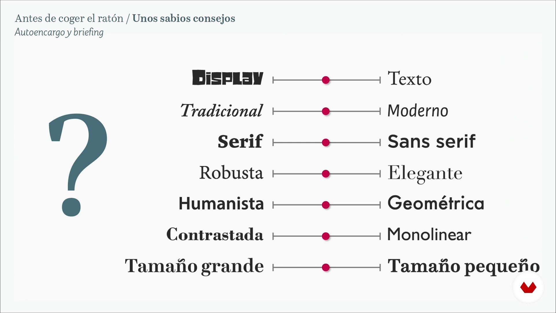
Some wise advice 1
19 minuten, 50 seconden
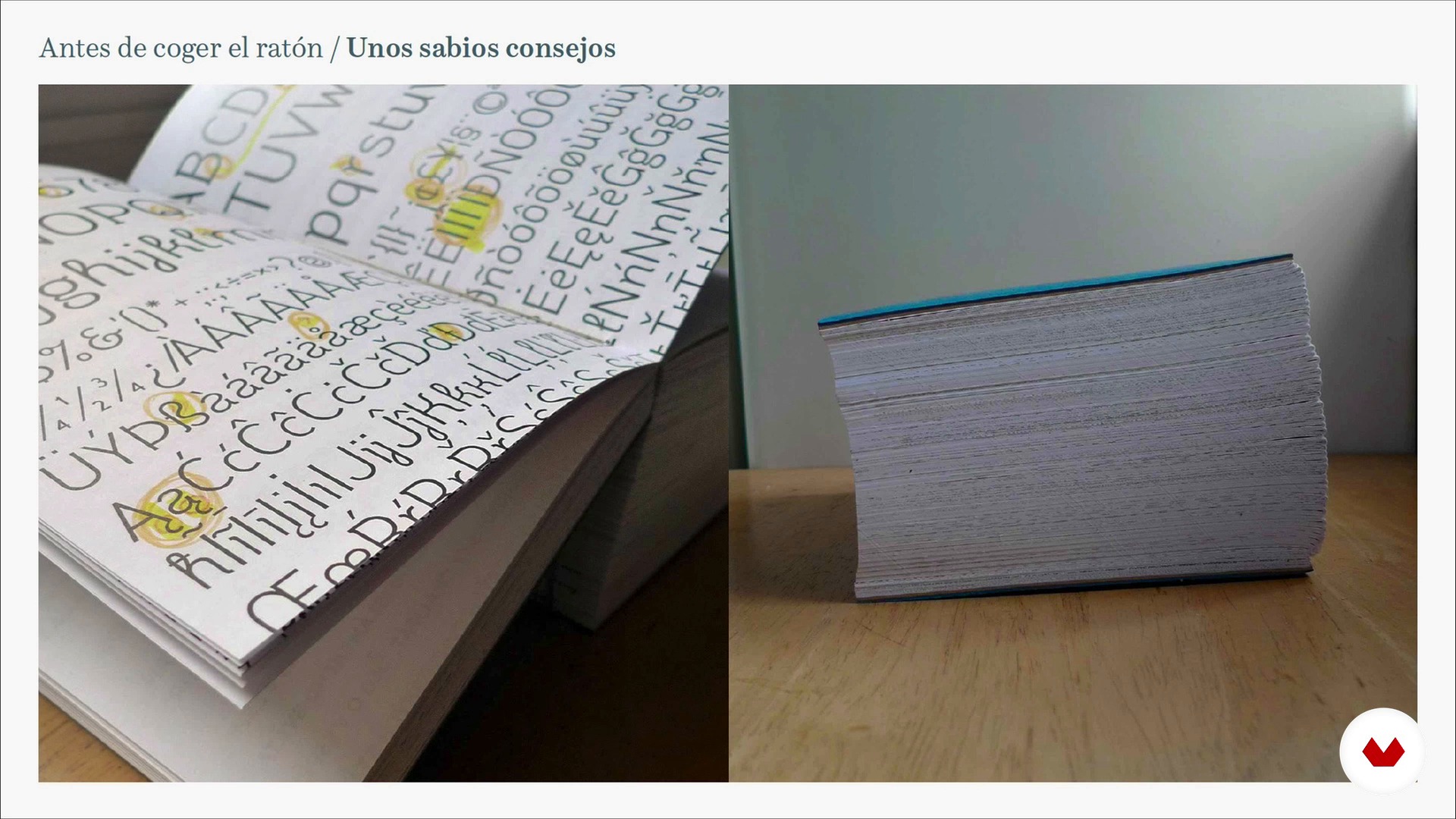
Some wise advice 2
6 minuten, 34 seconden
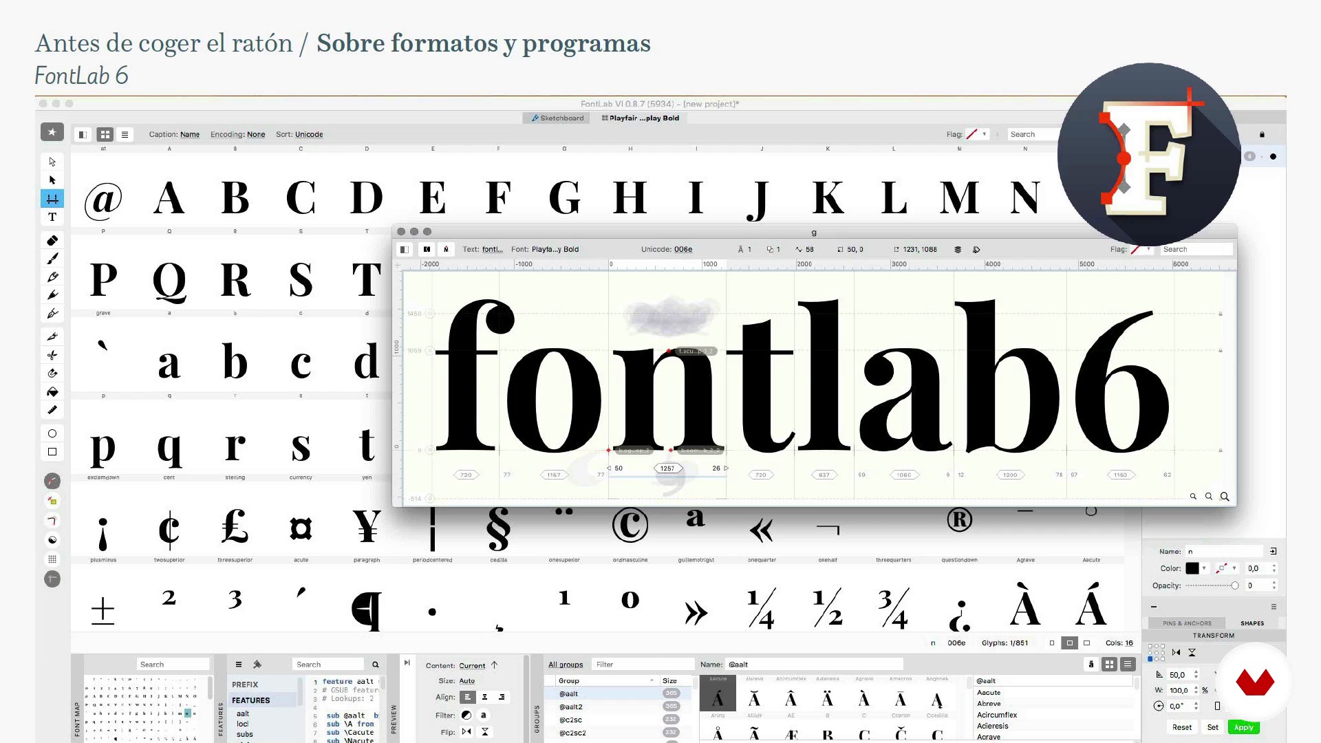
About formats and programs
13 minuten, 29 seconden
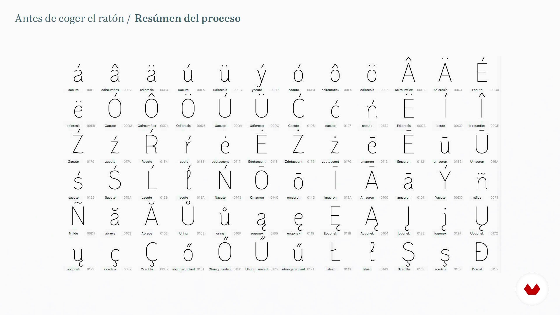
Summary of the process
12 minuten, 32 seconden
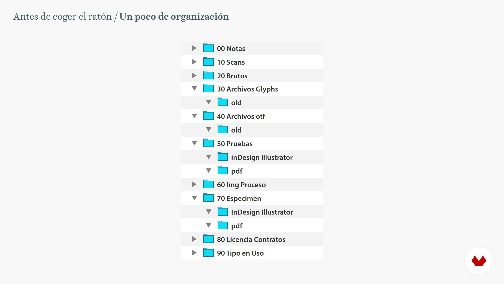
A little bit of organization
6 minuten, 50 seconden
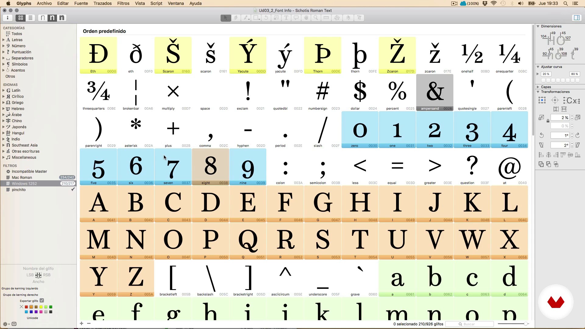
Hi, I'm Glyphs
20 minuten, 32 seconden
Wat is inbegrepen in deze cursus?
Begin by learning more about Juanjez's work, motivations, and general love of typography, as well as some of his favorite books and websites.
Before starting to design, Juanjez gives you some sage advice on what it means to embark on a long-term job such as type design and talks about key aspects such as self-commissions, motivation, and patience to reach the final goal.
Next, learn the materials, the file formats with which you work and the main functions of the Glyphs program, the type design and font production software for Mac.
Once you learn the process, start drawing. Explore some general concepts about drawing letters and handling Bézier curves, the differences between Illustrator and font creation programs, drawing letters directly with Glyphs, tricks to save time and create a complete set of characters.
Then, in order to have a harmonious system of shapes and spaces that you can call typography, learn spacing and kerning.
See how to apply OpenType features such as ligatures, small caps, etc. to your font. Take a look at Python and use programming scripts to automate tasks. Improve the view of your font on the screen with hinting and discover the interpolation technique to facilitate the task of creating font families.
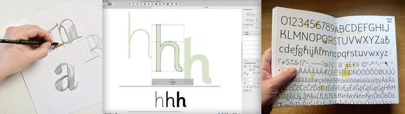
Aanbevolen software en tools voor deze cursus
Wat is het cursusproject?
Design a complete digital typeface, that is, a character set valid at least for Western and Central European languages, correctly spaced and including some typographical refinement such as ligatures and other OpenType features.
The final exercise consists of creating a specimen, a poster with your typography.
Projecten van studenten van de cursus
![Aline Text - A modern Slab Serif Typeface for text | Graduation Project [Update]](https://imgproxy.domestika.org/unsafe/s:210:210/dpr:2/rs:fill/plain/src://project-covers/000/370/446/370446-original.png?1526510362)


Voor wie is deze online cursus bedoeld?
Anyone who loves drawing and letters but has never tried to make their own, or they have tried and got stuck at some point.
Vereisten en materialen
No special prior knowledge of typography is required, just a large dose of perseverance, having a clear end goal, and not being in a hurry.
Regarding the materials, you need a pencil, paper, and a typography design program, although in the course we use Glyphs.
Beoordelingen
- 6 maanden geleden
Muy buen curso y muy completo
- 2 jaar geleden
Excellent learning! Big thanks to Juanjo López for this course! Highly recommended!!!
- 2 jaar geleden
ótimo curso
- 2 jaar geleden
muy buen curso de como crear tipografias.
- 2 jaar geleden
I found the course very useful. A lot of information is shared.

Juanjo López
Grafisch ontwerper en lettertypeontwerper, reclamekunstenaar en gepassioneerd door letters
Hij is een freelance ontwerper met een passie voor populaire grafische vormgeving en typografie. Hij stree...
Inhoud
- U1
Come through here
- Welcome and presentation
- Shipping library and life saving resources
- U2
Before touching the mouse
- Some wise advice 1
- Some wise advice 2
- About formats and programs
- Summary of the process
- A little bit of organization
- U3
Knowing the program
- Hi, I'm Glyphs
- The Font Info window
- The character set
- U4
Draw letters
- Basic concepts and very useful tips
- The Bézier curves
- Illustrator and Glyphs, that strange couple
- The vertical metric
- The drawing tools of Glyphs 1
- The drawing tools of Glyphs 2
- Your friends the components
- To the mess, drawing and testing letters 1
- To the mess, drawing and testing letters 2
- To the mess, drawing and trying letters 3
- U5
Spacing and Kerning
- General concepts
- The Spaced 1
- The Spacing 2
- Horror, the kerning!
- U6
Production: Come on, let's go!
- Completing the character set. The anchors 1
- Completing the character set. The anchors 2
- OpenType Functions 1
- OpenType 2 functions
- OpenType 3 functions
- A look at Python and scripts
- Hinting for clumsy
- Let's start a happy family Interpolation 1
- Let's start a happy family Interpolation 2
- Let's start a happy family Interpolation 3
- EP
Eindproject
- Design of a digital Typography from A to Z
Wat kan je verwachten van een cursus van Domestika
Leer in je eigen tempo
Geniet van thuis leren, zonder lesroosters en in je eigen tempo. Jij beslist wanneer je verder gaat met het volgende onderdeel.
Leer met de beste professionals
Leer de meest bruikbare methoden en technieken van de beste professionals in de creatieve industrie.
Ontmoet deskundige docenten
Iedere docent brengt kennis met passie over, biedt duidelijke uitleg en een professioneel perspectief bij elke les.
Certificaten
PLUSAls Plus-lid krijg je voor elke cursus een persoonlijk certificaat, ondertekend door je docent. Deel het in je portfolio, op social media of waar je maar wilt.
Zorg dat je op de voorste rij zit
Dankzij de hoge kwaliteit van de video's mis je geen enkel detail. Dankzij de onbeperkte toegang kun je de lessen zo vaak bekijken als nodig is om je vaardigheden te perfectioneren.
Deel kennis en ideeën
Stel vragen, krijg feedback en bied oplossingen aan. Deel je leerervaringen met andere studenten in de community die net als jij een passie hebben voor creativiteit.
Maak contact met een wereldwijde creatieve community
Deze community heeft miljoenen gebruikers van over de hele wereld, nieuwsgierig en enthousiast om hun creativiteit te verkennen en te uiten.
Geef cursussen op een professionele manier
Domestika selecteert zorgvuldig haar docenten en produceert iedere cursus in eigen huis om een uitstekende online leerervaring te garanderen.
Veelgestelde vragen
Je leert digitale lettertypes ontwerpen, ontwikkelen en afronden, inclusief kalligrafie, lettering, borden maken, afstand, kerning, OpenType en de commerciële kant van lettertypes.
De cursus is bedoeld voor een gemiddeld niveau, ideaal voor wie al basiskennis heeft van grafisch ontwerp of typografie en zich wil verdiepen in digitale lettertypeontwikkeling.
Je hebt basiskennis van ontwerp nodig, een computer en programma’s zoals Glyphs, FontLab, RoboFont of Illustrator. Ook zijn schetsmaterialen en toegang tot digitale bronnen handig.
Kalligrafie is artistiek handschrift, lettering is het tekenen van letters als unieke grafische composities, en typografie is het ontwerpen en gebruiken van complete digitale tekenreeksen.
Ja, de cursus behandelt technieken om letters met de hand te tekenen, te digitaliseren, te vectoriseren en hun vorm en contour te optimaliseren in gespecialiseerde software.
Ja, je leert letterfamilies ontwerpen, gewichten interpoleren, varianten maken en zorgen voor visuele en functionele samenhang in verschillende stijlen en formaten.
Ja, je werkt met gespecialiseerde programma’s zoals Glyphs, FontLab en RoboFont om digitale lettertypes te maken, organiseren en exporteren in professionele formaten.