Corporate Typography
A course by BauertypesBranding dan identitas / Arahan seni / Desain grafis
A course by Bauertypes, Branding dan identitas / Arahan seni / Desain grafis

Lean to choose and implement suitable typography for coherent and efficient business communication
In this course Bauertypes, with more than 100 years of experience in typography, distribution and advice, will teach you how to select and implement a typeface for a brand.
You will learn from Bauertypes, all the secrets to create a solid and consistent visual identity according to the needs of the company and to communicate its values. You will also learn to define the technical criteria for its implementation and to know what type of license you need.
Apa yang akan Anda pelajari dalam kursus daring ini?
1 pelajaran & 1 unduhan

Welcome to Bauertypes
1 menit, 1 detik
Basic concepts
1 menit, 1 detik
The art of typography design
1 menit, 1 detik
The hinting, the mother of the lamb
1 menit, 1 detik
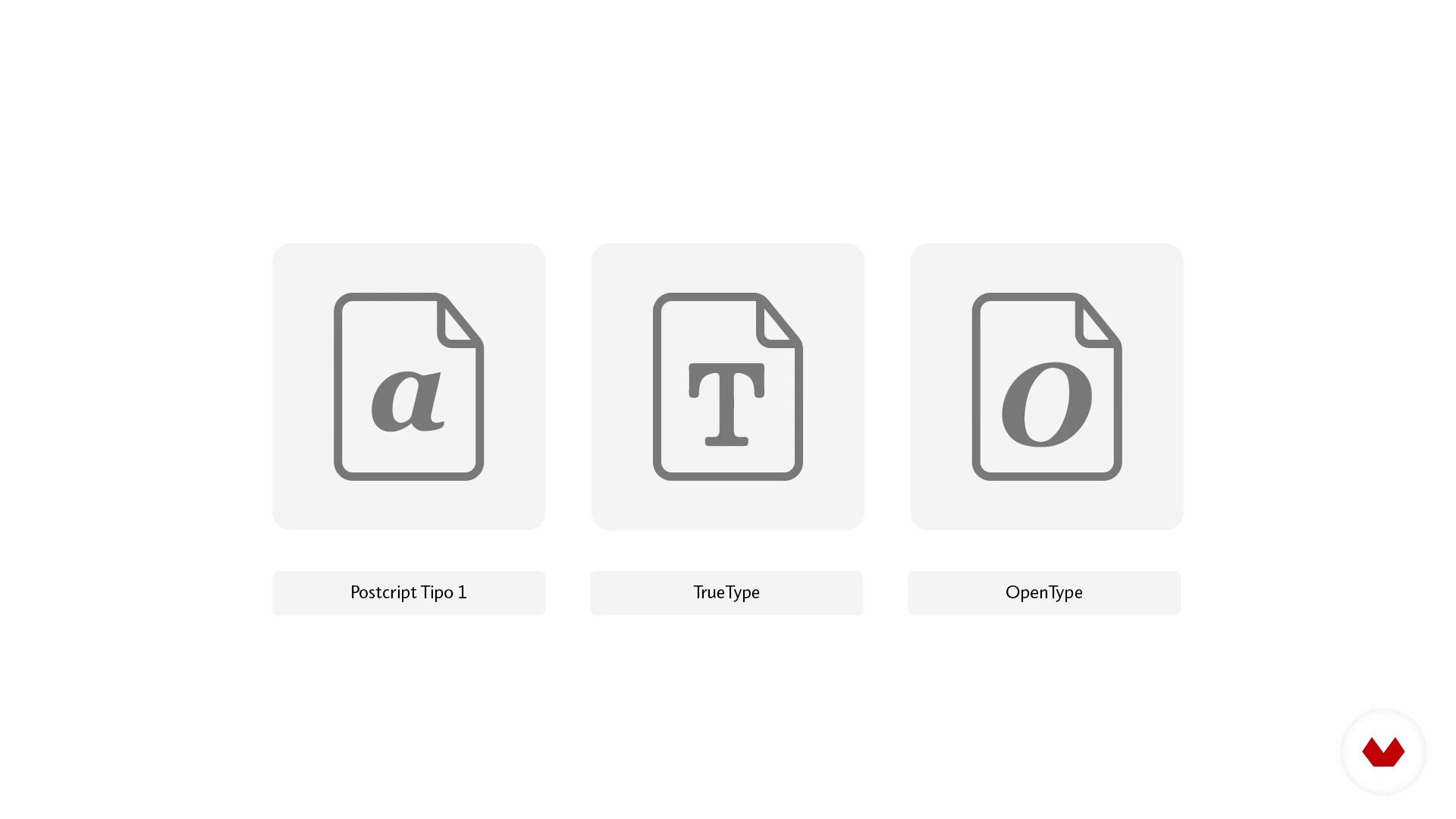
Formats
1 menit, 1 detik
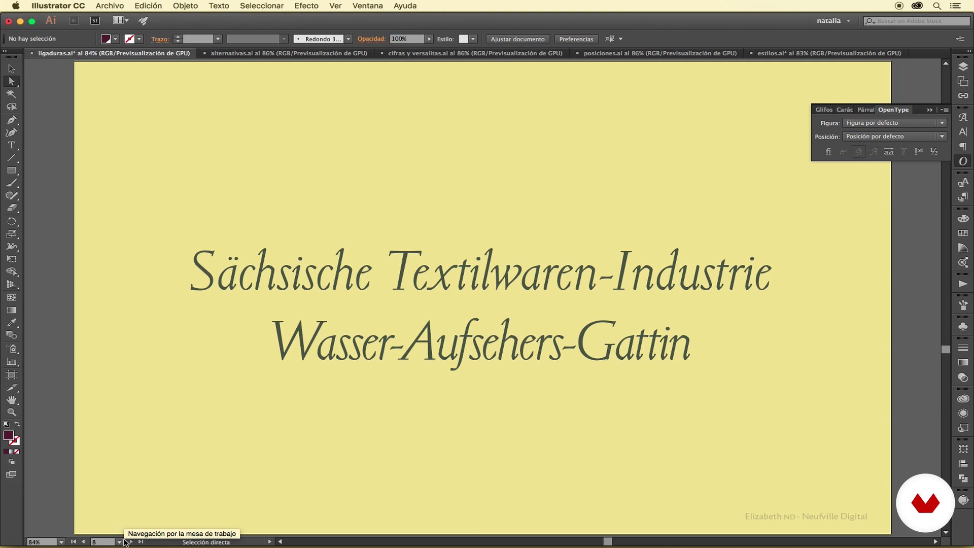
OpenType, a world of possibilities 1
1 menit, 1 detik
Apa yang termasuk dalam kursus ini?
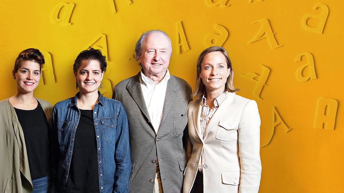
You will start discovering the broad trajectory of Bauertypes from the hand of Wolfgang Hartmann, president of the company, who will tell you about the evolution of the company from the distribution of lead types to the digital age.
Then Vivian Hartmann director of Bauertypes, will tell you how they have expanded their objectives to provide typographic advice and license management services.
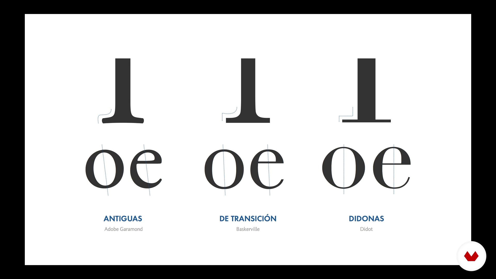
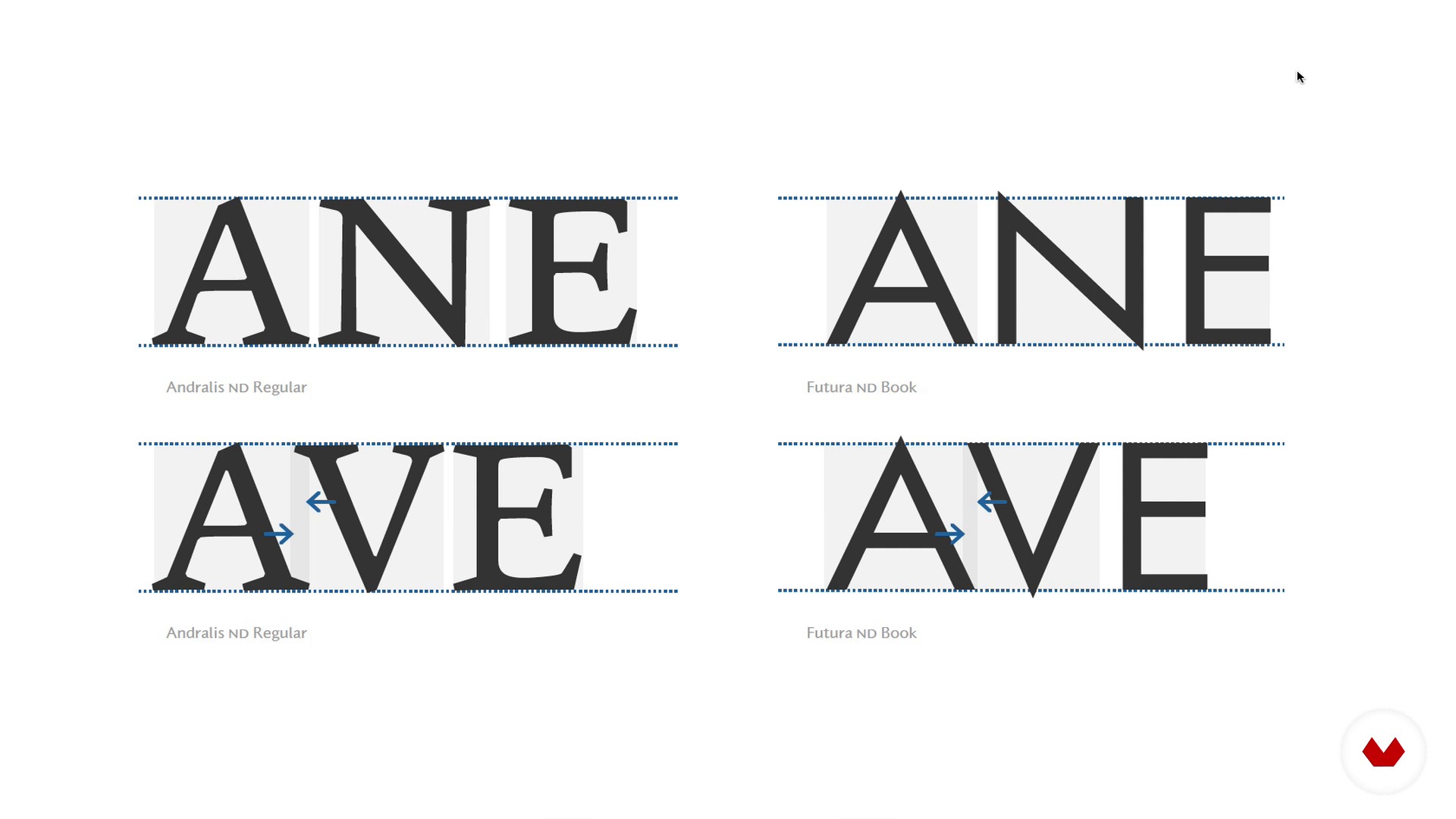
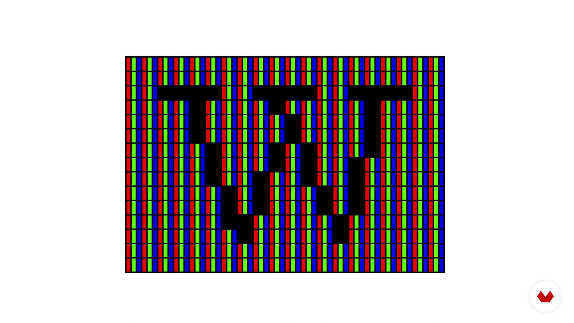
Next, the designers Natalia Weber Antón (graphic designer and typographic consultant) and Laura Asensio (creative director and graphic designer) will explain basic concepts about typography and you will know in depth how is the process of designing a letter and how its screen optimization is solved .
You will discover the different typography formats, especially the Opentype, where you will discover and explain the wide range of possibilities that this possibilities that this format offers and that, sometimes, are so unknown. You will also acquire a global vision of the typographic market by reviewing the most important foundries and bookstores, knowing the value of typography and its types of licenses.
Later, through some real examples, you will understand the strength of typography in business communication, the different possibilities of corporate typography and how to solve problems through it.
Finally, you will know the criteria for choosing a corporate typography by looking at its communicative values, technical and quality aspects, and how to implement it for later use.

Recommended software & tools for this course
What is this course's project?
You will implement a corporate typography for a Music Festival. To do this, following a very specific briefing, you will have to design a logo and choose the corporate typographies (one for headlines and another for text blocks) based on the communication values and technical specifications requested. You will have to know how to choose, also, the appropriate licenses.
Then you will develop a stylistic set, that is, a set of pictograms for the Festival in order to be added later to your corporate typography.
Who is this online course for?
To designers, illustrators and creatives in general who are lovers of branding and typography.
Requirements and materials
If you are a graphic designer and you are passionate about letters, you have the necessary requirements. Well, you will also need a computer with Illustrator and InDesign.
Ulasan
- 2 tahun yang lalu
Muy didáctico, los contenidos son relevantes y están perfectamente explicados. Enhorabuena.
- 3 tahun yang lalu
¡Excelente curso!
- 3 tahun yang lalu
Muy Top!!
- 3 tahun yang lalu
Curso interesante y curioso
- 4 tahun yang lalu
Curso muy interesante con pleno conocimiento de la materia. Sin duda lo recomiendo.

Isi
- U 1
Introduction
- Hello!
- From lead to pixel
- Welcome to Bauertypes
- U 2
Basic concepts
- Basic concepts
- The art of typography design
- The hinting, the mother of the lamb
- Formats
- OpenType, a world of possibilities 1
- OpenType, a world of possibilities 2
- OpenType, a world of possibilities 3
- U 3
The typographic market
- Foundries
- The value of typography
- Types of licenses
- U 4
Corporate typography
- The strength of typography in business communication
- Possibilities of corporate typography
- Solve problems through typography
- Practical cases
- U 5
How to choose a corporate typeface and implement it
- Quality criteria
- Formal criteria
- Technical criteria
- Implementation, continuity and support
- FP
Proyek akhir
- Corporate typography
Apa yang diharapkan dari kursus Domestika
Belajar dengan kecepatan Anda sendiri
Nikmati belajar dari rumah tanpa jadwal tetap dan dengan metode yang mudah diikuti. Anda bisa mengatur kecepatan belajar Anda sendiri.
Belajar dari para profesional terbaik
Pelajari metode dan teknik berharga yang dijelaskan oleh para ahli terkemuka di sektor kreatif.
Bertemu dengan guru ahli
Setiap pakar mengajarkan apa yang paling mereka kuasai, dengan pedoman yang jelas, semangat yang membara, dan wawasan profesional dalam setiap pelajaran.
Certificates
PLUSIf you're a Plus member, get a sertifikat khusus signed by your teacher for every course. Share it on your portfolio, social media, or wherever you like.
Dapatkan kursi baris depan
Video berkualitas tinggi, jadi Anda tidak akan melewatkan satu detail pun. Dengan akses tak terbatas, Anda dapat menontonnya sesering yang Anda butuhkan untuk menyempurnakan teknik Anda.
Berbagi pengetahuan dan ide
Ajukan pertanyaan, minta masukan, atau tawarkan solusi. Bagikan pengalaman belajar Anda dengan siswa lain di komunitas yang sama bersemangatnya dengan Anda dalam hal kreativitas.
Terhubung dengan komunitas kreatif global
Komunitas ini merupakan rumah bagi jutaan orang dari seluruh dunia yang ingin tahu dan bersemangat untuk mengeksplorasi dan mengekspresikan kreativitas mereka.
Tonton kursus yang diproduksi secara profesional
Domestika menyusun daftar guru dan memproduksi setiap kursus secara internal untuk memastikan pengalaman belajar daring berkualitas tinggi.
Tanya Jawab Umum
You’ll explore the history of typography, font design and creation, digital licenses, font management, corporate font selection, and technical aspects like formats, hinting, and advanced OpenType features.
This course is designed for intermediate learners. It’s perfect if you have basic graphic design or typography knowledge and want to deepen your skills in digital type management and creation.
Basic graphic design skills and familiarity with editing software are recommended. Access to programs like Adobe Illustrator, InDesign, or FontLab is helpful for practical exercises.
The course covers typography design history, font creation and digitization, management and licensing, corporate font selection, digital formats (OTF, TTF, WOFF), hinting, OpenType, ligatures, and customization for brand identity.
You’ll learn the technical, formal, and legal criteria to select, adapt, and implement fonts in corporate visual communication, enhancing brand consistency, uniqueness, and functionality.
Yes, the course includes analysis of font licenses, legal restrictions, and guidance on choosing the right license for professional or commercial use.
You’ll understand the features, benefits, differences, and compatibility of major digital font formats to pick the best one for your platform and environment.