


Brava Sans
por Rafael Jordán Oliver @rafael_jordan
- 97
- 1
- 0
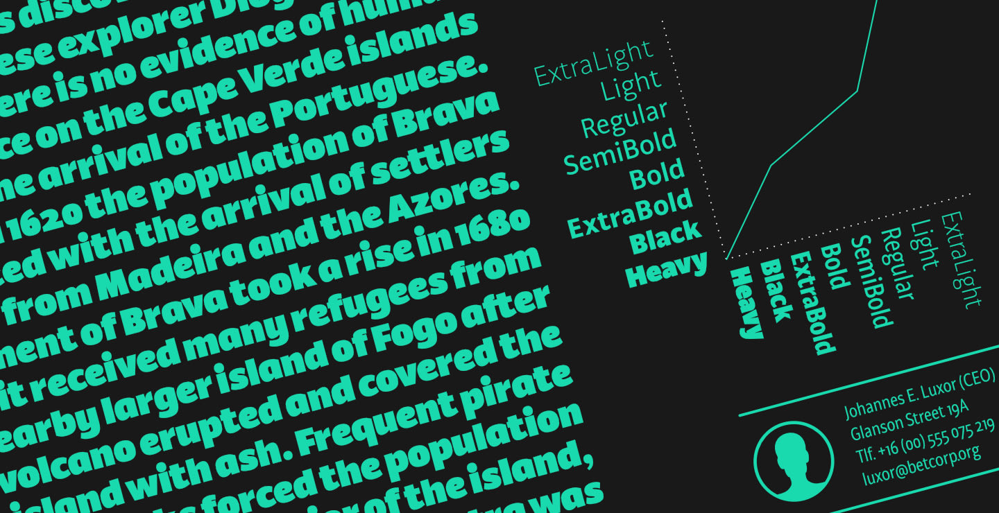
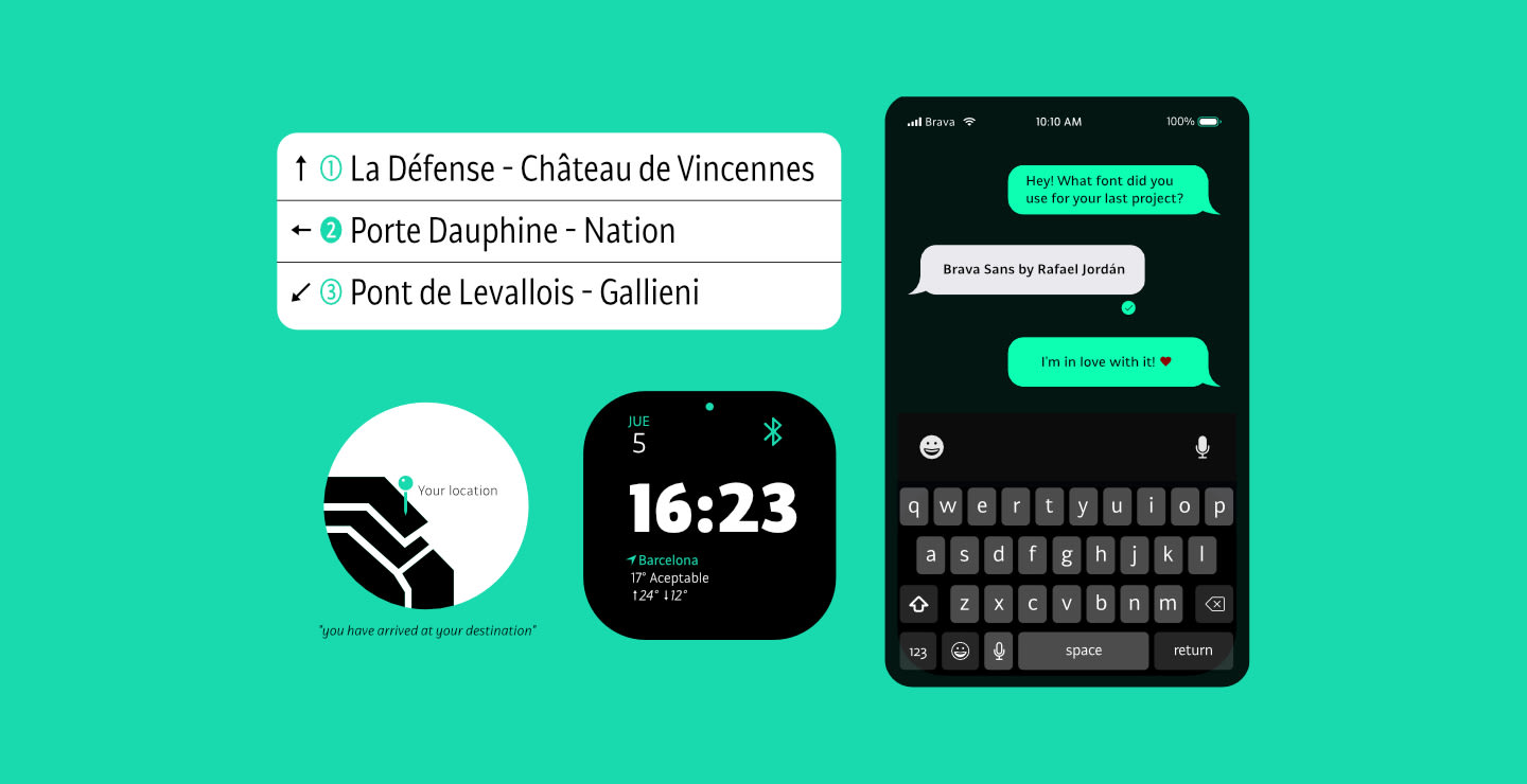
Brava Sans (the naked & extended version of Brava Slab) is a family of 8 weights, 2 widths and true italics. Designed for editorial purpose, it has a monolinear appearance with a humanist construction, open counters and a tall “x height” that give it a right personality for use in branding. Also Brava Sans has a lot of helpful features as a wide range cover of Latin languages, a lot of OpenType features, a new condensed width and two bolder and cooler weights that make Brava Sans a useful tool for the graphic designer.
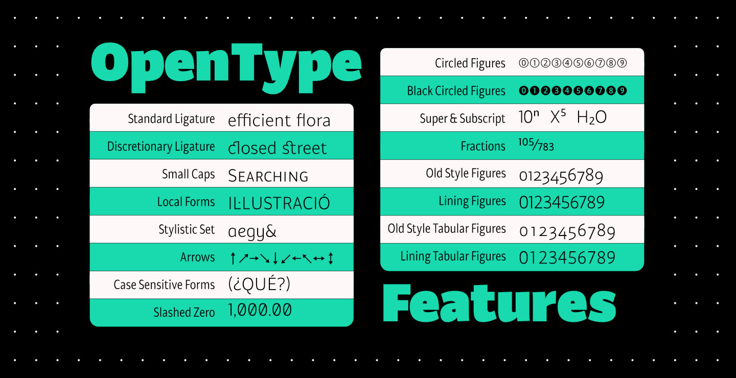
A full range of numerals (included old style figures, lining, numerators, denominators, superiors, subs, circled and black circled), small caps, forty ligatures (between standard & discretionary ligatures), a lowercase superior and inferior set and a stylistic set are some of the features that makes Brava Sans a solid choice.
Brava Sans ya disponible en MyFonts
con Descuento de Lanzamiento del 60%


0 comentarios
Entra o únete Gratis para comentar