Lanka
por Bogidar Mascareñas Vizcaíno @bogidar_mascarenas
- 275
- 7
- 0
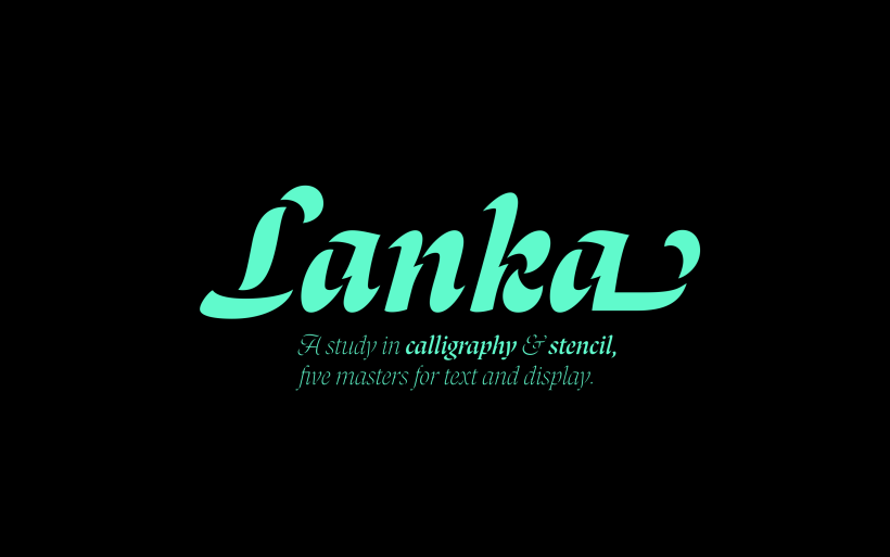
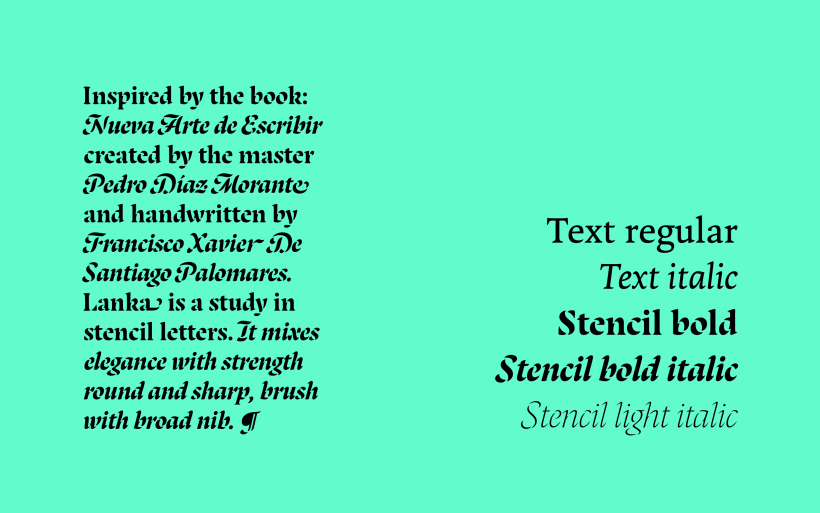
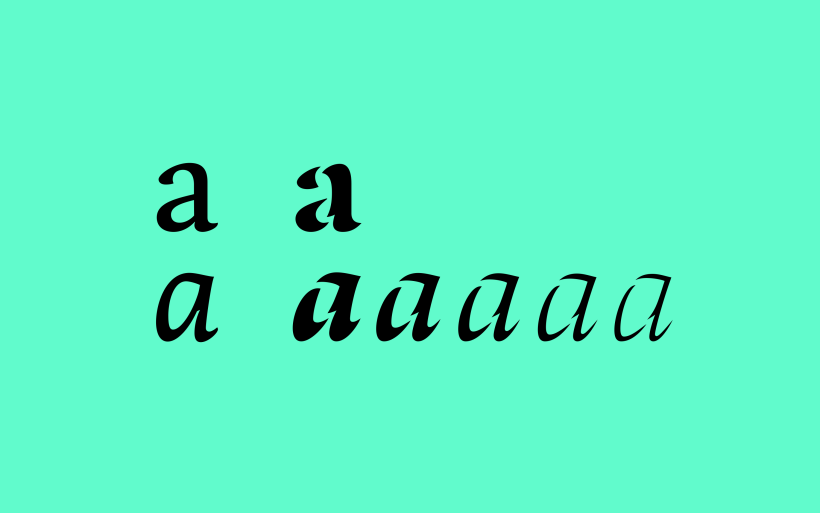
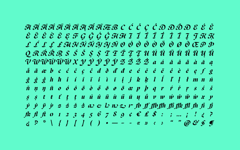
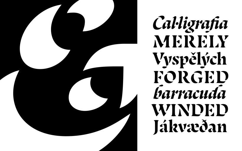
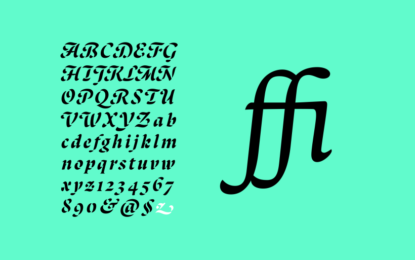
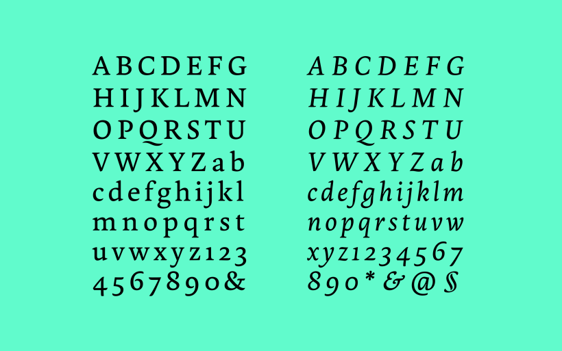
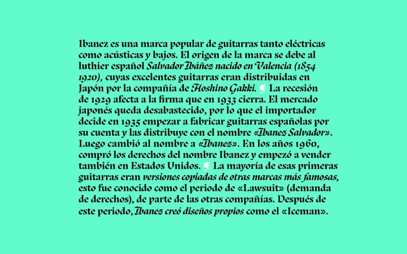
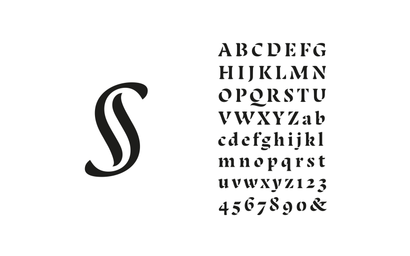
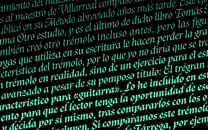
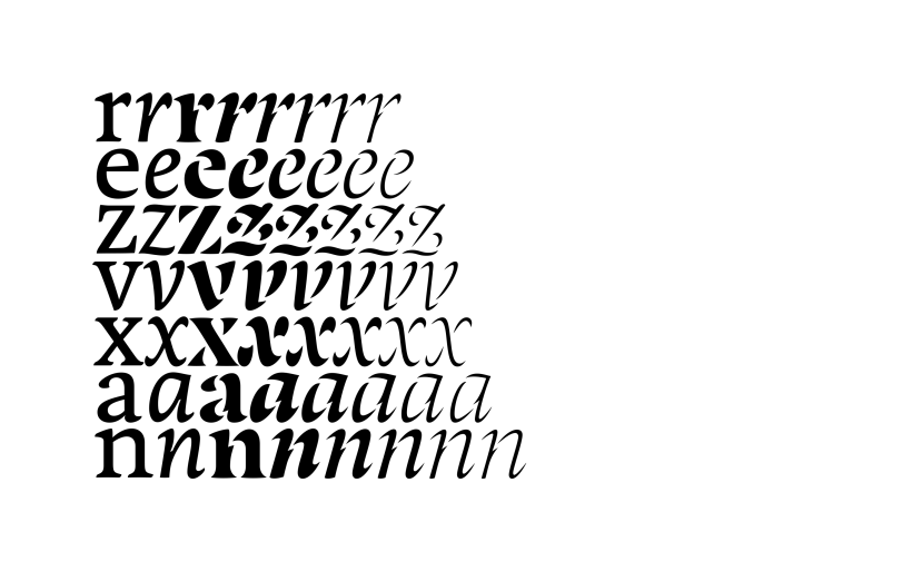
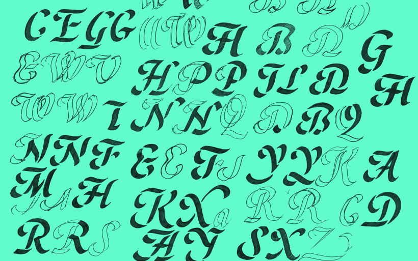
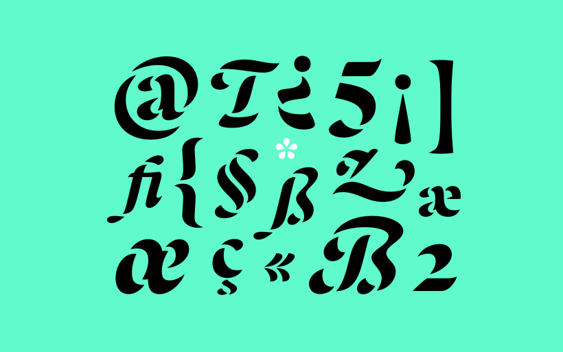
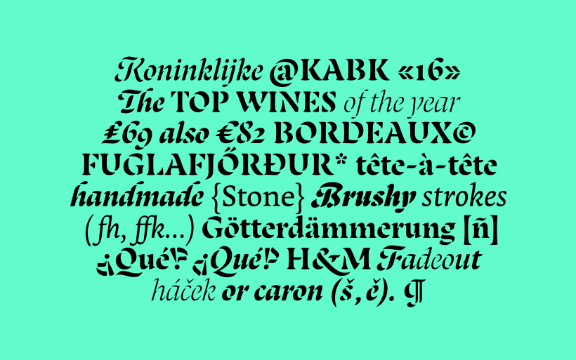
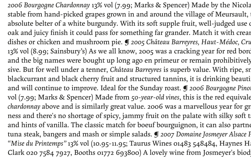
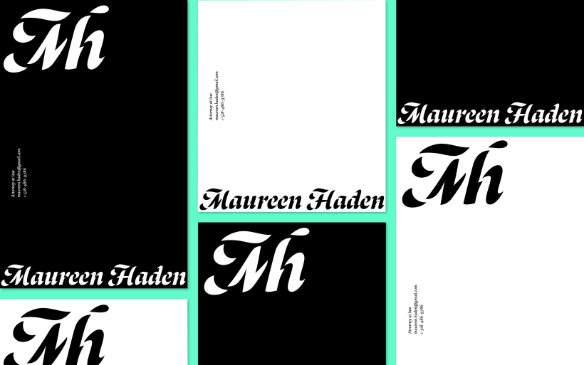
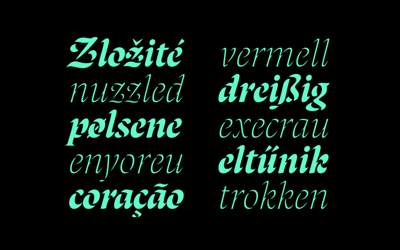
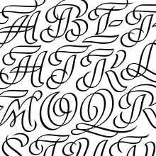
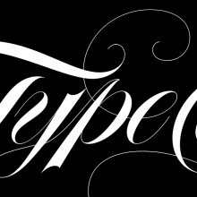
Stencils tend to be associated with sturdy and industrial shapes, but what if they were based on broad nib calligraphy? Lanka uses the junctures of calligraphic strokes as an opportunity to achieve stencil effect, shifting those connections in order to create unexpected shapes. The starting point was inspired by a Spanish book of engravings published by Francisco Palomares in 1776: “Arte nueva de Escribir”. Some of its reproductions show an uncommon stencil effect that attracted my attention. While Lanka’s stencil styles make it an eye-catcher, the text weights are sober workhorses suitable for longer pieces of text. The family is enhanced with different flourishes and alternates that add liveliness and variety.
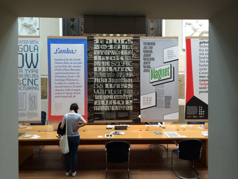
This project was part of the Type and Media Master in KABK, The Hague, The Netherlands.
Check the website to see all the projects.




0 comentarios
Entra o únete Gratis para comentar