


Depression and Anxiety around the World
por reperito @reperito
- 104
- 5
- 0
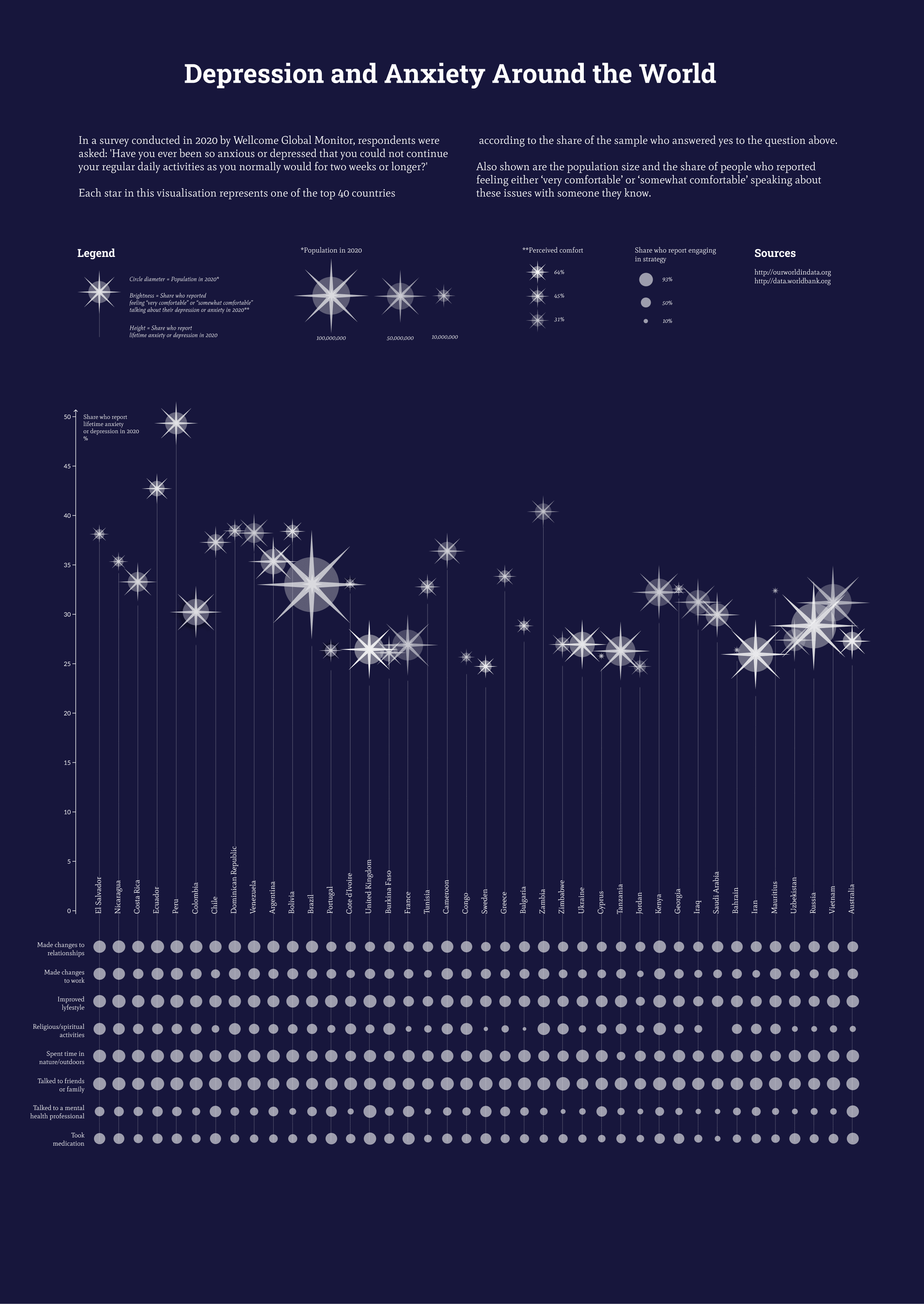
When browsing the Our World in Data, I chose the topic of mental health for my project. From all the data available on this topic, I wanted to represent the change in depression and anxiety levels over time, and compare that for different age groups. Also really interesting to me was to add data about the share of people who feel comfortable talking about their depression/anxiety to people they know. Besides that, I also wanted to include the data about different strategies people use to treat their mental health.
The first challenge
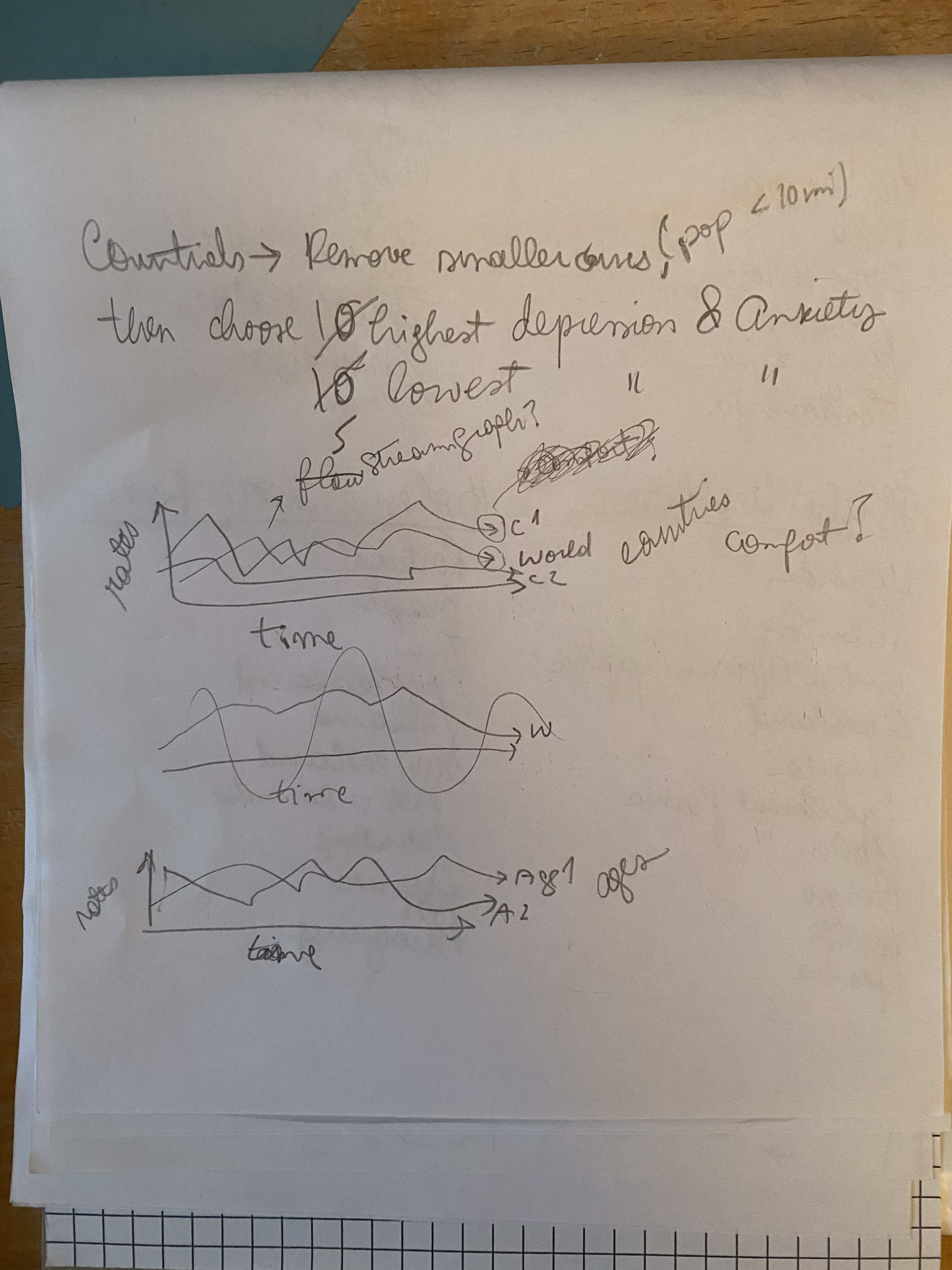
After organizing the data on Google Sheets and uploading it to RawData, I noticed that the difference between depression and anxiety levels over time was not big enough to be noticeable. Same thing for the age groups. So I decided to drop this data and represent only the other points, which were already interesting enough.

The choice of graph
I went for a bubble chart for the chance to represent several data points in a single graph. I suppose the end result could have also been achieved following the same method used by the instructor (linear dendogram).
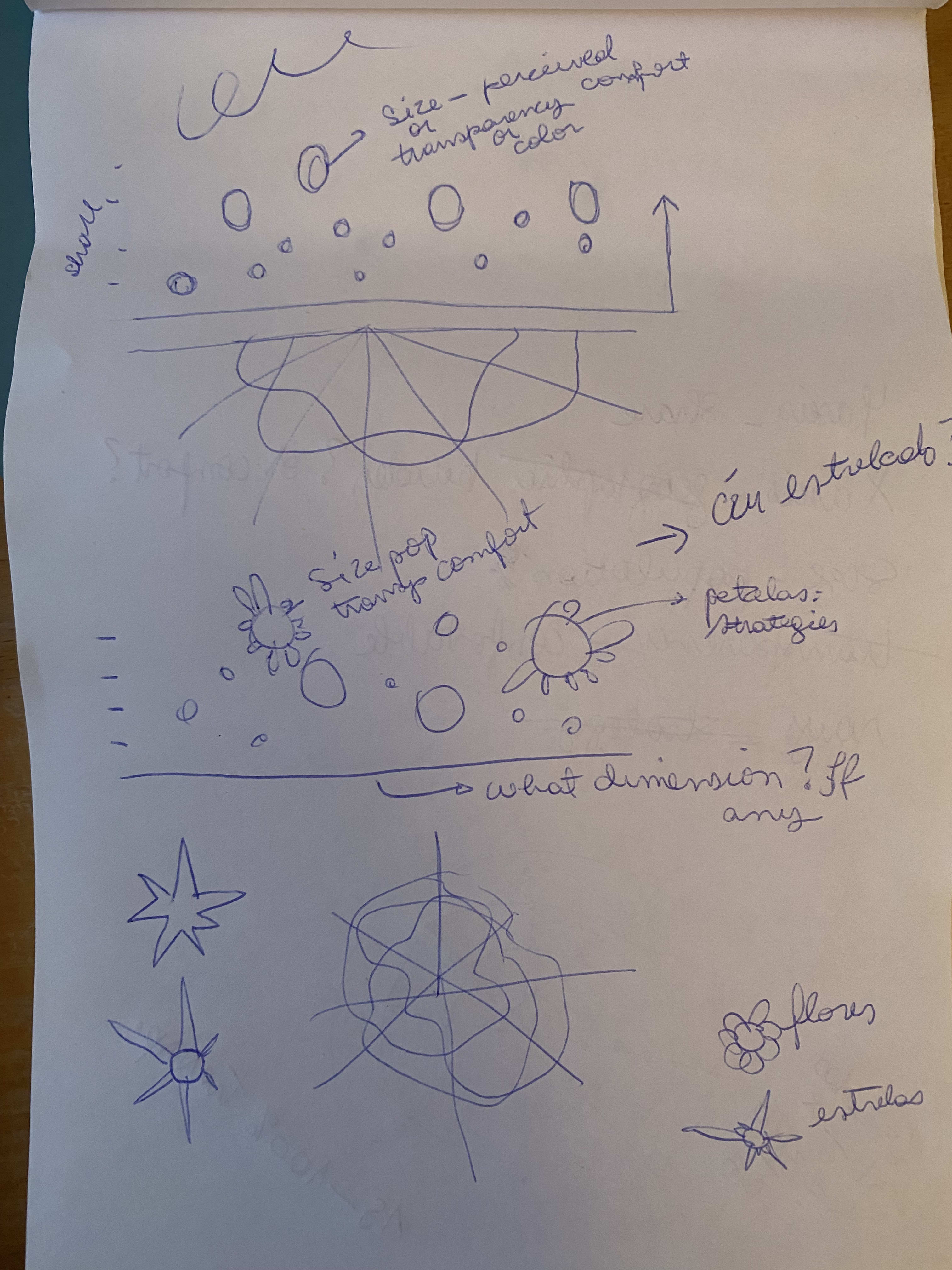
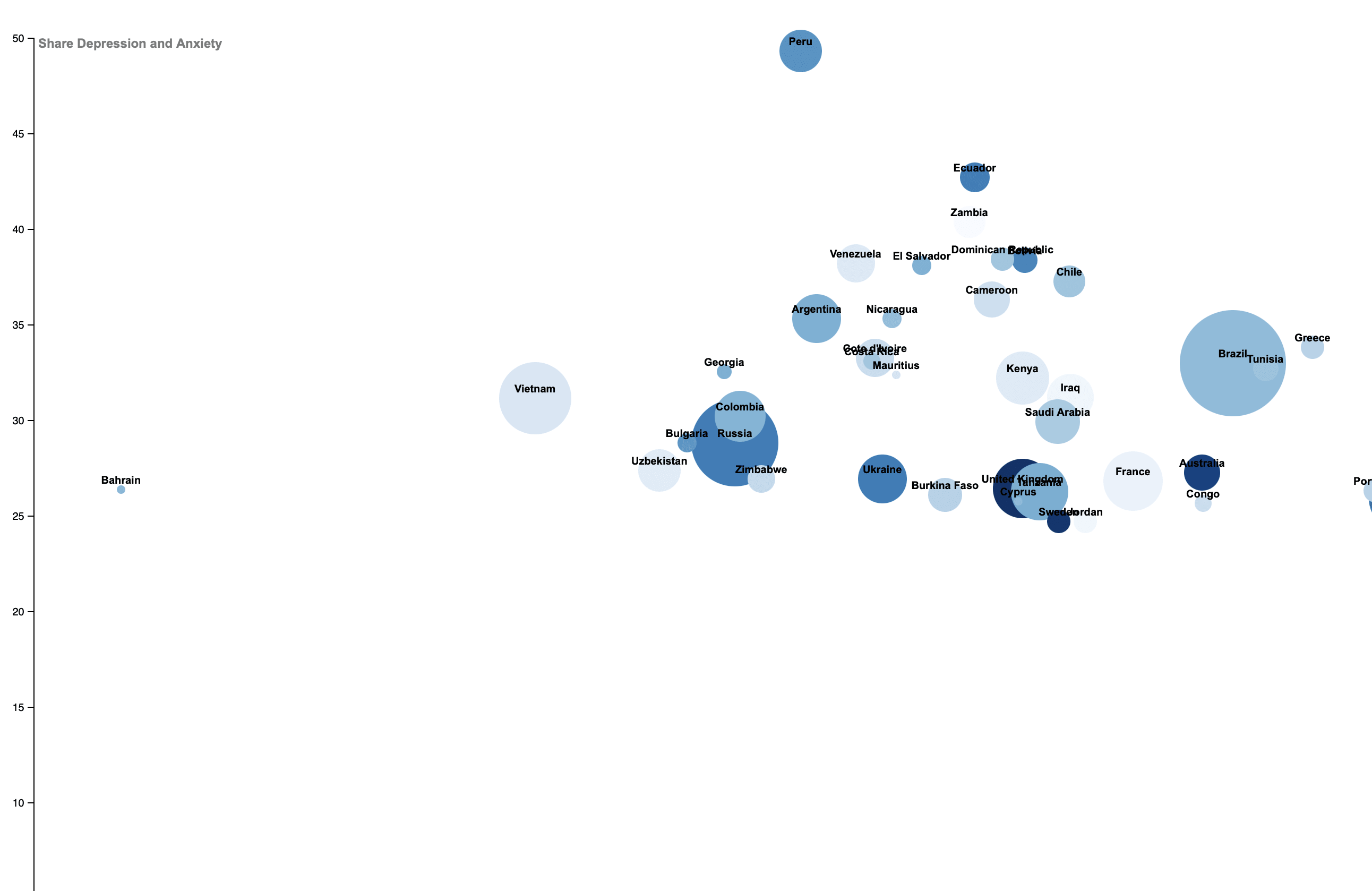
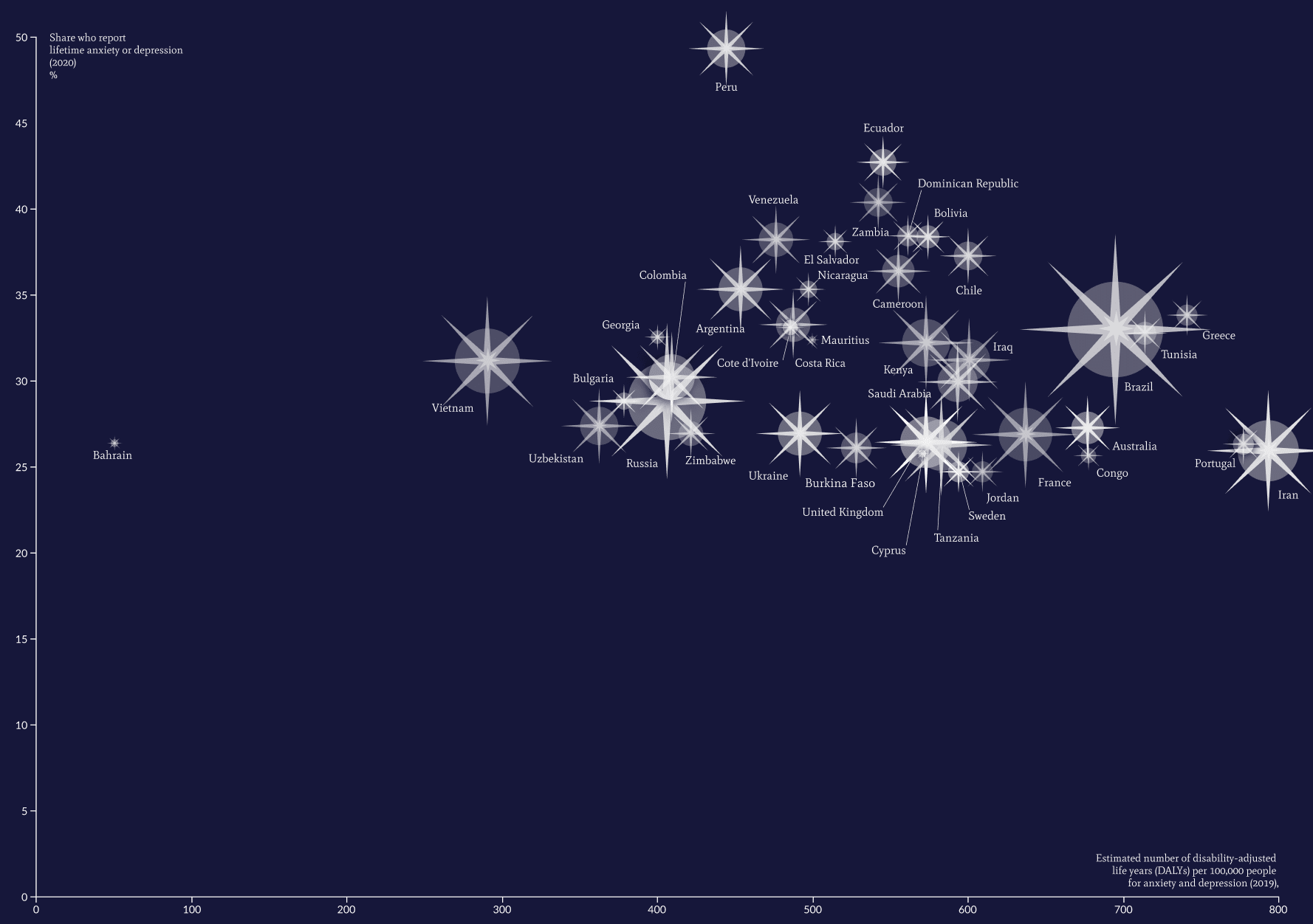
I tried several different variations of the bubble chart. I knew I wanted the Y axis to represent the share of the population who reported having had anxiety or depression. I also felt that it was important that the size represent the population, because it's a widely recognized pattern when it comes to countries. And I thought that using transparency to represent the share of the population who report feeling comfortable talking about it would be an intuitive choice.
Still, I tried different variables in the X axis: region, geographical location, and burden of disease (in the picture). I though the last one was a bit confusing and/or crowded, so I opted for adding the countries side by side according to their longitude. This version turned out to be the most readable.
Strategies for dealing with depression and anxiety for each country
For this part of the dataset, I couldn't find a readable way to incorporate in the bubble chart. My initial idea was to change the length of the start points to represent the share for each of the strategies. However, this would make the data too unreadable for the smallest stars. I decided to add this data in a separate graph.
I was considering a polar chart, but I was unsure that it would be readable enough with data for 40 countries. So I decided to do a matrix. But it is still an option. What do you think?

This is the end result so far. I am still unsure about:
- is the transparency of the stars is readable enough?
- are the circles of the matrix readable enough?
I could try substituting the latter for fractions of the circle instead of size, or go for a big polar chart. For the former, I am out of ideas. Would appreciate anyone's feedback on readability.
0 comentarios
Entra o únete Gratis para comentar