


Tengo Hijos!, Identity for a parents in distress publications company
de Nuño Conde @nunocon
- 50
- 0
- 0
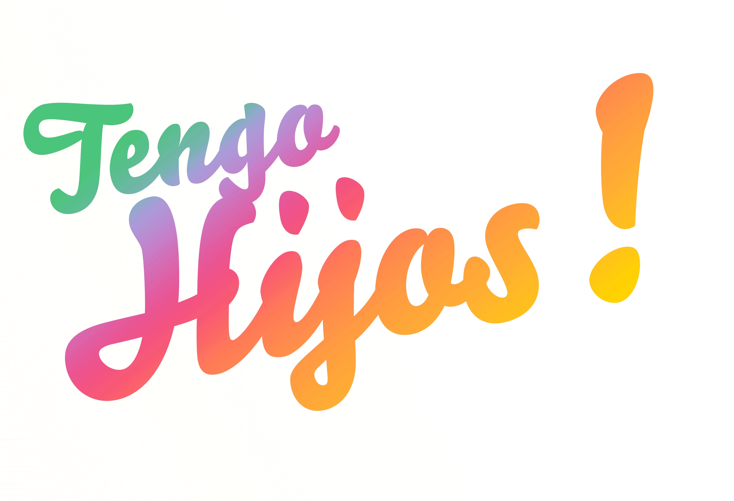
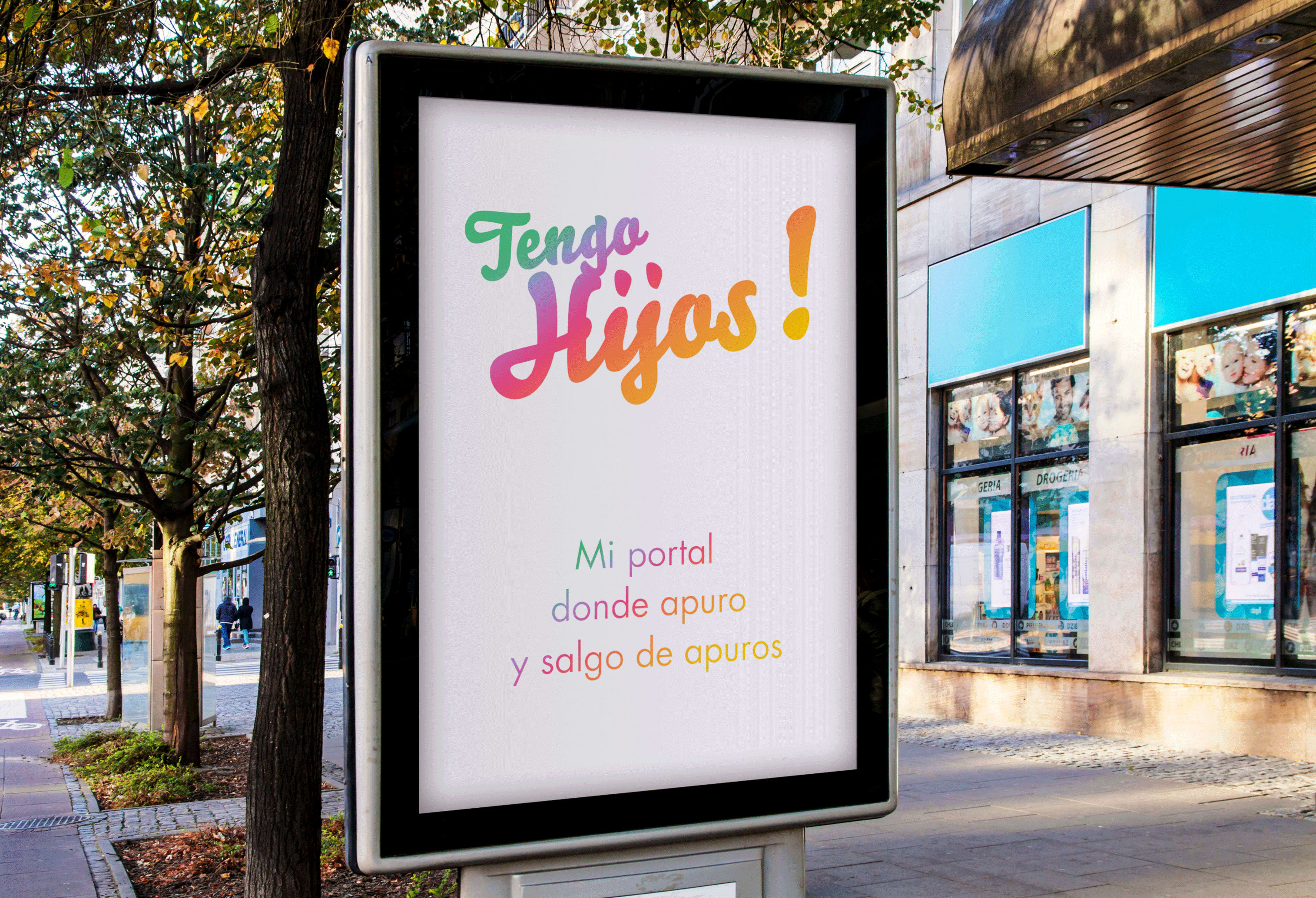
Tengo Hijos!, is a Spanish publishing platform specialized in reliable, comprehensive and useful information to first-time parents regarding education, health and entertainment. They entrusted me with the task of creating a logo and defining their visual identity. They wanted a very up-to-date, vital, accessible and reliable image for their company, an image able to capture the attention of their prime target: educated young parents. I saw the opportunity to create a logo those clients could easily feel identified with.
From insight to solution
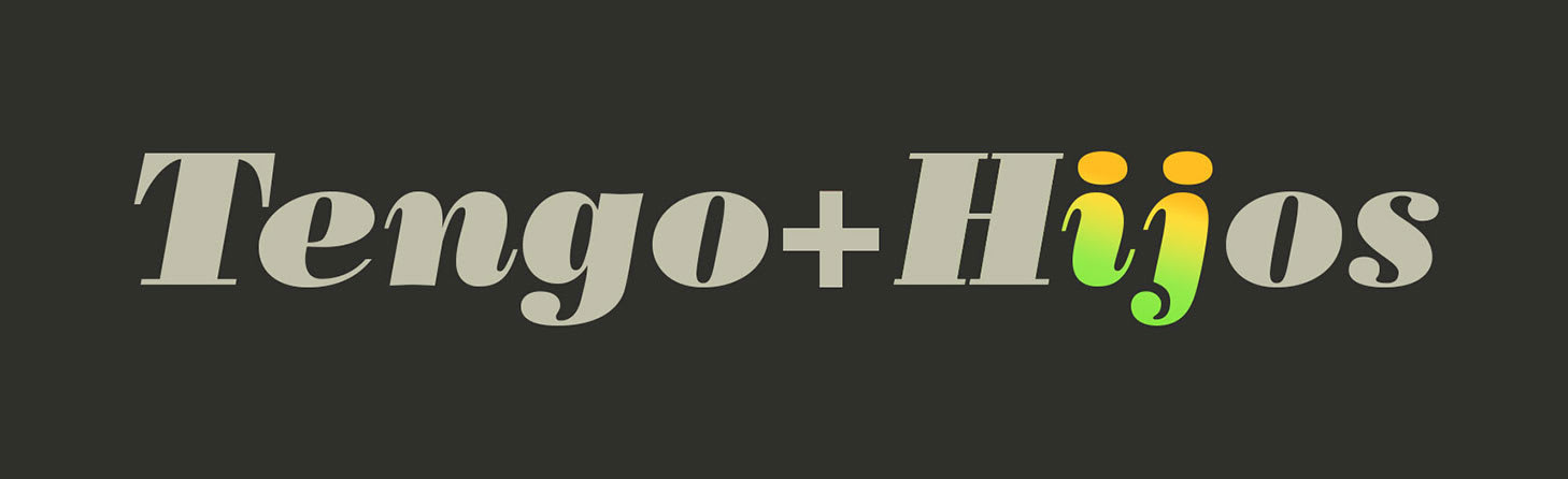
I was happy to have a challenge in hand. In order to materialize a logo suggesting the well of content the clients told me about, its freshness and its capacity to become a reference for the audience, I decided to start playing with very different ideas. Thanks to those, I realized I wanted to work with vivid colors and I had a playful insight: lowercase letter “I” and “J” could look like a pair of children walking hand in hand.
I had a beginning. And I thought it was too much of a serious one. So then came in the typography!
Hand written calligraphy made the logo closer to the audience, I shackled off the seriousness by breaking the square matrix for a diagonal, and I brightened it up and made it vibrant with a big exclamation point.
But there was another twist to give: “I” and “J” letters could very easily be made to look as either male or female, and also children or parents. This wanted gender and agelessness denotes an open, inclusive character.
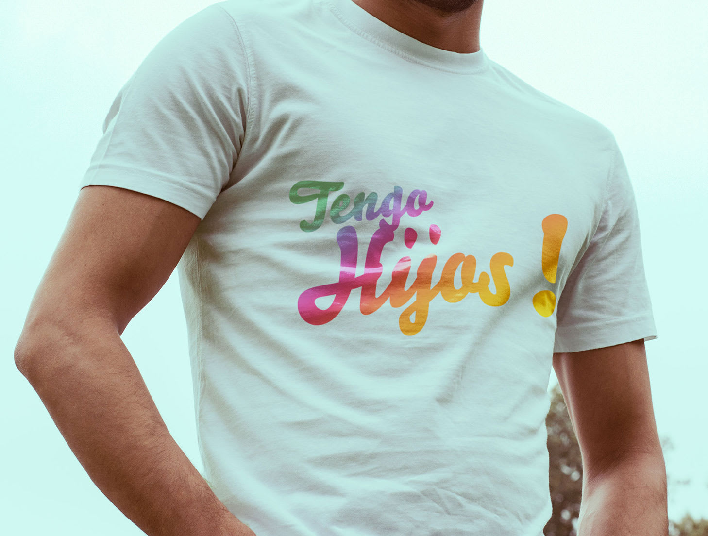
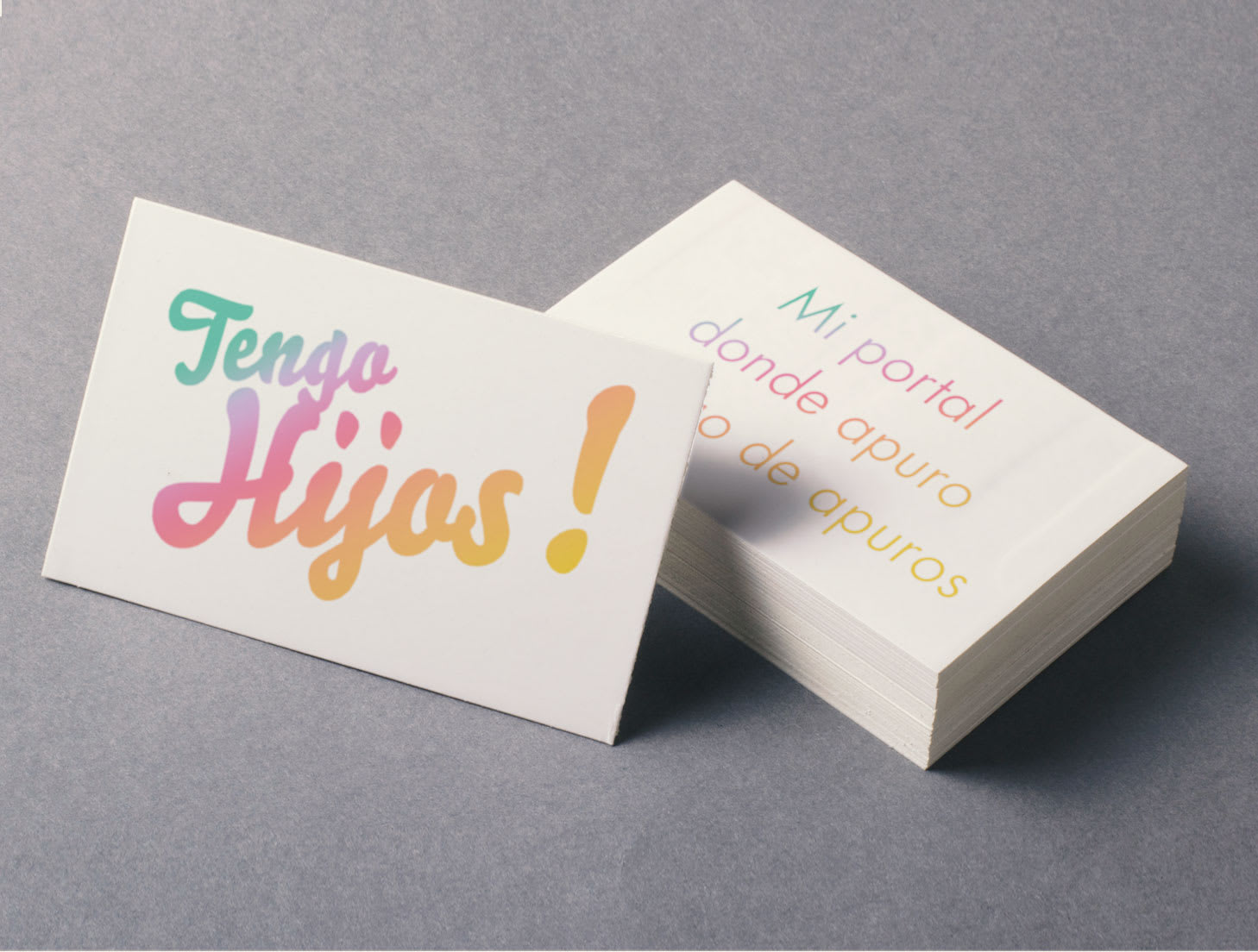
Identity aplications
The copywriting for this logo is “Mi portal donde apuro, y salgo de apuros” and it’s framed in the different applications. The copy was ideal for the brand’s need –up-to-date, accessible and reliable young image-, and the target audience could easily associate themselves to it.


0 comentários
Faça login ou cadastre-se Gratuitamente para comentar