
Interactive Map of Karlovy Vary (KVIFF) for Kids
de Valibook @lil_jilkova
- 684
- 33
- 0
Introduction
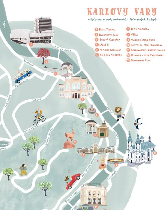
Hi everyone! I’m thrilled to share my final project for this amazing course. For my map, I chose the beautiful spa city of Karlovy Vary (Carlsbad) in the Czech Republic, specifically during the famous Karlovy Vary International Film Festival (KVIFF).
However, I added a specific twist to the brief: this map is designed entirely for children aged 2 to 12. My goal was to capture the vibrant, busy festival atmosphere and the elegance of the spa town, but translate it into a playful, engaging world for the youngest visitors.
Supplies
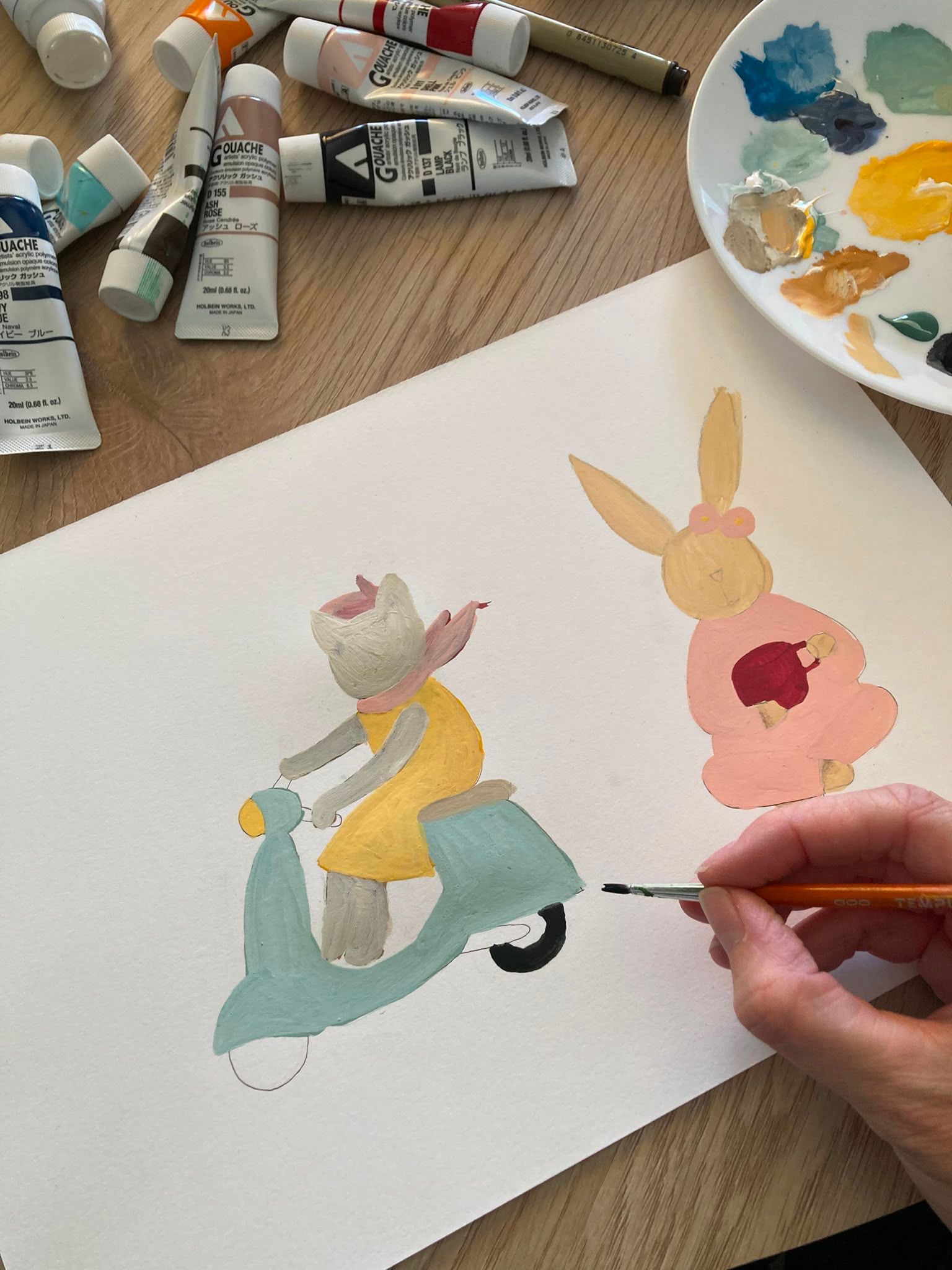
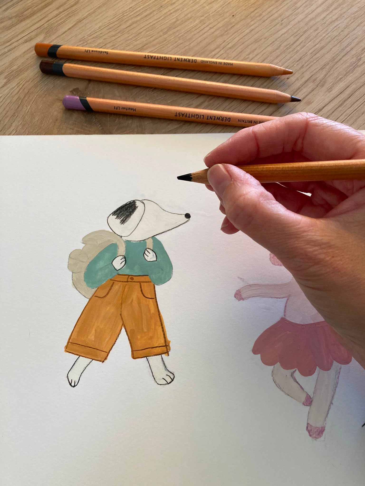
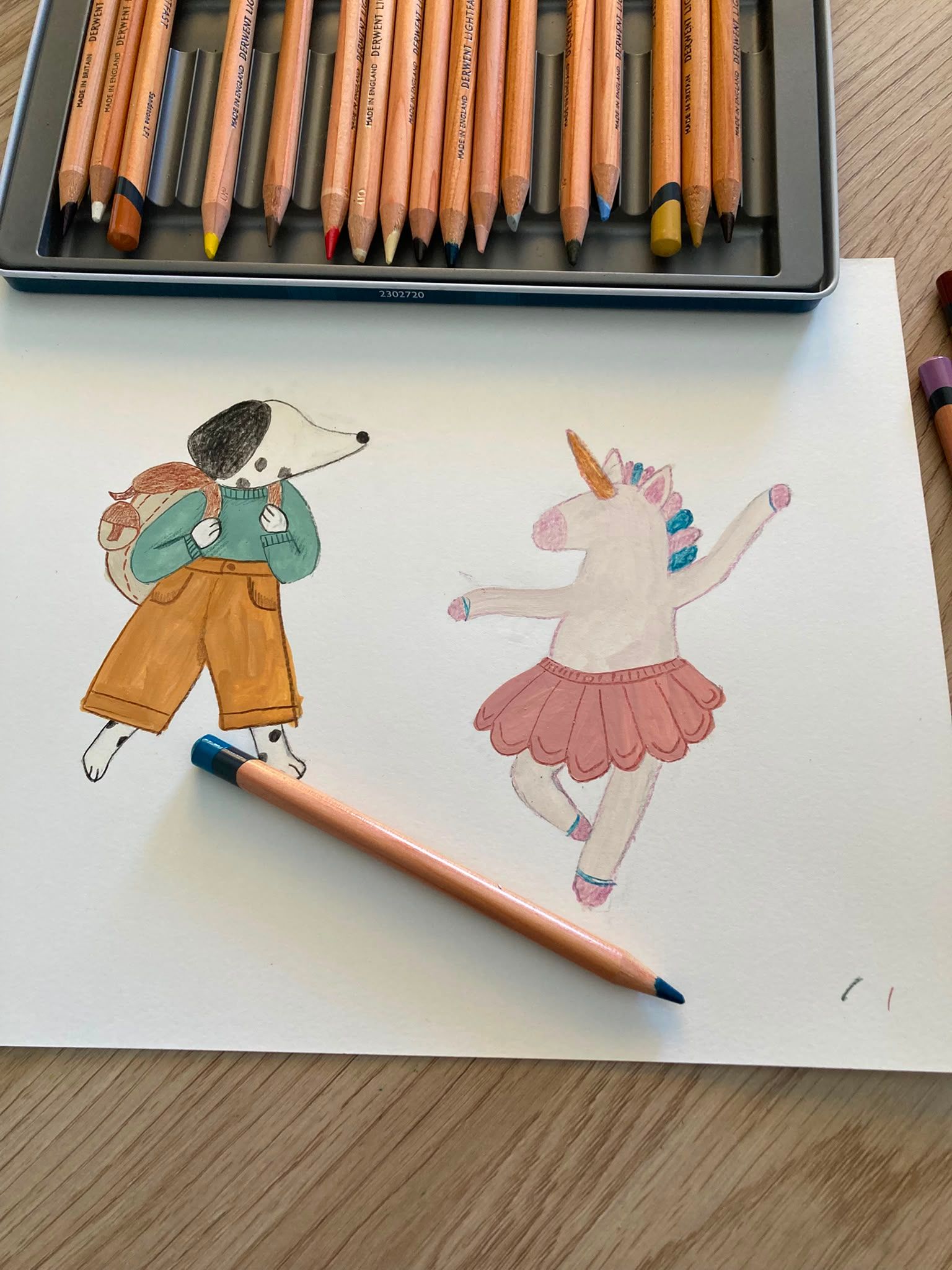
For this project, I used a hybrid workflow combining traditional mediums with digital post-production to achieve a texture-rich, yet professional look:
Traditional Art: I created the base and textures using watercolors for a soft, welcoming feel. I then added fine details and playful textures to the characters using colored pencils.
Adobe Fresco: Used for the initial layout, map background, and illustrating the specific festival and spa buildings while preserving the hand-painted aesthetic.
Adobe Illustrator: Used for all the hand-drawn lettering and vector titles to ensure crisp, scalable typography.
Adobe Photoshop: The final hub where I composed and layered the front side. The back side (coloring page) was also finalized using a seamless mix of Photoshop and Illustrator for print-ready production.
Characters and Interactive Elements
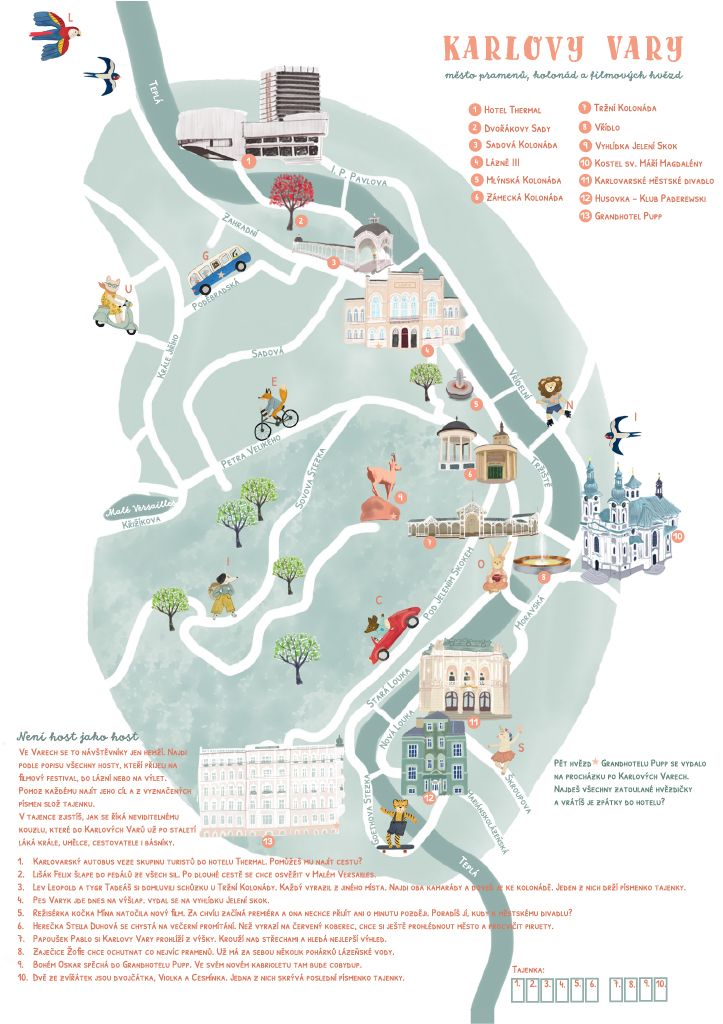
A map for kids needs to be more than just an orientation tool; it needs to be an adventure. I designed a set of fun, friendly characters that populate the map. These characters interact with the main spa colonnades and festival hotspots, directly prompting children to complete various activities and explore the city in a fun way.
Building the Festival Map
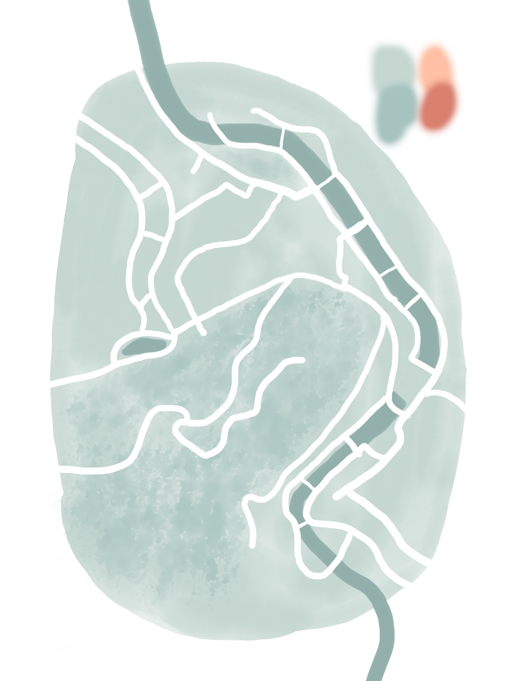
Applying the layout techniques from the course, I placed the key landmarks of Karlovy Vary. I had to balance the accuracy of the locations with a kid-friendly, simplified illustration style. I chose a vibrant, energetic color palette that reflects the lively mood of the film festival.
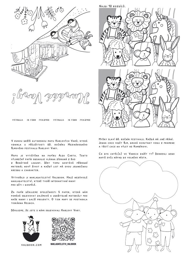
The Back Side - Coloring Page & Our Publishing House
I wanted the map to have a longer lifespan, so I designed the back side as a black-and-white coloring page! It features the map's title in hand-drawn lettering and gives kids a space to express their own creativity.
This project also serves a real-world purpose. The back side includes information about the independent publishing house I co-own and run with my creative duo partner, Mac. It was a great opportunity to merge illustration with product design.
The Final Result
Here is the final, printed-ready product! This course was incredibly helpful in organizing my workflow and thinking about the "essence" of a place. Designing for children during such a major cultural event was a fantastic challenge.
Thank you, Stef, for the inspiring lessons, and thank you all for checking out project by Valibook!


0 comentários
Faça login ou cadastre-se Gratuitamente para comentar