
Native Bites: Spicy Pickled Mangoes
oleh franzzapanta1033 @franzzapanta1033
- 347
- 0
- 0
Introduction
In this project, I developed a visual identity for a brand that sells pickled mangoes. I designed key elements inspired by history and ethnic patterns using Adobe Illustrator. I had fascinating discoveries upon researching for a concept for the brand, which I later incorporated into my design. My objective was to create a design that seamlessly shows the essence of culture and the rich history of the brand’s place of origin.
Supplies
I used Adobe Illustrator in making the visual elements and mockup.
Step 1: Drawing Inspiration from a Story
The business locally sources unripe mangoes in the city of Dipolog for their signature pickled mangoes. Interestingly, the particular variety of mango that they use is native to the region and is commonly known by the locals as "Manggang Bisaya". Dipolog itself has long been a center of cultural exchange, with the Subanen people as its earliest traders. To honor this heritage, I plan to incorporate traditional Subanen ethnic patterns into my design as a tribute to the culture and origins of the product.

Step 2: Designing the Key Visual Elements & Logo
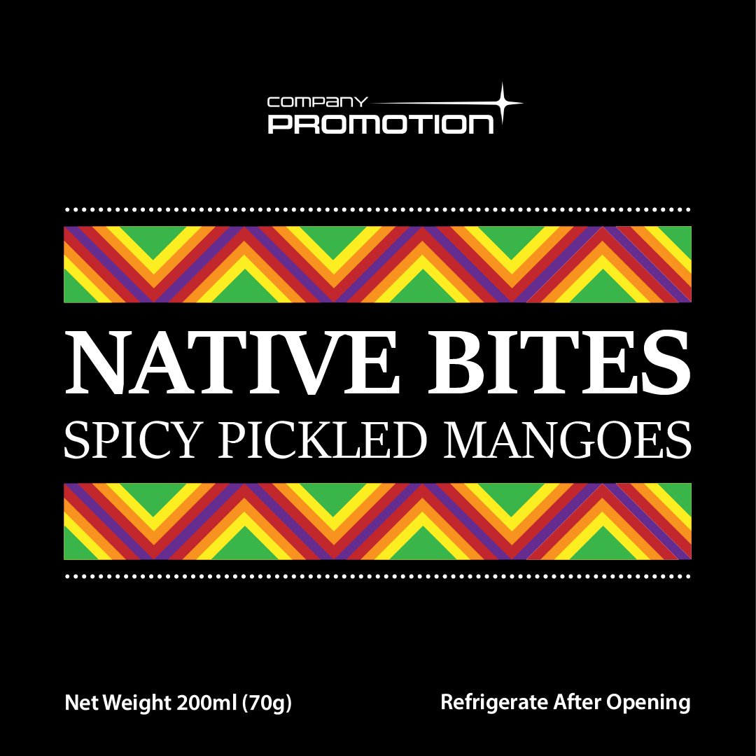
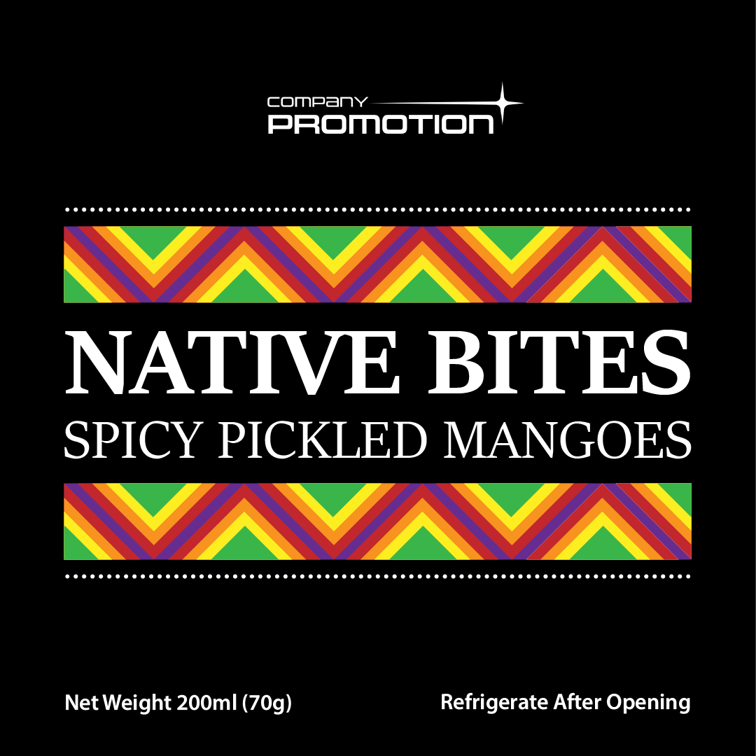
I noticed the prominent use of triangular shapes and zigzag patterns in traditional Subanen ethnic patterns, so I took them as inspiration in designing the key visual element. Since I didn't want my design to look ordinary, I gave it a layered look and used brighter colors that are aligned with the brand. In this way, my design would also have a more distinct look and feel.

Step 3: Designing the Product Labels
In designing the product label, I was going for something sleek and simple. I used the key visual element that I designed to "sandwich" the brand name. I used a serif font for the brand name to give it an ethnic feel, but I used sans-serif for other details about the product. I also added dotted lines to enhance the overall design and aesthetic of the label.
Step 4: Creating the Packaging Mockup
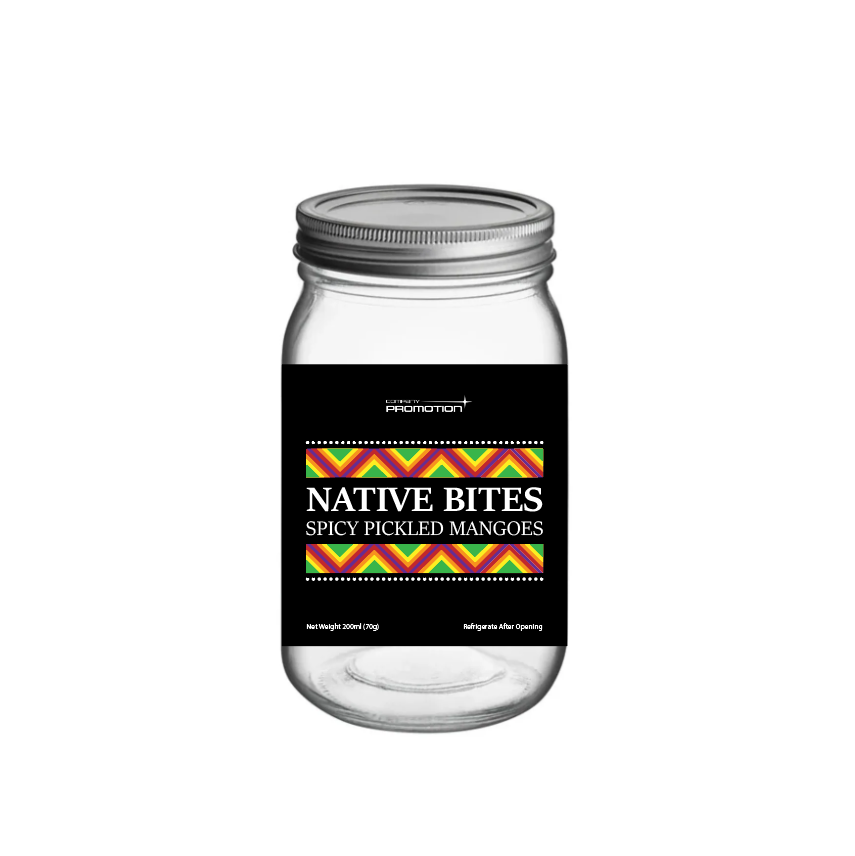
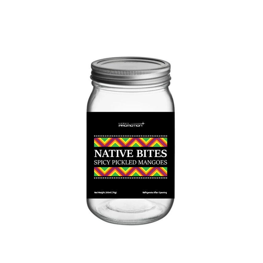
I chose an image of a glass jar that is commonly used for pickling to make it realistic and accurate with the actual packaging bottle. In making the mockup, it was somewhat straightforward because the image itself already has a shadow effect and the black background of the label makes it blend seamlessly into the jar. I just adjusted the placement of the label to align properly with the jar's curves, ensuring it looked as natural as possible.
1 komentar
Masuk atau bergabung Gratis untuk berkomentar