Handy Sisters | Branding Redesign
Hermanas manitas | Rediseño de branding
oleh Julia Yus @paperjulia
- 978
- 17
- 0
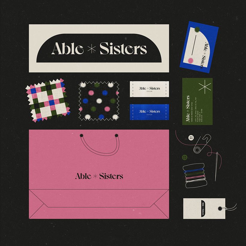
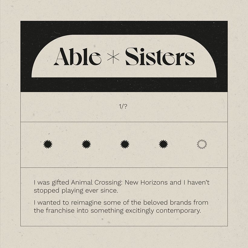
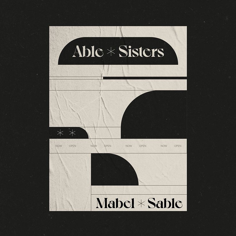
During the first wave of the pandemic, I was given ACNH and haven't stopped playing since. As a personal project, I decided to rebrand some of the franchise's iconic brands with a contemporary twist, starting with the tailoring company Hermanas Manitas.
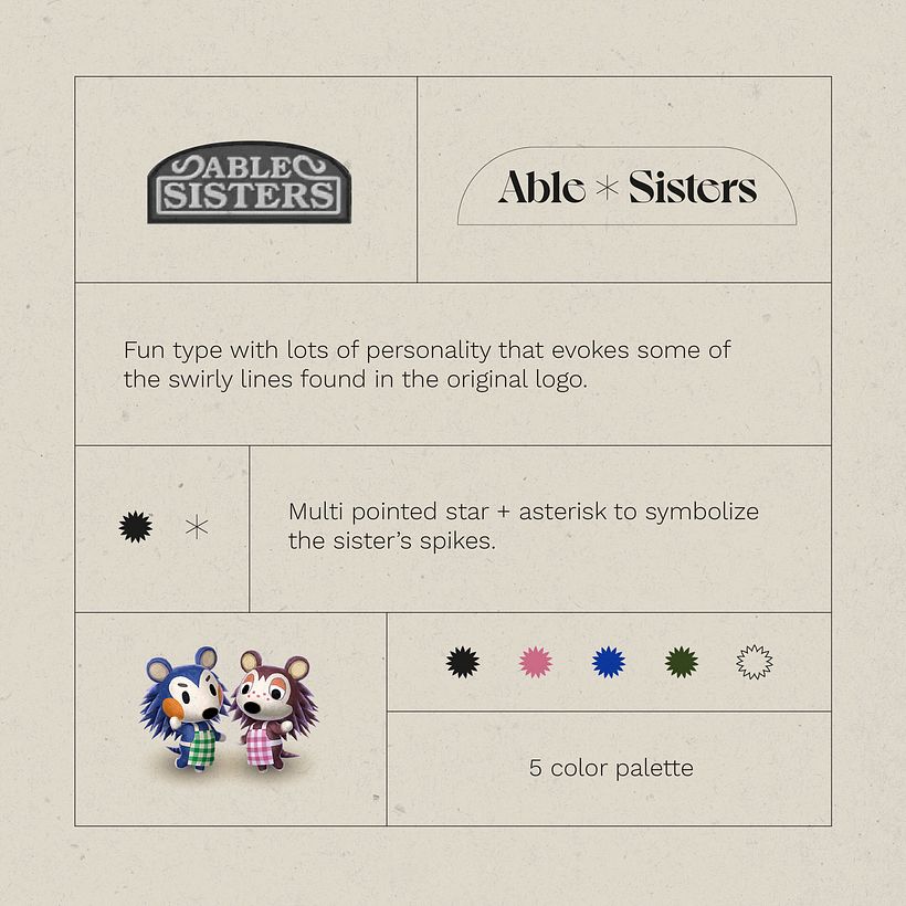
I chose a font with a lot of personality and curved lines reminiscent of the lines of the original logo.
As icons I designed a star with multiple edges and an asterisk reminiscent of a hedgehog's spines.
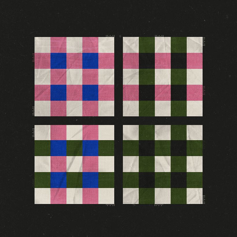
I created a palette of 5 colors based on the colors in the sisters' design.


1 komentar
Masuk atau bergabung Gratis untuk berkomentar