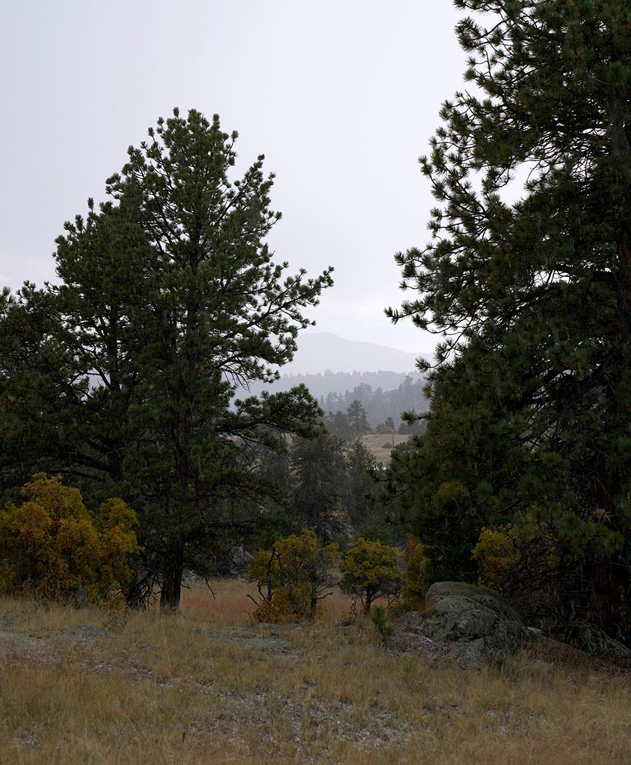
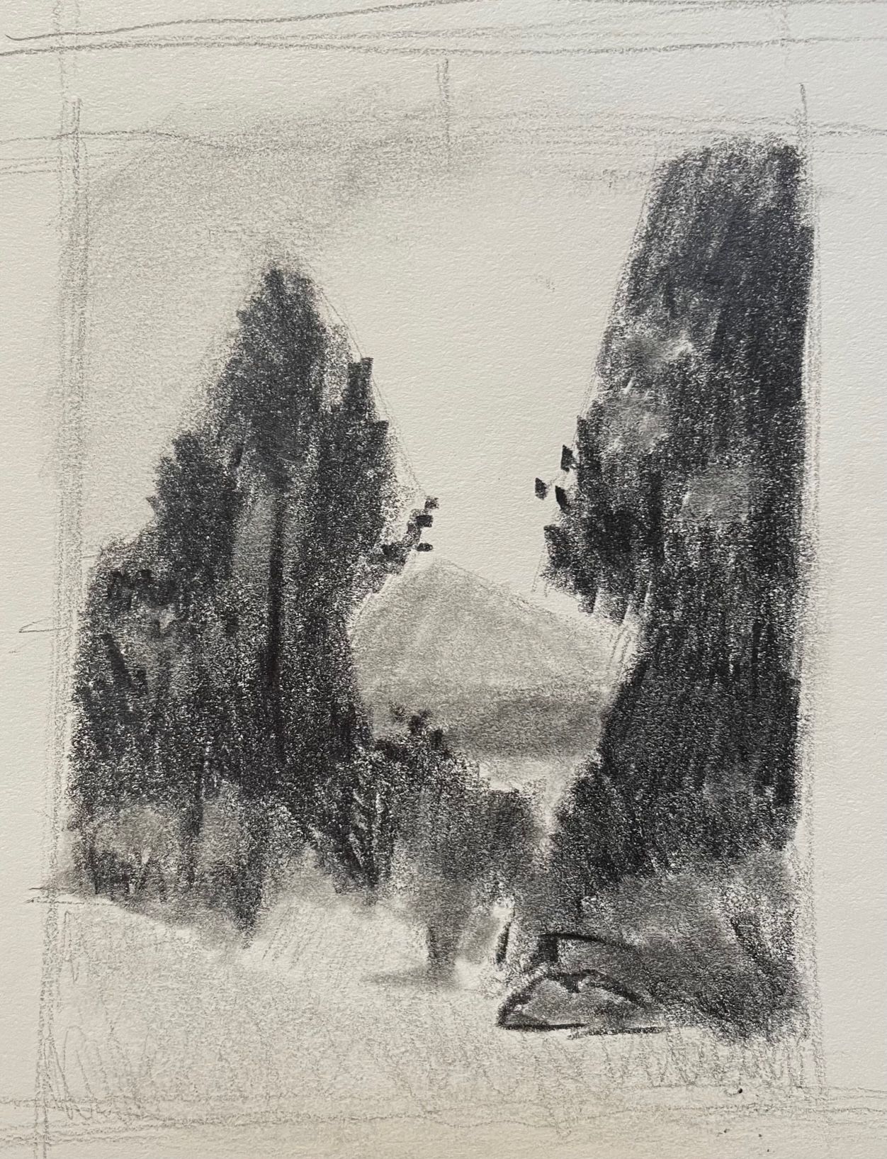
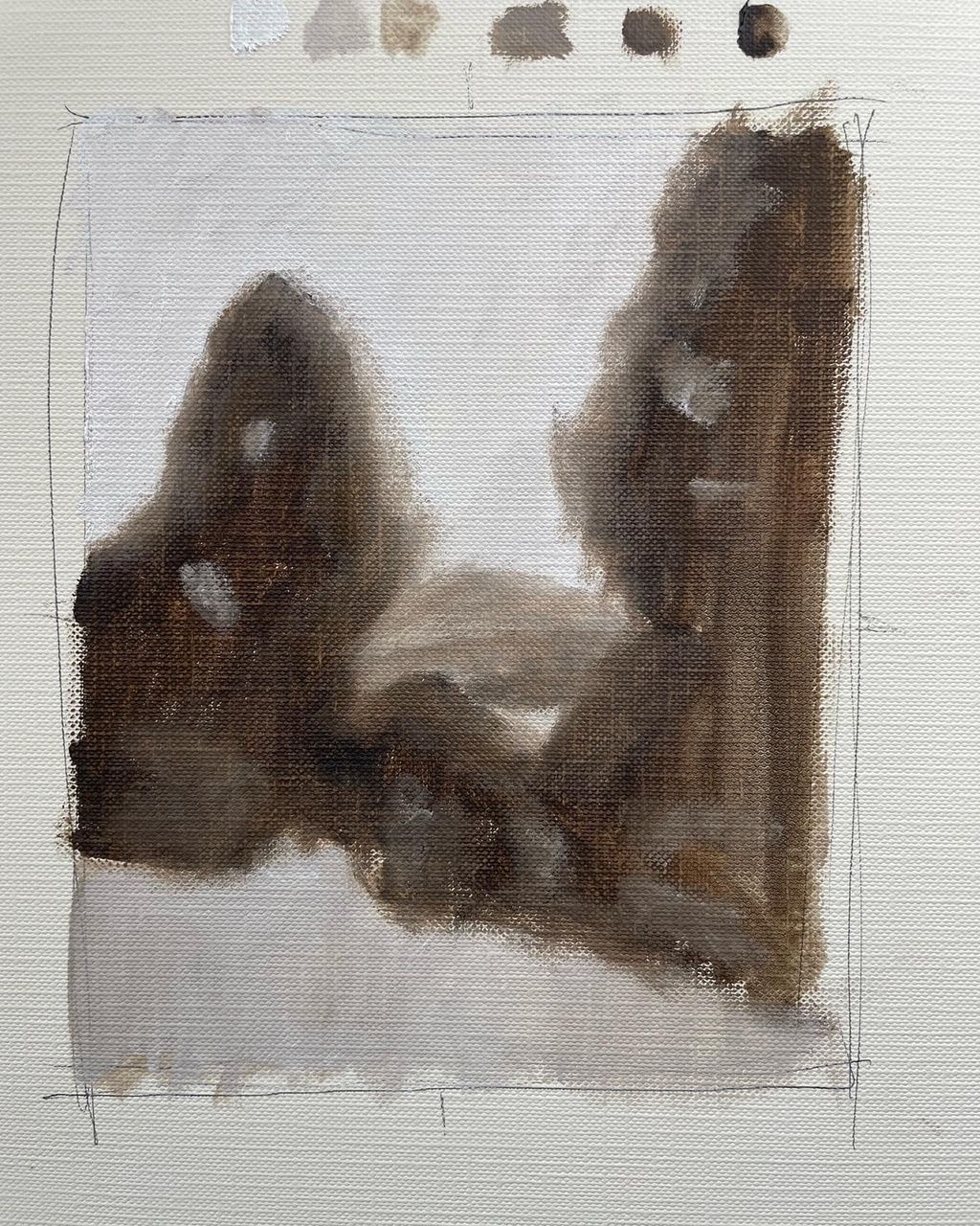
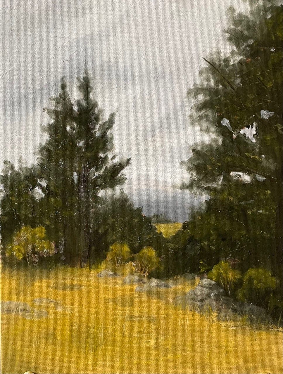
Hi Dave, wow! First of all, great reference. It looks beautiful and definitely worth painting that! Second, I love the very simple shapes of the composition and I like how you developed the vision from almost an abstract composition to a more complete tonal arrangement. Good work! The bigger painting is good, just practice using more neutral tones because this yellow is everywhere so maybe neutralizing it a bit in some parts or trying to vary your hues (like making a yellow that lean towards the blue so you create a yellow green, etc) without painting patches of different colors but maintaining the yellow tones just not too flat from foreground to deep space. That's to, everything else looks very nice!
Thanks for taking the course!





2 comentarios
Hi Dave, wow! First of all, great reference. It looks beautiful and definitely worth painting that! Second, I love the very simple shapes of the composition and I like how you developed the vision from almost an abstract composition to a more complete tonal arrangement. Good work! The bigger painting is good, just practice using more neutral tones because this yellow is everywhere so maybe neutralizing it a bit in some parts or trying to vary your hues (like making a yellow that lean towards the blue so you create a yellow green, etc) without painting patches of different colors but maintaining the yellow tones just not too flat from foreground to deep space. That's to, everything else looks very nice!
Thanks for taking the course!
This is sublime!
Entra o únete Gratis para comentar