


Course project
Mi Proyecto del curso: Infografía creativa: entre arte y periodismo
by He Jo @hbize_arq
- 1364
- 9
- 3
Hola Jaime,
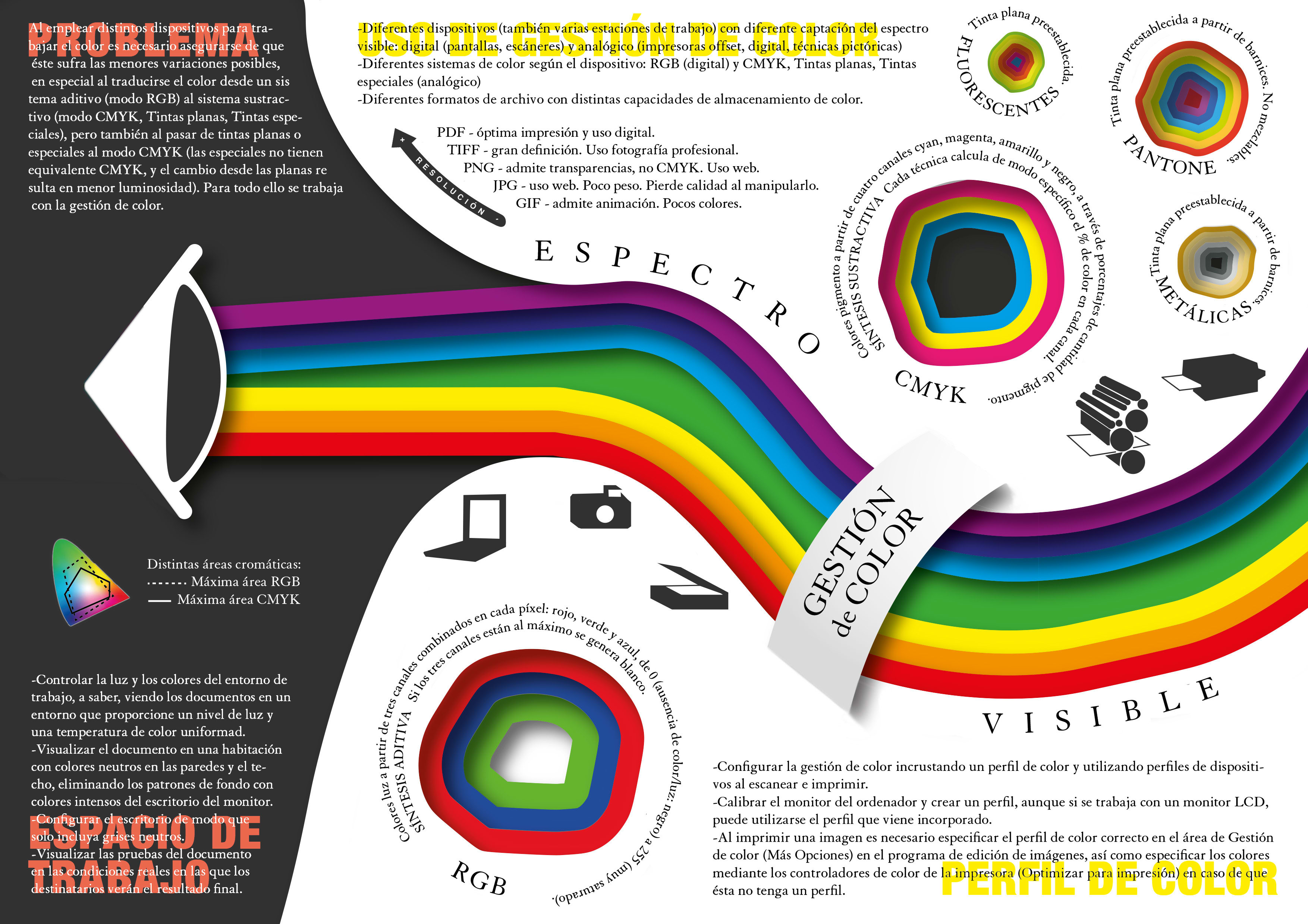
muchas gracias por el curso de introducción a la infografía, ¡me ha encantado! Necesitaba una base mínima para desarrollar la primera infografía que he hecho hasta ahora, pues me la pedían como parte de un trabajo en la universidad para la asignatura de Color, y no tenía ningunas nociones. Soy consciente de hay mucho texto todavía pero nos pedían que detalláramos el proceso que había de contar la infografía, la gestión de color.
Me van a evaluar el trabajo en su conjunto, por lo que si pudieses darme un feedback de esta parte en concreto te lo agradecería muchísimo.
Espero que tú y tu gente estéis bien con toda esta situación.
Un saludo,
Hernán.
3 comments
jaime_serra
Teacher PlusHernán, first of all congratulate you for having reached the end, you see that not many get to develop a final project. About the project, to tell you that, from the outset, I love how you have handled the colors, as if it were cut out cardboard. But I can't give you a refund if I can't read the text. And I can't because of the size. Why don't you email it to me? Cheers
See original
Hide original
jaime_serra
Teacher PlusHernán, received. I will give you a refund, I hope it does not seem too harsh, I emphasize what I think can be improved.
- Taking into account the type of infographic you want, I think a more traditional structure would be necessary: title, introduction, development, and sources of information. It is possible that the text of the 'problem' statement is the introduction. - I would like the main image (the eye with the broken light) to contain some specific information. Perhaps Newton's explanation of this decomposition from a prism? How does the eye process colors?
- It's okay to group the colors that work with light on one side and the colors that work with pigment on the other, but I appreciate this now that I read your email, why not put it as two subtitles? It would be more clear and orderly. - I would not assume that whoever reads the graph knows what colors are CMYK, even if they are the ones that appear in the graph (there are more pantone, metallized and fluorescent than those that appear, so one might think that CMYK also only some have been put on). I would clarify that there are more metallics, pantone and fluorescent and I would mark with text in each color of CMYK cyan, magenta, yellow and black (and, in addition, I would emphasize that the name CMYK comes from there), the same with Red, Green and Blue.
- Neither would it give as textual information the camera, scanner and computer and printing icons of another. I think you should write it.
- One of the things that I find most interesting about your work is the color areas of RGB and CMYT, but it is so small ...
- Finally, about typographic design. I am very 'Swiss', very squared, I do not like that they make me turn my head to read - unless the fact of doing so has an explanation in itself. Nor am I very fond of typographic games like color typography under white typography, which makes reading difficult for me. I'm very outcast to the left and top to bottom. And something more cultural: I love the serif, much more than 'dry stick', but I think the latter, in general, work better in infographics.
I insist: I love the subject, I like the idea of the 'cardboard' (I would appreciate it if it was real, not a digital effect), I think everything is very well understood. But I also believe that a lot can be improved and that my job is to be critical.
If you want to touch it up, redo it, turn it around and send it back to me, I'll be happy to help you.
I send you a hug.
See original
Hide original
hbize_arq
Thank you very much for extending so much, Jaime. All the notes you give me come great. Of course I will give it a good turn to see if in the next one I can be clearer. I take your word for it, when I have something more solid I will pass it on to you.
Thanks again and a hug.
See original
Hide original
Log in or join for Free to comment