


Buzón para el 2062... y más allá.
by ozestudi @oz_estudi
- 338
- 1
- 1
Somos conscientes que leer es un "latazo" pero dado que nuestra propuesta tiene cierta "base teórica" al respecto del diseño industrial, sería interesante que por lo menos miraráis por encima el primer comentario de este proyecto. En él hemos descrito y justificado la propuesta, que es en realidad una pese a que hay más imágenes. Gracias!! Saludos.
P.D.: No habría que decirlo, porque es intrínseco al diseño industrial, pero al igual que la función, la sostenibilidad se le presupone resuelta al producto y ésta estará contemplada en el proceso de desarrollo del mismo.
1 comment
oZ estudi
INTRODUCTION TO THE APPROACH
Einstein said that: "each one sees what he knows." So for the user, an observer in this case, to know what they see, we must always propose a support point, a previous reference product in the evolution of a function or a substantial change. Without ever forgetting that design is also culture.
It is important to start by saying that as a general rule industrial design always projects proposals for the future. This means that products are typically 3/5 years ahead on average.
That said, we can assume that thinking technologically in the longer term and doing a projection exercise to "guess" the artificial context in which the human being will live 50 years from now is - as can be imagined in a time when things change to a impressive pace - quite difficult and it is still a "science fiction" exercise, as long as we are seeking to draw valid conclusions for the future and work with certain rigor in the approaches.
Everything is very possible but the vast majority is unlikely. Under this prism our idea was born with the intention of approaching what could be probable and for this we propose our design within a logical evolution of the product and its functions. A point of view that is born through the following reflection:
"What we will be able to see many years from now will surely have X previous references that allow validity, understanding and its own evolutionary coherence."
THE PROJECT
Although the work responds to a contest, an always freer scope, we try to achieve the maximum possible objectivity and therefore we work from the logic of design - with all the reversals to take into account - to establish a coherent and "natural" evolution of the object itself .
An evolution based on the functions that it can presumably have throughout this time as well as the possible technologies that could be considered.
APPROACH
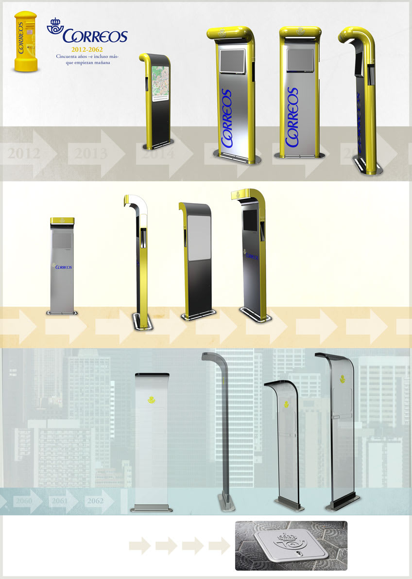
We carry out this evolutionary exercise from reference 0, the current mailbox. From here we generate references from what is probable and what is foreseeable until reaching 2062 and even beyond.
This is extremely important so that users can always interact with the object in an easy, understandable and efficient way. Thus, this evolution is really considered in order to offer a good “digestion” to the users, always starting from previous references.
Going too far or innovating by losing the previous references of an object implies assuming the risk that users will not be able to decode the product and its functions. That is, they do not understand it and therefore reject it.
Thus, our proposal, beyond the idea of logical evolution, is to present the mailbox for the year 2062, offering its line of logical changes to understand where we come from and where we are going. Without a doubt, it is not the only existing path but it is one of them.
IDEA A
Starting from the current reference 0, we are looking to minimize the general volume of the mailbox and we incorporate new telematic functions –which are the order of the day- that can allow the company to offer more “network” services. It could even be imagined that from a client card we could operate with this new service or without this access without viewing company information.
The product, with less visual weight but with a lot of volume, still logically incorporates current resources such as location maps, printed information, etc ...
It is designed to be made mainly of stamped steel sheet and incorporates LED lighting and beacons to mark the “totem”. At a formal level, we start from the current mailbox and retain a certain volume and presence. The characteristic hat of the previous object is also maintained, but at a conceptual level, which is now converted into the semicircular volume of the perimeter and into the proposed canopy that improves visibility in the presence of the sun. We reduce the chromatic claim for a better integration in the urban context. We maintain the same layout of the graphics as well as an entry for ordinary mail, now lateral and that could be multiple, with a tight storage volume.
IDEA B
We now start from reference A, which in turn started from reference 0. We maintain in this variation the structural gesture of the initial idea but we lose volume to make the object more neutral, lighter -visually speaking- and more “architectural”. The functional options are very similar to their precedent, although here there could be a wider range of possibilities at the telematic and software level.
This option, thought in the medium term, would also be totally viable and would be made of sheet steel and / or aluminum. It incorporates a touch screen and led lighting.
It should be said that this approach could really replace idea A, however, when thinking in a more neutral way, it is really interesting, in a first stage, to work closer to reference 0.
We continue to keep the regular mail reference on the side of the object because it clearly identifies the native function, although in these options it is already seen as secondary.
IDEA C Actually the proposal itself
It would really be our proposal to the contest. An approach closer to 2062 with new technologies that are now experimental. This new revision could totally maintain the structural gesture of the previous ideas, being a vertical panel with a canopy.
Here there could already be important changes. It could presumably be made of 25mm thick armored glass and everything would be visual and tactile. The information would be organized and displayed along the entire surface of the glass that would act as a screen. The LEDs would be integrated into the glass itself, which is now possible.
It is still a structure that we recognize from reference B but that minimizes its visuality and presence. Now the reference 0 has little to do with it but we understand it within these changes.
Here we tend to the decomposition of the object and its chromatic reference is reduced, which within the set is already associated with the brand.
An important detail is that we do without, now, the ordinary mail. Probably the evolution of the letter may go through other formats and / or supports that depend more on the storage of information.
IDEA D
But we still go one step further. It is true that when we think about the objects of tomorrow, about the objects from here 50, 60 or 100 years we can work with certain variables that some trend and future studies throw at us. These analyzes draw us a more reduced artificial context in a face-to-face and / or visual sense. There is a trend towards a minimization of resources and a miniaturization of the object. If we add to this that surely the future passes through information, data and its delivery, it is possible that the only thing that remains of the traditional mailbox within the architectural and / or urban context is exclusively the manhole through which the company accesses the core of the wiring and information.
So it is possible to imagine that really, from this evolutionary logic, the mailbox of the future, even beyond 2062, is the symbolic presence of this chest. Tomorrow would undoubtedly be the symbol of what was a mailbox.
See original
Hide original
Log in or join for Free to comment